
Step Up Your Power BI Game With SVGs 🔥
Building a Crypto Market Watch Dashboard in Power BI Using SVGs
🎁PBIX available for download at the end of this article!
Introduction
SVGs can really bring your visualizations in Power BI to the next level. I’ve only recently started using them (previously having a preference for developing custom visualizations in HTML), but I see they are becoming increasingly adopted by BI developers.
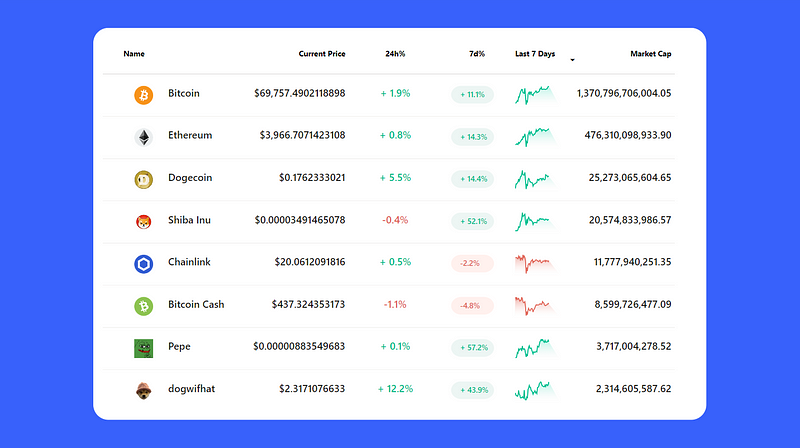
In the following article, I will give a brief overview on what are SVGs, how you can use them in Power BI, and then demonstrate how I leveraged them in building this market watch crypto table displayed as cover image.
What are SVGs?
SVG stands for Scalable Vector Graphics. It’s a type of file used for making pictures and designs that look clear and sharp, no matter how big or small you make them. This is great for websites and apps used on different devices, like phones or computers, because it ensures everything looks good on any screen size.
To illustrate SVG syntax, here’s an example code that creates a red rectangle with “1000” displayed at its center:
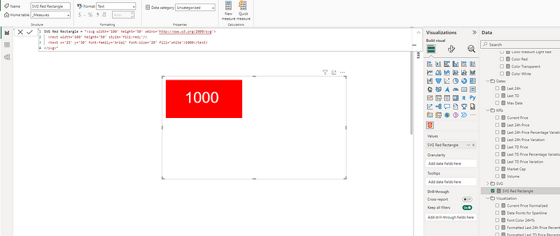
<svg width="100" height="50" xmlns="http://www.w3.org/2000/svg">
  <rect width="100" height="50" style="fill:red;"/>
  <text x="25" y="30" font-family="Arial" font-size="20" fill="white">1000</text>
</svg>
This SVG code does the following:
- It defines an SVG container with a width of 100 units and a height of 50 units with the code
<svg width="100" height="50" xmlns="http://www.w3.org/2000/svg">. Everything that is drawn or defined happens within this container. - Inside this container, the
<rect width="100" height="50" style="fill:red;"/>draws a rectangle with the same width and height as the container, and it is filled with the color red. - Finally the
<text x="25" y="30" font-family="Arial" font-size="20" fill="white">1000</text>places the text “1000” inside the rectangle. The text is positioned starting 25 units from the left and 30 units from the top of the container. The font used is Arial, with a font size of 20 units, and the text color is white to ensure visibility against the red background.
In Power BI, SVGs can be used to enhance reports and dashboards with rich, custom visualizations beyond what’s available through standard Power BI visuals.
How to Use SVGs in Power BI
The most common way to use SVGs in Power BI is to integrate the SVG code within a DAX measure and render the visualization through either Power BI’s table (or matrix) visual, or use a custom visual, such as the HTML content visual.
The SVG code in your DAX measure must be enclosed in double quotes (“ “), with any internal quotes replaced by single quotes (‘ ‘). For example, the code to generate the red rectangle previously needed to be changed to the following to add it to a DAX measure:
Initial Code =
<svg width="100" height="50" xmlns="http://www.w3.org/2000/svg">
  <rect width="100" height="50" style="fill:red;"/>
  <text x="25" y="30" font-family="Arial" font-size="20" fill="white">1000</text>
</svg>

Code for DAX Measure:
To render SVG code within a table visual, there are 2 things you must always do:
- Prefix the SVG code with:
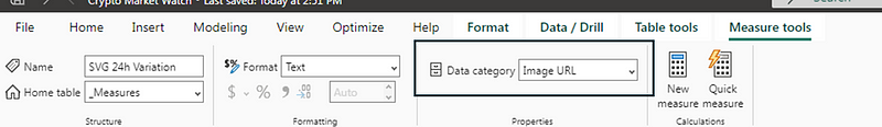
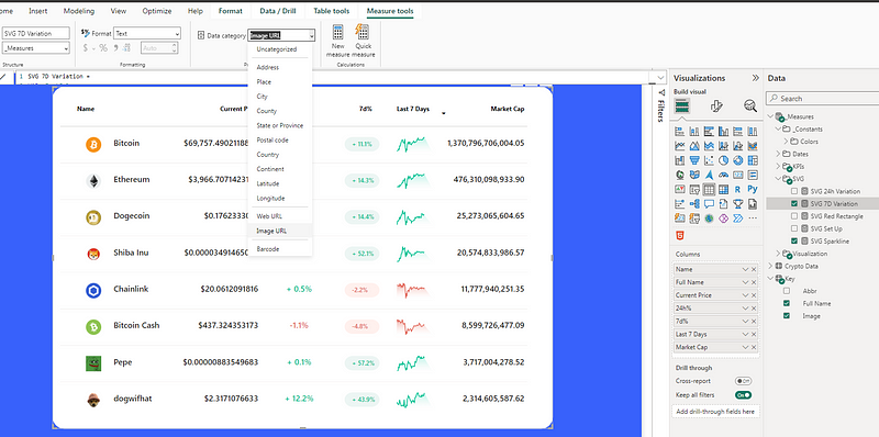
"data:image/svg+xml;utf8, "2. Set the SVG measure’s data category to Image URL under Measure tools.
Bas Dohmen from How to Power BI actually recently came out with a video that goes into more detail on how you can use SVGs in Power BI to import SVG images, create charts and customize columns in a table/matrix visual.
In my case, to better explain, I will take you through how I concretely created the crypto market watch table displayed as the cover image of this article.
Case Study: Building a Crypto Market Watch Dashboard
In crypto news, Bitcoin has been busting new all-time highs over the last few days and the talks around meme coins are continuing to generate a lot of enthusiasm. In this context, I decided to base my article’s example on some popular coins.
The following 2 columns in this crypto market watch table were built integrating SVG code within the DAX measures of this table visual in Power BI.
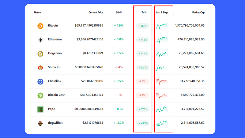
- 7d%: This first column displays the percentage variation of each coin over the last 7 days. The background oval as well as the text are generated using SVG code.
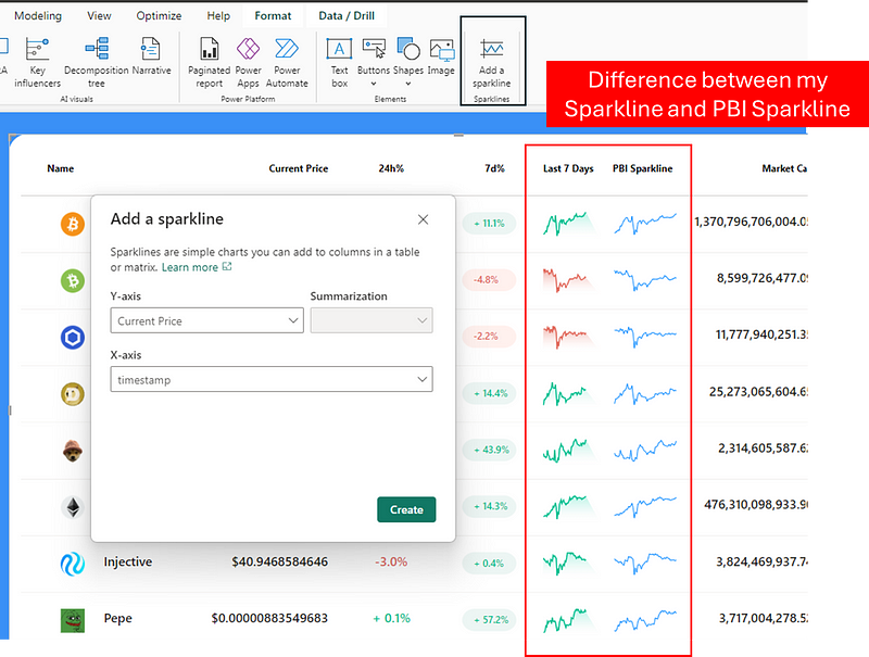
- Last 7 Days: This second column displays sparkline of each coins price over the last seven days. While sparklines can natively be included in table or matrix visuals in Power BI, we can’t dynamically adjust their color, nor add this gradient area effect I’ve included (which I am very proud of 😎).
The data was sourced from Coinmarket.com. You can view in the folder available for download at the end of this article the CSV extracts, as well as the steps applied in Power Query to upload the data.
1. Preparing the Initial Measures and Setting Up the Table Visual
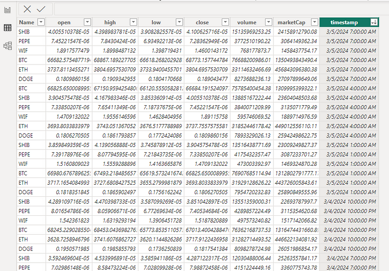
Once my data was loaded in Power BI, I had the table Crypto Data containing the following fields:
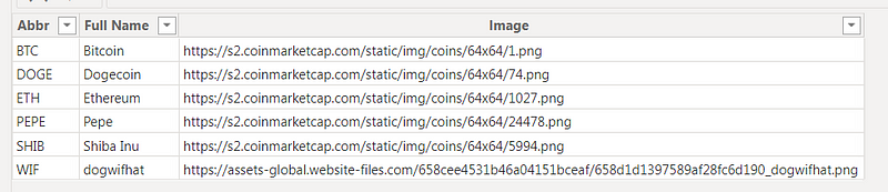
I also created the table Key in Excel and uploaded to Power BI to have the image URLs of each coin and display them in the table visual.
Since I wanted to display information on the current price, and its variation across the last 24h and 7 days, I started by creating the following three date measures:
Max Date = MAX('Crypto Data'[timestamp])


Last 24h = [Max Date]-1


Last 7D = [Max Date]-6.5
Max Date: This measure finds the most recent date and time (or the maximum timestamp) in the ‘Crypto Data’ table.
Last 24h: This measure calculates the date and time that was 24 hours before the Max Date.
Last 7D: This measure is aimed at calculating the point in time that was approximately 7 days (or precisely, 6 days and 12 hours, given the 0.5 of a day) before the Max Date. 6.5 (instead of 7) is used based on the availability of the data available from CSV extracts from Coinmarketcap.
Next, I created the following 3 measures that calculate the current price at each one of these time periods:
Current Price =
VAR _MaxDate = [Max Date]
VAR _Price =
    CALCULATE(
        MAX('Crypto Data'[close]),
        FILTER(
            'Crypto Data',
            'Crypto Data'[timestamp] = _MaxDate
        )
    )
RETURN _Price


Last 24h Price =
VAR _MinDate = [Last 24h]
VAR _Price =
    CALCULATE(
        MAX('Crypto Data'[close]),
        FILTER(
            'Crypto Data',
            'Crypto Data'[timestamp] = _MinDate
        )
    )
RETURN _Price


Last 7D Price =
VAR _MinDate = [Last 7D]
VAR _Price =
    CALCULATE(
        MAX('Crypto Data'[close]),
        FILTER(
            'Crypto Data',
            'Crypto Data'[timestamp] = _MinDate
        )
    )
RETURN _Price
After this, I created the required measures to calculate the variation and percentage variation between the different time periods:
Last 24h Price Variation = [Current Price] - [Last 24h Price]


Last 24h Price Percentage Variation =
    DIVIDE(
        [Last 24h Price Variation],
        [Last 24h Price]
    )


Last 7D Price Variation = [Current Price] - [Last 7D Price]


Last 7D Price Percentage Variation =
    DIVIDE(
        [Last 7D Price Variation],
        [Last 7D Price]
    )
I then wanted to format the way the measures would render in the table visual (adding a “+” for positive values).
Formatted Last 24h Price Percentage Variation =
VAR _FormattedRate = FORMAT([Last 24h Price Percentage Variation],"0.0%")
VAR _Result =
    IF(
       [Last 24h Price Percentage Variation]>0,
       "+ " & _FormattedRate,
       _FormattedRate
    )

RETURN _Result


Formatted Last 7D Price Percentage Variation =
VAR _FormattedRate = FORMAT([Last 7D Price Percentage Variation],"0.0%")
VAR _Result =
    IF(
       [Last 7D Price Percentage Variation]>0,
       "+ " & _FormattedRate,
       _FormattedRate
    )

RETURN _Result
The final measure I needed to create was to calculate each coin’s market cap:
Market Cap =
VAR _MaxDate = [Max Date]
VAR _MarketCap =
CALCULATE(
MAX('Crypto Data'[marketCap]),
FILTER(
'Crypto Data',
'Crypto Data'[timestamp] = _MaxDate
)
)
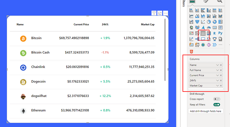
RETURN _MarketCap I then added Power BI’s table visual to my canvas and inserted the following fields:
- Image (column from the Key table) that I renamed ‘Name’
- Name (column from the Key table) that I renamed ‘Full Name’ but changed the header font color to white.
- Current Price (measure previously created).
- Formatted Last 24h Price Percentage Variation (measure created) that I renamed to 24h%. I also created a dynamic font color measure that I assigned to this table field.
- Market Cap (measure created).
You can view in detail all the applied formatting steps in the PBIX file available for download at the end of the article.
2. Developing the 7d% Column
Now that the initial measures were created and my table was set up, I was ready for things to get spicy 🔥. Since I was planning on creating multiple measure using SVG code, I first created this SVG Set Up measure.
It essentially prepares the foundation for embedding the SVG within Power BI suing a data URL shceme.
SVG Set Up = "data:image/svg+xml;utf8, <svg width='120' height='30' xmlns='http://www.w3.org/2000/svg'>"data:image/svg+xml;utf8,: This part of the string specifies that what follows is data in the format of an SVG image. Thedata:scheme is used to embed the image data directly inline.image/svg+xmlspecifies the MIME type as SVG, andutf8indicates that the encoding of the SVG content is in UTF-8, which is a standard character encoding for Unicode.<svg width='120' height='30' xmlns='http://www.w3.org/2000/svg'>: This part is the beginning of the SVG content itself. It starts an<svg>element that defines the space for the SVG graphic. Thewidth='120'andheight='30'attributes set the width and height of the SVG canvas to 120 and 30 pixels, respectively. Thexmlns='http://www.w3.org/2000/svg'attribute defines the XML namespace for SVG, ensuring that the SVG is correctly interpreted as such.
I then created the SVG 7D Variation measure.
SVG 7D Variation =
VAR _FontColor =
    SWITCH(
        TRUE(),
        [Last 7D Price Percentage Variation]>=1, [Color White],
        [Last 7D Price Percentage Variation]>0, [Color Green],
        [Last 7D Price Percentage Variation]<=-1, [Color White],
        [Last 7D Price Percentage Variation]<0, [Color Red],
        [Color Grey]
    )

VAR _BackgroundColor =
    SWITCH(
            TRUE(),
            [Last 7D Price Percentage Variation]>=1, [Color Green],
            [Last 7D Price Percentage Variation]>0, [Color Light Green],
            [Last 7D Price Percentage Variation]<=-1, [Color Red],
            [Last 7D Price Percentage Variation]<0, [Color Light Red],
            [Color Light Grey]
        )

VAR _Visualization =
    [SVG Set Up] & "
<rect x='10' y='0' width='68' height='28' rx='16' ry='16' style='fill:"&_BackgroundColor&"'/>
<text x='24' y='18' font-family='Segoe UI Semibold' font-size='12' fill='"&_FontColor&"'>"&[Formatted Last 7D Price Percentage Variation]&"</text>
</svg>
"
RETURN _Visualization- _FontColor: Determines the color of the text based on the percentage variation of the price over the last 7 days. It uses a
SWITCHfunction to assign different colors based on the value. The color codes were stored in DAX measure such asColor Green = "#00BF90". - _BackgroundColor: Sets the background color of the SVG element, again using a
SWITCHfunction with similar conditions to_FontColor, but with colors assigned to visually represent the change. - _Visualization: Constructs the SVG code using the
SVG Set Upmeasure as a foundation (defining the SVG's width, height, and namespace). It then adds a rectangle (using<rect>) with a background color (_BackgroundColor) and text (<text>) displaying the formatted last 7-day price percentage variation in the appropriate font color (_FontColor).
As you can see, in the SVG code only single quotes (‘’) are used across the SVG code. Double-quotes (“”) with the & are added to wrap DAX measures or variables.
Now that this SVG measure is ready, we can add it to the table, while making sure to change the measure Data category to “Image URL”.
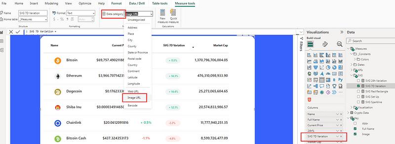
Finally, I renamed the field in the table to “7d%” by double-clicking on it.
3. Developing the Last 7d Column
To develop this column, I used a similar approach as before but focused on displaying a unique SVG shape called a polyline. This requires setting preliminary measures to calculate the sparkline’s data points, which are the coordinates for the SVG polyline. First, I determined the X-axis values, then calculated the Y-axis values. It’s important to normalize the Y-axis values and invert them to ensure accurate display because SVG’s coordinate system places higher Y-values lower on the canvas, which can be counterintuitive 🙃.
- X-coordinate Calculation:This measure ranks each timestamp to determine its X-coordinate position in the sparkline.
X-coordinate =
    RANKX(
        ALL('Crypto Data'[timestamp]),
        FIRSTNONBLANK('Crypto Data'[timestamp],1),,ASC
)- Current Price Normalized: Here, we normalize the current price to fit within our SVG canvas, inverting the Y-axis so higher values are displayed towards the top. I also multiplied the values by 30 for the sparkline to properly fill the container area.
Current Price Normalized =
VAR _MaxPrice = MAXX(ALL('Crypto Data'[timestamp]), [Current Price])
VAR _MinPrice = MINX(ALL('Crypto Data'[timestamp]), [Current Price])
VAR _NormalizedPrice = 1 -
DIVIDE(
    [Current Price] - _MinPrice,
    _MaxPrice - _MinPrice
)

RETURN _NormalizedPrice * 30- Data Points for Sparkline: This concatenates all the coordinates for the sparkline, preparing them to be used in the SVG.
Data Points for Sparkline =
CONCATENATEX(
    DISTINCT('Crypto Data'[timestamp]),
    [X-coordinate] & ", " & [Current Price Normalized],
    " "
)- SVG Sparkline Measure: Once my data points where ready, I built the following SVG measure that rendered the desired sparkline for my table:
SVG Sparkline =
VAR _SparklineColor =
    IF(
        [Last 7D Price Percentage Variation] < 0,
        [Color Red],
        [Color Green]
    )
VAR _BackgroundColor1 =
    IF(
        [Last 7D Price Percentage Variation] < 0,
        [Color Medium Light Red],
        [Color Medium Light Green]
    )
VAR _BackgroundColor2 =
    IF(
        [Last 7D Price Percentage Variation] < 0,
        [Color Light Red],
        [Color Light Green]
    )
RETURN
[SVG Set Up] &
"<defs>
    <linearGradient id='gradientFill' x1='0%' y1='0%' x2='0%' y2='100%'>
      <stop offset='0%' style='stop-color:" &_BackgroundColor1 & "; stop-opacity:1' />
      <stop offset='100%' style='stop-color:" &_BackgroundColor2 & "; stop-opacity:0' />
    </linearGradient>
</defs>
<polyline fill='url(#gradientFill)' points='" &[Data Points for Sparkline] & " 70,30 0,30'/>
<polyline fill='none' stroke='" &_SparklineColor & "' stroke-width='1.5' points='" &[Data Points for Sparkline] & "' />
</svg>"- _SparklineColor: Determines the color of the sparkline itself. If the last 7 days’ price variation is negative, the sparkline will be red ([Color Red]), indicating a downward trend. If it’s positive, the sparkline will be green ([Color Green]), indicating an upward trend.
- _BackgroundColor1 and _BackgroundColor2: These variables define the start and end colors for a gradient effect used as the fill for the sparkline. The gradient changes based on the last 7 days’ price variation: For negative variations, the gradient starts with a medium light red and fades to a light red. For positive variations, it starts with a medium light green and fades to a light green.
<defs>and<linearGradient>: These elements define a gradient fill named 'gradientFill' that transitions vertically (y1='0%'toy2='100%') from_BackgroundColor1to_BackgroundColor2. This gradient is applied to the area under the sparkline, visually representing the price variation over the last 7 days with a subtle color shift, enhancing the visual appeal and making the trend easier to interpret.<polyline fill='url(#gradientFill)' points='...'>: This element draws the first polyline using the previously defined gradient as the fill. It represents the area under the sparkline. Thepointsattribute is dynamically generated based on the data (handled by[Data Points for Sparkline]), with additional points added (70,30 0,30) to close the shape at the bottom of the SVG container, ensuring the filled area is properly bounded.<polyline fill='none' stroke='...' stroke-width='1.5' points='...'>: This second polyline represents the sparkline itself, with no fill and a stroke color determined by_SparklineColor. Thestroke-widthis set to 1.5 for visibility. Thepointsattribute, like before, is dynamically generated to draw the line based on the data. This line traces the price movement over the last 7 days.
Once this measure was ready, I could add in the table, like for the previous one, while changing its data category to ‘Image URL’. I also changed the field name to ‘Last 7 Days’.
Wrapping Up
In conclusion, SVGs can really add an extra level of pro-ness to your Power BI reports and dashboards. I’ve personally been enjoying integrating them into table or matrix visuals, but I would love to hear if you use them, and if so, how?
I am no SVG pro, most of my SVG code is usually generated with ChatGPT 🤖 and then I bring the required customization to it.
Not to sound like the Amazon recommender system 😅, but if you liked this article, you might also enjoy one of my latest on how to use HTML in Power BI.
And finally, here is the PBIX file to see all these examples in action!
Happy Power BI report designing ✨🎨!


