
Elevating Power BI Reports with HTML & CSS: Joining Forces 💪
In It to Win It 🤠: Part 2 of Participating in the FP20 Analytics Challenge on Data-Driven Education Management
🎁PBIX file available for download at the end of this article!
Introduction
HTML (HyperText Markup Language) is the standard programming language used to create and design web pages. Combined with CSS (Cascading Style Sheets), which allows for extensive styling and layout adjustments, these two languages enable the design of virtually any type of web interface.
While I’m not an expert in HTML/CSS, I’ve been increasingly using them into parts of my Power BI reports to enhance visual appeal through customized shapes, icons, and more. This has also helped me simplify or reduce the number of shapes and measures used in reports for a cleaner look. Many of you may have already noticed in my PBIX files shared across previous articles, I often leverage the HTML Content visual that allows us to merge the capabilities of Power BI with the versatility of HTML/CSS 💪.
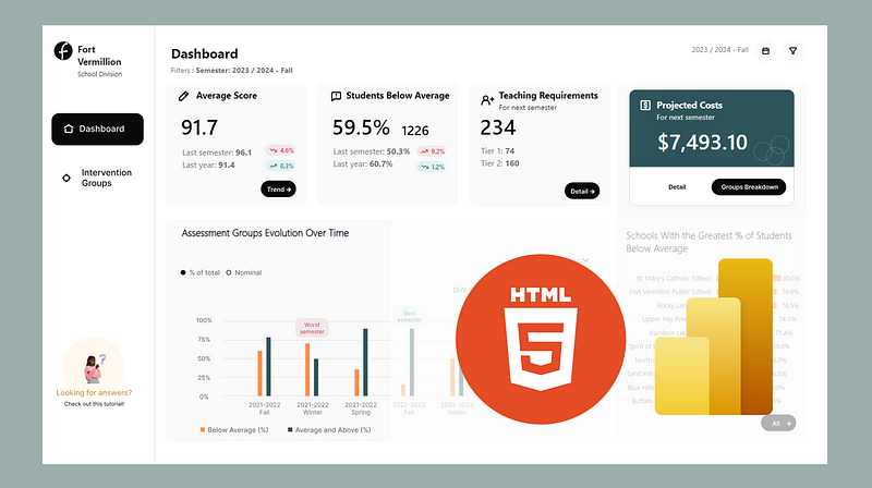
Following my last article “How to Design Attractive Power BI Reports” for the FP20 Analytics Challenge on Data-Driven Education Management, I’ll demonstrate a few simple ways I utilized the HTML content visual in my report for this competition (Power BI report still in progress 😅— competition ends February 15 ⏰).
Getting Access to the HTML Content Visual
The HTML content visual is not a standard visualization within Power BI. To add it into your report, you can import it using the following steps:
- Click on the “Get more visuals” three dots (…) from the Visualizations panel in Power BI.
- Select the HTML Content visual. Use the search bar on the right-hand side to find it faster.
- Click on “Add” to import the HTML Content Visual into your Power BI report.

Using the HTML Content Visual in Power BI
To use the HTML content visual in Power BI, all you need to do is add the visualization to your report and use measures or fields that contain HTML code. The HTML code must always be enclosed in quotation marks (“ ”) in measures or fields.
What I really appreciate about the HTML Content Visual is the ability to combine the power of DAX and HTML in the measures you create to make the most of this visualization. It will become clearer in the following sections when I go through some examples.
You can check out the documentation for this visualization tool here.
A Bit About HTML…
HTML is made up of a series of elements or tags that instruct the web browser on how to display content. For instance, text can be enclosed in different tags to indicate whether it should be displayed as a paragraph, a heading, or a list item. HTML tags are typically used in pairs, such as <p> for the start of a paragraph and </p> for the end. Attributes within these tags can further define styles, links, or other properties.
I’ve found that having a basic understanding of HTML has been quite beneficial in my overall programming journey. I learn best through projects, which is why I’ll show you some straightforward examples in the next sections to get you started with using HTML. However, if you prefer learning through courses, I recommend Codecadmy’s Learn HTML course. I completed it, along with the CSS course, a few years ago. Each is about 6 hours long and provided me with a solid foundation (I think 😅).
1. Styling Text
I discovered the HTML visual while searching for a method to italicize part of the text rendered by a measure. Here are some common ways to style text in HTML:
<i>and</i>for making text italic.<b>and</b>for bolding text.<br>for adding a line break.<u>and</u>for underlining text.<span style="color:#FF5733;">and</span>for changing text color.<div style="font-family:'Arial';">and</div>for changing the font family.
These HTML tags can be directly incorporated into your measures or fields, allowing dynamic alterations to text appearance within your reports. This feature is particularly useful for emphasizing key indicators, highlighting specific parts or making your report more fancy 😎.
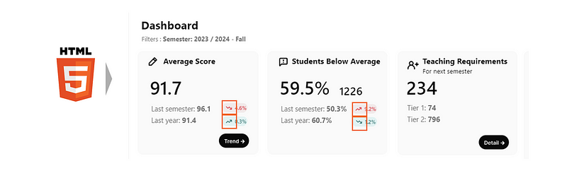
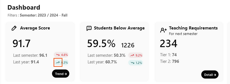
In my report, I styled these text boxes using the HTML Content Visual:
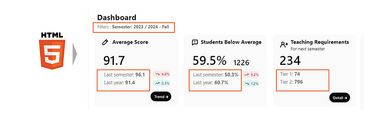
Here’s the DAX measure I created for displaying the “Last semester/Last Year” text beneath the Average Score KPI:
Visualization Last Semester/Year Average Score =
"Last semester: " & "<b>" & FORMAT([Average Score Last Semester], "0.0") & "</b><br>" &
"Last year: " & "<b>" & FORMAT([Average Score Last Year], "0.0") & "</b>"
In this measure, I make the text bold by placing the text I want to highlight between <b> and </b> tags. To move to a new line, I use the <br> tag. It's important to note that all HTML tags are included within quotation marks. When you need to use two or more HTML tags in a row in a DAX measure (like </b><br>), you can put them together inside the same set of quotation marks.
2. Creating Shapes
HTML and CSS provide a powerful toolkit for creating custom shapes directly within your Power BI reports.
In my report, I created the following background oval shapes to display the last semester and last year variations of the showcased KPIs.
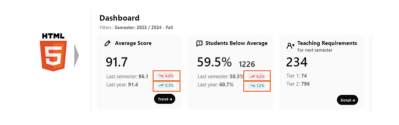
I opted to create these shapes using HTML instead of Power BI’s built-in oval shape because I wanted to include HTML icons (which we’ll explore in the next section). Additionally, I needed these ovals to be quite small, and with Power BI shapes, I wouldn’t have been able to add text and make it fully visible.
To achieve this, I began by creating a DAX measure titled ‘Oval Set Up’:
Oval Set Up = "<head>
<meta name=""viewport"" content=""width=device-width, initial-scale=1"">
<style>
.oval {
height: 18px;
width: 48px;
background-color: {BACKGROUND_COLOR} ;
border-radius: 25px;
display: flex;
align-items: center;
justify-content: center;
color: {FONT_COLOR} ;
font-size: 10px;
}
</style>
<body>
<div class=""oval"">
<span> {TEXT}</span>
</div>
</body>
"This measure uses HTML and CSS to define the look and layout of the oval shape, with placeholders (between the {} brackets) for customizable elements. Here’s what each part of the code accomplishes:
- HTML Structure: The
<head>section includes a<meta>tag that ensures the content is properly scaled on different devices, withwidth=device-width, initial-scale=1making the content responsive. The<style>section within the<head>defines the CSS styles for the oval shape. - CSS Styling (
ovalclass):
height: 18px;andwidth: 48px;set the oval's size.background-color: {BACKGROUND_COLOR};specifies the oval's fill color, where{BACKGROUND_COLOR}is a placeholder for any color value.border-radius: 25px;gives the shape its rounded, oval appearance by defining how rounded the corners should be.display: flex; align-items: center; justify-content: center;centers the text (or any content) inside the oval both vertically and horizontally.color: {FONT_COLOR};sets the color of the text within the oval, where{FONT_COLOR}is a placeholder for the text color.font-size: 10px;specifies the size of the text inside the oval.
3. HTML Body and Content:
- The
<body>contains a<div>element with the class "oval," applying the previously defined CSS styles to this div. - Inside the div, a
<span>element contains{TEXT}, a placeholder for the text you want to display inside the oval. The
The next measure demonstrates displaying the first oval shape (showing last semester’s variation) by replacing the {Placeholder} with values defined in DAX and substituting them into the HTML/CSS code as follows:
Formatted Average Score Last Semester Variation =
VAR _Variation = FORMAT(ABS([Last Semester Average Score % Variation]), "0.0%")
VAR _BackgroundColor =
IF(
[Last Semester Average Score Variation]<0,
[Color Light Red],
[Color Light Green]
)
VAR _FontColor =
IF(
[Last Semester Average Score Variation]<0,
[Color Red],
[Color Green]
)
VAR _Text =
IF(
[Last Semester Average Score Variation]<0,
[Icon red triangle down] & _Variation,
[Icon green triangle up] & _Variation
)
VAR _Shape =
SUBSTITUTE(
SUBSTITUTE(
SUBSTITUTE(
[Oval Set Up],
"{BACKGROUND_COLOR}",
_BackgroundColor
),
"{FONT_COLOR}",
_FontColor
),
"{TEXT}",
_Text
)
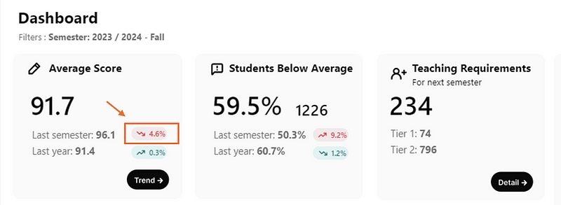
RETURN IF([Average Score Last Semester] <> BLANK(), _Shape) Here is what the measure achieves:
- _Variation Calculation: The measure calculates the absolute percentage variation of the last semester’s average score using
FORMAT(ABS([Last Semester Average Score % Variation]), "0.0%"). - Background Color Determination: It determines the background color based on whether the variation in the average score is negative (decrease) or positive (increase). If the variation is negative, it uses a light red color (
[Color Light Red]); if positive, a light green color ([Color Light Green]) is used. - Font Color Selection: Similar to the background color, the font color is also chosen based on the score’s variation. A darker shade of red (
[Color Red]) indicates a decrease, while green ([Color Green]) signifies an increase. - Text and Icon Composition: The measure constructs the text to be displayed, combining an icon with the variation percentage. If the score has decreased, it prepends a red downward arrow icon to the variation (
[Icon red arrow down] & _Variation); for an increase, a green upward arrow icon is used ([Icon green arrow up] & _Variation). - Shape Customization with HTML: Using the HTML setup from
[Oval Set Up], it replaces placeholders for background color, font color, and text with the determined values (_BackgroundColor,_FontColor,_Text). This step customizes the appearance of an HTML/CSS-designed oval shape to reflect the current data context—color-coded and labeled with the appropriate icon and percentage change. - Conditional Rendering: Finally, the measure outputs the customized HTML/CSS oval shape only if there is a valid average score for the last semester (
IF([Average Score Last Semester] <> BLANK(), _Shape)). This ensures the visualization appears only when data is available (since only a few semester are available in the data model).
3. Integrating Icons Found Online
Instead of loading icons as pictures in your Power BI reports, having them appear in HTML offers a cleaner look, and you can apply a variety of customization options that depend on the business rules you set up (for example, making the icon appear smaller or bigger, changing its color, rotating it, etc.).
I personally like the ‘Font Awesome’ icons library because of its modern look. So far, I have been only using the free ones, but there is also a membership option if you want to access some of the fancier/trendier ones.
In my report, I’ve added up and down arrow icons leveraging the Font Awesome icons library.
Since I sometimes use many icons from this library, like the Oval shape, I first set up a DAX measure with placeholders that are then replaced.
Icon Font awesome icon set up = "
<head>
<meta name=""viewport"" content=""width=device-width, initial-scale=1"">
<link rel=""stylesheet"" href=""https://cdnjs.cloudflare.com/ajax/libs/font-awesome/6.1.1/css/all.min.css""/>
</head>
<i style=""color:{COLOR}"" class=""{ICON_CODE} {SIZE}"">
</i>
"Here is what the measure achieves:
- Responsive Design Setup: The
<meta>tag in the<head>section ensures that the content is optimized for display across different devices by setting the viewport to match the device's width and scale the content appropriately. This means the icon will look good whether viewed on a desktop, tablet, or smartphone. - Accessing Font Awesome Icons: The
<link>tag imports the Font Awesome stylesheet from a CDN (Content Delivery Network). This stylesheet provides the styles for all Font Awesome icons, making them accessible for use in the report by referencing their specific class names. - Icon Display and Customization: The
<i>tag is used to insert an icon into the HTML content. Theclassattribute specifies which icon to display using{ICON_CODE}(a placeholder for the icon's specific class name from Font Awesome) and{SIZE}(a placeholder for the icon size, using Font Awesome's size modifiers likefa-lgfor large). Thestyleattribute is used to set the icon's color through{COLOR}, a placeholder to be replaced with the desired color code. - Space Management: The
By replacing {COLOR}, {ICON_CODE}, and {SIZE} placeholders with actual values, this measure allows for the dynamic insertion of customized icons into our Power BI report.
Then, to create the arrow icons, I replace the placeholder values in measures like the following for the Green Arrow Up:
Color Green = "#2C6D6A"

Icon green arrow up =
SUBSTITUTE(
        SUBSTITUTE(
            SUBSTITUTE(
                [Icon Font awesome icon set up],
                "{ICON_CODE}",
                "fa-solid fa-arrow-trend-up"
                ),
            "{SIZE}",
            "fa-md"
        ),
        "{COLOR}",
        [Color Green]
    )
Here is what the Icon green arrow up measure achieves:
- Base Template: It starts with
[Icon Font awesome icon set up], which is a predefined template containing HTML code structured to include a Font Awesome icon. This template has placeholders for the icon's code ({ICON_CODE}), size ({SIZE}), and color ({COLOR}). - First Replacement —
{ICON_CODE}: The firstSUBSTITUTEfunction replaces the placeholder{ICON_CODE}with"fa-solid fa-arrow-trend-up". This specifies the use of a solid, upward-trending arrow icon from the Font Awesome library. This icon is chosen to visually represent positive growth or improvement, typically used in KPIs or metrics that have increased. - Second Replacement —
{SIZE}: The nextSUBSTITUTEfunction replaces the{SIZE}placeholder with"fa-md", setting the size of the icon to medium. Font Awesome uses various size classes (fa-xs,fa-sm,fa-md,fa-lg,fa-xl, andfa-2xtofa-10x) to allow for easy resizing of icons. Choosingfa-mdensures that the icon is neither too small nor too large, making it visually balanced within the context it's used. - Third Replacement —
{COLOR}: The finalSUBSTITUTEfunction replaces the{COLOR}placeholder with[Color Green]. This part of the measure customizes the color of the icon, using a predefined variable or measure[Color Green]that specifies the exact shade of green to be used. Green is commonly associated with positive performance, making it an appropriate choice for an upward-trending arrow icon.
You can view the DAX measures of all the other icons created in this Power BI report leveraging the Font Awesome icon library by downloading the PBIX file available at the end of this article. They are all available under the _Constants/HTML Set Up measure folder.
Other Opportunities to Leverage the HTML Content Visual
As you can see, we are only scratching the surface of what is possible to achieve with the HTML content visual in Power BI. Here are some other ideas of leveraging this visualization in Power BI:
- Embedding Interactive Content: Integrate interactive elements like maps, animated charts, or mini-games to engage users.
- Creating Custom Navigation Menus: Use HTML/CSS to design intuitive navigation menus, enhancing report usability and structure.
- Incorporating External Web Content: Embed videos, real-time data feeds, or other web content directly into reports to provide up-to-date information and enrich the data narrative.
- Custom Styling and Branding: Tailor the look and feel of reports to match corporate branding or specific design guidelines, creating a consistent visual experience across all reports.
And I am sure there are so many more!!
Wrapping Up
That’s all for this article! We’ve just scratched the surface of what you can do with HTML and CSS in Power BI, and I hope it got you excited and thinking of all the opportunities and potential use cases. If you are not too familiar using HTML, but still want to give this visualization a try, consider leveraging ChatGPT 🤖 to help you prepare the HTML code you need!
Here is the PBIX file to see all these examples in action.
Happy designing 🎨 and stay tuned for my next update in navigating this challenge 🥸!


