
Start guide
How to ace Data Visualization
Data visualization techniques are a quick way to identify patterns and understand the complex dataset. As a result, it is widely used in several industries to present the data to stakeholders. This article shows various data visualization techniques which can be helpful for your next data science project.
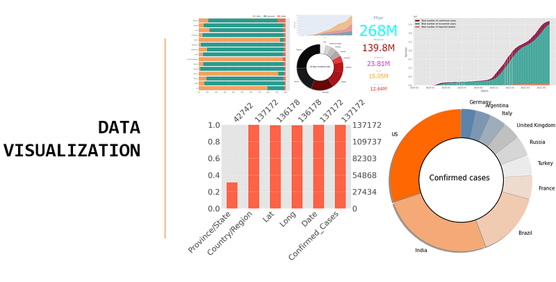
The human brain responds well and retains more information from simple diagrams or visual content than text or numbers. Therefore, representing a complex dataset in graphical format is an effective way to drive crucial insights and gain more information about the data. Furthermore, the popularity of data visualization techniques can be estimated through the number of visualization tools available now in the market. Many online platforms and businesses use data visualization techniques to present data as visual content (infographics), which helps them deliver crucial information quickly. The visual content registers in the brain quickly and helps create engaging content for the audience.
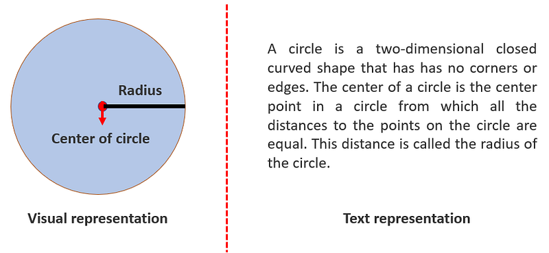
The figure above shows a simple example of how visual representation can be processed quickly compared to text. However, this does not mean that text or numbers are less used. On the contrary, many companies use a combination of visuals, text, and numbers for their reports as a compelling storytelling method about their process, growth, profits, or losses.
Visualizing COVID-19 dataset
This article uses the COVID-19 dataset made available from the Center for System Science and Engineering (CSSE) as an example for showcasing different data visualization techniques.
Categorical values
Categorical data can be ordinal or nominal. Several data visualization techniques offer efficient and elegant ways to visualize categorical data. However, it also depends on individuals which techniques suit best for their case.
In general, the real-world dataset may contain missing values. Hence, the first step for any data-centric project involves checking the missing values. There are various ways to present missing values in a report.
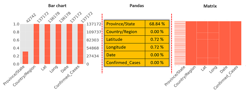
When the dataset has fewer columns, it is easy to use pandas; however, when the number of columns grows, a bar chart or matrix may be a better choice. The missingno library provides an easy and quick way to visualize and summarize the integrity of the dataset. When the number of categories is less, then often using numbers as indicators of frequencies are used. For example, the figure below shows the number of global COVID-19 cases.
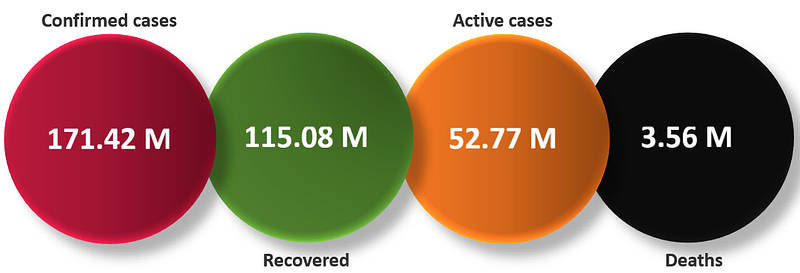
With a simple diagram, one can directly visualize the current scenario of COVID-19 cases. However, when the number of categories is large, another technique should be used instead of the above method.
When visualizing the number of cases based on countries in such cases Pie chart can be used, for example, the figure below shows the number of confirmed cases, death cases, and people recovered for the top 15 countries most affected by COVID-19.
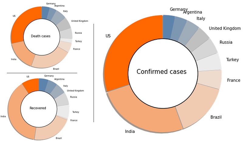
In the figure above, each slice of pie represents the fraction of cases of a country in a group. However, comparing two different pie can be misleading. For example, comparing a pie chart of death cases to a pie chart of recoveries for the United States may conclude that deaths are more than recoveries which is not the case. Hence, for such comparisons, it is advisable to create a separate pie chart for each country.
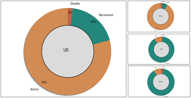
The figure above shows a clear picture of all cases when created pie charts for each country. However, creating a pie chart for each country would result in too many graphs. Moreover, it is hard to display everything on a single report; hence the better visualization technique could be a stacked normalized bar chart.
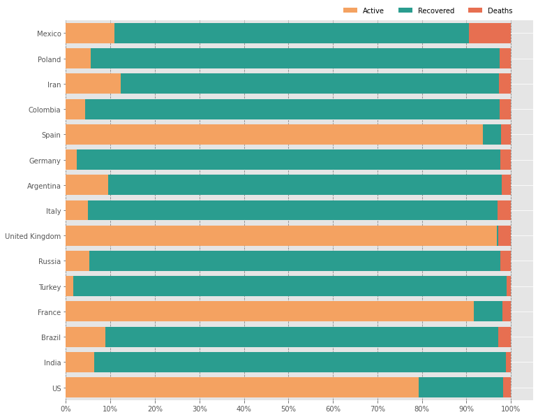
In this case, a stacked normalized bar chart seems to be a good alternative. However, a pie chart also has the advantage as it can represent data very compactly. In the case of the bar chart, the size depends on the dataset. The figure below shows the comparison between the pie chart and bar chart for 14 days incidence rate of COVID-19 cases.
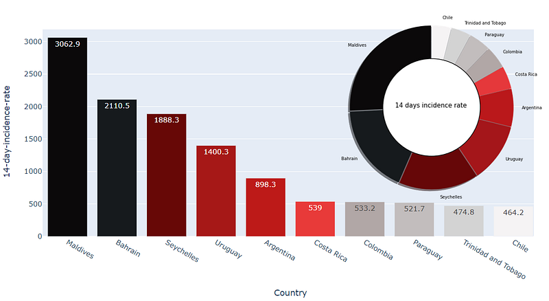
In short, it depends on individual preferences and the size of the report to choose the right graph.
The treemap is also one of the commonly used visualization techniques to represent the categorical features based on the frequency. The figure below shows the confirmed cases of COVID-19.
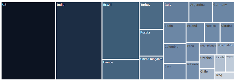
A bigger size of the box means a higher number of cases.
Wordcloud is also a great contender and an artistic way to present the dataset. The figure below shows different ways to represent the dataset.
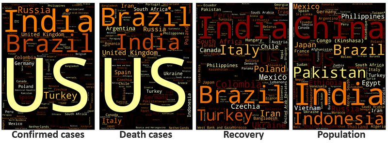
A bigger text size means a higher number. With a simple wordcloud, one can easily extract meaningful information from the dataset.
The other exciting way to visualize a dataset based on geographical location is by using the map. The figure below shows the confirmed cases by country.
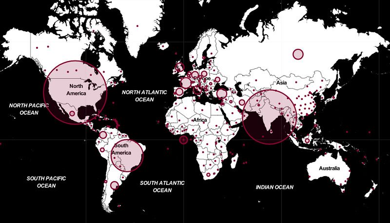
The bigger circle size here represents the higher number of COVID-19 cases. Thus, this kind of data visualization technique creates more engaging content and easy to remember.
Continuous values
There also exists a plethora of visualization techniques for continuous values. The most common method to visualize continuous values through a scatter plot.
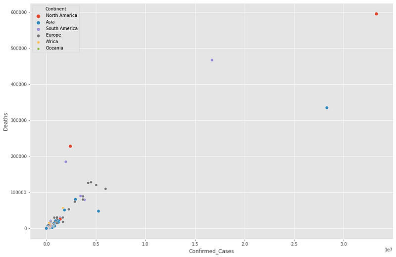
The scatter plot above shows the number of confirmed cases vs. deaths, color-coded by continent. However, one can add more information to the scatter plot by using the size of the marker.
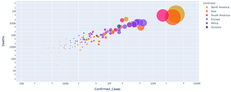
The figure above shows the number of confirmed cases vs. deaths on a log scale. The size of the marker represents the country with a large number of COVID-19 cases.
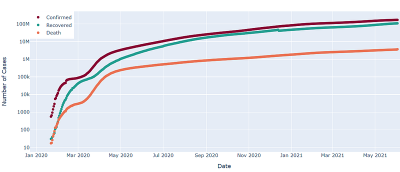
The other visualization technique for plotting the time series data is a line plot. The figure below shows the global rise in confirmed cases, deaths, and recoveries of COVID-19 cases.
One can also use the stacked or overlay mode of the bar chart to show the rise of COVID-19 cases for the U.S., India, and Brazil.
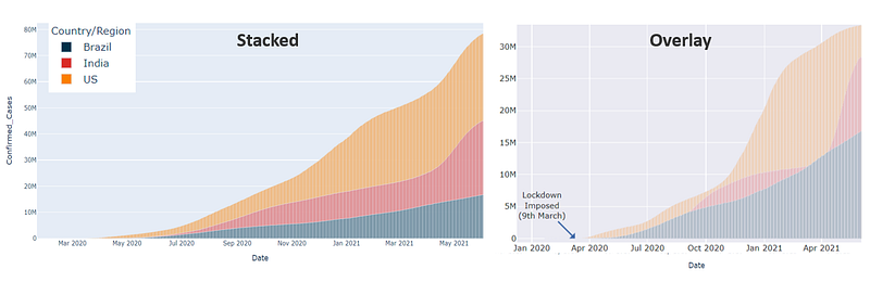
These plots are a fantastic way to compare continuous values based on categories. For example, the figure below shows the daily vaccination for the countries whose confirmed cases of COVID-19 shown above.
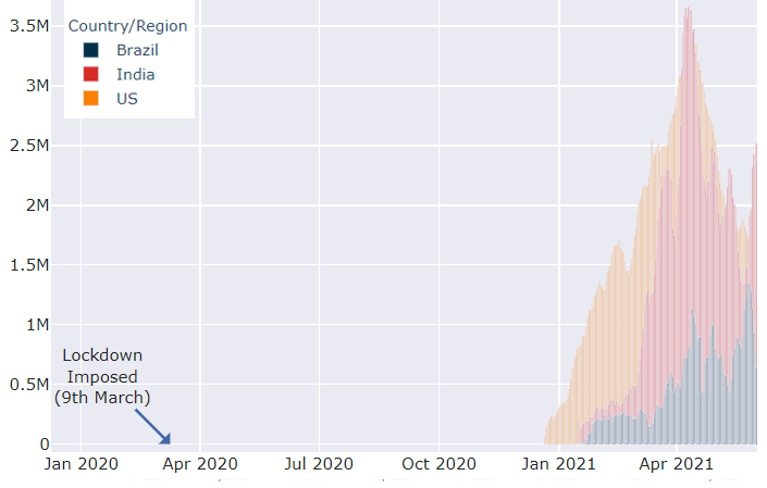
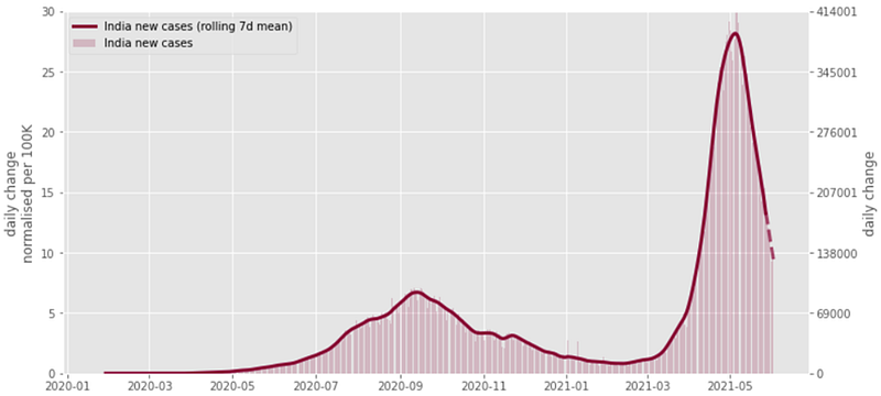
One can use line plot and bar plot to show more information. For example, the figure below shows the new cases in India with a 7 days rolling average over time.
That’s it.
One can use different combinations of visualization techniques to generate compelling and engaging visual content.
I hope you enjoyed this article. Any questions? Have I missed something? Please reach out on my LinkedIn or Twitter.
Further interesting articles:
- How to ace Exploratory Data Analysis
- How to find the best performing Machine Learning algorithm
- How to deal with an imbalanced dataset
Follow this Github link to access all the resources used for this article.
Cheers!
Rahul


