
Data Visualization — Part 5
Fundamentals of Good Design for Data Storytelling
You don’t need to be a professional designer. Anyone can learn these concepts and practice them to get better.

Several years ago, I earned a ‘MicroMasters’ from RIT in Design Thinking. One thing I learned was that the principals are cross-disciplinary. Understanding your customers and audience needs was a faster way of bringing them value, and visual tools are essential at every stage.
In his book Change by Design, Tim Brown states that drawing, “can simultaneously reveal both the functional characteristics of an idea and its emotional content.” It is unnecessary to possess good drawing skills. A simple sketch can tell us more than a 10-minute description of an idea.
You don’t need to be a professional designer. Anyone can learn these concepts and practice them to get better.
Data visualization turned into a data story requires design consideration to ensure audience reach, gain acceptance, and achieve the goal of transferring knowledge as truth or inspiring someone to act. Highlighting what’s essential (directing the eyes and mind), removing distractions, designing for, what I call, mind-mapping are ways to think like a designer.
10/90
Universal Principles of Design by H. Lidwell and Butler suggest only highlighting 10% of a design. It makes sense. If everything is highlighted or too many things, how are people going to know where to look?
- Underlining adds noise and is the least legible. Instead, use bold or italics.
- Do not use different fonts to highlight sections, titles, or labels.
- Color is a way to highlight. Imagine shading all the bars in a graph grey except the outlier, which is in bright green. Where will people look first?
- Highlighting or inverting elements is effective at attracting attention but, don’t overuse it. If more than three sections are highlighted on one data dashboard, people will instinctively look for a pattern of groups or hierarchy to figure out how to make sense of the highlighted text.
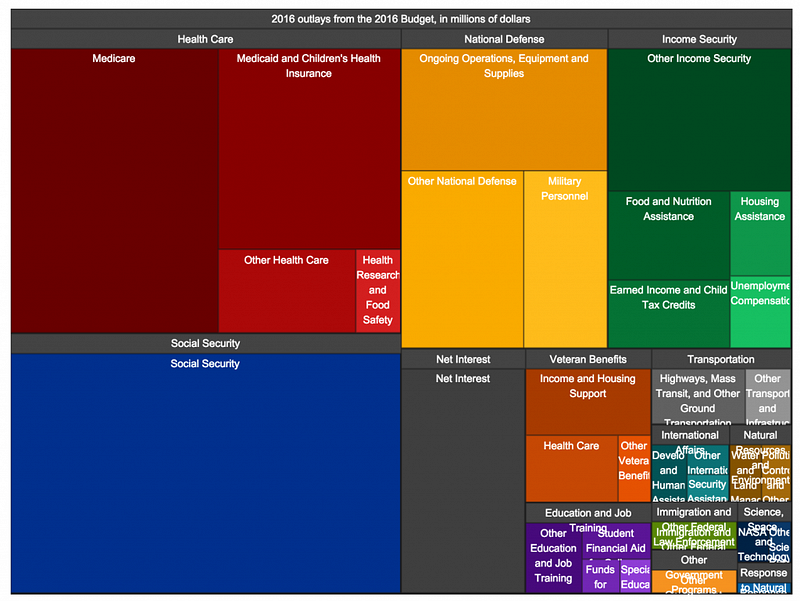
- Making elements stand out using size is another way to capture attention. Make sure there is a significant difference between two objects you are using to compare. If there isn’t much visual difference, but the data’s reality is significant, display it differently. (See Example Below)
Cut, Eliminate, Edit
Remove anything that doesn’t support the goal of your data story. This sounds easy, but I, too, am guilty of wanting to ‘dress things up’ or brand a visualization to connect with a client.
Summarize and abbreviate where possible, and if you find that supporting information is necessary but not the focus, de-emphasize it using opacity, lighter colors, or scaling down.
Mind-mapping aka Where People Intuitively Look
The way a visual or text presents will determine where people will look and what order they will map their eyes around an object, or in this case, dashboard. A good design will indicate the order in which information is processed and inform intent.
Think about a scatter-plot. Most people read the title of a dashboard or data story first. Then, look at the x and y-axis to understand what they’re measuring. Then, they’re drawn to colors that pop out, the size of objects, and the object’s hierarchical placement.
Look at your next dashboard with the mind of a designer. Where did I look first? Why? Where did I look second and so forth? If possible, ask people these same questions to be objective about your design habits.
Most importantly, good design is legible, clean, straightforward, and not complicated. It doesn’t assume that different people looking at the same thing will draw the same conclusion. This is why creating an intentional and obvious design is essential.
Audience Reach and Acceptance
When an audience sees a design, they’ll mentally reject or accept it. One reason is that people are used to visual patterns, and they’ll always look for that first, and when it’s not there, they have to think.
Leveraging a few design techniques can help improve your reach and audience acceptance. One, providing a background as to why things look different allows people to adjust mentally. Two, showing differences in an improved process, as a comparison, will enable people to see a familiar pattern and then link it to something new. And as a Design Thinker would do, if possible, interview, observe and research an audience to fully understand their needs before presenting them with a fixed and prescribed data story.
Using design concepts will help you build a solid foundation in data storytelling because it’s more than cleaning, organizing, and calculating data. It’s more than presenting the facts. It’s designing a product that can “simultaneously reveal both the functional characteristics of an idea and its emotional content,” leading to trust, acceptance, dissemination, and action.
Part 1 — Context and Pre-Data Visualization Planning
Part 2 — Selecting Effective Visuals for Data Visualizations
Part 3- Identifying and Eliminating Design Clutter From Data Visualizations
Part 4 — Data Visualization: Designing for Attention
Part 5 — Fundamentals of Good Design for Data Storytelling