
Data Visualization — Part 3
Identifying and Eliminating Design Clutter From Data Visualizations
Clutter, whether you’re walking into your grandma’s basement or looking at a computer screen with colors, numbers, and shapes, results in mental overload.
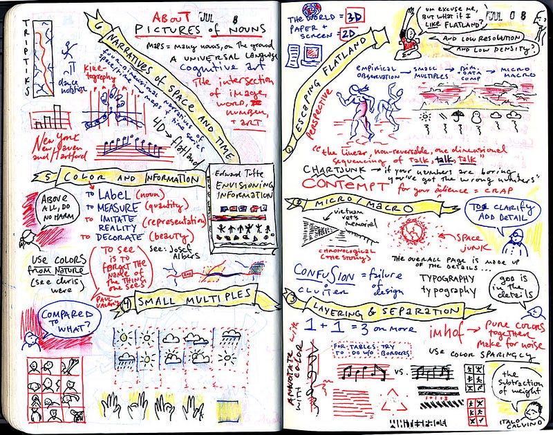
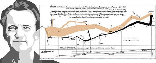
If you’ve never heard of Edward Tufte, a pioneer in the field of data visualization, I highly suggest researching and reading his work. He’s known for such quotes as “Simple design, intense content,” and “If the information is in chaos, don’t start throwing out information; instead, fix the design.”
In his book, The Visual Display of Quantitative Information, Tufte writes, “the larger share of a graphic’s ink devoted to data, the better.” Tufte is referencing balancing the appropriate number of elements to communicate while reducing non-essential, distracting elements.
The more difficult it is to understand the point of a visualization, the less credibility it will carry and making visuals complicated will not make you look smarter.
Even if you’re explaining it in person, if it’s too cluttered, you’ll most likely be speaking for too long and find that you’re explaining things related but not connected to your point or goal. In other words, chaotic data visuals can lead you to talk in circles.
Common Mistakes
People make common mistakes when creating data visualizations that can mean the difference between being dismissed and attracting interest. These mistakes are in part because people are mixing and crossing over into different disciplines.
A designer and artist is rarely a mathematician and analyst. These are two sides of the brain working together to create a product that appeals to both logic and reason in your audience’s minds.
Data Design is Where Small Things Matter
Colors can be underestimated elements in a design. Poor color schemes and dark background colors are the most common fails. Utilizing colors strategically to direct an audience’s eyes and highlight a point will ensure that every detail you add to a design will have a clear purpose and meaning.
Fonts are another subtle detail that should go unnoticed. Fonts that don’t align with the design’s tone and using different fonts in the same project are eye-catching in a negative way.
Other mistakes are vertical or angled labels, overly thick borders and gridlines, and ‘extra’ clip art that’s not adding value.
Clearing up Space on Screen and in Your Head
Visual principles to consider
- Proximity refers to how close things are to one another. People typically assume that things close together are in a group or related somehow. Patterns of objects placed in rows, lines, or in a hierarchy indicate distinction.
- Similarity in shape, color, and proximity are indicators of association. Using these mental visual pattern-associations to your advantage will draw attention to the right places and result in the intended meaning.
- Visual order is one of the easiest things to fix without destroying your overall product. Elements that are well placed and ‘easy’ on the eyes and head will utilize alignment and white space to outline a path for someone’s eyes to follow. If you look at your design and find that you’re randomly looking all over the page without direction you might find that your visual order needs to be adjusted.
- White space is good. Plan on having space between elements and around elements to give mental pauses and meaning to the thoughtful and specific elements you’ve selected.
Design Actions
- Soften gridlines and chart borders to allow more significant contrast in the data which supports your point or goal.
- Remove extra clip art, markers, and dots that sit on a gridline if they do not have a clear purpose.
- Abbreviate dates, months, dollars, and counties/states where possible to keep charts clean and ample white space on the page.
- Label values directly on, over, or next to a visual to speed up mental calculations and comparisons.
There are theories of visual perception in which data visualization best practices are grounded. One of those is the Gestalt principles, the law of continuity and closure, and the figure-ground relationship. The theory centers around the idea that people’s perception is based on their sensory information interpretation. What understanding these principals can do for you as a data storyteller is to help you leverage what we know people are most commonly drawn to and perceive when they see visuals.
Don Norman’s ‘levels of design’ is another group of theories set into practice by a pioneer in design thinking. Visceral design, for example, looks at how the qualities of an object makes people feel. Is there an icon, a color, or a shape that you can add to a data story that stirs some ‘connectedness’ or emotion in the audience?
Look at other people’s designs and consider why they used the elements they did. Was anything in the design not necessary to reach their point? If so, what would removing it do to the alignment, flow, and white space? Now, ask several people to look at your work and have them answer the same question.
Clean design goes a long way. Ensuring every element placed on a screen or paper has meaning and strategy associated with it will increase the chances that your point is remembered, trusted, and impactful.
There is no right or wrong way to design a data visualization. There are best practices and good, better, and best forms of expressing a point. If you are reaching your goal, you’re doing it right. If your data visualizations seem ineffective or ignored, think about making changes that lead to maximum impact.
*This is part three of an eight-part series on data visualization.
Part 1 — Context and Pre-Data Visualization Planning
Part 2 — Selecting Effective Visuals for Data Visualizations