
Extract a Subview and Preview
Build an App Like Lego, with SwiftUI — Tutorial 7
1. Introduction
Good designers break up an app into components, where each scene is made up of several subviews, which stack together like Lego blocks. Those subviews might be further broken down into smaller subviews. Each component can be shared across multiple parent/super views, scenes, and even different apps. This is commonly referred to as a “design system”.
Read more about building a design system, to be shared between designers and developers, in the article “Build an App Like Lego — An Intro for Designers”.
Good developers also break up their app code into reusable components. Instead of building “massive views”, they extract code for each reusable subview into its own file, with its own preview.
In this Tutorial 7, we will extract a cell component from an existing scene, and begin to enhance it, adding another text view in a vertical stack.
At the end of Tutorial 6 we saw our sample images in the assets catalog. Now we will prepare a cell into which we can add those images (in the next Tutorial 8).
We’ll pick up here where the last tutorial left off. Ideally, you have completed the previous tutorials in this series. Or, you can download the prepared project, ready to start this tutorial.
2. News List Cell
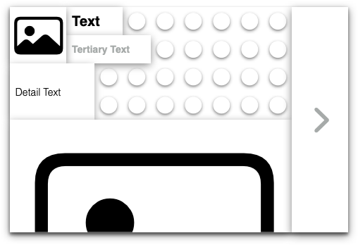
We want to ultimately get the cells in the News list to look like those that we previewed as the end goal in Tutorial 1.
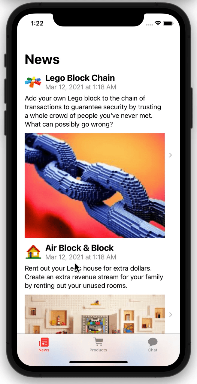
As you can see, the desired layout includes a small image, the title, the date (in gray), some detailed text, and a large detail image. At least one text view is allowed to wrap over multiple lines. The fonts show varied styles. The cell height grows to fit its contents.
To achieve this, we need to create our own custom layout, including several subviews:
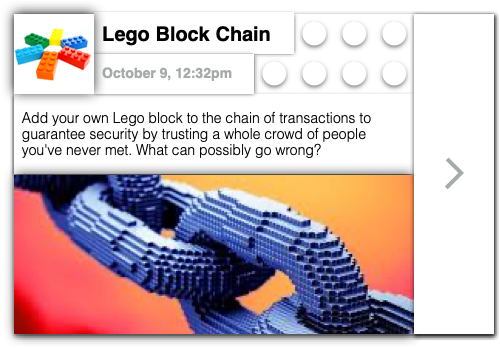
Imagefor the small image.Textfor the title.Textfor the detail.Textfor the dateImagefor the large detail image
Imagined as Lego blocks, it looks something likes this:
3. Extract a Subview
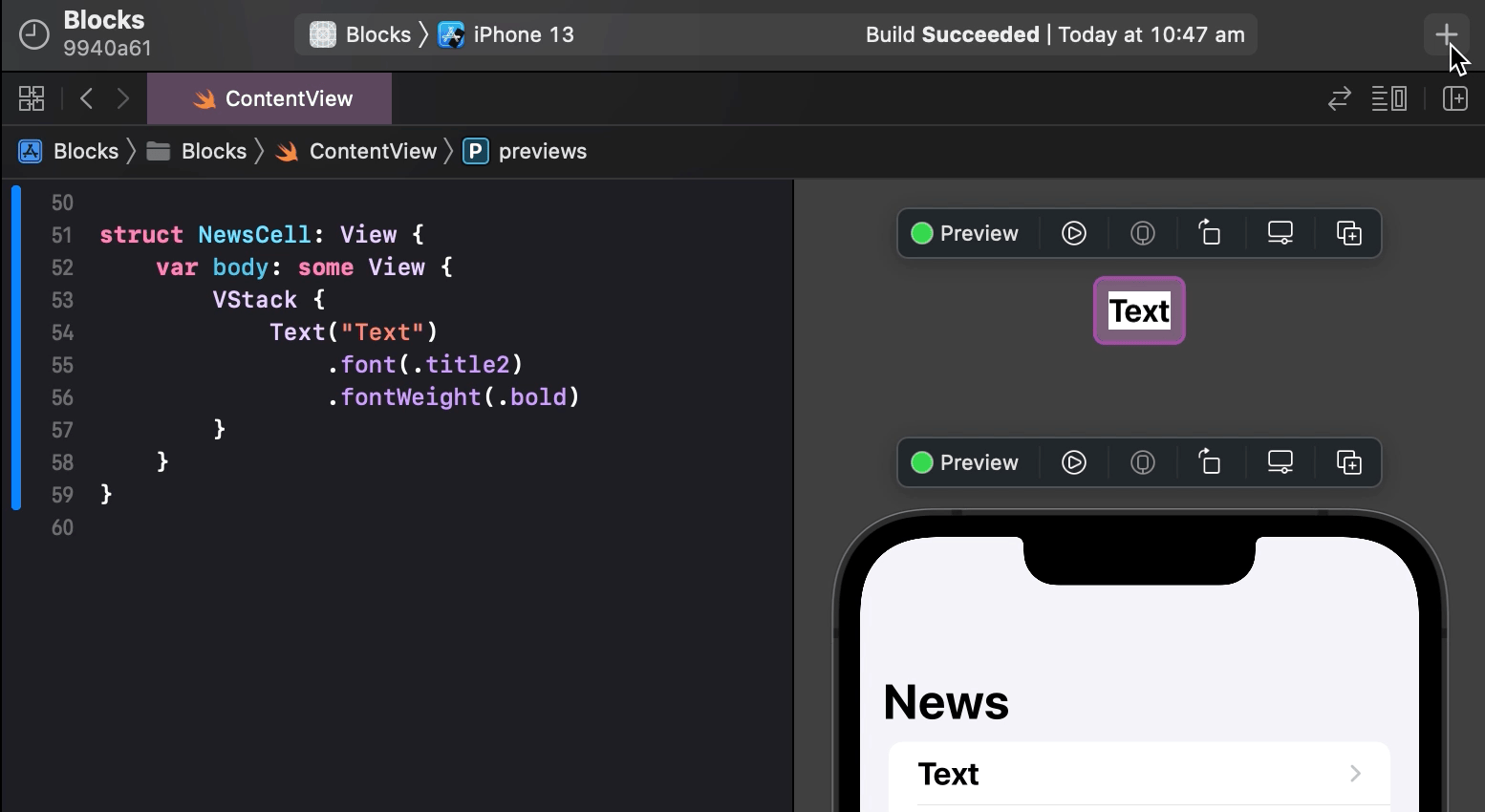
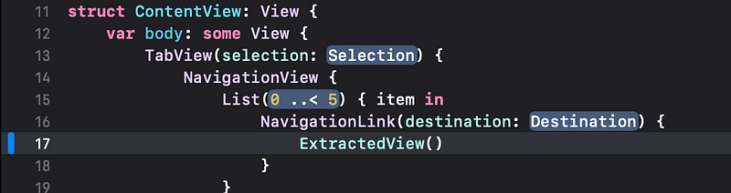
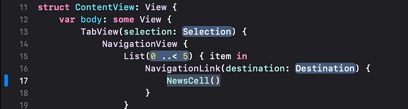
So far, in this custom cell, we have only created the text title. We need to add several other subviews (text and image views). If we do this in the main ContentView code, it will become cluttered. Let’s avoid the clutter by first extracting out Text("Title") into a new view of its own, where we can add the other subviews.
👉 In the Xcode project’s File navigator, select the ContentView.swift file, if not already selected.
👉 In the code, Command click near the start of Text("Text") and choose Extract Subview from the menu of actions.
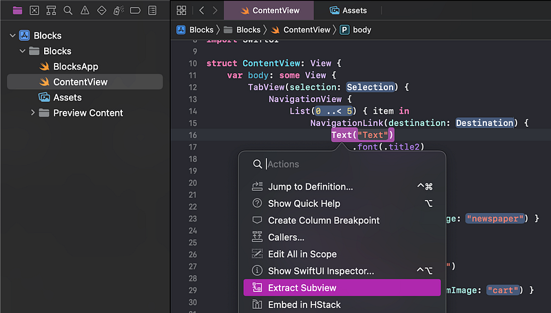
👁 Xcode pulls the Text and its modifiers out of the main struct ContentView code, into a new struct ExtractedView code block at the end of the file.
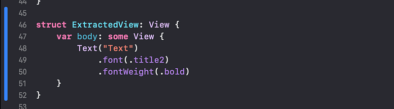
ExtractedView is just a placeholder name. We need to rename this ExtractedView to something that better describes its purpose: NewsCell.
👉 Right click on the ExtractedView in the code and choose Refactor > Rename.
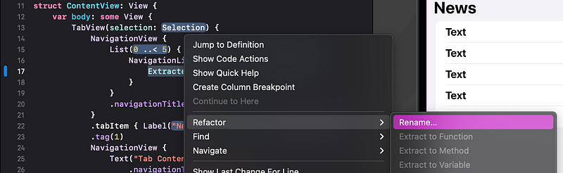
👁 The code editor changes to show both instances of ExtractedView as highlighted and ready to edit.
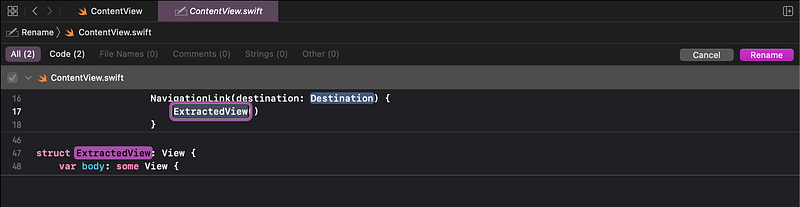
👉 Type NewsCell and then click Rename or hit enter (on the keyboard).
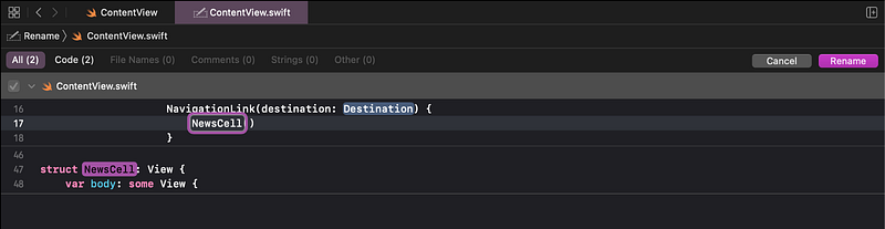
👁 You should then see it renamed in both locations. If not, undo and repeat the previous steps to Extract Subview.
4. Add a Preview
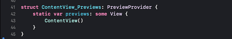
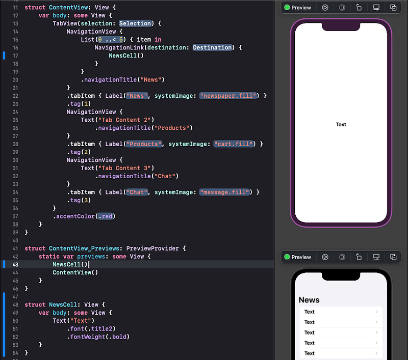
For now, we have both the ContentView of our whole app and the NewsCell in the same code file. We will eventually create a separate code file for each view. Each SwiftUI view file usually contains its own preview code, which is responsible for generating the preview we’ve used throughout this tutorial.
The current preview code is fairly simple. It just contains the name of the view that we have been previewing: ContentView. The () after the name of the view basically just means “make one of these”. So, ContentView() means “make a ContentView here”.
It will be easier to manage and edit the preview of our new NewsCell if we add a separate preview of it here.
👉 In the code, after the var preview line, insert a new blank line and start typing NewsCell. You should see Xcode autocomplete it and offer NewsCell from a popup menu.
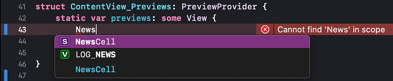
👉 Complete entering NewsCell by either typing or hit return to choose it in the menu. Type () at the end.
👁 Check that the preview pane now shows the additional NewsCell preview. You may need to click the Resume button in the top right of the preview to refresh it.
5. Preview Size That Fits
As you can see, the new preview of the NewsCell is taking up an entire iPhone screen. Since it is intended to be a repeating cell row in a list, it would be better for the preview to instead show just the size that fits its content.
👉 In the preview code, click in the NewsCell() line (if that line is not already selected). In the Attributes inspector change the Preview Layout to Size That Fits.
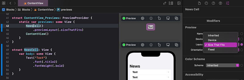
👁 As shown above, you should see that Xcode has added a new .previewLayout(.sizeThatFits) to the NewsCell(). The preview of the NewsCell is now much smaller — the minimum size needed to fit its content.
6. VStack
Now we start to really build with blocks, like Lego.
Recall that the aim of this tutorial is to build a custom view (which we’ve named “NewsCell”) that implements a Lego block structure that can display a news article such as:
Our NewsCell needs to eventually display any text and images that we give it. We should therefore design the NewsCell with placeholders, like this:
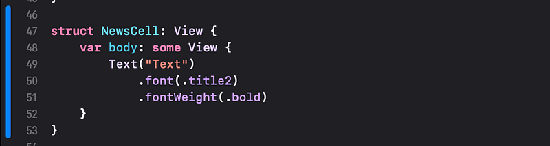
So far, our NewsCell only contains one Text view.
We need to add another text view for the gray wording, under the first Text view, which looks like this in Lego blocks:
To add views together, like this, in a vertical stack, we need to embed them in SwiftUI’s “VStack”.
👉 In the preview, Command click on the Text. In the popup menu, choose Embed in VStack.
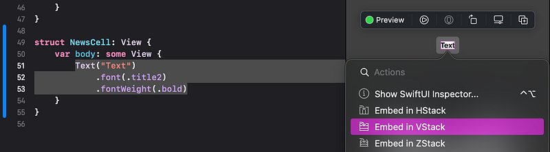
👁 You can see that the code now has a new VStack with the title Text inside it.
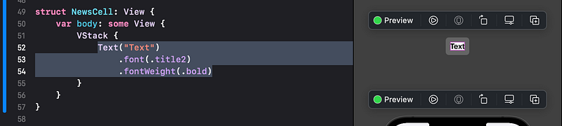
🐞 Xcode might not correctly indent the last Text modifier (fontWeight). If this happens, just select the whole line by triple-clicking, then press control - i (on the keyboard) to auto indent the code.
Nothing changed in the preview, since the VStack only contains the same original Text view.
Now let’s add a second Text view (for the gray subtitle) to the VStack.
👉 As you’ve done in earlier tutorials, drag the Text view from the Library into the preview, directly below the existing title text view. When it’s in the right place to release, you will see a colored line below the title text. If it’s hard to see, remember that you can zoom in using the magnifying glass buttons in the bottom right of the preview pane, or use a reverse pinch on a trackpad.
👁 In the code, the VStack now contains two Text subviews.
7. VStack Alignment
The VStack defaults to aligning its subviews by their horizontal centers. For our purpose, we need to instead align it on the left. More accurately, we want the text aligned on the “leading” edge, which in English writing happens to be on the left. In many other languages, the leading edge is on the right. Fortunately, SwiftUI uses the alignment terms leading and trailing, so it can adapt to any language orientation.
👉 Check that the VStack is still selected in the code. (If not, you can simply click on it.) In the Attributes inspector, under the Vertical Stack heading, click on the leading alignment icon.
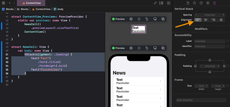
👁 The two Text views are now aligned on the leading edge of the VStack. The first preview shows just one news cell. The second preview shows a list of news cells, each with the updated changes.
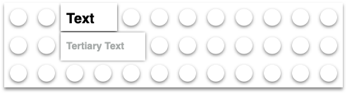
8. Text Color
Let’s replace the "Placeholder" text, so we can see how it compares with our desired layout.
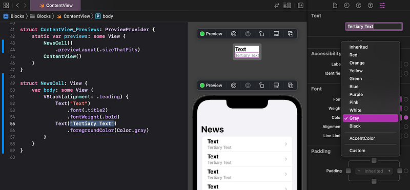
👉 Click on the Placeholder text, in the preview or the code. You might have to click twice. In the Attributes inspector, change the wording from Placeholder to Tertiary Text. Hit return on the keyboard.
👉 Change the Font Color to Gray.
9. Commit Changes
As you’ve done before:
- 👉 Choose
Commitfrom theSource Controlmenu. - 👉 Enter a description such as:
Created NewsCell with custom layout - 👉 Click on the
Commitbutton.
10. Recap
We created a custom layout for our news cell. We added a vertical stack view, text, and modifiers.
We will complete this layout in Tutorial 8 by adding images and more text.
See upcoming tutorials in the table of contents.
⁉️ If you have any questions or comments, please add a response below.
This series is released via Next Level Swift. Subscribe to keep updated and never miss a new Tutorial of this series!

We are always looking for talented and passionate Swift developers! Check out our writer’s section and find out how you can share your knowledge with the Next Level Swift Community!


