
Image Views, Resizing, Aspect Ratio
Build an App Like Lego, with SwiftUI — Tutorial 8
1. Introduction
Images, such as photos and drawings, come in various sizes and resolutions. When showing an image in an app, the available rectangular area is usually quite different from that of the image. So, we need to stipulate how the image should be resized.
Should the image stretch and shrink? If the aspect ratio of the image differs from the display area, should it fill the area and crop the image, or fit what it can and leave edge gaps?
At the end of Tutorial 7 we separated our news cell and added another text view in a vertical stack. In Tutorial 6 we added image files to the asset catalog in our Xcode project. In this Tutorial 8 we will add image views to the news cell, to show those image files. We will also add more text views.
We’ll pick up here where the last tutorial left off. Ideally, you have completed the previous tutorials in this series. Or, you can download the prepared project, ready to start this tutorial.
2. Add an Image in an HStack
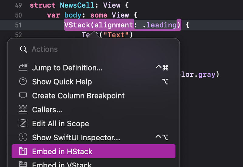
Our NewsCell currently contains two text views.
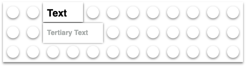
We need to add the small image horizontally next to the existing content.
As you might guess, following our use of the VStack in the previous tutorial, SwiftUI provides an “HStack” view to layout subviews horizontally.
We need to embed our VStack (which contains the two Text views) in a new HStack. Then, we’ll add the image to that HStack.
👉 If not already open, open the “Blocks” Xcode project and select the ContentView.swift file in the File navigator.
👉 Command click on the VStack in the code. In the Actions popup menu, choose Embed in HStack.
👁 Check that the new HStack is at the top level inside the body.
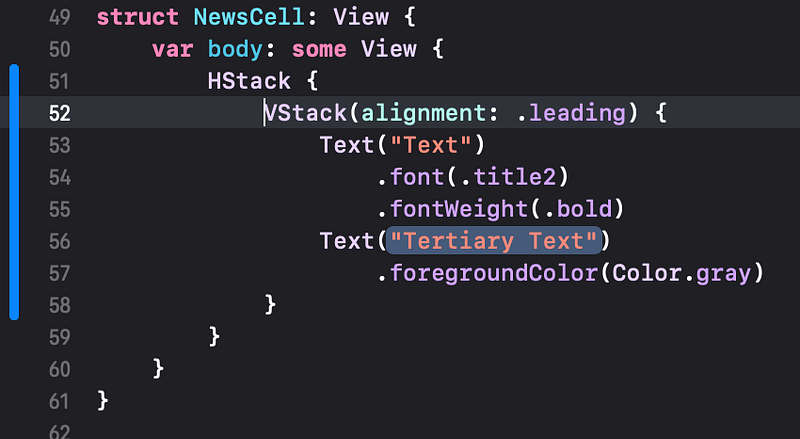
👉 Drag the Image view from the Library into the code, to insert a new line after the HStack.
🐞 Previously, we dragged a Text view into a VStack in the preview. Unfortunately, if we try to drag the image here into the preview, Xcode doesn’t let us position it correctly. So, we’re dragging it into the code instead.
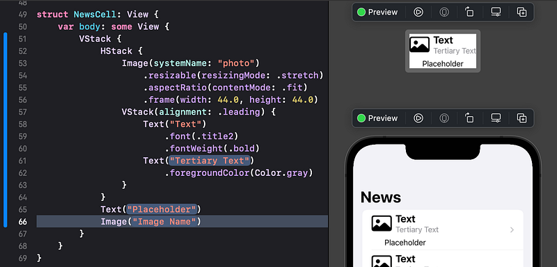
👁 The Image view comes with a default "Image Name". Since that image file doesn’t exist in our app, it shows no image in the preview, but just adds a small gap.
For now, we will add the system “photo” image as the placeholder. Later we will make this a property that we can change. We can use an SF Symbol icon for this. You might recall in Tutorial 6 that we displayed an SF Symbol as an image in a Label in a tab item.
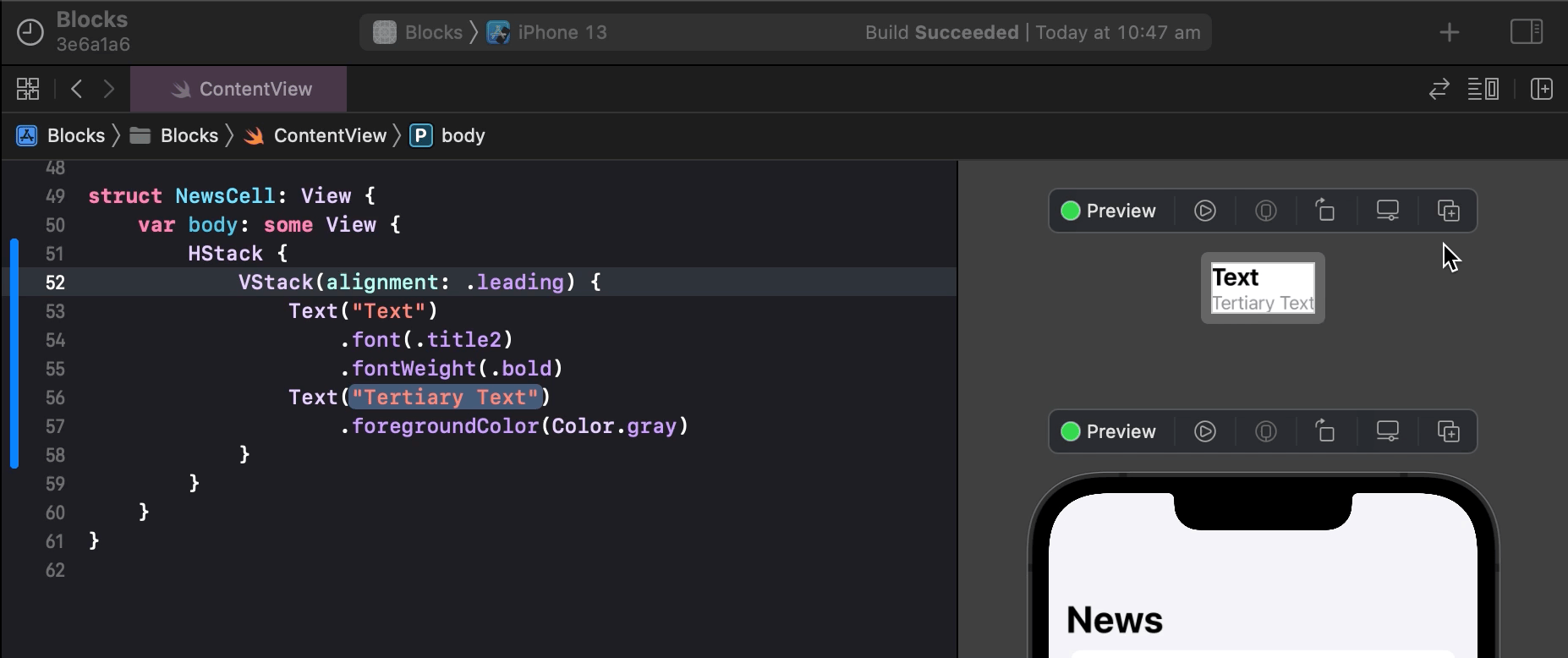
👉 In the code, click on the "Image Name" placeholder and type to replace it with systemName: "photo".
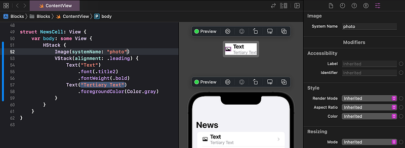
👁 Check that the photo image appears in the preview. If not, check that you have typed the name exactly right, matching lowercase/uppercase.
The image is too small, compared to our intended layout. We will deal with that shortly.
3. Image Modifiers
The image is showing at its original size. But we want to stretch (or shrink) it to fit a defined frame, with a consistent width and height.
You may have noticed the Frame Width and Height in the Attributes inspector. Let’s try that and see what happens.
👉 With the Image still selected in the code, in the Attributes inspector, enter the Frame Width and Height as 44. As usual, hit return to tell Xcode to update the preview with the new attributes.
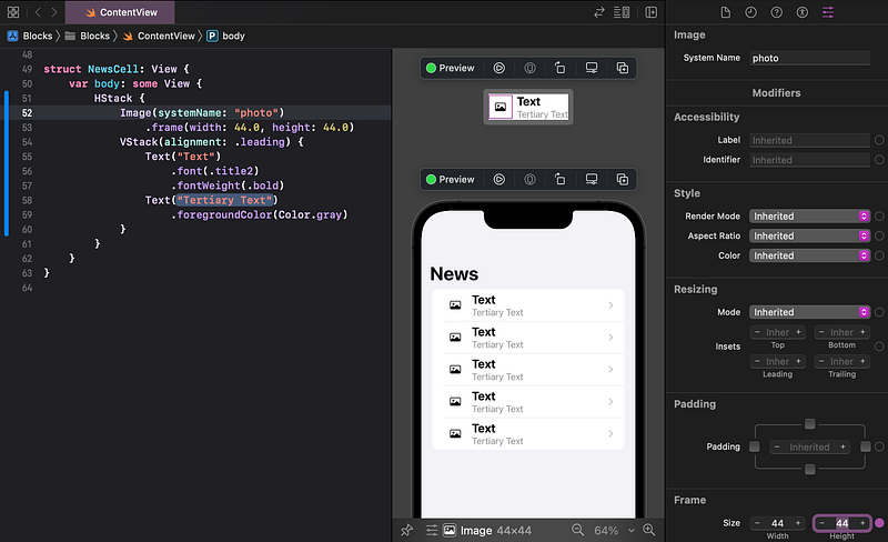
👁 What happened? As you can see by the thin square outline in the left of the NewsCell preview, the image’s frame has been correctly set to 44 x 44 points. However, the image content has not resized to fit its frame.
We need to:
- Modify the image to be resizable, so it will stretch or shrink to fit its frame.
- Modify the image to respect its original aspect ratio, so it doesn’t distort when it resizes.
SwiftUI provides modifiers for images called resizable and aspectRatio. They only apply to images and not all view types.
When we add modifiers to a view, the order of those modifiers matters. For example, after adding the frame modifier to our image, that modified view is no longer a pure image. We can’t add image modifiers after applying a frame. So, we need to add the resizable and aspect ratio modifiers before the frame modifier.
👉 In the Attributes inspector, set the Aspect Ratio to Fit. Set the Resizing Mode to Stretch.
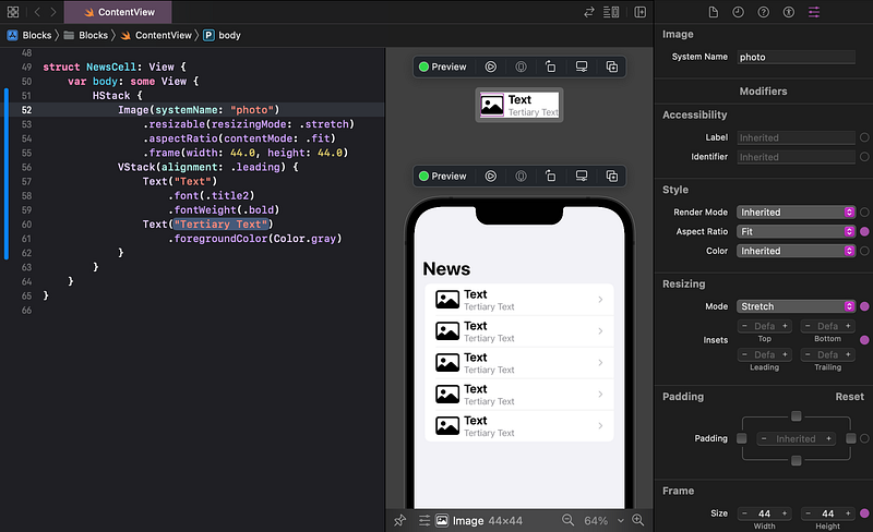
👁 The NewsCell layout is looking pretty good so far. With the frame modifier after the image modifiers (resizable and aspectRatio), the image is sizing correctly for our layout.
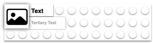
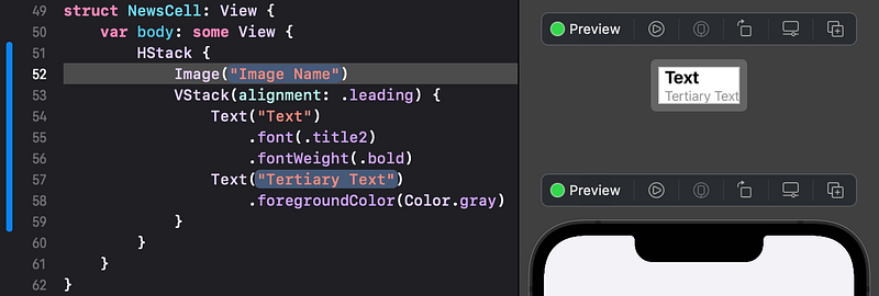
4. Add Another VStack
We’re nearly there. We just need to add a detailed text view and a large image, vertically below the blocks (views) that we’ve positioned so far.
Follow the steps below. They are fairly brief since you have already learned the detail in the previous steps. Refer back if you need to.
👉 Command click on the HStack and choose Embed in VStack.
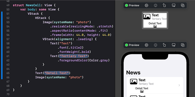
👉 From the Library, drag a Text view and an Image view to insert new lines in the code, just before the closing } of the new VStack.
👉 To assist our comparison with the sample layout, replace the Placeholder in the Text with Detail Text.
👉 Replace the placeholder "Image Name" with systemName: "photo".
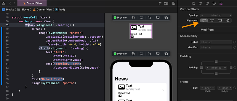
👉 In the code, click on the top VStack. In the Attributes inspector, set the Alignment to leading.
👉 Click on the new bottom image in the preview (in the top preview of the news cell, not the bottom preview of the list).
👉 In the Attributes inspector, set the Aspect Ratio to Fill and the Resizing Mode to Stretch.
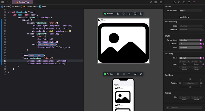
👁 The image stretches to fill all of the available areas.
Let’s limit the image’s height, so it won’t dwarf the text and the rest of the screen.
👉 Set the image’s Frame Height to 240 (and hit return). Leave the Width blank (default).
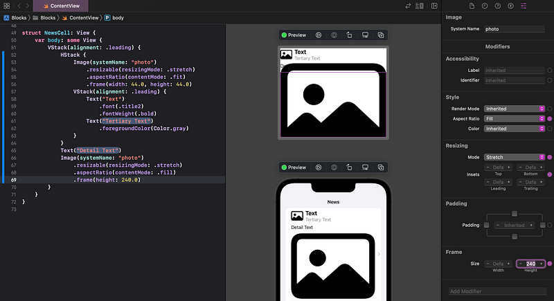
👁 As you can see by the thin frame outline of the image in the preview of the NewsCell, the frame height is set correctly, but the image is exceeding its frame and overlapping other views.
We need to clip the image to cut off any part that exceeds its frame. In the Attributes inspector, unfortunately, there is no obvious option to clip the image to its frame.
Fear not — we can add other modifiers just by clicking in the Add Modifier field at the bottom of the Attributes inspector.
👉 In the Add Modifier field, type cli.
🐞 If clicking in the Add Modifier the field doesn’t show the popup menu, try hitting the down arrow on the keyboard.
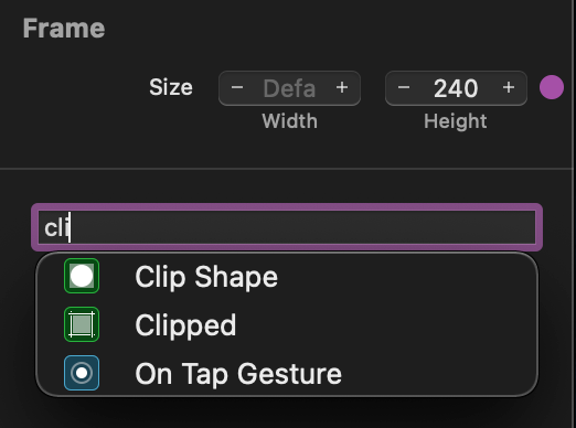
👉 Select the Clipped modifier from the popup menu.
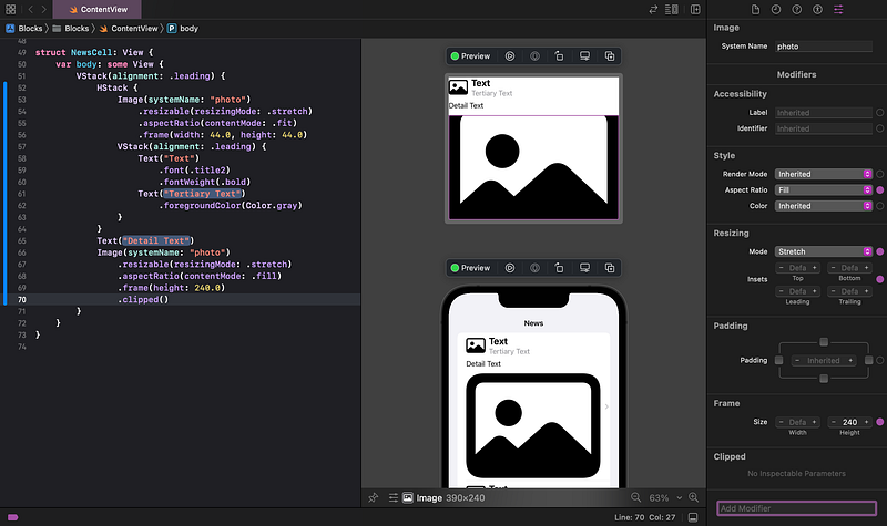
👁 The code now has a new .clipped() modifier on the second Image. In the preview, the image is now clipped to its frame. The Attributes inspector has added a Clipped section.
Ideally, we’d like the image to only use the full 240 points as the maximum height, but use less if the image is smaller. Fortunately, frame accepts maxHeight, for this purpose.
👉 In the code, in the frame(...), change height to maxHeight.
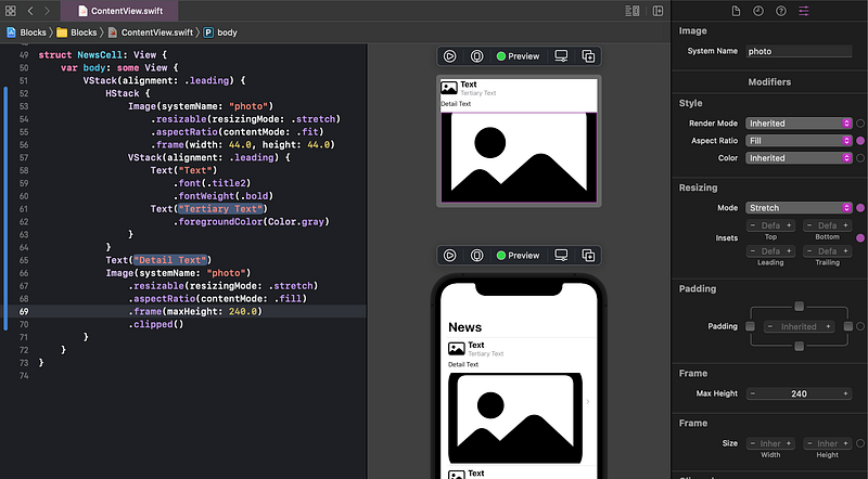
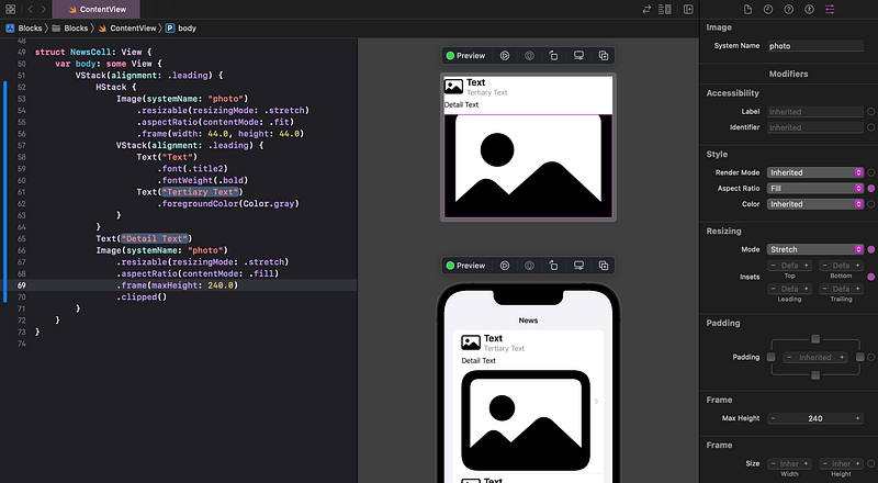
🐞 Ideally, the Attributes inspector UI would offer maxHeight as a selectable option, but it doesn’t (in Xcode 13.3 and earlier). That’s why we had to change the code to maxHeight.
👁 The final Lego block in our design, the disclosure indicator (right pointing chevron), is automatically added to each of our cells by the List, as you can see in the full scene preview.
5. Commit Changes
As you’ve done before:
- 👉 Choose
Commitfrom theSource Controlmenu. - 👉 Enter a description such as:
NewsCell: HStack and images - 👉 Click on the
Commitbutton.
6. Recap
We created a custom layout for our news cell. We added stack views, images, text and modifiers so that it should layout properly, given any text and image content.
Next, in Tutorial 9, we will move the NewsCell code to its own separate file.
See upcoming tutorials in the table of contents. Follow the author to be notified of more articles.
⁉️ If you have any questions or comments, please add a response below.
This series is released via Next Level Swift. Subscribe to keep updated and never miss a new Tutorial of this series!

We are always looking for talented and passionate Swift developers! Check out our writer’s section and find out how you can share your knowledge with the Next Level Swift Community!


