
Figma’s Magic Power for Developers
Our take from Config 2023, Figma’s annual design conference

As Figma CEO Dylan Field said, design is changing, and so are the roles we all play. Config 2023, Figma’s annual design conference, was held from June 21 to June 22, 2023. The theme is rethinking product building from the ground up — from shifting mindsets to bringing design and engineering closer together to make great work. It is at the dawn of AI and the future of design, another session that walks through the history of generating UI with AI, challenges and opportunities in building with AI for design, and breaking down barriers between design and code roles.
The two-day meeting is Figma’s biggest product launch of the year. It focuses on brainstorming, designing, and building. As 30% of the attendees are developers, Figma is no longer exclusively for designers. The beta features of Dev Mode and Figma for VS Code are powerful for developers. In addition, The open beta Variables empowers designers to work like developers. Let’s take a look at these features.
Figma Design Tool
Figma is a collaborative web application for interface design, with additional offline features enabled by desktop applications for macOS and Windows. It focuses on user interface and user experience design, emphasizing real-time collaboration and utilizing a variety of vector graphics editors and prototyping tools.
We create an account and sign in to use the web version of the application:
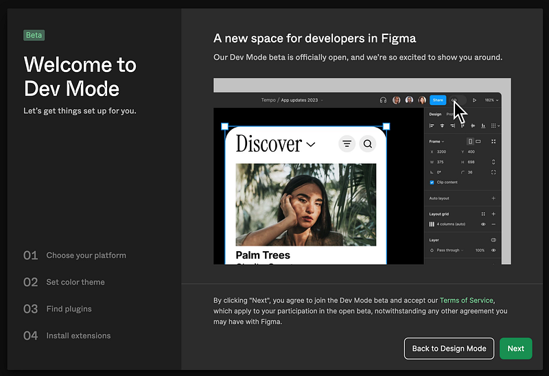
Dev Mode
Dev Mode is a brand new space in Figma design. It gives developers everything from navigating design files to transforming designs into code.
Dev Mode is now in beta and free for all users for the rest of 2023. Starting in 2024, it is available on education and paid plans. It needs to be installed.
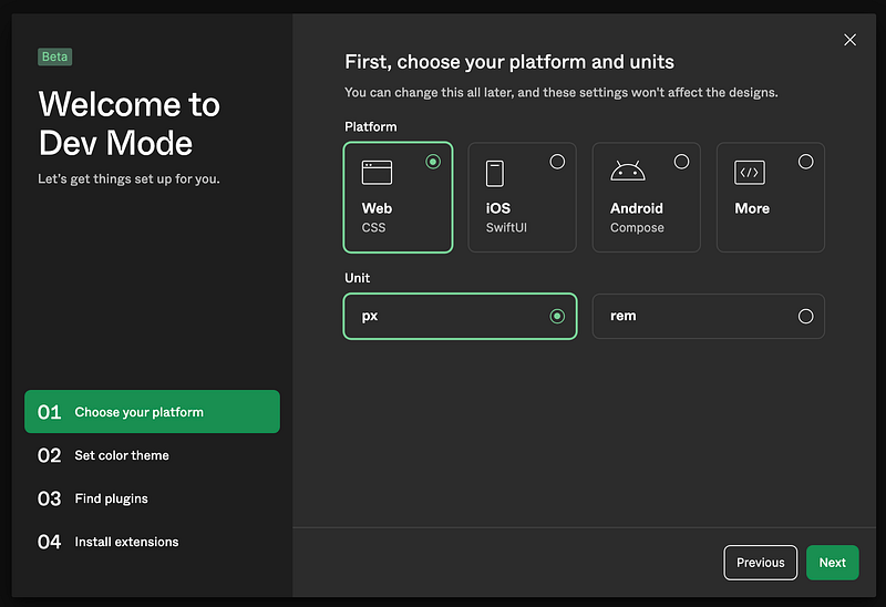
The first step is Choose your platform, which supports Web, iOS, Android, and More. It also has a choice of unit, px or rem.
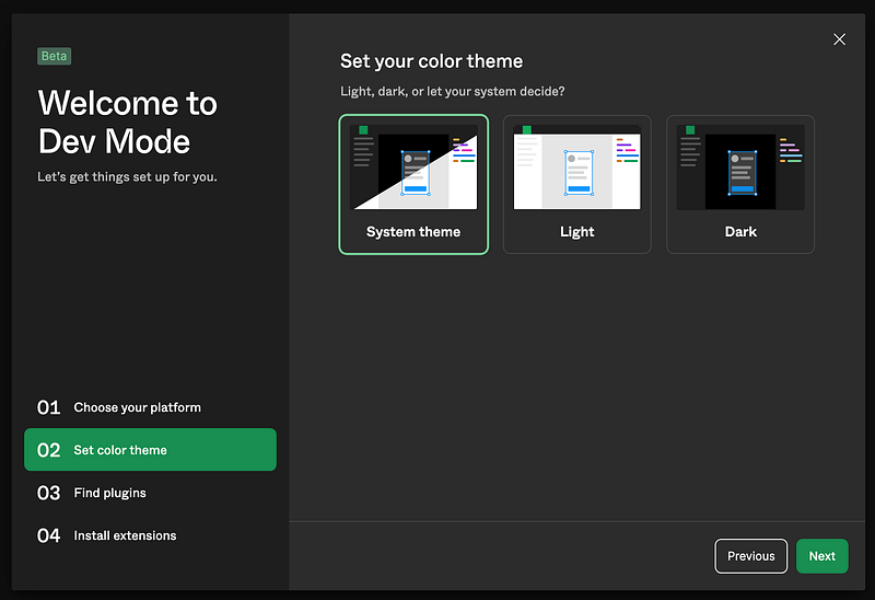
The second step is Set your color theme, which supports Light mode, Dark mode, or whatever System theme is.
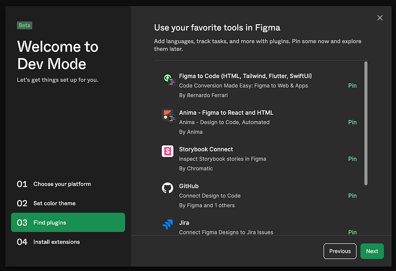
The third step is Find plugins, which adds the preferred plugins, including Figma to Code (HTML, Tailwind, Flutter, SwiftUI), Anima — Figma to React and HTML, Storybook Connect, GitHub, Jira, etc.
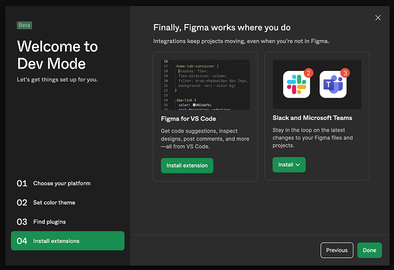
The fourth step is Install extensions, which adds extensions outside of Figma, such as Figma for VS Code.
In the end, it shows the summary of our choices:
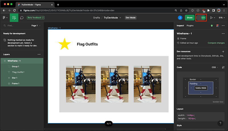
Here is an example design:
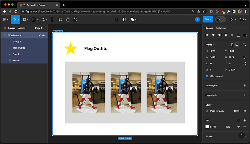
Switching to the Dev Mode by clicking </> below, we see the Inspect tab.
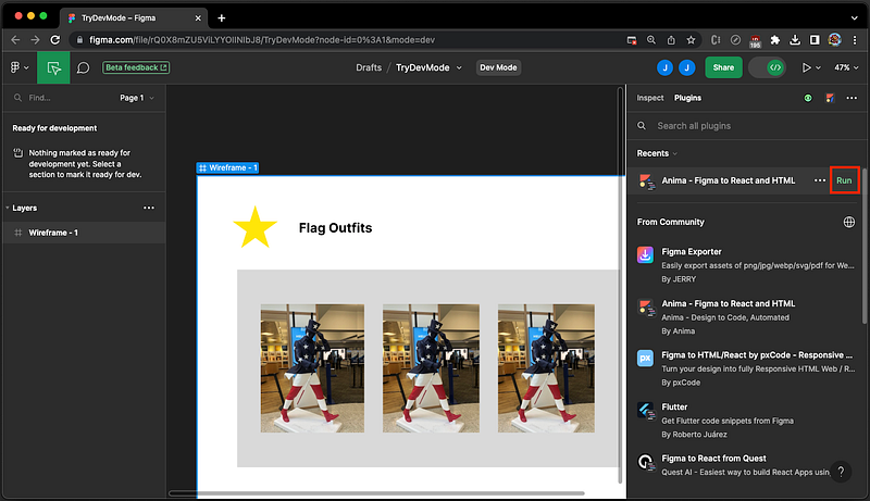
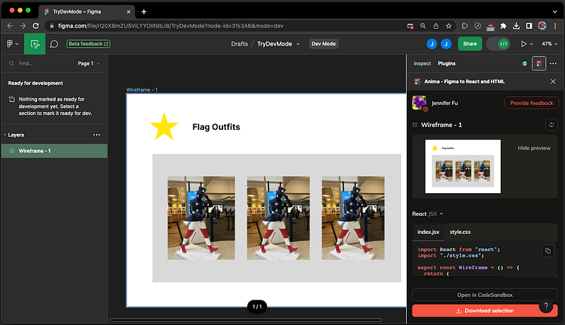
Change to the Plugins tab, and click the Run button below for the plugin Anima — Figma to React and HTML.
It generates index.jsx and style.css.
Here’s what index.jsx looks like:
import React from "react";
import "./style.css";

export const Wireframe = () => {
  return (
    <div className="wireframe">
      <div className="div">
        <img className="star" alt="Star" src="star-1.png" />
        <h1 className="text-wrapper">Flag Outfits</h1>
        <div className="group">
          <div className="overlap-group">
            <img className="IMG" alt="Img" src="IMG-8059-1.png" />
            <img className="img" alt="Img" src="IMG-8059-4.png" />
            <img className="IMG-2" alt="Img" src="IMG-8059-3.png" />
          </div>
          <img className="IMG-3" alt="Img" src="IMG-8059-2.png" />
          <img className="IMG-4" alt="Img" src="IMG-8059-5.png" />
        </div>
      </div>
    </div>
  );
};
The following is style.css:
.wireframe {
background-color: #ffffff;
display: flex;
flex-direction: row;
justify-content: center;
width: 100%;
}
.wireframe .div {
background-color: #ffffff;
border: 1px none;
height: 1024px;
position: relative;
width: 1440px;
}
.wireframe .star {
height: 134px;
left: 110px;
position: absolute;
top: 90px;
width: 141px;
}
.wireframe .text-wrapper {
color: #000000;
font-family: "Inter-Bold", Helvetica;
font-size: 40px;
font-weight: 700;
left: 316px;
letter-spacing: 0;
line-height: normal;
position: absolute;
top: 135px;
width: 294px;
}
.wireframe .group {
background-color: #d9d9d9;
height: 615px;
left: 124px;
position: absolute;
top: 291px;
width: 1191px;
}
.wireframe .overlap-group {
height: 400px;
left: 73px;
position: absolute;
top: 107px;
width: 322px;
}
.wireframe .IMG {
height: 400px;
left: 22px;
object-fit: cover;
position: absolute;
top: 0;
width: 300px;
}
.wireframe .img {
height: 400px;
left: 22px;
object-fit: cover;
position: absolute;
top: 0;
width: 300px;
}
.wireframe .IMG-2 {
height: 400px;
left: 0;
object-fit: cover;
position: absolute;
top: 0;
width: 300px;
}
.wireframe .IMG-3 {
height: 400px;
left: 453px;
object-fit: cover;
position: absolute;
top: 107px;
width: 300px;
}
.wireframe .IMG-4 {
height: 400px;
left: 811px;
object-fit: cover;
position: absolute;
top: 107px;
width: 300px;
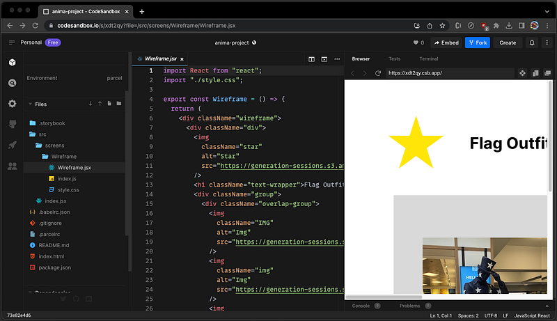
}These files can be downloaded or opened and executed in CodeSandBox. They can be the starting point of coding.
Figma for VS Code
Figma for VS Code is a VS Code extension. It is now in beta and free for all users for the rest of 2023. Starting in 2024, it will be available on the education and paid plans.
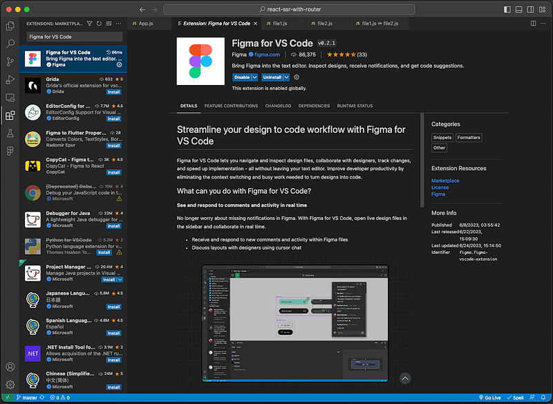
The extension allows developers to navigate and inspect design files, collaborate with designers, track changes, and speed up implementation — all inside VS Code.
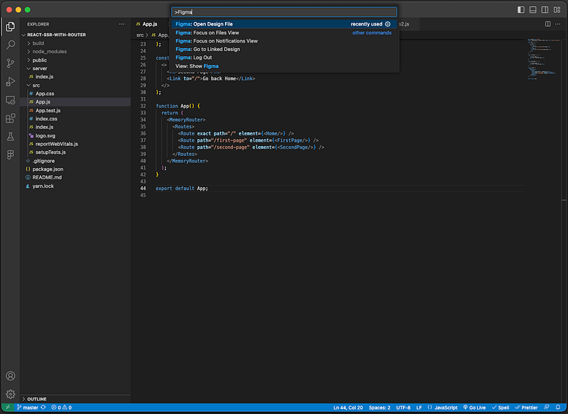
Figma for VS Code can be invoked in a few steps:
- Right-click any file and select
Command Palette…. - Filter by the word
Figmaand execute the commandFigma: Open Design File.
It asks for the Figma design file’s URL:
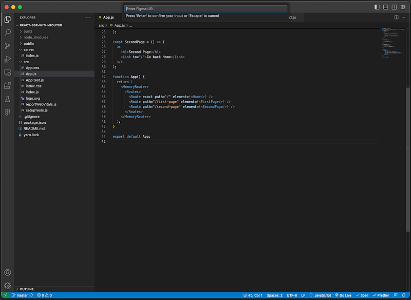
After providing the URL, https://www.figma.com/file/..., the Figma design shows up inside VS Code.
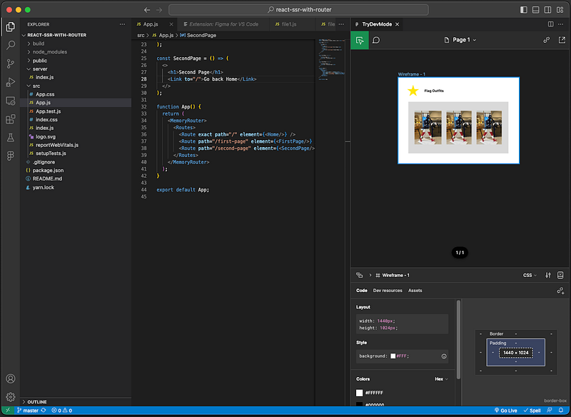
With Figma for VS Code, developers can perform Figma tasks inside VSCode without switching context.
Variables
In computer programming, variables store information to be referenced and manipulated. Variables are introduced to Figma to store reusable values that can be applied to all design properties and prototyping actions.
Although Variables are not for developers, this feature allows designers to work like developers. Variables are not free. The feature is available on the education plan and any paid plans.
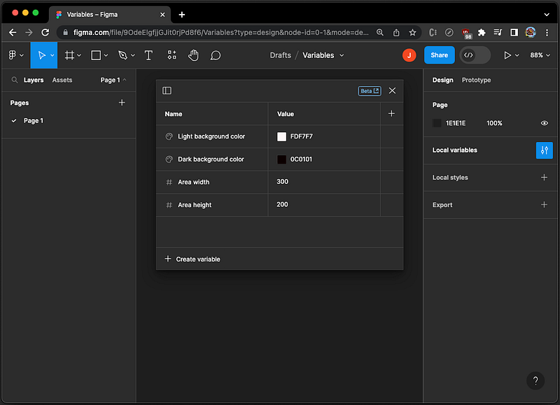
Click the Local variables button, it pops up a modal to create reusable numbers, text, and colors that can be applied across files and prototypes.
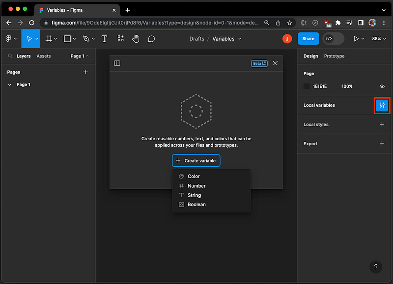
We create a few variables:
- Two background colors, one for the light mode and one for the dark mode.
- Two sizes, one for the area width and one for the area height.
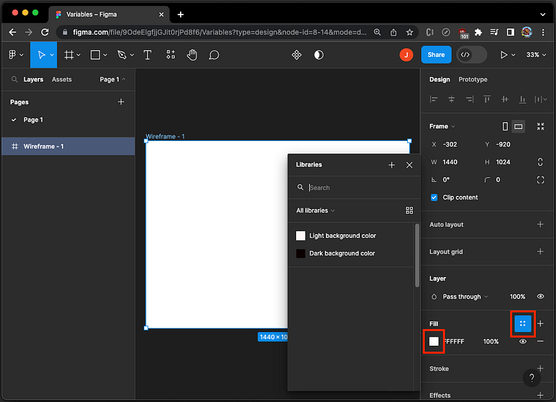
During the design, these variables can be applied. In the following UI, clicking the Style button or the color square, the color variables become available choices.
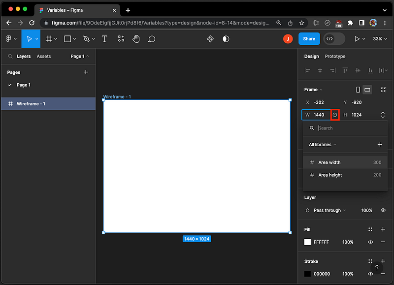
In the following UI, after you click the Size button, the number variables become available choices.
With variables, designers are empowered to work like developers.
Conclusion
We have shown new features in Config 2023. Figma focuses on brainstorming, designing, and building. The beta features of Dev Mode and Figma for VS Code are powerful for developers. In addition, The open beta Variables empowers designers to work like developers.
Thanks for reading.
Want to Connect?

If you are interested, check out my directory of web development articles.