
Ant Design System Dark Mode and Other Theme Customization
It takes one line of code to set up dark mode for an Ant Design System app
Dark mode is a color scheme that uses light-colored text, icons, and UI elements on a dark background. The opposite color scheme is called light mode. As described in another article, dark mode is stylish and hip for some UI designs. It requires less energy to display and is less harmful to the eyes in the long run than light mode.
Ant Design System 5.0 provides a new way to customize themes for primary color, border radius, border color, etc. It takes one line of code to set dark mode for an Ant Design System app. Let’s take a look at how it works.
Set Up Antd in Create React App
We use Create React App as a base to explore Ant Design System themes. The following command creates a React project:
% yarn create react-app react-antd-dark
% cd react-antd-dark
Set up antd:
% yarn add antdIt becomes part of dependencies in package.json:
"dependencies": {
  "antd": "^5.2.0"
}
The working environment is ready.
Display Antd Components
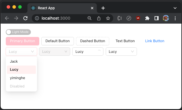
We modify src/App.js to show some of the Ant Design System, specifically a group of buttons and a group of select components.
- At lines 3–8,
optionsis set for select components. - At line 12, the global background is set to
white, full screen, with20pxpadding. Spaceis an antd component, which sets a unified space to avoid components clinging together. It can set direction to be'horizontal'or'vertical', and the default direction is'horizontal'. The content does not wrap by default, and a scrollbar will be added when needed. However, it can be set towrap.- At lines 13–46, component groups are contained vertically.
- At lines 14–20, a group of buttons are defined in the horizontal direction.
– At line 15, a
primarybutton is created. – At line 16, adefaultbutton is created. – At line 17, adashedbutton is created. – At line 18, atextbutton is created. – At line 19, alinkbutton is created. - At lines 21–45, a group of select components are defined in horizontal direction.
– At lines 22–26, a select component is created.
– At lines 27–32, a
disabledselect component is created. – At lines 33–38, a select component withloadingspinner is created. – At lines 39–44, a select component with a clear option is created.
Execute yarn start, and we see an app with the Ant Design System components.
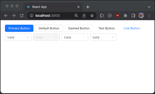
Show Antd Components in Dark Mode
ConfigProvider provides uniform configuration support for Ant Design System components. Since version 5.0, it adds the theme support for primary color, border radius, border color, etc. It can switch themes dynamically, support multiple themes, customize theme variables for some components, and more.
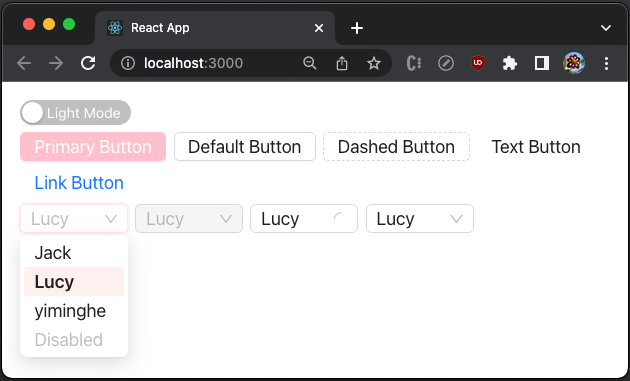
With ConfigProvider, it takes one line of code to set up dark mode. Here is the modified src/App.js:
- At line 12, the background is set to
black. - At line 13, it sets the theme algorithm to
theme.darkAlgorithm.
Execute yarn start, and we see the app in dark mode.
Isn’t that beautiful and simple?
Add Theme Switch Button
The app is in dark mode if the theme algorithm is set to theme.darkAlgorithm, and the app is in light mode if the theme algorithm is set to theme.defaultAlgorithm.
It works, but hardcoded code does not work gracefully.
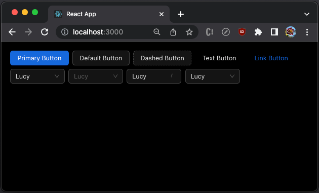
We add a switch button at the top of the UI to enable the switch dynamically. Here is the modified src/App.js:
- At line 12, the state,
darkMode, is created to track whether the app is in dark mode. - At line 16, the background color is set to
blackorwhite, based on whetherdarkModeis true. - At line 23, the theme algorithm is set to
theme.darkAlgorithmortheme.defaultAlgorithm, based on whetherdarkModeis true. - At lines 27–32, the
Switchcomponent is configured. When it is checked,"Dark Mode"shows (line 29). When it is unchecked,"Light Mode"shows (line 30).
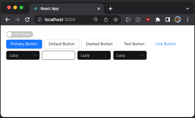
Execute yarn start, and the app is in light mode.
Flipping the switch changes it to dark mode.
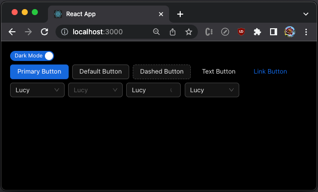
And the mode can be toggled continuously.
Preserve the Previously Set Color Scheme
A user can toggle the color theme. However, the previous theme gets lost after the user exits. It would be nice to preserve the previously set color scheme.
Besides saving a user persona on the server, local storage is a popular way to save the setting. Here is the modified src/App.js:
- At line 13,
darkModeis set totrueif'darkMode'in local storage is'true'. - At line 35,
'darkMode'in local storage is updated whenever the mode is switched.
Use the OS Color Scheme Preference Initially
We can reuse the color scheme if the user has previously set a color scheme. What happens if a user runs the app for the first time or local storage is cleared for some reason?
In this case, we can use the OS color scheme preference. A previous article explained how to use the media query, matchMedia(), to get the OS color scheme preference. Dark mode means that the following statement is true.
matchMedia('(prefers-color-scheme: dark)').matches)Here is the modified src/App.js:
- At lines 13–15,
darkModeis set totrueif'darkMode'in local storage is'true', or'darkMode'in local storage is not'false'and the OS color scheme preference isdark.
Reuse Antd’s Setting in Local Storage
Our app works well. It sets the color scheme based on the following order of precedence:
- Reuse the color scheme if the user has previously set a color scheme.
- Use the OS color scheme preference.
A user can toggle the color theme continuously, and the new mode is saved in local storage for future use.
Open the inspect window, we find two keys in local storage, 'theme' and 'darkMode'.
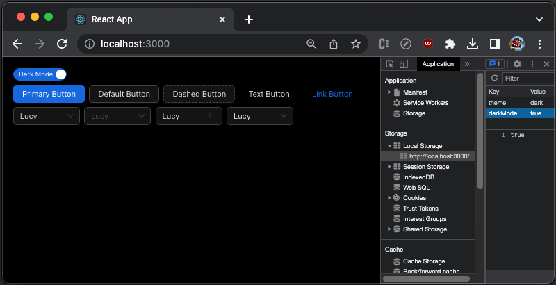
'darkMode' is set by our app and 'theme' is set by antd. In fact, theme is set to the same value as the OS color scheme preference. Can we reuse it?
Yes, we can.
Here is the modified src/App.js:
- At lines 13–15,
darkModeis set totrueif'theme'in local storage is'dark', or'theme'in local storage is not'light'and the OS color scheme preference isdark. - At line 37,
'theme'in local storage is updated when the mode is switched.
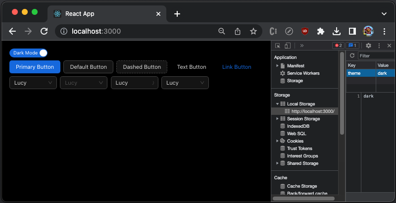
Open the inspect window. There is one key in local storage, 'theme'.
Set up Multiple Themes in Antd App
By nesting ConfigProvider, we can apply the local theme to some parts of the UI. By default, an unspecified configuration in the child theme will inherit the parent theme.
Here is an example:
At lines 48–80, the group of select components is wrapped in another ConfigProvider, with the opposite color scheme of the global theme.
When the global theme is set to light mode, the group of select components is in dark mode.
When the global theme is set to dark mode, the group of select components is in light mode.

What Can Be Customized in Theme?
Ant Design System allows us to customize design tokens to construct a uniquely branded enterprise application.
Design tokens are divided into three layers: Seed, Map, and Alias Tokens. These token groups are not simple groupings but a three-layer derivation relationship.
Seed tokens
In most cases, using Seed Tokens should be sufficient for customization. Here is the definition of SeedToken:
export interface SeedToken extends PresetColorType {
  /**
   * Brand Color
   */
  colorPrimary: string;
  /**
   * Success Color
   */
  colorSuccess: string;
  /**
   * Warning Color
   */
  colorWarning: string;
  /**
   * Error Color
   */
  colorError: string;
  /**
   * Info Color
   */
  colorInfo: string;
  /**
   * Seed Text Color
   */
  colorTextBase: string;
  /**
   * Seed Background Color
   */
  colorBgBase: string;
  /**
   * Font family for default text
   */
  fontFamily: string;
  /**
   * Font family for code text
   */
  fontFamilyCode: string;
  /**
   * Default Font Size
   */
  fontSize: number;
  /**
   * Base Line Width
   */
  lineWidth: number;
  /**
   * Border style of base components
   */
  lineType: string;
  /**
   * Border radius of base components
   */
  borderRadius: number;
  /**
   * Size Change Unit
   * @default 4
   */
  sizeUnit: number;
  /**
   * Size Base Step
   * @default 4
   */
  sizeStep: number;
  /**
   * Popup Arrow size
   */
  sizePopupArrow: number;
  /**
   * Base Control Height
   * @default 32
   */
  controlHeight: number;
  /**
   * Base zIndex
   * @default 0
   */
  zIndexBase: number;
  /**
   * Popup base zIndex
   * @default 1000
   */
  zIndexPopupBase: number;
  /**
   * Define default Image opacity. Useful when in dark-like theme
   */
  opacityImage: number;
  /**
   * Animation Duration Unit
   * @default 100ms
   */
  motionUnit: number;
  /**
   * Motion base time
   */
  motionBase: number;
  motionEaseOutCirc: string;
  motionEaseInOutCirc: string;
  motionEaseInOut: string;
  motionEaseOutBack: string;
  motionEaseInBack: string;
  motionEaseInQuint: string;
  motionEaseOutQuint: string;
  motionEaseOut: string;
  /**
   * Wireframe Style
   * @default false
   */
  wireframe: boolean;
}
The following code modifies ConfigProvider in src/App.js to customize SeedToken.colorPrimary.
<ConfigProvider
  theme={{
    algorithm: darkMode ? theme.darkAlgorithm : theme.defaultAlgorithm,
    token: {
      colorPrimary: 'pink',
    },
  }}
>
Execute yarn start, and we see that the primary color is set to pink.
Map tokens
Map Tokens are derived from Seed Tokens, with finer controls.
export interface MapToken extends SeedToken, ColorPalettes, ColorMapToken, SizeMapToken, HeightMapToken, StyleMapToken, FontMapToken, CommonMapToken {
}
Here is the definition of ColorMapToken:
export interface ColorMapToken extends ColorNeutralMapToken, ColorPrimaryMapToken, ColorSuccessMapToken, ColorWarningMapToken, ColorErrorMapToken, ColorInfoMapToken {
  /**
   * Pure white color that won't be changed by theme
   * @default #FFFFFF
   */
  colorWhite: string;
  /**
   * Background color of the mask
   */
  colorBgMask: string;
}
Here is the definition of SizeMapToken:
export interface SizeMapToken {
  /**
   * XXL
   * @default 48
   */
  sizeXXL: number;
  /**
   * XL
   * @default 32
   */
  sizeXL: number;
  /**
   * LG
   * @default 24
   */
  sizeLG: number;
  /**
   * MD
   * @default 20
   */
  sizeMD: number;
  /** Same as size by default, but could be larger in compact mode */
  sizeMS: number;
  /**
   * Size
   * @default 16
   */
  size: number;
  /**
   * SM
   * @default 12
   */
  sizeSM: number;
  /**
   * XS
   * @default 8
   */
  sizeXS: number;
  /**
   * XXS
   * @default 4
   */
  sizeXXS: number;
}
Here is the definition of HeightMapToken:
export interface HeightMapToken {
  /** Only Used for control inside component like Multiple Select inner selection item */
  /**
   * XS component height
   */
  controlHeightXS: number;
  /**
   * SM component height
   */
  controlHeightSM: number;
  /**
   * LG component height
   */
  controlHeightLG: number;
}
Here is the definition of StyleMapToken:
export interface StyleMapToken {
  /**
   * Line Width
   * @default 1
   */
  lineWidthBold: number;
  /**
   * XS Size Border Radius
   * @default 2
   */
  borderRadiusXS: number;
  /**
   * SM Size Border Radius
   * @default 4
   */
  borderRadiusSM: number;
  /**
   * LG Size Border Radius
   * @default 8
   */
  borderRadiusLG: number;
  /**
   * @default 4
   */
  borderRadiusOuter: number;
}
Here is the definition of FontMapToken:
export interface FontMapToken {
  fontSizeSM: number;
  fontSize: number;
  fontSizeLG: number;
  fontSizeXL: number;
  /**
   * H1
   * @default 38
   */
  fontSizeHeading1: number;
  /**
   * H2
   * @default 30
   */
  fontSizeHeading2: number;
  /**
   * H3
   * @default 24
   */
  fontSizeHeading3: number;
  /**
   * H4
   * @default 20
   */
  fontSizeHeading4: number;
  /**
   * H5
   * @default 16
   */
  fontSizeHeading5: number;
  lineHeight: number;
  lineHeightLG: number;
  lineHeightSM: number;
  lineHeightHeading1: number;
  lineHeightHeading2: number;
  lineHeightHeading3: number;
  lineHeightHeading4: number;
  lineHeightHeading5: number;
}
Here is the definition of CommonMapToken:
export interface CommonMapToken extends StyleMapToken {
  motionDurationFast: string;
  motionDurationMid: string;
  motionDurationSlow: string;
}
MapToken is a gradient variable derived from SeedToken. It is recommended to implement custom MapToken through theme.algorithm, which can ensure the gradient relationship between MapTokens. However, it can also be overridden by theme.token to modify the values of some MapTokens individually.
The following code modifies ConfigProvider in src/App.js to customize MapToken.fontSize, in addition to SeedToken.colorPrimary.
<ConfigProvider
  theme={{
    algorithm: darkMode ? theme.darkAlgorithm : theme.defaultAlgorithm,
    token: {
      colorPrimary: 'pink',
      fontSize: 20,
    },
  }}
>
Execute yarn start, and we see that the primary color is set to pink and the font size is 20.
Alias tokens
Alias Tokens are derived from Map Tokens, with even finer controls.
export interface AliasToken extends MapToken {
  colorFillContentHover: string;
  colorFillAlter: string;
  colorFillContent: string;
  colorBgContainerDisabled: string;
  colorBgTextHover: string;
  colorBgTextActive: string;
  colorBorderBg: string;
  colorSplit: string;
  colorTextPlaceholder: string;
  colorTextDisabled: string;
  colorTextHeading: string;
  colorTextLabel: string;
  colorTextDescription: string;
  colorTextLightSolid: string;
  /** Weak action. Such as `allowClear` or Alert close button */
  colorIcon: string;
  /** Weak action hover color. Such as `allowClear` or Alert close button */
  colorIconHover: string;
  colorLink: string;
  colorLinkHover: string;
  colorLinkActive: string;
  colorHighlight: string;
  controlOutline: string;
  colorWarningOutline: string;
  colorErrorOutline: string;
  /** Operation icon in Select, Cascader, etc. icon fontSize. Normal is same as fontSizeSM */
  fontSizeIcon: number;
  /** For heading like h1, h2, h3 or option selected item */
  fontWeightStrong: number;
  controlOutlineWidth: number;
  controlItemBgHover: string;
  controlItemBgActive: string;
  controlItemBgActiveHover: string;
  controlInteractiveSize: number;
  controlItemBgActiveDisabled: string;
  paddingXXS: number;
  paddingXS: number;
  paddingSM: number;
  padding: number;
  paddingMD: number;
  paddingLG: number;
  paddingXL: number;
  paddingContentHorizontalLG: number;
  paddingContentHorizontal: number;
  paddingContentHorizontalSM: number;
  paddingContentVerticalLG: number;
  paddingContentVertical: number;
  paddingContentVerticalSM: number;
  marginXXS: number;
  marginXS: number;
  marginSM: number;
  margin: number;
  marginMD: number;
  marginLG: number;
  marginXL: number;
  marginXXL: number;
  opacityLoading: number;
  boxShadow: string;
  boxShadowSecondary: string;
  boxShadowTertiary: string;
  linkDecoration: React.CSSProperties['textDecoration'];
  linkHoverDecoration: React.CSSProperties['textDecoration'];
  linkFocusDecoration: React.CSSProperties['textDecoration'];
  controlPaddingHorizontal: number;
  controlPaddingHorizontalSM: number;
  screenXS: number;
  screenXSMin: number;
  screenXSMax: number;
  screenSM: number;
  screenSMMin: number;
  screenSMMax: number;
  screenMD: number;
  screenMDMin: number;
  screenMDMax: number;
  screenLG: number;
  screenLGMin: number;
  screenLGMax: number;
  screenXL: number;
  screenXLMin: number;
  screenXLMax: number;
  screenXXL: number;
  screenXXLMin: number;
  /** Used for DefaultButton, Switch which has default outline */
  controlTmpOutline: string;
}
Alias Token is used to control the style of some common components in batches, which is a Map Token alias or a specially processed Map Token.
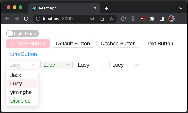
The following code modifies ConfigProvider in src/App.js to customize AliasToken.colorTextDisabled, in addition to SeedToken.colorPrimary and MapToken.fontSize.
<ConfigProvider
  theme={{
    algorithm: darkMode ? theme.darkAlgorithm : theme.defaultAlgorithm,
    token: {
      colorPrimary: 'pink',
      fontSize: 20,
      colorTextDisabled: 'green',
    },
  }}
>
Execute yarn start, and we see that the primary color is set to pink, the font size is 20, and the disabled color is green.
ThemeConfig
theme is defined as ThemeConfig, which has the following props:
export interface ThemeConfig {
/** Modify Design Token */
token?: Partial<AliasToken>;
/** Modify Component Token and Alias Token applied to components */
components?: OverrideToken;
/** Modify the algorithms of theme, (token: SeedToken) => MapToken | ((token: SeedToken) => MapToken)[] */
algorithm?: MappingAlgorithm | MappingAlgorithm[];
/** Some configuration, and default is true */
hashed?: boolean;
/** Inherit theme configured in upper ConfigProvider, and default is true */
inherit?: boolean;
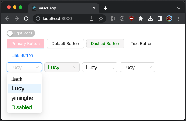
}components allows us to set the customization to a specific component. Let’s see the following src/App.js:
- At lines 30–32,
Button’sSeedToken.colorPrimaryis set topink. - At lines 33–35,
Select’sMapToken.fontSizeis set to 20. - At line 36, all components'
AliasToken.colorTextDisabledis set togreen. - At line 53, the
dashedbutton is set todisabled.
Execute yarn start, and we see that Button’s primary color is set to pink, Select’s font size is set to 20, and the disabled color, green, is set to all components.
Conclusion
We have walked through Ant Design System themes. From antd 5.0, it takes one line of code to set up dark mode. In addition, it provides the full capability to customize themes for primary color, border radius, border color, etc.
Theme is an amazing feature for constructing a uniquely branded enterprise application.
Thanks for reading.
Want to Connect?

If you are interested, check out my directory of web development articles.


