
Building Dark Mode for Storybook and Web Applications
A complete guide on dark mode
Dark mode is a color scheme that uses light-colored text, icons, and UI elements on a dark background. The opposite color scheme is called light mode.
These are reasons for users to choose dark mode:
- Light on the dark mode requires less energy to display.
- Science shows that negative polarity (dark mode) is less harmful to the eyes in the long run than light mode.
- Dark mode is stylish and hip for some UI design.
These are reasons for users to choose light mode:
- Most electronic devices have light mode as default.
- Light mode is the skeuomorphic approach.
- Light mode reads better under strong (sun) light.
Dark mode is a choice, and light mode is a must. When it is said to support dark mode, it implies supporting both dark and light modes. Dark mode has gained a lot of traction since the year 2015. Nowadays, sophisticated web applications support both of them.
This is a complete guide on the following topics:
Dark Mode for Storybook
Storybook is an open source tool for building UI components and pages in isolation. This allows us to work on one component at a time. It streamlines UI development, testing, and documentation.
It takes a few steps to build dark mode for Storybook:
- Set up Storybook in Create React environment.
- Install the addon,
storybook-dark-mode. - Follow the order of precedence for the initial color scheme.
- Use Storybook buttons to control the theme and background.
- Customize Storybook settings.
Set up storybook in a Create React environment
We use Create React App as a base to explore Storybook. The following command creates a React project:
npx create-react-app storybook-darkmode
cd storybook-darkmode
Type the command, npx sb init, and Storybook is installed. Although we have installed Storybook 6.5, it is similar to what we have described for Storybook 6.3.

It creates the folder, .storybook, with two configuration files:
main.js: Configures story file location, addons, and custom Webpack and Babel configurations.preview.js: Sets the global setting for decorators, parameters, and global types.
Type the command, npm run storybook, and the example Storybook runs at http://localhost:6006.

By default, Storybook is in light mode.
Install the addon, storybook-dark-mode
storybook-dark-mode is a Storybook addon that supports the toggle between dark and light modes. This addon has 183.5k weekly downloads, and its usage is catching up to Storybook’s. Look at the two converging lines, and take a guess. Is 2020 the year that every Storybook comes with storybook-dark-mode?

Let’s install storybook-dark-mode:
npm i --save-dev storybook-dark-modeIn .storybook/main.js, we include the addon, 'storybook-dark-mode' (line 11) in the following code:
Type the command, npm run storybook, and Storybook is in dark mode as the macOS has been set to dark mode.

Follow the order of precedence for the initial color scheme
Here is the defined order of precedence for the initial color scheme:
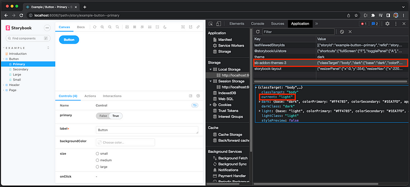
- Reuse the color scheme if the user has previously set a color scheme.
In the local storage, the key, sb-addon-themes-3, saves the theme object, with current set to the color scheme. In the following example, current is set to light:
2. Use the value that is configured for current parameter in .storybook/preview.js. In the following example, current is set to light (line 3):
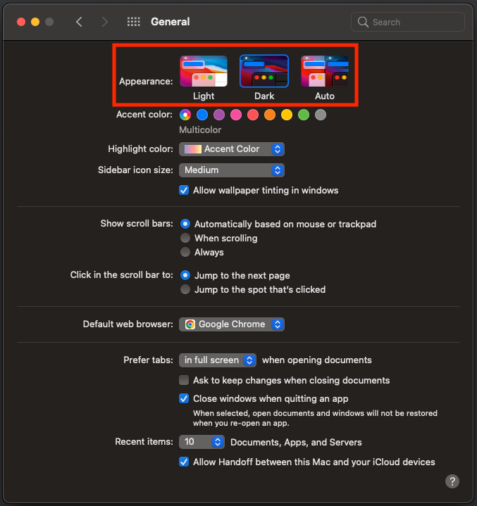
3. Use the OS color scheme preference.
The following are the color scheme preferences on macOS:
However, because of a known issue, the configured current parameter (#2) becomes the first precedence.
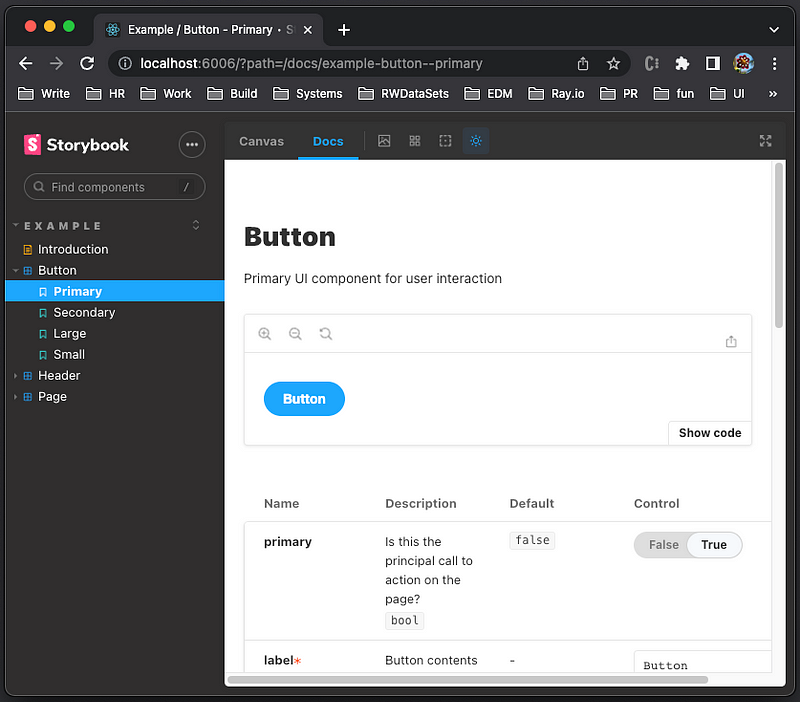
Use Storybook buttons to control the theme and background
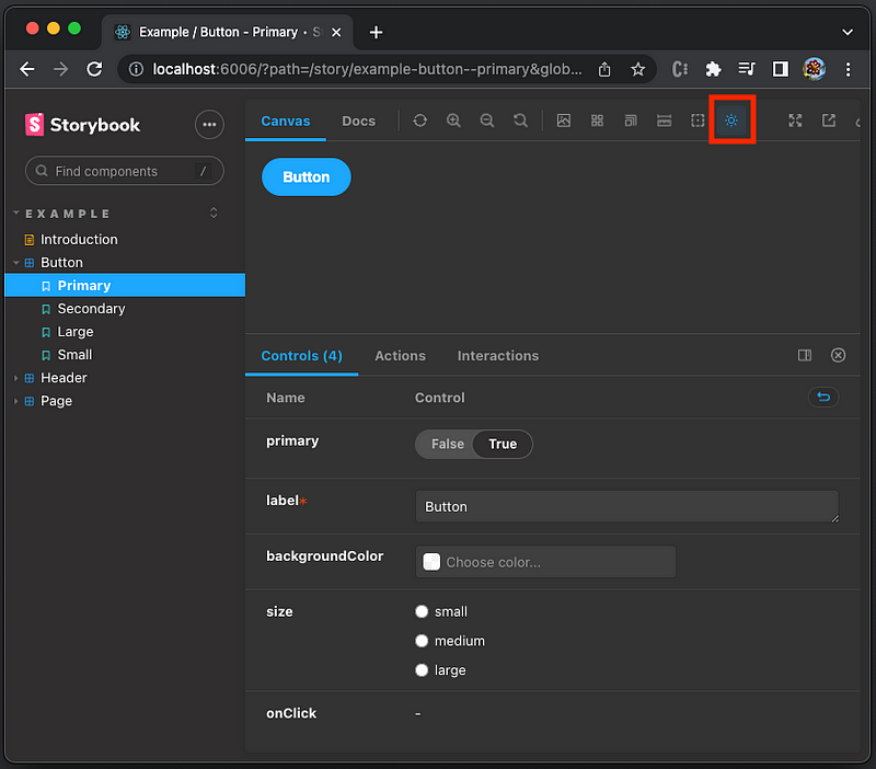
After the storybook is launched, there is a change theme button (in the red box below) to switch between dark (moon) and light (sun) modes.
Besides the change theme button, there is a change background button (in the red box below) to change the background of the preview, regardless of the color scheme.

If you feel that it is confusing to have two controls, this change background button can be hidden with the following setting in .storybook/preview.js.
Customize Storybook settings
Things work well. Then we change to the Docs tab.
We find out that the show code section is not in dark mode, although the same section is in dark mode in the Canvas tab.
Can we customize it to dark mode?
Yes, we can.
Put the following darkMode setting into .storybook/preview.js:
Lines 2 and 3 add darkClass or lightClass to the body element when switching between dark and light modes. Line 4 configures darkClass or lightClass to the body element in the preview iframe.
Let’s inspect the elements.
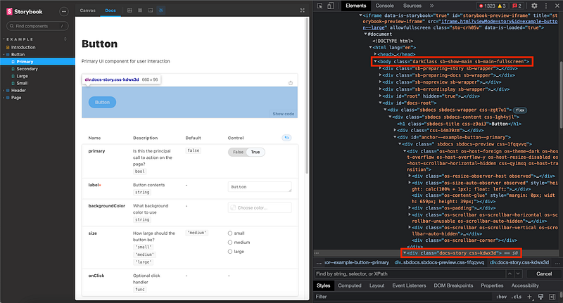
The body element in the preview iframe has the class, darkClass. The show code section is inside body with the class, docs-story. Using the techniques described in 6 Ways To Configure Global Styles for Storybook, we can import the stylesheet in .storybook/preview.js.
Add .storybook/style.css as follows:
Import the style file into .storybook/preview.js.
The show code section is in Dark mode now.

Similarly, we can customize other Storybook settings as desired.
Dark Mode for Web Applications
We can borrow the idea from Storybook to set up dark mode for Web applications.
- Follow the order of precedence for the initial color scheme.
- Use
ThemeProvider in styled-components. - Implement Create React App with dark mode.
Follow the order of precedence for the initial color scheme
Here is the order of precedence for the initial color scheme:
- Reuse the color scheme if the user has previously set a color scheme.
In the local storage, the key, my-color-scheme, saves the color scheme, dark or light:
const storageKey = 'my-color-scheme';2. Use the OS color scheme preference.
A previous article explained how to use the media query, matchMedia(), to get the OS color scheme preference. Dark mode means that the following statement is true.
matchMedia('(prefers-color-scheme: dark)').matches3. Use light mode as default.
If nothing has been set, we go for light mode as the default.
const defaultMode = 'light';The following is the summarized algorithm:
Use ThemeProvider in styled-components
styled-components is a CSS-in-JS approach — a JavaScript library that bundles each JavaScript component with all its belonging CSS rules and dependencies.
We define the dark mode theme and the light mode theme.
Then the Container style is defined based on the selected theme.
ThemeProvider is a context API, which provides a theme context with the theme prop. This prop can be dynamically accessed by every wrapped component.
Place Container inside ThemeProvider, and it receives the proper theme.
Implement Create React App with dark mode
To use styled-components, we need to install the package:
npm i styled-componentsstyled-components becomes part of dependencies in package.json.
Here is the final src/App.js:
- At line 2,
styledandThemeProviderare imported fromstyled-components. - At lines 6–9, the dark mode theme is defined.
- At lines 11–14, the light mode theme is defined.
- At lines 16–19, the
Containerstyle is defined via the selected theme. - At lines 26–41, the color scheme is set following the order of precedence.
- At lines 43–47, the button handler switches between dark and light modes, and updates local storage.
- At line 50,
ThemeProvider’s theme is set to the selected color scheme. - At lines 55–57, the button is set to proper text based on the color scheme, and clicking it switches between dark and light modes.
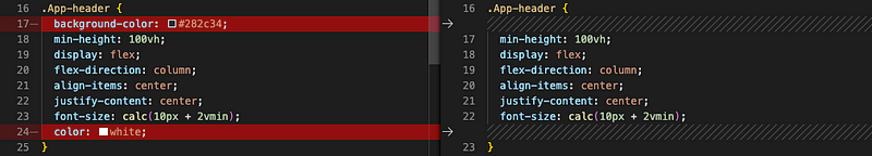
Since background-color and color are defined in the theme, they should be removed from the App-header class styling in src/App.css.
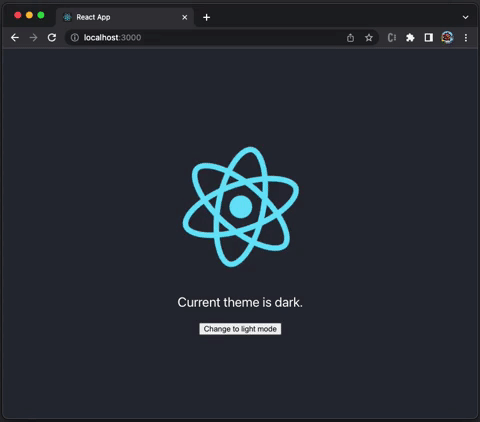
Execute npm start. We can switch the color scheme between dark and light modes by clicking the button.
Conclusion
Dark mode is popular these days. When it is said to support dark mode, it implies supporting both dark and light modes. We have given a complete guide on how to build dark mode for Storybook and Web applications.
Thanks for reading.
If you are interested, check out my directory of web development articles.
Note: Thanks, S Sreeram and Siddhartha Chinthapally, for working with me on the dark mode project for Domino products.


