
Dumbell Plots, Slope Charts, and Mirror Bar Charts in Python and Plotly
Hands on tutorial for creating 3 charts in Python that helps us compare similar data points effectively
When it comes to data visualization, a data analyst has many choices. Bad data representation can lead to misunderstanding and incorrect data interpretation. A smart data visualization, on the other hand, can help you reap the benefits of data-driven decision making. Effective data visualization not only aids in better understanding of the data but also communicates a story to the user.
This tutorial will focus on visualization approaches that allow us to compare similar values effectively. For example, health statistics for people of different genders, data for various timestamps, and so on. Basic plots in matplotlib or plotly libraries can be used to produce the three plots we’ll look at. I prefer Plotly to Matplotlib because of the built-in features that come with it. The tool tips are my personal fave. These tool tips can be used to convey a lot of additional information. Other great Plotly features include zooming, pan/lasso selection, and plot download as a png file.
Let’s get down to business and start plotting. The data for the graphs was obtained from the NCDRisc website. It contains health statistics such as diabetes, BMI, and morbid obesity for both males and females from 1975 to 2015 for various countries. It also includes information on each country’s GDP and Western diet scores. You may get the consolidated data from my github repository here.
1. Dumbell Plots
Dumbbell plots are useful for showing changes over time or disparities between two (or three) groups. The dumbell shape is what gives it its name.
We begin by reading the data for this plot. You can read the raw data from the github here if you want to follow along.
data = pd.read_csv('https://raw.githubusercontent.com/hgarg01/graphs-for-comparing-values/main/data.csv')
data.shape
(16800, 17)
data.columns
Index(['Country', 'ISO', 'Sex', 'Year', 'Mean_BMI_adults',
       'Prevalence_obesity_adults', 'Prevalence_underweight_adults',
       'Prevalence_morbid_obesity_adults', 'Diabetes_prevalence',
       'Systolic_blood_pressure', 'Prevalence_raised_blood_pressure', 'Region',
       'Superregion', 'Years_of_education', 'Urbanisation',
       'Western_diet_score', 'GDP_USD'],
      dtype='object')
We have the GDP of all countries in USD from 1975 to 2015 in the dataset. We only use data from these two years because we want to show the contrast in GDP between 1975 and 2015. Also, because there are too many countries in the dataset and plotting them all together would be too crowded, we opted to only display the data from Sub-Saharan Africa. The slilcing of the data is done bellow.
df_africa = data[(data['Superregion']=='Sub-Saharan Africa') & (data['Sex'] == 'Male')& ((data['Year'] == 2015) | (data['Year'] == 1975))]
df_africa_gdp = df_africa[['Country', 'Year', 'GDP_USD']]
To make a dumbell plot with plotly, plot the dots for each GDP value and draw a line connecting the two dots to connect the GDP of each country from 1975 to 2005. Below is the complete code.
In line 1 above, we convert the year column to string, so they are treated as categorical values and not quantitative. In line 3, we draw a scatter plot using the function px.scatter with GDP along the x-axis and countries along the y-axis. We plot 1 point each for the years 1975 and 2015 in different colors. The color has been specified with the color_discrete_map argument of the function.
On line 7, we iterate on each country, filter the data frame by the name of every country(line 9) and add a line using the add_shape function, connecting the 2 dots plotted earlier. In line 20, we update the layout by making the grid invisible and setting the title.
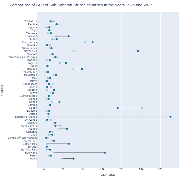
This graph is highly useful for comparing GDP over two years. We can clearly see that Equatorial Guinea is not only the wealthiest country in the region, but it also has the largest increase in GDP between 1975 and 2015. A quick google search reveals that Equatorial Guinea has become Africa’s wealthiest nation on a per-capita basis since the start of oil production in the mid-nineties, and the third-largest oil producing country in Sub-Saharan Africa.
We can observe that the GDP of some countries is declining, with GDP in 2015 being lower than in 1975. Gabon is one of the countries with the fastest-declining GDP. The main reason for this is a drop in oil reserves and prices.
I used the same code as above to compare the BMI of males and females of the Sub-Saharan African countries in the year 2015, and created the following plot.
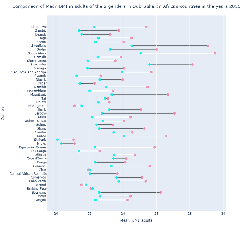
We can see from the plot above that in majority of the countries, Mean BMI of an adult woman is more than that of a man. This trend is reverse in very few countries like Madagascar and Burundi. Maximum average BMI for females can be seen in South Africa and that for males in Seychelles.
We can tweak the code above to include 3 or 4 points and connect them all with one line. But this plot works the best when you are comparing 2 values at a time. More points in a line may cause confusion.
2. Slope Charts
Slope charts are simple graphs that show transitions or changes over time, absolute values, and rankings. Slope charts depict two values across time, with the slope of the line from one point to the next indicating the amount of change and the rate of change.
We choose to show the countries in the Ocenia super-region on the slope chart. This super-region is ideal for displaying this data because it contains 16 countries — not too many to overcrowd the plot and not too few to make it appear sparse. In addition, the GDP of some nations in the super-region increased from 1975 to 2015, while the GDP of others decreased, making the information interesting to be displayed.
Before being able to plot the data, we need to slice it and manipulate to make it suitable for the plot.
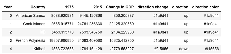
To begin, we slice the data in line 1 so that it contains data for the Ocenia super-region and the two years 1975 and 2015. Line 6 creates a pivot table using nations as the index and GDP figures from 1975 to 2015 as columns. The difference in GDP from 1975 to 2015 is then calculated (line 8). If the change in GDP is greater than zero, the growth direction is ‘up,’ otherwise ‘down’ (lines 11–13). Finally, we assign a separate color to each direction (line 15), which will be utilized in our code to distinguish between growth types. The following is the head of the resulting data frame.
In lines 2 and 6, We create the scatter plots for the GDP values of two years in vertical columns, where each column represents a year. In line 12, we connect the two dots on the two columns that represent the same country. The direction color that we calculated in our data frame earlier, determines the color of the connecting lines: green for positive GDP growth and red for negative GDP growth. The graphs are then enhanced with annotations to make them more legible and understanding. In line 26, we iterate through the list of all the countries’ names, writing the countries with odd indexes in the 1975 column and those with even indexes in the 2015 column. This is done to avoid the over crowding of the names. Some of the names still appear very close. We can rectify this situation by increasing the height of the plot.
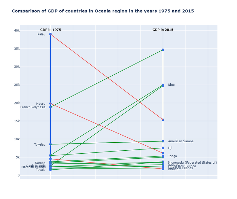
This graph explains a number of things, including 1) the ranking of countries in terms of GDP in 1975 versus 2015. The higher a country is on the vertical line, higher is the GDP of the country in that year. 2) Change in a country’s GDP over 40 years. Positive growth is indicated by green lines, whereas negative growth is indicated by red lines. Except for Palau, Tonga, and Kiribati, the majority of the countries in this region have had positive growth. 3) The GDP growth rate. The faster a country’s GDP grows or decreases, the steeper the slope of the line. Cook Island has an extremely steep growth line, indicating rapid development. Similarly Palau has a sharp decline in its GDP from 1975 to 2015.
We can generalize the code above to plot data for more than 2 years. We plotted the slope for chart for the same data as above, with additional GDP values for the year 1995. Here’s the result
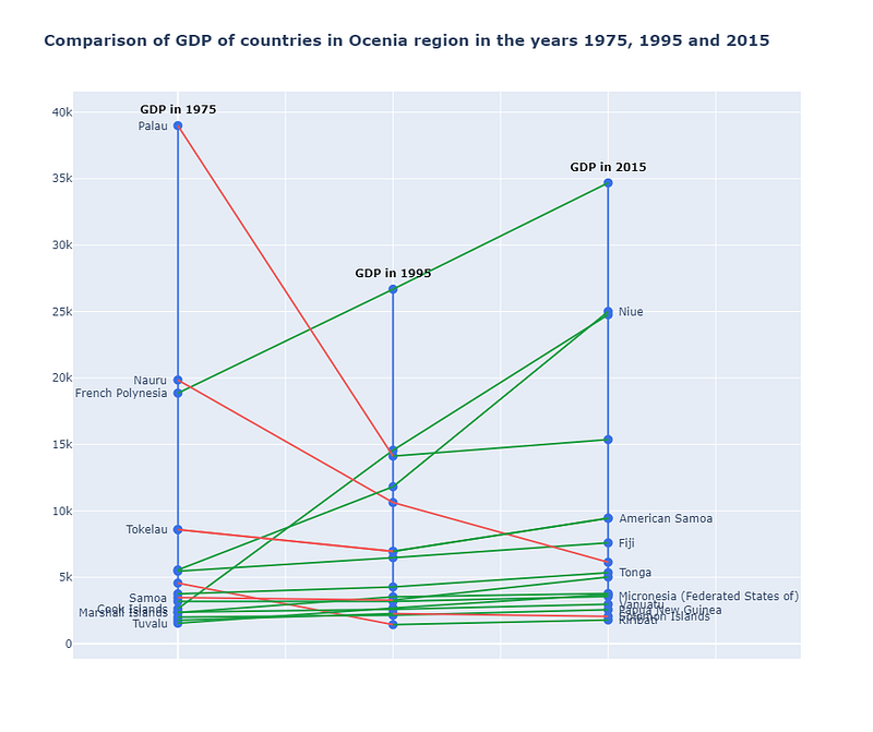
We can clearly see form the plot that many countries, such as Palau and Tokelau, had a dramatic decrease in their economies from 1975 to 1995, as seen in the graph above, but they appear to have performed better in the subsequent 20 years. From 1975 to 1995, and then again to 2015, French Polynesia’s GDP grew steadily and impressively. The tourism industry and the export of pearls played a major role in this growth.
We saw how simple it is to increase the number of year lines in the slope chart in order to include more data. However, keeping the lines to a maximum of 3 or 4 works best; otherwise, the plot may get overcrowded, confusing the audience.
3. Mirror Bar Chart
Mirror bar charts comparatively display 2 sets of data side by side along the vertical axis. The 2 sides of the chart resembles the reflection in the mirror, hence the name mirror bar chart.
We used the data for the Sub Saharan African super region to create the mirror bar plot. Complete code is given below.
We begin by dividing the graph into two subplots that share the y-axis (line 4). In lines 7 and 8, we add two bar charts for the GDP values of the selected countries in 1975 and 2015. The range of the 1975 graph was set to ‘reversed’ on line 21. The graph will now be plotted in the opposite direction. The following is the final outcome:
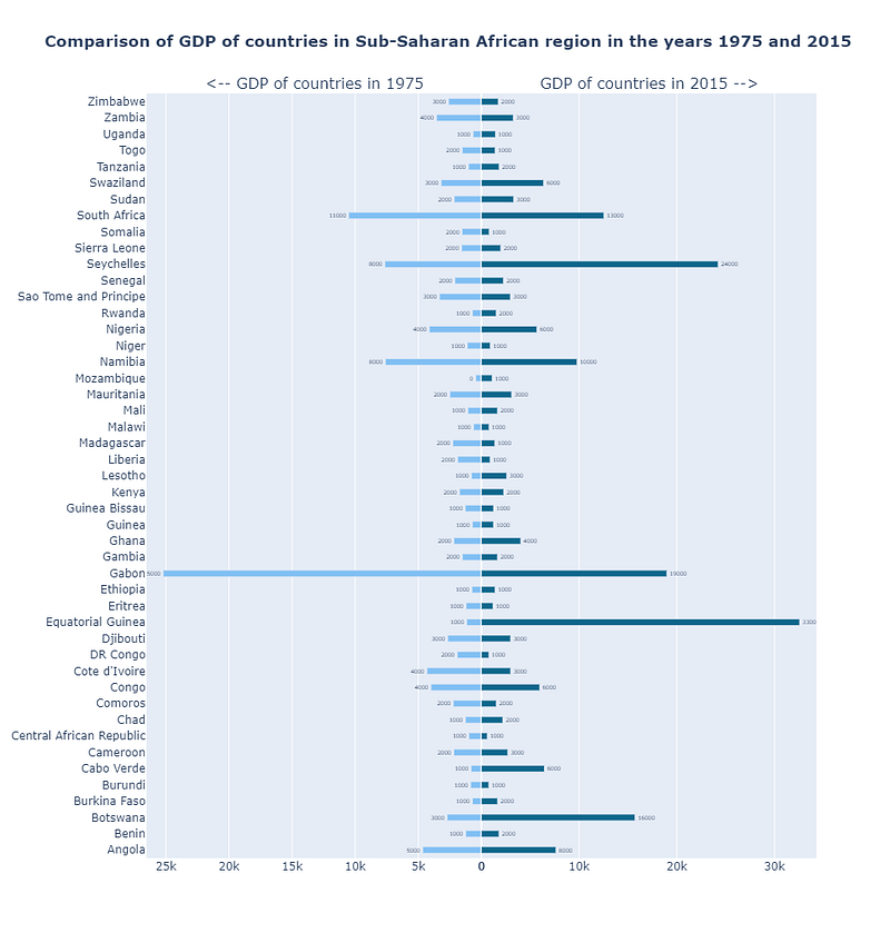
This graph is useful for comparing the two values. We can clearly observe that Gabon was first in terms of GDP in 1975, but fell to third place in 2015.
We may draw a similar mirror bar chart using the BMI data of adults, as shown below.
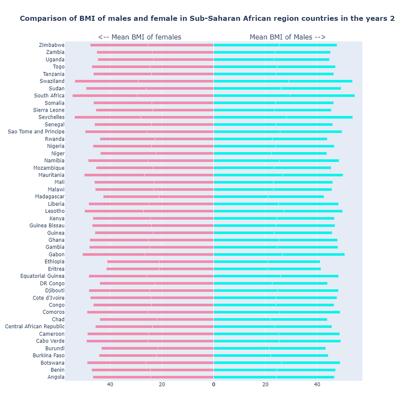
Because most of the countries have comparable BMI values, the graph does not properly represent the story in the graph above.
Finally, we may conclude that mirror plots are useful for comparing two data side by side. However, if the difference is not large, like in the example above, they are ineffective. They also can’t show more than two values in time, unlike the dumbell plot and slope chart.
Analysts and data scientists have a variety of plot options when it comes to narrative represented by data. We learned how to create Dumbell plots, slope charts, and mirror bar charts to compare values at two points in time. They all have their own set of benefits and drawbacks. When selecting on the appropriate graph for our needs, we should bear these in mind and select what works best for our data.
This concludes the plotly chart tutorial. Thank you for taking out the time to read this. I hope you learnt something new. Some of my other popular articles can be found here and here. If this article was worth your time, please feel free to clap and follow. If not, please tell me how can I make it better. Keep reading and keep learning!!


