
Calendar Heatmaps : A perfect way to display your time-series quantitative data
A quick and simple guide to create calendar heatmaps using Python libraries and add interactivity using widgets
When deciding on the visualization for our data, we have a large number of options. A perfect visualization is not just simple but also intuitive and insightful.
A simple heatmap shows data graphically where individual values are represented by the color gradient. Calendar heatmap is the visualization that combines heatmaps and calendars. A calendar heatmap uses colored cells, to show relative number of events for each day in a calendar view. Days are arranged into columns by weeks and grouped by months and years. This enables us to quickly identify daily and weekly patterns, and to recognize anomalies within the data.
Without further ado, lets get coding and learn how to make these wonderful plots.
Data for this tutorial has been taken from kaggle and is available on this link. This data is a sales dataset with information regarding the order number, order date, product category, price of the item ordered, total order quantity and sales amount.
1. Install the library calmap
In order to be able to use the library calmap, we need to start with the installation. You can do that from within the jupyter notebook if you proceed the command with a ‘!’.
!pip install calplot2. Read the data and perform preprocessing
#read the data
import pandas as pd
df = pd.read_csv('C:/Users/~/sales_data_sample.csv')
df.shape
Now, we need to convert the type of orderdate to datetime. For this data to work with the calplot library, the data needs to be in the form of a time series. For that, we need a date index. Let’s set orderdate as the index of the series.
#change the type of data
df['ORDERDATE'] = pd.to_datetime(df['ORDERDATE'])
#Set orderdate as index
df.set_index('ORDERDATE', inplace = True)
3. Create the calendar plot with the library calplot
import calplotpl1 = calplot.calplot(data = df['SALES'],how = 'sum', cmap = 'Reds', figsize = (16, 8), suptitle = "Total Sales by Month and Year")We use the calplot function of library calplot to generate this plot. The first argument of the function calplot defines the variable and the data frame that we want to create the plot on. In this case, we want it to be on the column Sales. The second argument ‘how’ defines how we want to aggregate the data. We can pass standard python functions in this argument. In this case, we have passed ‘sum’ because we want to calculate the daily total sales value.
The next argument cmap is the color map and defines the color scheme to be applied in the plot. There are many inbuilt color schemes in Matplotlib- Python which can be found here. The next 2 parameters are the figure size and the title of the graph.
On running the code snippet above, we get the following plot.
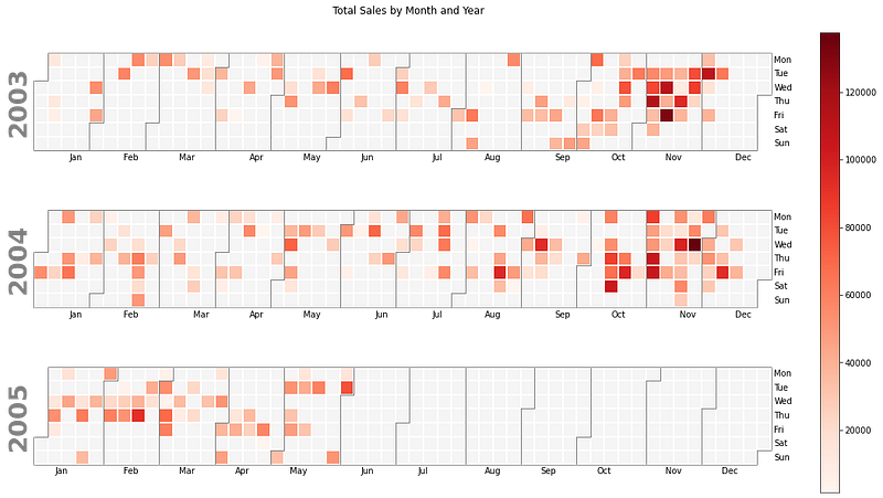
We can see that the whole time period in the data is divided into years and years into months. On y-axis, we can see the name of the days and the color gradient shows the amount of sale. Dark colors mean more sales, whereas lighter colors mean less sales.
From the plot above, it is easy to identify that the maximum sales have happened in the month of November. The simplicity and clarity of this plot makes it easily understandable, yet very insightful.
Let’s now try another plot using the calplot library. This time, let’s try and count the number of orders placed per day. For this, we can group the data by order date and aggregate by the count of orders. The code and plot for this is given below.
#group the orders by date and count the number of orders per day
counts = df.groupby('ORDERDATE')['ORDERNUMBER'].agg( 'count').reset_index()
counts['ORDERDATE'] = pd.to_datetime(counts['ORDERDATE'])
counts
#create the plot
calplot.calplot(counts['ORDERNUMBER'], cmap = 'GnBu', textformat ={:.0f}', figsize = (16, 8), suptitle = "Total Orders by Month and Year")
By specifying the textformat, we can display the resulting values on the map. There are many other arguments that we can specify inside the calplot function, complete list of which can be found here.
4. Make your plot more insightful by including drop-down widgets
We saw the total sales in the calendar maps created above. But what if we want to view the sales of each product individually and compare which products are best-selling and which products are seasonal?
In cases such as these, we can add a drop down to our calendar plot and slice the data on the basis of the values in the drop down. The easiest way to do this inside jupyter notebook is using widgets.
Widgets are eventful python objects that can be used to to build interactive GUIs for our notebooks. The widgets are fairly easy to understand and use in the jupyter notebooks.
We start with installing the library ipywidgets and importing in into the notebook.
!pip install ipywidgets
from ipywidgets import interact, interactive, fixed, interact_manual
import ipywidgets as widgets
Creating drop-downs in widgets involves 3 simple steps:
Step 1. Create the dropdown with the items. In this case, we want to include a dropdown with all the product line values. This can be done as follows:
products = set(list(df['PRODUCTLINE]))Using a list function will convert all the values of the column PRODUCTLINE into list items and the duplicate values are removed by converting it into a set.
Step 2. define a function to draw the desired plot.
def draw_calplot(prod):
   data_subset = df[df['PRODUCTLINE'] == prod]
   plt = calplot.calplot(data = data_subset['SALES'], how = 'sum',     cmaps = 'Reds', figsize = (16,8), suptitle = 'Total Sales for teh Product '+prod)
In the function defined above, we first slice the data based on the value of prod. prod is the value that will be selected from the drop down list and passed into the function draw_calplot. Next line of the function creates the required calendar plot on the sliced data.
Step 3: Now all that is left to do is display the drop-down and render the calendar plot using the value selected from the drop-down list. Believe it or not, this is all done in a single line of code.
x = interact(draw_calplot, prod = products) Interact is the part where all the magic happens. It automatically creates a user interface for exploring code and data interactively. The first argument of interact is the function we want to use to render the plot and the second argument is the drop down list ‘products’. The value selected in the drop-down is passed through the variable ‘prod’ into the function draw_calplot.
Drop-down is just one type of widget available in the ipywidgets library. The complete list can be found here. It’s very easy to create these widgets and they are perfect if you want to create an interactive environment within the notebook for data exploration.
A snapshot of the plot produced using the above code is given below.

5. Calendar heatmap using the Python library ‘July’
The library ‘July’ creates calendar heatmaps similar to the calplot, with the only difference that they are used to display one year’s/ month’s worth of data rather than multiple years.
To use the library july, we start with the installation of the library and then calculate the range of dates we want to display in the plot. After that we call the function. I have used 2 different functions- heatmap and calendar_plot to create the plots. While heatmap creates a compact plot for the entire year, calendar_plot divides the entire year into months and displays each month separately. It is also easier to understand. We can decide the plot we want to use based on our requirements.
!pip install july
import july
from july.utils import date_range
dates = date_range("2004-01-01", "2004-12-31")
july.heatmap( dates, data =df1['SALES'], title='Total Sales', cmap="golden", month_grid=True, horizontal = True)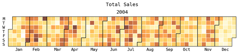
Let’s now create a plot using calendar_plot function from july.
july.calendar_plot(dates, df1['SALES'], cmap = 'copper');
We can see that this plot has the acronyms for days of the week on the top as well as the number of weeks on the left. Hence this visualization can prove to be more useful and detailed in some cases. If you would like to see the data of one particular month, you can use the function month_plot from july.
Conclusion
In this article we learnt how to use 2 different Python libraries — calmap and july- to create calendar heatmap plot. The strength of these plots lie in the simplicity yet effectiveness of them. We also learnt to use widgets to slice our data and interact with the plots using widgets.
Thank you for your time. I hope you got to learn something new. Special thanks goes to my friend and colleague Mohammed Shah for helping me with one of the plots and suggesting ways to improve. Some of my other popular articles can be found here and here. If this article was worth your time, please feel free to clap and follow. If not, please tell me how can I make it better. Connect on linkedin if you like. Keep reading and keep learning!!


