
Diamonds.. What determines their price?
EDA on diamonds dataset in R

Diamonds are forever.
Diamonds are a girl’s best friend!
Diamonds are a girl’s best friend and a man’s worst enemy!!
The fascination of mankind with the king of gems has been widely documented in history and continues to capture the hearts of people(women in particular). The beauty, brilliance and rarity of this stone makes it a perfect gift for special occasions.
Have you ever wondered why some diamonds are very expensive, while others are not. Some are very bright while others are not. In this article, we look at the diamonds with the data analysis lens and perform the exploratory data analysis on the diamonds dataset in R. We would aim to answer the following questions :-
- What are the factors that affect the price of a diamond?
- To determine the price of a diamond, which are the factors to look out for? Which variables are most important and which are not important at all?
Read the data
We start with attaching the data that comes with the ggplot2 library and familiarise ourselves with all the variables included.
library(ggplot2)
data(diamonds)
str(diamonds)
tibble [53,940 x 10] (S3: tbl_df/tbl/data.frame)
$ carat : num [1:53940] 0.23 0.21 0.23 0.29 0.31 0.24 0.24 0.26 0.22 0.23 ...
$ cut : Ord.factor w/ 5 levels "Fair"<"Good"<..: 5 4 2 4 2 3 3 3 1 3 ...
$ color : Ord.factor w/ 7 levels "D"<"E"<"F"<"G"<..: 2 2 2 6 7 7 6 5 2 5 ...
$ clarity: Ord.factor w/ 8 levels "I1"<"SI2"<"SI1"<..: 2 3 5 4 2 6 7 3 4 5 ...
$ depth : num [1:53940] 61.5 59.8 56.9 62.4 63.3 62.8 62.3 61.9 65.1 59.4 ...
$ table : num [1:53940] 55 61 65 58 58 57 57 55 61 61 ...
$ price : int [1:53940] 326 326 327 334 335 336 336 337 337 338 ...
$ x : num [1:53940] 3.95 3.89 4.05 4.2 4.34 3.94 3.95 4.07 3.87 4 ...
$ y : num [1:53940] 3.98 3.84 4.07 4.23 4.35 3.96 3.98 4.11 3.78 4.05 ...
$ z : num [1:53940] 2.43 2.31 2.31 2.63 2.75 2.48 2.47 2.53 2.49 2.39 ...Some variables used in this dataset are categorical — like cut, color and clarity and some are quantitative — like depth, price, table, x, y and z. Weight of a diamond is measured in carat. Cut, color and clarity are self-explanatory. The meaning of the rest of the variables is explained in the picture below:
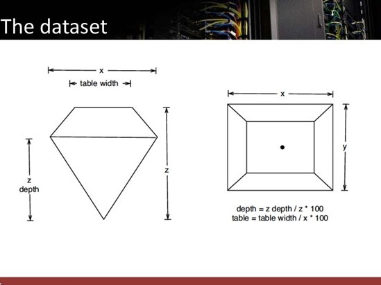
As we can see here, x and y are the length and width of the thickest part of the diamond, whereas table width is the width of the flat surface on the top of the diamond.
Distribution of the price of diamonds
ggplot(diamonds) + geom_histogram(aes(x = price))+ ggtitle("Diamond Price Distribution") + xlab("Diamond Price US$") + ylab("Frequency")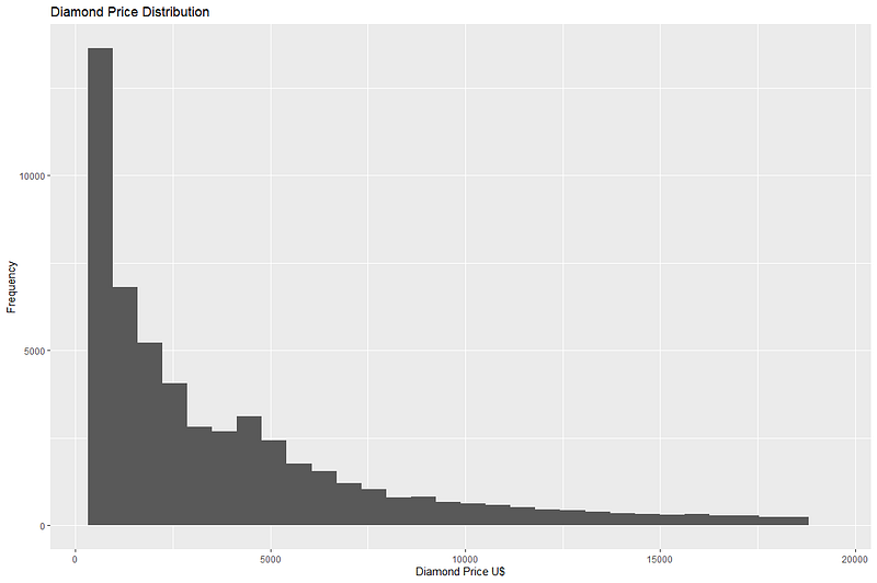
We can see that maximum diamonds in the dataset are priced below 1000 USD. The price range though goes up to nearly 18,000 USD, but the frequency of such expensive diamonds is very low.
Let’s also look at the central tendency of price of diamonds by calculating mean and median.
mean(diamonds$price)
[1] 3932.8
median(diamonds$price)
[1] 2401
Although most diamonds from the dataset are not very expensive, long right tail of the data brings the mean value of price up. In this case, median is perhaps a better indicator of the central tendency of data.
Effect of all the numerical columns on price
Next we start with identifying the numerical columns in the data and calculate correlations amongst them to see if they have any effect on the value of price.
num.Cols <- diamonds[,sapply(diamonds,is.numeric)]
library(corrplot)
corrplot(cor(num.Cols), method = "circle", type = "upper", addCoef.col = "black")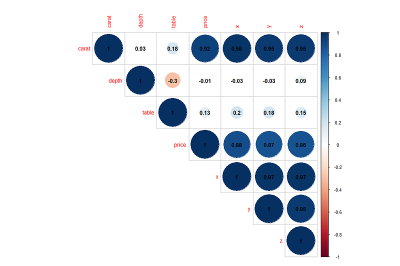
We can draw the following conclusions from the correlation graph above:
- We can see some strong correlations of price with the columns carat, x, y and z. This means that as the value of carat increases, so does the price of diamond. Similarly as the value of x, y or z increases so does the price. What this also means is that bigger diamonds tend to be more expensive.
- Carat also has strong positive correlations with price, x, y and z. This means that bigger diamonds(more x, y and z) generally have more weight in carats.
- Variable depth has a weak negative correlation with table. This means that as the value of depth increases, the value of table decreases.
Study the effects of categorical variables on the price
There are 3 categorical variables in the dataset- Cut, Color and Clarity. Let’s have a look at the effect of these variables on the price of a diamond.
To study the effect of the variable cut, we will create 2 types of plots — Box plots and ridge plots. Both these plots help us understand the distribution of data across different categories.
library(ggridges)
library(viridis)
p1 <- ggplot(diamonds, aes(x = price, y = cut, fill = ..x..)) +
  geom_density_ridges_gradient(scale = 2, rel_min_height = 0.01) +
scale_fill_viridis(option = "A", direction = -1) + ggtitle("Ridge plot showing Price of diamonds by cut")library(tidyverse)
cut_median <- summarise(group_by(diamonds, cut), MD = median(price))
p2 <- ggplot(diamonds) +geom_boxplot(aes(x = cut, y = price, color = cut)) + ggtitle("Price of diamonds by their cut") +
geom_text(data = cut_median, aes(cut, MD, label = MD),
position = position_dodge(width = 0.8), size = 3, vjust = -0.5)ggpubr::ggarrange(p2, p1, nrow = 1, ncol = 2)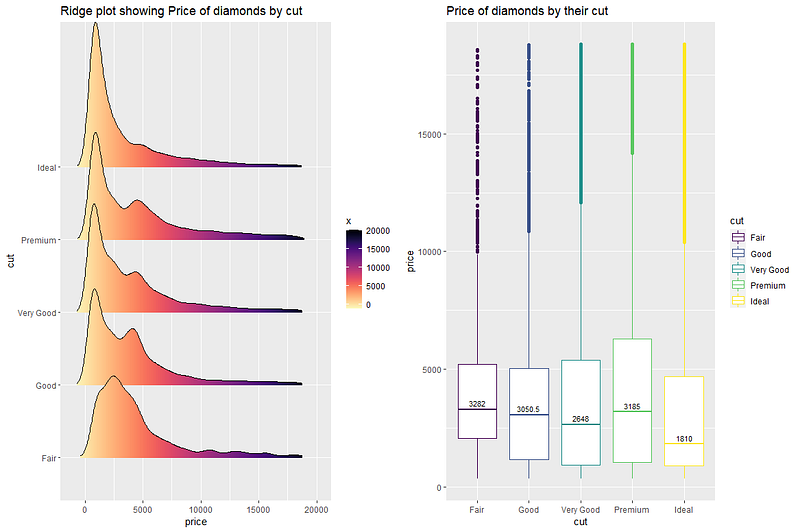
The 2 plots above help us understand the distribution of price for different cuts of diamonds. Fair cut seems to have the maximum median price value. The right skew of all the density plots show that mean price would be higher than the median value.
We can draw a similar plot for price vs color of diamond.
#price vs color
p1<- ggplot(diamonds, aes(x = price, y = color, fill = ..x..)) +
  geom_density_ridges_gradient(scale = 2, rel_min_height = 0.01) +
  scale_fill_viridis(option = "A", direction = -1) + ggtitle("Ridge plot for Price vs Color")
color_median <- summarise(group_by(diamonds, color), MD = median(price))
p2 <- ggplot(diamonds) +geom_boxplot(aes(x = color, y = price, color = color)) + ggtitle("Boxplot of Price vs Color") +
  geom_text(data = color_median, aes(color, MD, label = MD),
            position = position_dodge(width = 0.8), size = 3, vjust = -0.5)
ggpubr::ggarrange(p1, p2, nrow = 1, ncol = 2)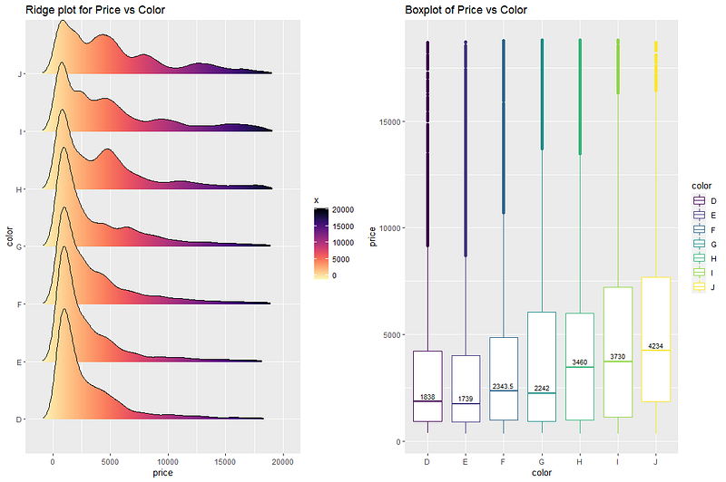
Maximum median price is for the color value ‘J’. Median values show an increasing trend from the color values ‘D’ to ‘J’. Like before, long tail of the ridge plots at the right means that mean prices for the colors are generally higher than the median values.
Similar analysis is done for the variable clarity.
#price vs clarity
p1<- ggplot(diamonds, aes(x = price, y = clarity, fill = ..x..)) +
  geom_density_ridges_gradient(scale = 2, rel_min_height = 0.01) +
  scale_fill_viridis(option = "A", direction = -1) + ggtitle("Ridge plot for Price vs Clarity")
clarity_median <- summarise(group_by(diamonds, clarity), MD = median(price))
p2 <- ggplot(diamonds) +geom_boxplot(aes(x = clarity, y = price, color = clarity)) + ggtitle("Boxplot of Price vs Clarity") +
  geom_text(data = clarity_median, aes(clarity, MD, label = MD),
            position = position_dodge(width = 0.8), size = 3, vjust = -0.5)
ggpubr::ggarrange(p1, p2, nrow = 1, ncol = 2)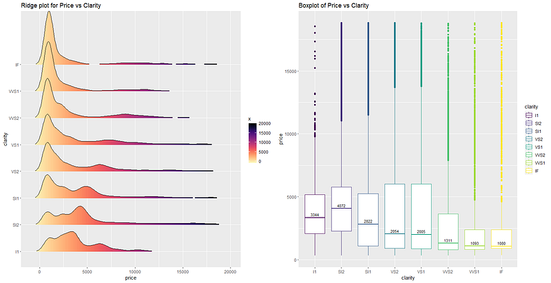
Highest mean price seems to belong to the clarity value ‘SI2’, followed by ‘I1’ and the ‘SI1’. Though there are few outliers, most of the diamonds of ‘IF’ clarity seem to have a low price. . Interestingly, the line ridge plot of ‘SI2’ clarity shows that maximum diamonds of ‘SI2’ clarity has higher price than the other diamonds with different clarity.
Relative importance of features
Lastly, we want to know which factors are considered most important when determining the price of a diamond. Calculating the price of a diamond based on other features of the dataset is an example of a regression problem. Let’s first try to create a linear regression model and see if it fits the data well.
#linear regression price vs all the other variables of the dataset
lmMod <- lm(price~., data=diamonds)
summary(lmMod)
Call:
lm(formula = price ~ ., data = diamonds)Residuals:
Min 1Q Median 3Q Max
-21376.0 -592.4 -183.5 376.4 10694.2Coefficients:
Estimate Std. Error t value Pr(>|t|)
(Intercept) 5753.762 396.630 14.507 < 2e-16 ***
carat 11256.978 48.628 231.494 < 2e-16 ***
cut.L 584.457 22.478 26.001 < 2e-16 ***
cut.Q -301.908 17.994 -16.778 < 2e-16 ***
cut.C 148.035 15.483 9.561 < 2e-16 ***
cut^4 -20.794 12.377 -1.680 0.09294 .
color.L -1952.160 17.342 -112.570 < 2e-16 ***
color.Q -672.054 15.777 -42.597 < 2e-16 ***
color.C -165.283 14.725 -11.225 < 2e-16 ***
color^4 38.195 13.527 2.824 0.00475 **
color^5 -95.793 12.776 -7.498 6.59e-14 ***
color^6 -48.466 11.614 -4.173 3.01e-05 ***
clarity.L 4097.431 30.259 135.414 < 2e-16 ***
clarity.Q -1925.004 28.227 -68.197 < 2e-16 ***
clarity.C 982.205 24.152 40.668 < 2e-16 ***
clarity^4 -364.918 19.285 -18.922 < 2e-16 ***
clarity^5 233.563 15.752 14.828 < 2e-16 ***
clarity^6 6.883 13.715 0.502 0.61575
clarity^7 90.640 12.103 7.489 7.06e-14 ***
depth -63.806 4.535 -14.071 < 2e-16 ***
table -26.474 2.912 -9.092 < 2e-16 ***
x -1008.261 32.898 -30.648 < 2e-16 ***
y 9.609 19.333 0.497 0.61918
z -50.119 33.486 -1.497 0.13448
---
Signif. codes: 0 ‘***’ 0.001 ‘**’ 0.01 ‘*’ 0.05 ‘.’ 0.1 ‘ ’ 1Residual standard error: 1130 on 53916 degrees of freedom
Multiple R-squared: 0.9198, Adjusted R-squared: 0.9198
F-statistic: 2.688e+04 on 23 and 53916 DF, p-value: < 2.2e-16The output of the model shows that residual standard error of the model is 1130 and adjusted R-squared value is 0.9198, which means that this model explains 91% of the price variable well on the basis of the rest of the variables, using linear regression. This is a pretty good performance for the basic model we built here. We can further improve this performance using regularizations, removing insignificant variables from the model or some data processing(taking log of price or combining some categories of the categorical columns).
But for now we are interested in learning about the relative importance of all the features in determining the value of price. This can be done using the library called relaimpo. After building the linear regression model, it is passed as an argument to a function calc.relimp(). This function calculates how important each variable is in contributing towards the calculation of R-squared value(in other words explaining the target variable).
library(relaimpo)
# calculate relative importance
importance <- calc.relimp(lmMod, type = "lmg", rela = F)

# Sort
sort(round(importance$lmg, 3), decreasing=TRUE)
carat     x     y       z      clarity   color     cut   table   depth
0.277 0.204 0.187 0.186 0.039 0.018 0.004 0.003 0.001plot(importance)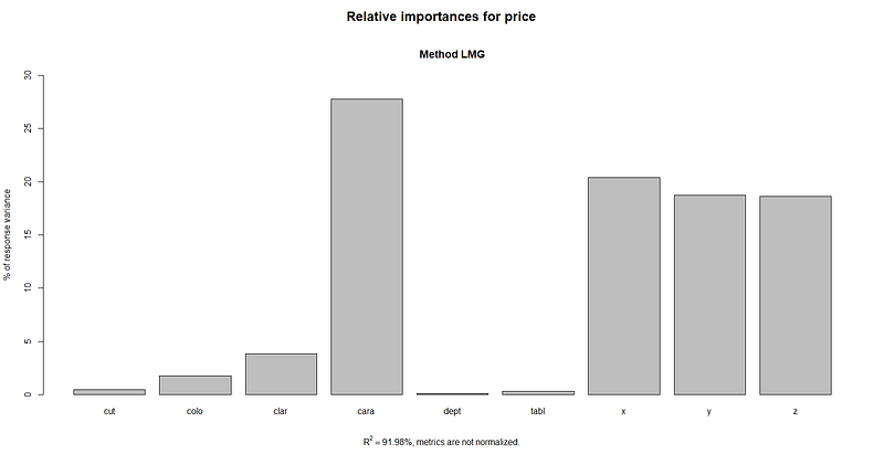
From the output of calc.relimp function and its plot, we can clearly see that carat is the most important variable in determining the price of a diamond. This is followed by the variables x, y, z, clarity, color, and cut, with table and depth variables far behind than the others.
Conclusion
In this article, we performed the exploratory data analysis on the diamonds dataset to understand the patterns hidden behind the numbers. We first divided all the variables into 2 groups - numerical and categorical. We calculated and studied the correlation between all the quantitative variables and found that the target variable price has strong positive correlation with the variables carat, x, y and z.
We also plotted price against all the categorical variables and analyzed their patterns. In the end, we created a linear regression model and calculated relative importance of all the variables in determining the value of price. It can be inferred that the most important factors for determining the price of a diamond are carat, x, y and z in that order. This means that higher the weight(carat) and bigger the size, the more expensive will be the diamond. Superior clarity, color and cut are also determining factors but not as much as the ones mentioned previously. Depth and table variables seem to be the least important factors for determining the price of a diamond.
If you would like to explore the diamonds dataset further, have a look at one of my previous articles here, where I talked about different visualization techniques performed on this dataset. If this article was worth your time, please feel free to clap and follow. If not, please tell me how can I make it better. Connect on linkedin if you like. Keep reading and keep learning!!


