

Data Visualization
Understanding and visualizing data using seaborn library
In the previous posts, we have learned about different data structures in python, reading data from different formats of files and writing data to different formats of file. In this post, we will learn about data visualization to get a deeper understanding of the data.
Python code for analyzing data is available at -https://github.com/arshren/MachineLearning/blob/master/Machine%20Learning%20step%201%20-%20understanding%20data.ipynb

What is data visualization?
Data visualization is presenting data into an appropriate pictorial or graphical form.
for example, if we want to understand how the area of the house has an influence on the price of the house. A scatter plot between the area of the house and price of the house would quickly help us gain the understanding
Why data visualization is useful?
A picture says a thousand words, our brains process pictures and colors better than numbers or text, so when we see the data related to area of the house and its prices we take time to process the information and come to a conclusion however when we have a scatter plot, with just one look we are able to understand the relationship, identify trends and also spot the outliers.
This visualization of data becomes all the more important when we have huge datasets. It is difficult for human brain to analyze the huge data without any pictorial representation and that’s when data visualization comes to our rescue
Where all can we use data visualization techniques?
- To comprehend the data easily
- Identify relationships and patterns
- Checks for emerging trends from the data
- Helps create a story from the data and communicate to stakeholders
Here we will take the titanic dataset available at Kaggel to analyze the data , learn data visualization to get a deeper understanding, The goal of the train dataset is to learn if the passenger survived based on the features provided in the data set
Titanic dataset is available here -https://www.kaggle.com/c/titanic
First we will install seaborn by going to Anaconda prompt if you already haven’t installed it earlier
pip install seabornonce we have installed seaborn we will import all the required libraries. %matplotlib inline will show output of the plotting commands inline with in the Jupyter notebook
import numpy as np
import pandas as pd
import matplotlib.pyplot as plt
import seaborn as sns
%matplotlib inline
we will now read the data from the downloaded dataset. and we will use the training dataset — train.csv
For more details on reading from a different formats of file and writing to different formats of file follow my post — https://readmedium.com/python-reading-and-writing-data-from-files-d3b70441416e
To get a good understanding of the data refer to my post https://readmedium.com/machine-learning-understanding-data-dfef261d833b
I have downloaded my dataset in my default jupyter folder
data_set = pd.read_csv("train.csv")let’s visualize the data and see if we can then find the right features that impacts the passenger’s survival rate.
Let’s understand the various data visualization options available to is
What are common types of data visualization in Python?
Scatter Plot — a cloud of points showing a joint distribution of two numerical variables where each point represents an observation from the dataset. Helps to understand the relationship between two numerical variables
Distribution plot — compares range and distribution for groups of numerical data
Histogram — used for graphical representation of numeric data
Bar graph — used for graphical representation of categorical data
Box Plot — shows distribution of quantitative or categorical data in a way that helps comparison between variables or across the categorical variable.
Box shows quartiles of the dataset.
The whiskers extend to show the remaining of the distribution except for points determined to be outliers using the interquartile range function
Kernel density estimation(KDE) plot — plots a smooth curve shape of the distribution. It is a nonparametric estimation of density where inferences about the population is made from the finite data sample
Violin plot — combines KDE with box plots. In the interior of the violin we can show the individual observation or summary of the distribution
Factor plot — helps build conditional plots like when data is segmented by one or more variable along with the factor variable
Pair plot — helps show interaction between two variables at a time. Takes two variables at a time from the dataset and shows the relationship
Heat map — is a graphical representation where colors are used in the similar way bar charts uses heights. In other words it uses color-coding to represent different values. Heat map uses warm to cool color spectrum.
Now let’s dive into visualizing the Titanic dataset
Let’s view all the features of the dataset by printing just 3 rows from the dataset
data_set.head(3)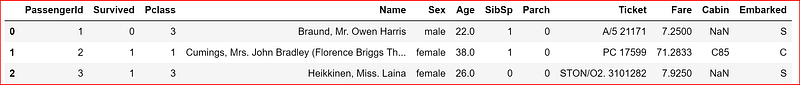
Here our target variable is Survived column which indicates if the passenger survived or not in the Titanic crash.
Our aim here is to identify the key feature that will be helpful to predict if a passenger survived or not based on the training data.
we will visualize the relationship between different variables with respect to Survived column and understand the distribution of data and their relationships.
we create two datasets -numeric_data dataset one for all numeric data along with the Survived target column
category_data for categorical data and then we have data_set for all the features
numeric_data = data_set.iloc[:,[0,1,5,9,12]]
numeric_data.head(3)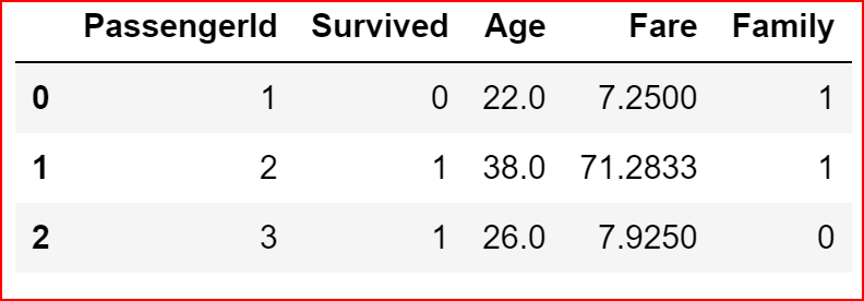
category_data=data_set.iloc[:,[2,3,4,8,10,11]]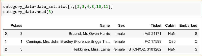
we start with pairplot which plots pairwise relationship for all the numeric variables within the dataset
It helps get a quick visualization of the entire dataset and we set any categorical variable to hue. Since we want to understand how each feature impacts survival of a passenger we have set hue to ‘Survived’ column in the data set
Different values of Survived column i.e.; survived and not survived data will come if different colors
sns.pairplot(numeric_data.dropna(), hue='Survived')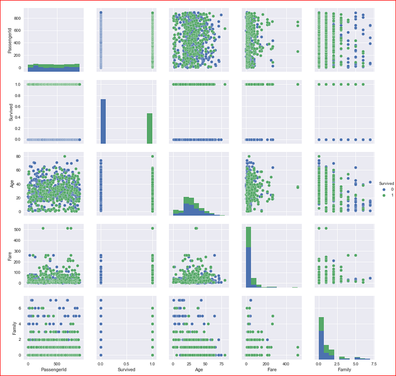
Now let’s understand the data distribution of different features and start with numeric features
we will plot the distribution of data for Age using distplot().
For Age we have some null values so we are dropping them before plotting the data
sns.distplot(numeric_data['Age'].dropna())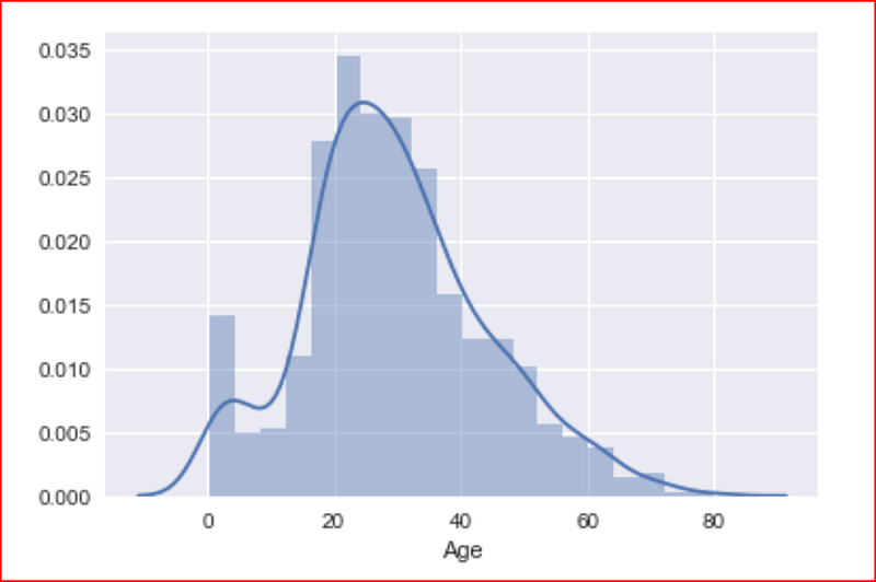
This plot tells us that majority of the passengers were young and most of them were around the age 20–40 and we had some very young children also on the ship as well as some passengers were 70–80 years old.
distplot() is used for plotting a single or univariate variable. Here we are plotting Fare and dividing into 10 different bins and we do not want the kernel density estimation graph, so we are setting kde to false and we get a histogram
sns.distplot(numeric_data['Fare'], bins =6, kde= False)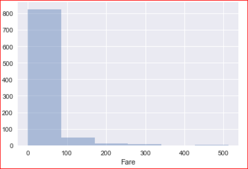
Here we see that even though we have 3 classes we have at least 5 different fares and majority of the passenger paid less than $100 and very few of them paid more $100. the max fare range is upto $500
plotting distribution for number of family members
sns.distplot(numeric_data['Family'], kde=False)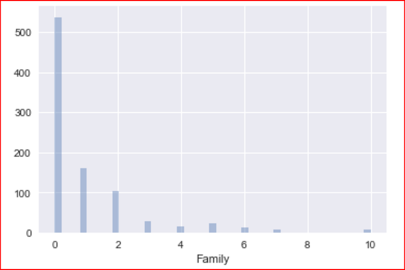
We have now covered all numeric variables so let’s dive into categorical variables
when we look at the categorical data, we realize that Name and Ticket number do not have any impact on chances of survival of a passenger, so we drop these columns
category_data = category_data.iloc[:,[0,2,4,5]]
category_data.head(3)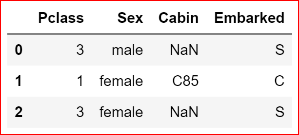
we now try to understand the distribution of data for the sex(gender), how many males and how many females do we have in the dataset with respect to their survival
plt.figure(figsize=(5,5))
sns.countplot(data=data_set, x="Sex", hue='Survived')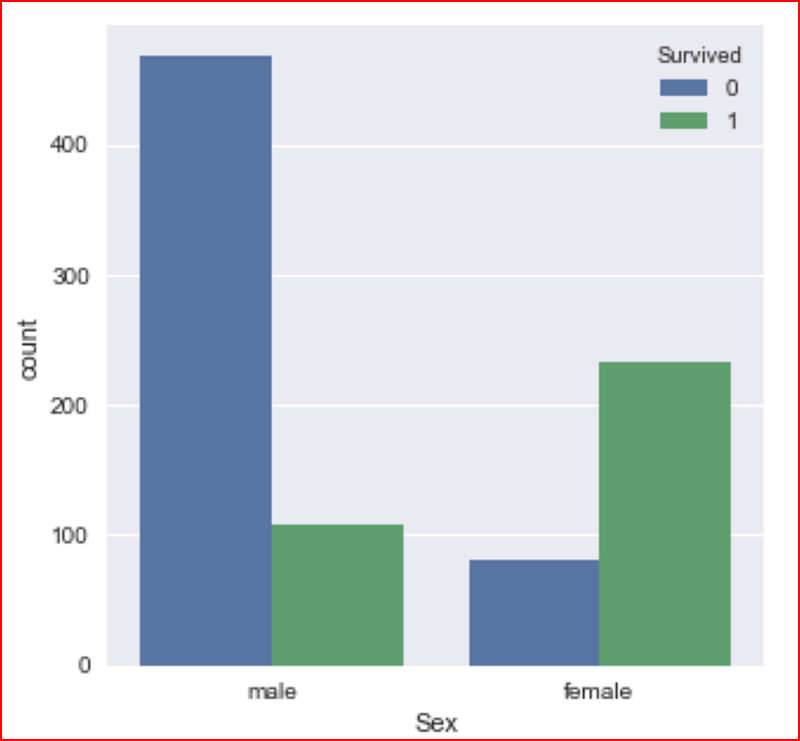
checking if Pclass had an impact on survival
sns.countplot(data=data_set, x="Pclass", hue='Survived')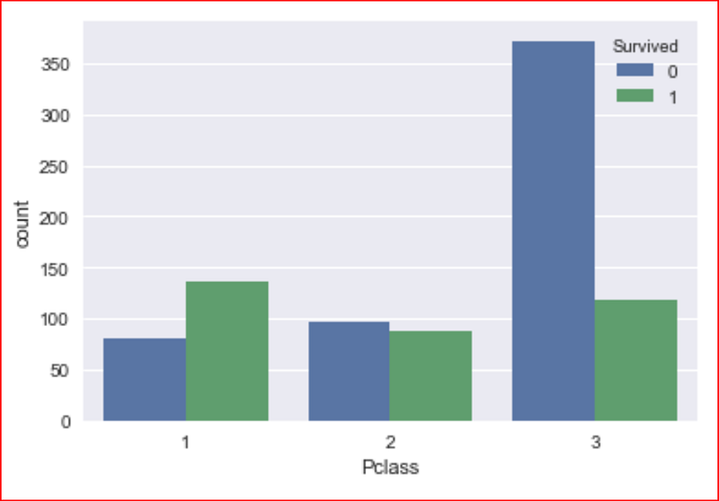
First class passenger survived more than second and third class passengers
our last categorical variable is the port of embarkment
sns.countplot(data=data_set, x="Embarked", hue='Survived')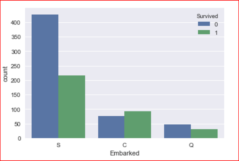
Does the port of embarkation has any significance with Pclass. let’s find out by visualizing the data
sns.countplot(data=data_set, x="Embarked", hue='Pclass')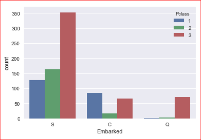
Let’s visualize the age and sex features impact on passengers survival chances
sns.boxplot(data=data_set, x=’Age’, y=’Sex’, hue =’Survived’)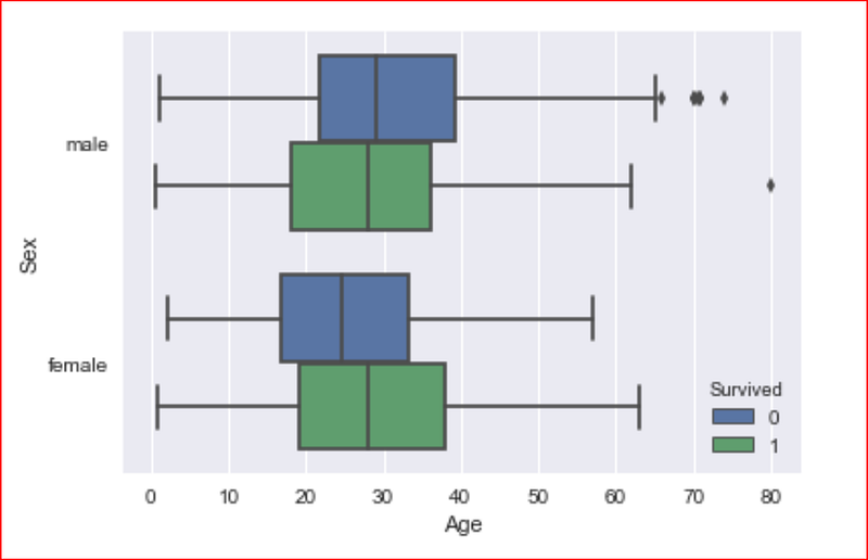
we now use jointplot, which allows us to combine distribution for two variables.
in jointplot, we will get the distribution of data variables specified in x and y from dataset specified in data attribute. In the middle it shows a scatter plot by default
sns.jointplot(x= 'Age',y='Fare', data= data_set)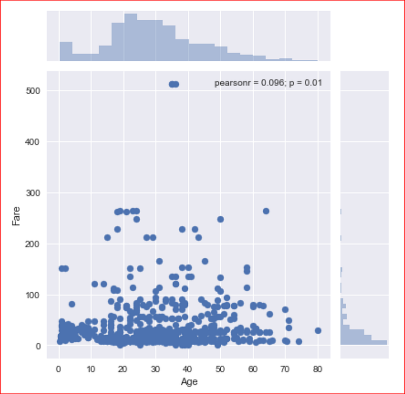
This plot tells us that most of the passengers fare less than $100.
Finally we plot the heatmap by using the correlation for the dataset
sns.heatmap(data_set.corr(), annot=True)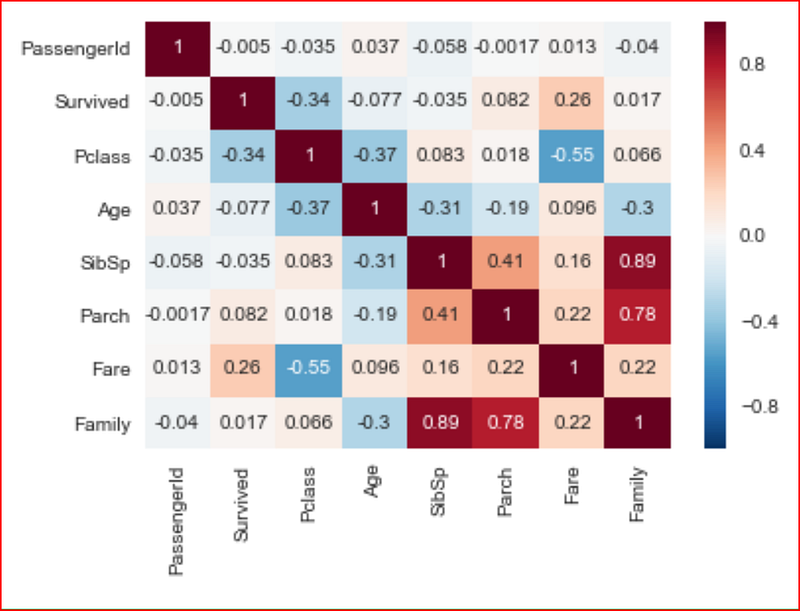
Now that we have a better understanding of the features with respect to survival of the passenger, we will now go and clean the data and get ready for our next step


