
Create a Cell by Stacking Subviews
Build an App Like Lego, with SwiftUI — Tutorial 14
In SwiftUI, we can build a view from subview components by dragging them from a library, so that they click into place vertically and horizontally, like Lego® blocks.
In this Tutorial 14, we will add text subviews, a button, and a resizing image.
In the previous Tutorial 13, we finished connecting the news Article model instances with the NewsCells in the News scene. Now we will build a ProductCell for our Products scene.
We will pick up here where the last tutorial left off. Ideally, you have completed the previous tutorials in this series. Or, you can download the prepared project, ready to start this tutorial.
2. Product Cell
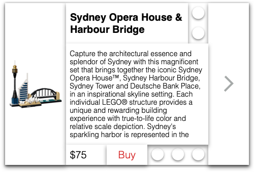
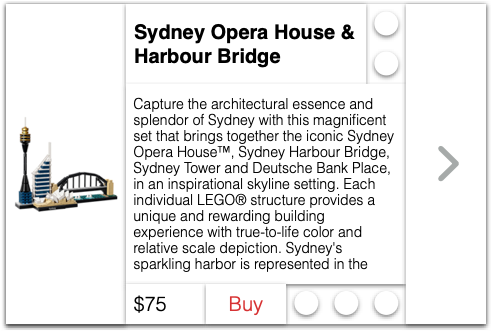
We’re going to create a product cell to show the image, name description, and price of a product, along with a button to buy it. We will assemble the Lego® blocks like this:
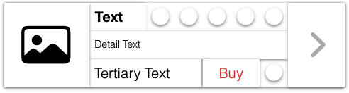
The layout above shows placeholders for the image and text blocks, which we will be able to replace for each different instance. For example, to sell the Sydney Harbour Bridge, we could substitute the image and text blocks as shown below.
👉 In Xcode’s File menu, select New > File. Choose theSwiftUI View template, and name it ProductCell.swift.
👉 If the preview is not appearing, press the Resume button in the top right of the preview pane.
3. Text Attributes
Now we will style the text subview using the Attributes inspector.
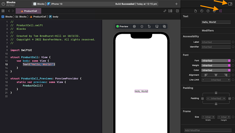
👉 Click on Hello, World! in the code or in the preview, to select it.
👉 Ensure that the Attributes inspector panel is visible on the right. If not, click on the Show Inspectors and the Show Attributes inspector buttons in the top right (as shown below).
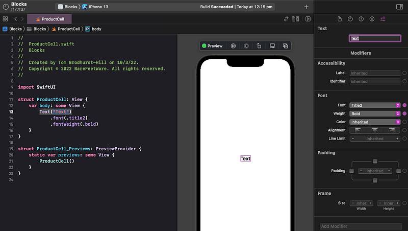
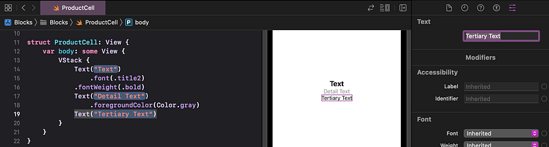
👉 In the Attributes inspector, change the text to be just the word Text. Hit return. Set the Font to Title 2. Set the Font Weight to Bold.
🐞 You might need to first select Title, to prompt Xcode to also list Title 2.
👁 Check that your code, preview, and Attributes inspector appear as below.
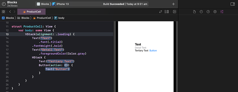
4. Add Subviews in a Vertical Stack
Let’s add the other Lego blocks (subviews) to our view.
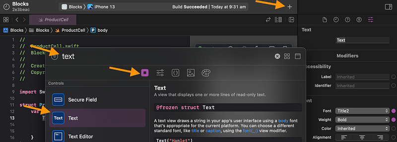
👉 Click on the Library button (the + symbol) above the top right of the preview pane.
👉 The Library appears. Ensure that the Views tab is selected. Type the word text into the search bar. Select the Text item in the list, as shown below.
👉 Drag the Text item from the Library into the preview, just below the existing Text subview (Lego block).
👁 As shown below, Xcode shows where the new subview will be positioned, like one Lego block below the other.
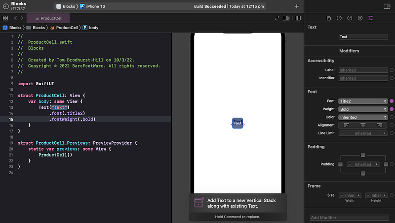
👁 In the code, Xcode adds a VStack (vertical stack) containing the original Text and the new Placeholder text.
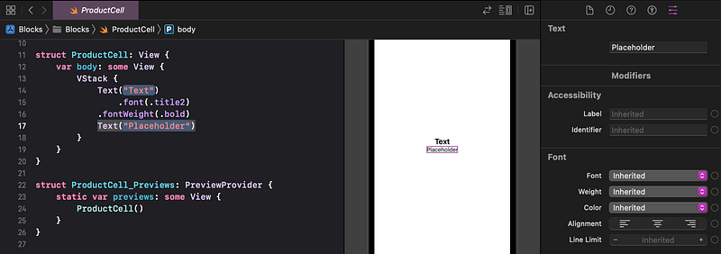
👉 In the preview, click on the new Placeholder text subview, so that you can see its attributes.
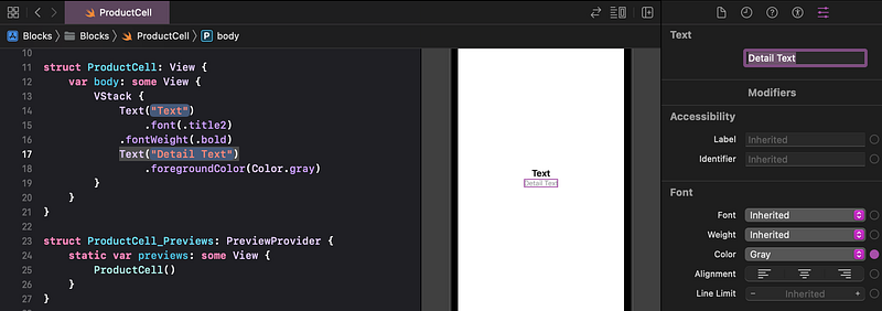
👉 In the Attributes inspector, change the new text subview to contain the words Detail Text. Hit return so Xcode applies the change. Change the Color to Gray.
👉 Again from the Views Library, drag in a third text subview, just below the Detail Text. Before you release the dragged object, ensure that the caption at the bottom says Insert Text in Vertical Stack. If it instead says Add Text to a new Vertical Stack... then you need to move the pointer up a few pixels until the caption changes.
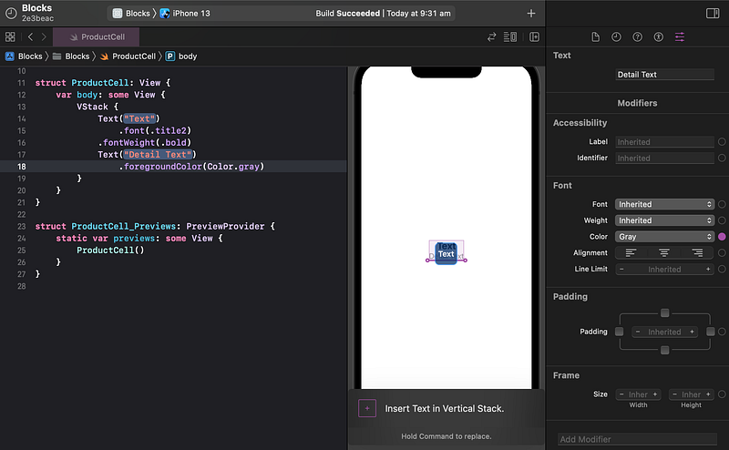
👁 Check that your code appears as shown below, with all three Text subviews in just one VStack. Otherwise, undo and try again.
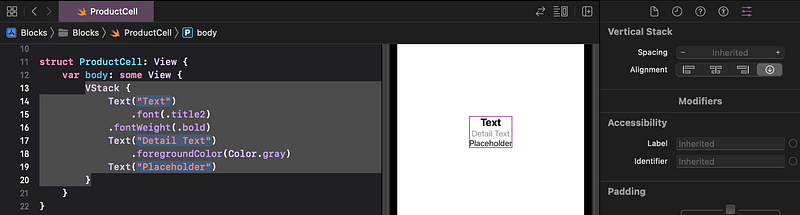
👉 In the preview, click once on the new Placeholder text subview. In the Attributes inspector, change the words to Tertiary Text and hit return.
5. Vertical Stack Alignment
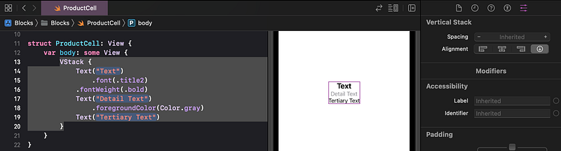
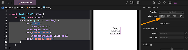
Our vertical stack contains the three text subviews, stacked like Lego® blocks. A VStack defaults to center aligning its subviews, but we want this VStack to align them against the leading edge (the left edge in English systems).
👉 In the preview, select the VStack, by clicking just to the left or right of the Text subview. Alternatively, click in the white space away from the text subviews, then once anywhere on the text subviews.
👁 Confirm that Xcode shows the VStack selected in the code, preview and Attributes inspector, as shown below.
👉 In the Attributes inspector, next to Alignment, click on the leading (first) icon.
6. Add a Subview in a Horizontal Stack
👉 Show the Views Library again, but this time locate the Button item (at the top of the list). Drag Button into the preview to the right of the Tertiary Text. Ensure that the insertion bar shows only to the right of the Tertiary Text and not all of the text subviews.
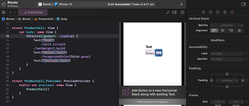
👁 Xcode creates an HStack (horizontal stack), containing the Tertiary Text and the Button side by side.
7. Add a Stretching Image in a Horizontal Stack
👉 Click the + button again to show the Library. Click on the Media Library tab to show the image assets that are available in our project.
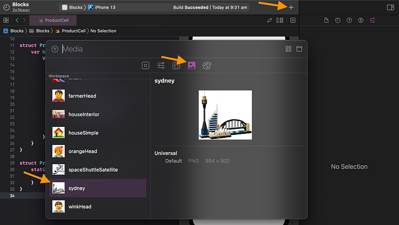
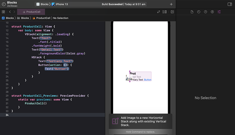
👉 Drag the Sydney image to the left of the text subviews. This time, ensure that the insertion bar appears next to all the text subviews, as shown below.
🐞 We could have instead dragged Image from the Views Library, but it defaults to using Image("Image Name"). Since the file name "Image Name" is not in our project, the preview would show nothing, making it difficult to select.
👁 The image loads but is so huge that we can barely see it on the iPhone screen. It also pushes all of the other content off-screen.
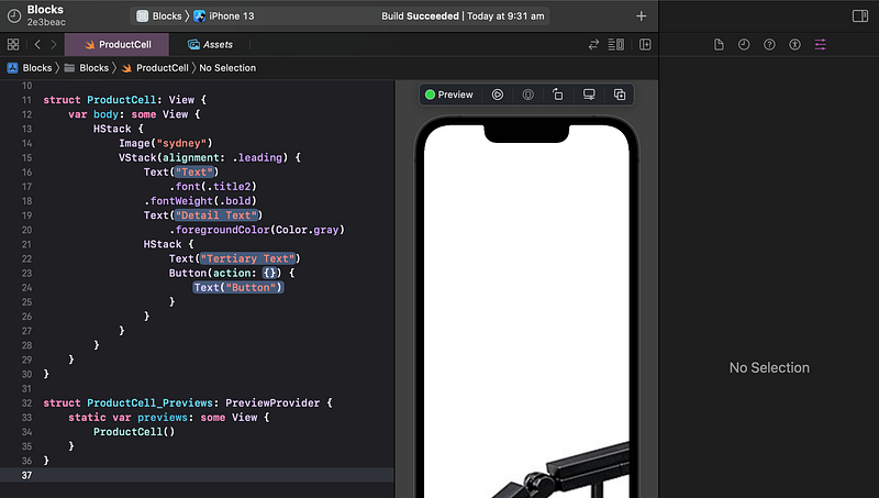
We need to restrict the image to be 60 points wide, make it stretch/shrink to fit, and keep its aspect ratio.
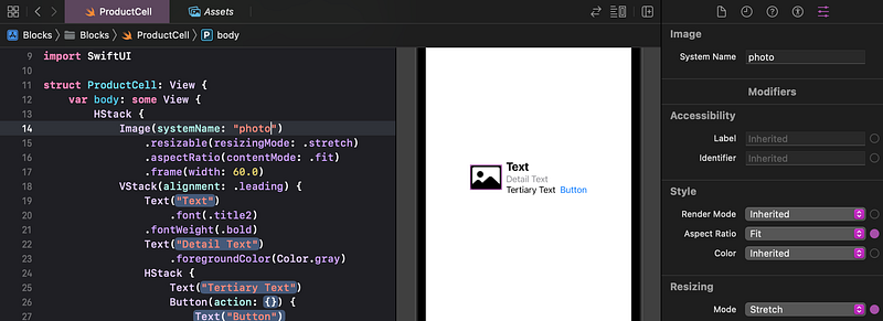
👉 In the code, click on the Image("sydney") line of code.
👉 In the Attributes inspector, set the Frame Width to 60, and hit return.
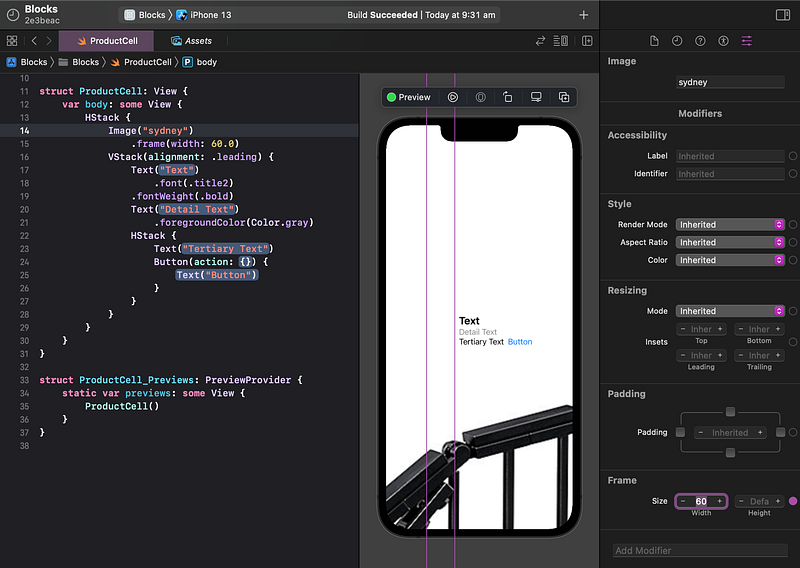
👁 As you can see by the tall rectangular outline, the image is now restricted to a width of 60 points, allowing room for the rest of the content to appear again. However, the image content is drawing beyond its frame.
We need to restrict the image to shrink/stretch to only fill its frame.
👉 In the Attributes inspector, set the Resizing Mode to Stretch
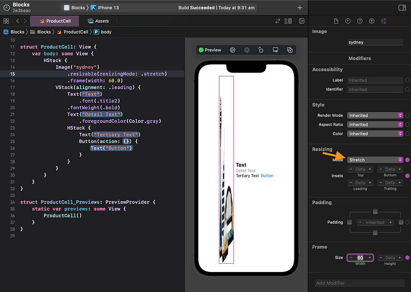
👁 The image is now stretching to fit its frame, but it is distorted — not stretching vertically by the same proportion as horizontally.
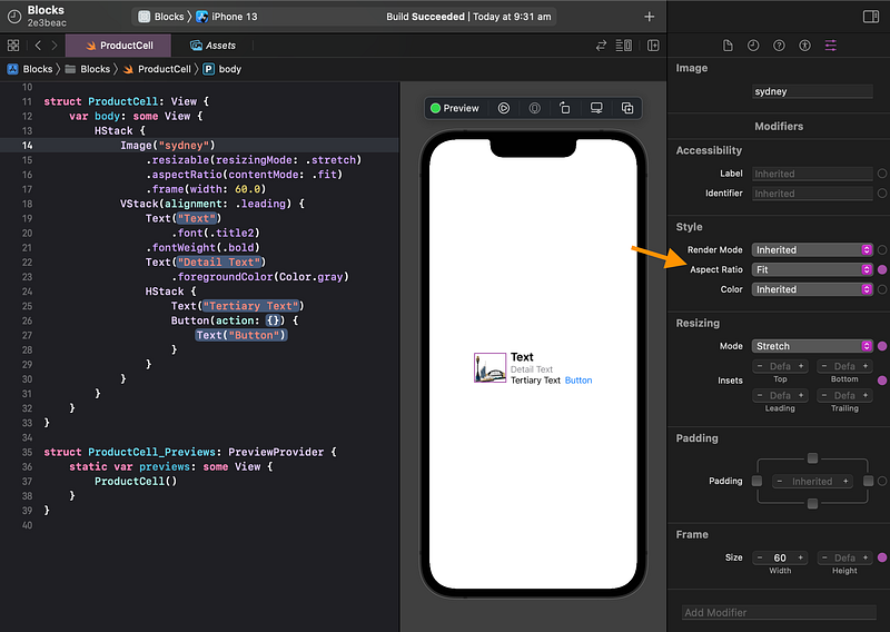
We can fix the vertical/horizontal distortion by setting the aspect ratio to fit.
👉 In the Attributes inspector, set the Aspect Ratio to Fit.
8. Image Symbol
Since the Library only facilitates adding an Image that uses an asset file, we used the Sydney image as a placeholder. However, it would be better to show something more general, like the “photo” system image. As we discussed earlier in Tutorial 6, SwiftUI provides thousands of “SF Symbol” icons, including one called “photo”.
👉 In the code, after Image, select ("Sydney"). Delete it and type an opening parenthesis again. Xcode shows a popup list of autocomplete options. Scroll down to the Image(systemName:) option and select it.
🐞 If you don’t see the systemName option, scroll down or start typing it until it appears.
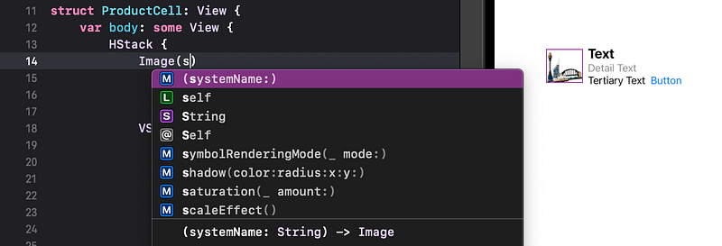
👁 Xcode enters Image(systemName: String), with theString placeholder selected.
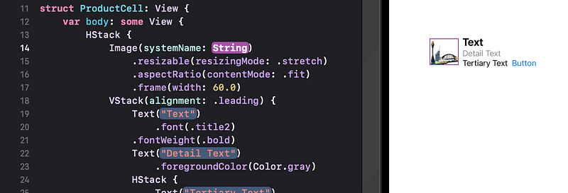
👉 Replace String with "photo".
👁 Xcode shows the photo icon, as the placeholder image in our cell.
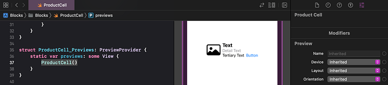
9. Preview Size That Fits
The ProductCell layout is looking pretty good now.
The preview is showing on a full-screen iPhone. This view is intended to be just part of a full scene, so it makes more sense to show a preview of just the size that fits the content.
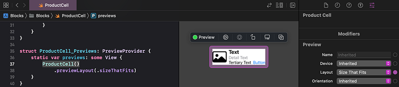
👉 Click anywhere in the white space of the preview, outside of the subviews that we’ve added.
👉 In the Attributes inspector, set the Preview Layout to Size That Fits.
🐞 We could have set the preview layout to Size That Fits at the very beginning, before adding the subviews. This would have made it a bit easier to manage. Unfortunately, Xcode (up to at least version 12.5) doesn’t allow us to drag subviews in to add an outer VStack or HStack, without the extra space on the outside. So, we deferred resizing the preview until after that was done.
10. Change the Button Title
The button is currently displaying the default title Button. Let’s change it to Buy to match our design.
👉 In the preview, click once on the Button.
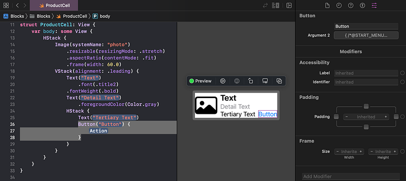
👉 In the Attributes inspector, under the Button heading, change the title from Button to Buy, and hit return.
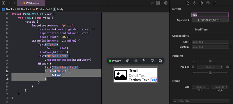
👁 Check that your code and preview appear as shown above.
11. Commit Changes
As you’ve done before:
- 👉 Choose
Commitfrom theSource Controlmenu. - 👉 Enter a description such as:
ProductCell - 👉 Click on the
Commitbutton.
12. Next…
We have created a ProductCell, including subviews for text, an image and a button.
In Tutorial 15 we will create a Product model, some mock products and show them in a list in the app.
See upcoming tutorials in the table of contents. Follow the author to be notified of more articles. If you liked this article, clap for it (up to 50 times).
💬 If you have any questions or comments, please add a response below.
This series is released via Next Level Swift. Subscribe to keep updated and never miss a new Tutorial of this series!

We are always looking for talented and passionate Swift developers! Feel free to check out our writer’s section and find out how you can share your knowledge with the Next Level Swift Community!