
Chapter 9: Box Model Dimensions
A Complete Frontend Developer Textbook for Beginners (2023 Edition)

This is the textbook version of Lesson 9 of 100 from the Udemy video course: A Complete Frontend Developer Course for Beginners
Overview
This lesson covers the following HTML tags, CSS properties, and JavaScript commands for the first time:
HTML
None.
CSS
JS
- window.innerWidth
- window.innerHeight
- window.getComputedStyle().width
- window.getComputedStyle().height
- document.querySelector(“header”).clientWidth
- document.querySelector(“header”).clientHeight
- document.querySelector(“header”).offsetWidth
- document.querySelector(“header”).offsetHeight
- document.querySelector(“header”).scrollWidth
- document.querySelector(“header”).scrollHeight
This lesson begins with this Codepen. Code along with me to increase retention!
Lecture
We now know that every element has a box around it.
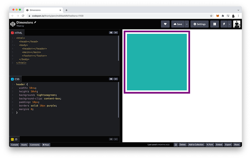
In this example, the header element has a content area which is 50vw by 50vh (light green area):
header {
 width: 50vw;
 height: 50vh;
 background: lightseagreen;
 background-clip: content-box;
}
Its padding is 10px (white area).
header {
 width: 50vw;
 height: 50vh;
 background: lightseagreen;
background-clip: content-box; padding: 10px;
}Its border is also 10px (purple area).
header {
 width: 50vw;
 height: 50vh;
 background: lightseagreen;
background-clip: content-box; padding: 10px;
border: solid 10px purple;
}And its margin is 0:
header {
 width: 50vw;
 height: 50vh;
 background: lightseagreen;
background-clip: content-box; padding: 10px;
border: solid 10px purple;
margin: 0;
}We also know that the dimensions of the content area are known as the width and the height:
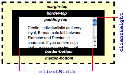
content: width x heightIf we include the padding, the dimensions are known as the clientWidth and the clientHeight:
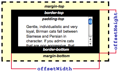
content + padding: clientWidth x clientHeightAnd if we also include the border, the dimensions are known as the offsetWidth and the offsetHeight:
content + padding + border: offsetWidth x offsetHeightTo better understand these different dimensions, let’s calculate their exact sizes in pixels.
width x height
The header width is 50vw which is 50% of the viewport width:
header width = 50% of viewport widthTo get the viewport width, we can use JavaScript and write:
window.innerWidthTo see the result, let’s log it to the Console:
console.log(window.innerWidth)Thus, my viewport width is 610 pixels:
Console Window:610
Yours might not be the same as mine because your viewport size is most likely different from mine!
Therefore, my header width is half of that which is 305 pixels:
header width = 50% x 610 = 305Alternatively, we can also get the width of the header directly using this command:
window.getComputedStyle().widthThen, inside the parentheses, select the header element:
window.getComputedStyle(document.querySelector("header")).widthLikewise, the header height is 50vh which is 50% of the viewport height:
header height = 50% of viewport heightTo get the viewport height, we can write:
console.log(window.innerHeight)Thus, my viewport height is 365 pixels:
Console Window:365
Therefore, my header height is half of that which is 183 pixels:
header height = 50% x 365 = 182.5 ≈ 183Remember: a pixel is the smallest dot on a computer screen, so it’s not possible to have half a pixel.
Alternatively, we can also get the height of the header directly using this command:
window.getComputedStyle().heightThen, inside the parentheses, select the header element:
window.getComputedStyle(document.querySelector("header")).heightclientWidth x clientHeight
Again, the clientWidth and the clientHeight are equal to the content plus the padding:
clientWidth = width + padding
clientHeight = height + padding
If the width is 305px and the padding is 10px, what is the clientWidth?
It is 305 plus the padding on the right, and the padding on the left, so:
clientWidth: 305 + 10 + 10 = 325pxWe can check this by first selecting the header:
document.querySelector(“header”)Then add:
document.querySelector(“header”).clientWidthTo see the result, let’s log it to the Console:
console.log(document.querySelector("header").clientWidth)There it is:
Console Window:325
Likewise, if the height is 183px and the padding is 10px, what is the clientHeight?
It is 183 plus the padding on the top, and the padding on the bottom, so:
clientHeight: 183 + 10 + 10 = 203pxSimilarly, to check this, we can write
console.log(document.querySelector(“header”).clientHeight)And there it is:
Console Window:203
offsetWidth x offsetHeight
Again, the offsetWidth and the offsetHeight are equal to the content plus the padding plus the border:
offsetWidth = width + padding + border
offsetHeight = height + padding + border
Since content plus padding is equal to the client dimensions, another way to calculate the offset dimensions is:
offsetWidth = clientWidth + border
offsetHeight = clientHeight + border
If the clientWidth is 325px and the border is 10px, what is the offsetWidth?
It is 325 plus the border on the right, and the border on the left, so:
offsetWidth: 325 + 10 + 10 = 345pxTo check this, we can write:
console.log(document.querySelector(“header”).offsetWidth)There it is:
Console Window:345
Likewise, if the clientHeight is 203px , what is the offsetHeight?
It is 203 plus the border on the top, and the border on the bottom, so:
offsetHeight: 203 + 10 + 10 = 223pxSimilarly, to check this, we can write:
console.log(document.querySelector(“header”).offsetHeight)And there it is:
Console Window:223
The finished Codepen:
scrollWidth x scrollHeight
Now let’s suppose that our header has a nav element as a child:
<html>
 <head></head>
 <body>
  <header>
   <nav></nav>
  </header>
  <main></main>
  <footer></footer>
 </body>
</html>
What if its width is 400px, its height is 300px, and its background is lightskyblue:
nav {
 width: 400px;
 height: 300px;
 background: lightskyblue;
}
As you can see, the child element is larger than its parent:
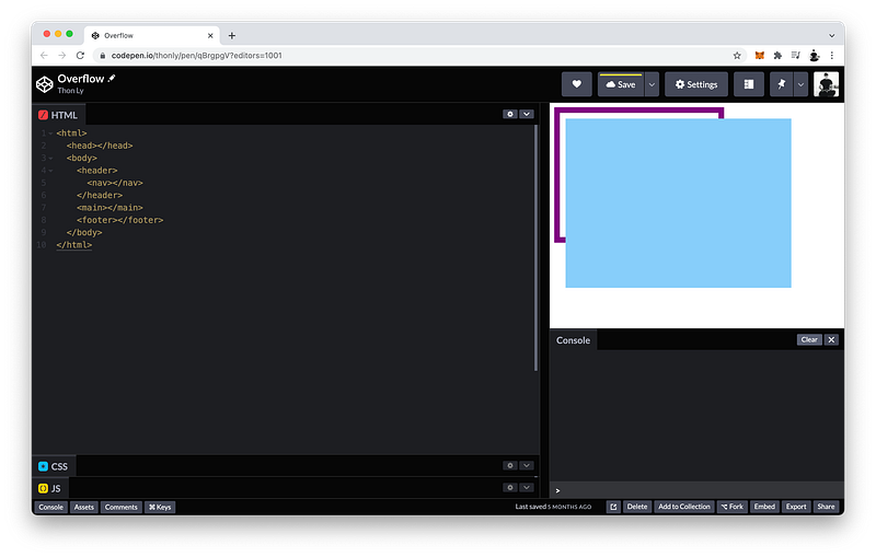
When this happens, we say the child element overflows.
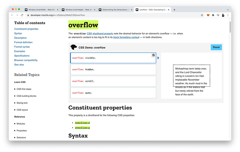
We can control how the child element overflows by using the overflow property on the parent.
By default, its value is visible:
header {
 overflow: visible;
}
If we like, we can make it hidden:
header {
 overflow: hidden;
}
And of course, we can also make it scrollable:
header {
 overflow: scroll;
}
We can now scroll: Up and Down. Right and Left.
If we want to, we can make it scrollable in only one direction. If we only want up and down, which is along the y-axis, set:
- overflow-y to
scroll - and overflow-x to
hidden
header {
 overflow-y: scroll;
 overflow-x: hidden;
}
If we only want right and left, which is along the x-axis, set:
- overflow-x to
scroll - and overflow-y to
hidden
header {
 overflow-y: hidden;
 overflow-x: scroll;
}
We can also determine the dimensions of the overflowed content.
To get the overflowed width, we can write:
console.log(document.querySelector(“header”).scrollWidth)It is 410 pixels because the nav is 400px plus the 10px padding on the left (of the parent).
To get the overflowed height, we can write:
console.log(document.querySelector(“header”).scrollHeight)It is 320 pixels because the nav is 300px plus the 10px padding on the top, and the 10px padding on the bottom (of the parent).
Note that regarding the child element, the scrollWidth and scrollHeight are the summation of:
scrollWidth = width + padding + border + margin
scrollHeight = height + padding + border + margin
Which are equivalent to:
scrollWidth = offsetWidth + margin
scrollHeight = offsetHeight + margin
The finished Codepen:
Summary
In this lesson, we learned how to get the exact width and height of the viewport using JavaScript.
To get the viewport width, we use:
viewport width = window.innerWidth
To get the viewport height, we use:
viewport height = window.innerHeight
Therefore, the dimensions of the viewport are:
viewport = innerWidth x innerHeightWe also learned how to determine four different types of dimensions of every element.
The CSS width and height determines the dimensions of the content area:
content = width x heightTo get the dimensions of the content area (of an element) using JavaScript:
width = window.getComputedStyle(element).width
height = window.getComputedStyle(element).height
If we include the paddings on both sides:
We would get the clientWidth and the clientHeight:
content + padding = clientWidth x clientHeightIf we also include the borders on both sides:
We would get the offsetWidth and the offsetHeight:
content + padding + border = offsetWidth x offsetHeightWhen the child element is larger than its parent, the child element overflows and is visible by default on the parent element.
If we want, we can choose to hide the overflowed element:
overflow: hidden;Of course, we can make the parent element scrollable instead:
overflow: scroll;Using overflow-x and overflow-y, we can even control what axis is scrollable:
overflow-x: scroll;
overflow-y: hidden;
To determine the dimensions of the overflowed element, we can use JavaScript on the parent element to get the scrollWidth and the scrollHeight:
[parentElement].scrollWidth
[parentElement].scrollHeight
Therefore, the dimensions of the overflowed element are:
overflowed element = scrollWidth x scrollHeightWhich is equivalent to:
overflowed element = content + padding + border + marginTo summarize the four types of dimensions of every element vis-à-vis the Box Model:
- content =
widthxheight - content + padding =
clientWidthxclientHeight - content + padding + border =
offsetWidthxoffsetHeight - content + padding + border + margin =
scrollWidthxscrollHeight
Concept Quiz
Take my Programming Concept Quiz to check your understanding! For every correct choice, you will earn SW Coins which you can redeem for coupons towards the purchase of any of my Udemy courses!
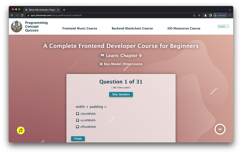
Sample Quiz Questions for Lesson 9:
Question 1:
width + padding =
- offsetWidth
- clientWidth
- scrollWidth
Question 2:
height + padding =
- offsetHeight
- clientHeight
- scrollHeight
Question 3:
clientWidth + border =
- offsetWidth
- clientWidth
- scrollWidth
Question 4:
clientHeight + border =
- offsetHeight
- clientHeight
- scrollHeight
Question 5:
height + padding = offsetHeight
- True
- False
Question 6:
height + padding + border = offsetHeight
- True
- False
Question 7:
width + padding + border = clientWidth + border
- True
- False
Question 8:
height + padding + border + margin = scrollHeight
- True
- False
Question 9:
offsetWidth + margin = scrollWidth
- True
- False
Question 10:
innerWidth and innerHeight form the dimensions of:
- viewport
- content area
content + paddingcontent + padding + bordercontent + padding + border + margin
Question 11:
The CSS width and height form the dimensions of:
- viewport
- content area
content + paddingcontent + padding + bordercontent + padding + border + margin
Question 12:
The clientWidth and clientHeight form the dimensions of:
- viewport
- content area
content + paddingcontent + padding + bordercontent + padding + border + margin
Question 13:
The offsetWidth and offsetHeight form the dimensions of:
- viewport
- content area
content + paddingcontent + padding + bordercontent + padding + border + margin
Question 14:
The scrollWidth and scrollHeight form the dimensions of:
- viewport
- content area
content + paddingcontent + padding + bordercontent + padding + border + margin
Question 15:
It is possible to have fractions of a pixel.
- True
- False
Question 16:
The viewport width is 100px. The width is 50vw. What is the width in pixels?
- 100px
- 50px
- 30px
Question 17:
The viewport height is 100px. The height is 35vh. What is the height in pixels?
- 100px
- 35px
- 70px
Question 18:
The width is 100px. The padding is 10px on all sides. What is the clientWidth?
- 100px
- 110px
- 120px
Question 19:
The height is 50px. The padding is 5px on all sides. What is the clientHeight?
- 50px
- 55px
- 60px
Question 20:
The clientWidth is 100px. The border is 10px on all sides. What is the offsetWidth?
- 100px
- 110px
- 120px
Question 21:
The clientHeight is 50px. The border is 5px on all sides. What is the offsetHeight?
- 50px
- 55px
- 60px
Question 22:
The width is 100px. The padding is 5px on all sides. The border is 10px on all sides. What is the offsetWidth?
- 100px
- 110px
- 120px
- 130px
Question 23:
The viewport height is 100px. The height is 50vh. The padding is 10px on all sides. The border is 5px on all sides. What is the offsetHeight?
- 50px
- 60px
- 70px
- 80px
- 90px
- 100px
Question 24:
An overflow occurs when:
- The parent is larger than its child.
- The child is larger than its parent.
Question 25:
We use the overflow property on the parent to control the overflow of the child.
- True
- False
Question 26:
Which is NOT an option for the overflow value?
- visible
- hidden
- scrollable
- scroll
Question 27:
To make the parent scrollable in the x direction, we use:
- scroll
- overflow-x
- overflow-y
Question 28:
To make the parent scrollable along the y-axis, we use
- scroll
- overflow-x
- overflow-y
Question 29:
To get the width of the overflowed content, we use:
- clientWidth
- scrollWidth
- offsetWidth
Question 30:
To get the height of the overflowed content, we use:
- clientHeight
- scrollHeight
- offsetHeight
Question 31:
We use scrollWidth and scrollHeight on the parent element.
- True
- False
→ Programming Concept Quiz for Chapter 9
Coding Exercises
Check out my Interactive Coding Exercises to put to practice what you have learned! There, you will also find interactive hints to help you understand each line of code. Likewise, for every correct solution, you will earn SW Coins which you can redeem for coupons towards the purchase of any of my Udemy courses!
→ Interactive Coding Exercises for Chapter 9
Syntax Flashcards
Review what you have learned by playing my Syntax Flashcard Game! These flashcards are designed to help you commit to memory all the new code syntaxes you learned in this lesson. Likewise, for every correct answer, you will earn SW Coins which you can redeem for coupons towards the purchase of any of my Udemy courses!
→ Syntax Flashcard Game for Chapter 9
Next Steps
Congrats on completing Unit 2: Lesson 4 of 13! 🎉
Unit 1: 100% Completed
Unit 2: 31% Completed
Unit 3: 0% Completed
Unit 4: 0% Completed
Unit 5: 0% Completed
Bonus Unit 6: 0% Completed
Bonus Unit 7: 0% Completed
Overall Progress: 9% Completed→ Join Remote Frontend Cohort Program
Next Lesson
In the next lesson, we will learn how to position any element anywhere on the screen. Moreover, we will also learn how to fix it in place even if a user scrolls away. Like this lesson, we will also learn how to calculate its exact position using JavaScript to prepare us for animations and music games in Unit 4!
→ Chapter 10: Positioning Elements
When you use my referral link above 👆 to become a Medium member, all proceeds will be donated towards the construction of the Silicon Wat Campus for children in Ukraine and Cambodia ❤️


