
Chapter 15: Responsive Layouts with CSS Grid
A Complete Frontend Developer Textbook for Beginners (2023 Edition)

This is the textbook version of Lesson 15 of 100 from the Udemy video course: A Complete Frontend Developer Course for Beginners
← Chapter 14: Responsive Layouts with CSS Flexbox
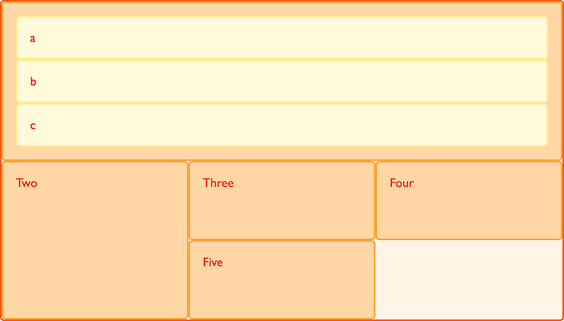
Overview
This lesson covers the following HTML tags, CSS properties, and JavaScript commands for the first time:
HTML
None.
CSS
- grid-template-rows
- grid-template-columns
- grid-template-areas
- grid-row-gap
- grid-column-gap
- grid-auto-flow
- grid-auto-rows
- grid-auto-columns
- grid-row
- grid-column
- grid-area
- z-index
- :nth-child()
- repeat()
JS
None.
This lesson begins with this Codepen. Code along with me to increase retention!
Lecture
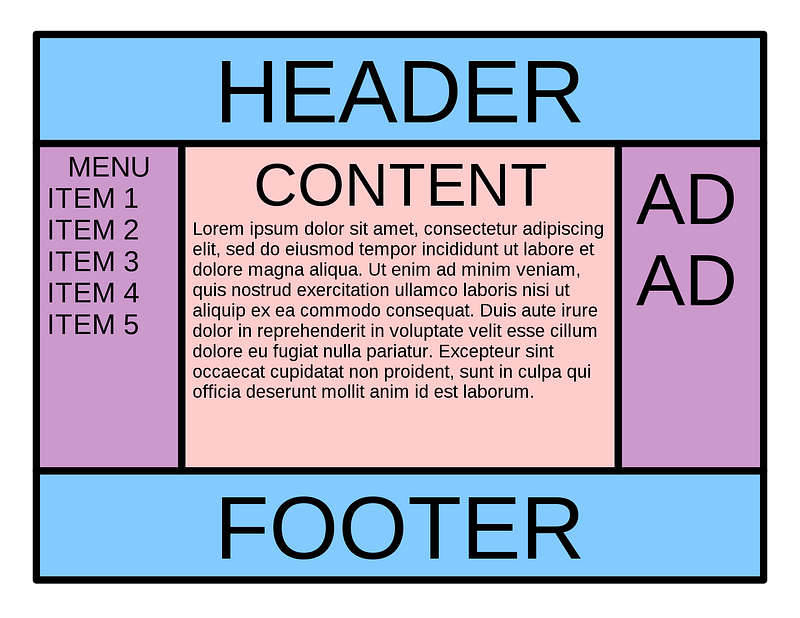
Before diving deep into CSS Grid, let’s review Flexbox one more time. This time around, let’s complete the Holy Grail as depicted:
#/media/File:HolyGrail.svg)
Fully mastering Flexbox will help us segue seamlessly into CSS Grid!
Holy Grail with Flexbox
As depicted in the Holy Grail, the main section has three subsections. Therefore, let’s add another section subsection to main:
HTML Window:<html>
<head></head>
<body>
<header></header>
<main>
<section></section>
<section></section>
<section></section>
</main>
<footer></footer>
</body>
</html>To go fullscreen, let’s remove the default margin in body like usual:
CSS Window:body {
margin: 0;
}To follow the best practice, let’s also define the dimensions of our fullscreen here at the highest parent:
body {
margin: 0;
width: 100vw;
height: 100vh;
}This way, all children elements of body can simply use relative units (to the body) like percentages.
header {
width: 100%;
height: 20%;
}main {
width: 100%;
height: 70%;
}footer {
width: 100%;
height: 10%;
}This is a best practice because one simple change at the top will trickle down to all the descendants.
Even better than percentages, let’s use flexboxes instead! To do this, first we need to set the display to flex on the parent:
body {
margin: 0;
width: 100vw;
height: 100vh;
display: flex;
}Then we set the flex-direction to column:
body {
margin: 0;
width: 100vw;
height: 100vh;
display: flex;
flex-direction: column;
}Now, we’re ready to use flexboxes instead of percentages.
Remember: Flexbox uses fraction units to make partitioning all the available space of the parent easy and intuitive.
header {
flex: 1;
}main {
flex: 1;
}footer {
flex: 1;
}With a flex value of 1, for example, right away, without needing to declare the width and height, all the children elements will expand to fill up the parent container equally and automatically.
To make the children take up the same amount as the percentages, we can partition them as follows:
header {
flex: 2;
}main {
flex: 7;
}footer {
flex: 1;
}A flex value of
1(for example) is actually a shorthand for a flex-grow of1.
How did we get these numbers?
To use an analogy, when we turn on flexbox, it’s like we’ve been given a whole pizza.
Parent Container => Whole PizzaWe can cut up this pizza into as many equal slices as we want!
Fraction units are like these equal slices of pizza!
Fractions => SlicesIn our example, we simply choose to divide our pizza into 10 equal slices:
Total: 2 + 7 + 1 = 10If the header takes up 2 slices, how much did it take from the total?
2 / 10 = 20%If the main takes up 7 slices, how much did it take from the total?
7 / 10 = 70%And if the footer takes up 1 slice, how much did it take from the total?
1 / 10 = 10%Hence, the fractions we use here are equivalent to the percentages we used at the beginning.
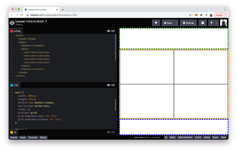
Back to our example, let’s give each section of the body a border like before so we can visualize them:
header {
flex: 2;
border: 5px dashed green;
}main {
flex: 7;
border: 5px dashed orange;
}footer {
flex: 1;
border: 5px dashed blue;
}Unlike before, however, a box-sizing of border-box is no longer necessary. As we have witnessed, flexboxes expand to fill the parent container automatically.
🎉 The sections look great, and the CSS code is a lot cleaner than before too!
Now, let’s create the subsections!
Again, to make these subsections behave as flexboxes, we need to set the display to flex on the parent:
main {
flex: 7;
border: 5px dashed orange;
display: flex;
}But this time, let’s set the flex-direction to row:
main {
flex: 7;
border: 5px dashed orange;
display: flex;
flex-direction: row;
}Like before, let’s make the left section element the :first-child:
section:first-child {
}And let’s make the right section element the :last-child:
section:last-child {
}What about the middle section element?
<html>
 <head></head>
 <body>
  <header></header>
  <main>
   <section></section>
   <section></section>
   <section></section>
  </main>
  <footer></footer>
 </body>
</html>How do we select it with CSS code?
We can use another pseudo-class called :nth-child():
section:nth-child() {}
Then inside the parentheses, we specify which child we want. In our case, it’s the second child:
section:nth-child(2) {
}If we wanted, we could also use this pseudo-class to select the
:first-childusing:nth-child(1)and the:last-childas:nth-child(3). Again, we will study pseudo-classes in great detail in Unit 3.
How should we partition all the available space of main amongst its subsections?
Again, we have total freedom to divide the parent container into as many equal fractions as we like, but for simplicity, let’s imagine again that there are 10 fractions total.
Let’s give the left subsection 2 fractions and a background-color of yellow so we can see it:
section:first-child {
flex: 2;
background-color: yellow;
}Let’s also give the right subsection 2 fractions but a background-color of purple so we can see it:
section:last-child {
flex: 2;
background-color: purple;
}Finally, let’s give the middle subsection the remaining fractions and a background-color of red so we can see it:
section:nth-child(2) {
flex: 6;
background-color: red;
}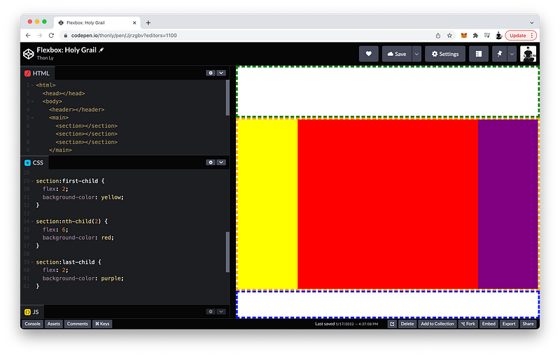
Perfect! 🎉
If you’re a math whiz, you may have recognized that these fractions can be reduced by a Greatest Common Factor of 2:
section:first-child {
flex: 1;
background-color: yellow;
}section:nth-child(2) {
flex: 3;
background-color: red;
}section:last-child {
flex: 1;
background-color: purple;
}In other words, we could have chosen to cut up our pizza into 5 equal slices if we had wanted. Either way, the children get the exact same amount in the final analysis.
Overall, this layout is quite easy to create, right?
Believe it or not, this Holy Grail was once infamously difficult to achieve without hacking away at the HTML and CSS code beyond recognition. Hence, its aptly dubbed name!
With Flexbox as we have witnessed, this once elusive layout is now quite trivial to attain! 😎
The finished Codepen:
In the next lecture, we will attempt to create four subsections but spread over 2 rows AND 2 columns.
Can Flexbox handle this 2-by-2 matrix? Let’s find out!
Flexbox versus Grid
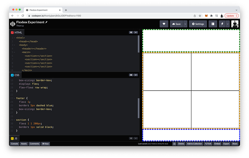
Using Flexbox, let’s try to create 4 boxes spread over 2 rows and 2 columns inside of main:
<html>
<head></head>
<body>
<header></header>
<main>
</main>
<footer></footer>
</body>
</html>Like before, let’s create a section element for each box:
<html>
<head></head>
<body>
<header></header>
<main>
<section></section>
<section></section>
<section></section>
<section></section>
</main>
<footer></footer>
</body>
</html>To make these boxes behave as flexboxes, we set the display to flex in the parent:
main {
 flex: 7;
 border: 5px dashed orange;
 display: flex;
}And the flex-flow to row and wrap to make the boxes wrap to the next row:
main {
 flex: 7;
 border: 5px dashed orange;
 display: flex;
 flex-flow: row wrap;
}
As for the children of main:
section {}
Let’s give them all a flex property of 1 for grow, 1 for shrink, and 200px for the basis to make space for some boxes to wrap to the next row:
section {
 flex: 1 1 200px;
}
Again, if these flex properties are still confusing, they will be covered in great detail in Unit 3.
Finally, let’s give them all a border of 1px, solid and black so we can visualize them:
section {
flex: 1 1 200px;
border: 1px solid black;
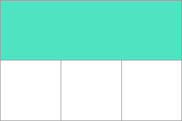
}It looks like we have achieved the 2x2 matrix that we wanted:
However, there is a limitation.
Now try making the viewport wider:
As you can see, flex-wrap does not enforce the number of rows and columns.
In fact, Flexbox is intended to work really well whenever we want to lay out boxes in only one direction: rows OR columns
If we want to lay out boxes in two dimensions that respect both rows AND columns, we should use CSS Grid instead.
Let’s demonstrate by refactoring our code to use CSS Grid instead of Flexbox.
On our parent, instead of flex, let’s set the display to grid:
main {
 flex: 7;
 border: 5px dashed orange;
 display: grid;
}
Instead of flex-flow, we can use grid-template-rows to set the number of rows. Let’s create two rows and give them 1 fraction each:
main {
 flex: 7;
 border: 5px dashed orange;
 display: grid;
 grid-template-rows: 1fr 1fr;
}
To set the number of columns, we can use grid-template-columns. Let’s also create two columns and give them each 1fr:
main {
 flex: 7;
 border: 5px dashed orange;
 display: grid;
 grid-template-rows: 1fr 1fr;
 grid-template-columns: 1fr 1fr;
}
As for the children of main, the flex property is no longer necessary:
section {
 flex: 1 1 200px; // delete
 border: 1px solid black;
}
As you can see, CSS Grid uses fr units which behave exactly like the fraction units of Flexbox.
1fr = 1 fractionThe reason CSS Grid has the
frdesignation whereas Flexbox does not is because CSS Grid also allows other types of units too! (e.g., absolute units)
Now, let’s see what happens if we change the viewport size like before:
As you can see, when we use CSS Grid, an invisible grid system is created that always respect the number of rows and columns.
The finished Codepen:
CSS Grid
Now that we know how useful a grid system can be, let’s study it in detail.
Firstly, if all the columns or rows have equal lengths, we can use the repeat() shortcut:
main {
 flex: 7;
 border: 5px dashed orange;
 display: grid;
 grid-template-columns: repeat();
 grid-template-rows: 1fr 1fr;
}
Then inside the parentheses, we indicate the number of times, and the length for each one:
main {
 flex: 7;
 border: 5px dashed orange;
 display: grid;
 grid-template-columns: repeat(2, 1fr);
 grid-template-rows: 1fr 1fr;
}
Likewise, for the rows:
main {
 flex: 7;
 border: 5px dashed orange;
 display: grid;
 grid-template-columns: repeat(2, 1fr);
 grid-template-rows: repeat(2, 1fr);
}
Using this shortcut, we can easily create a grid system with 12 columns and 12 rows for example:
main {
flex: 7;
border: 5px dashed orange;
display: grid;
grid-template-columns: repeat(12, 1fr);
grid-template-rows: repeat(12, 1fr);
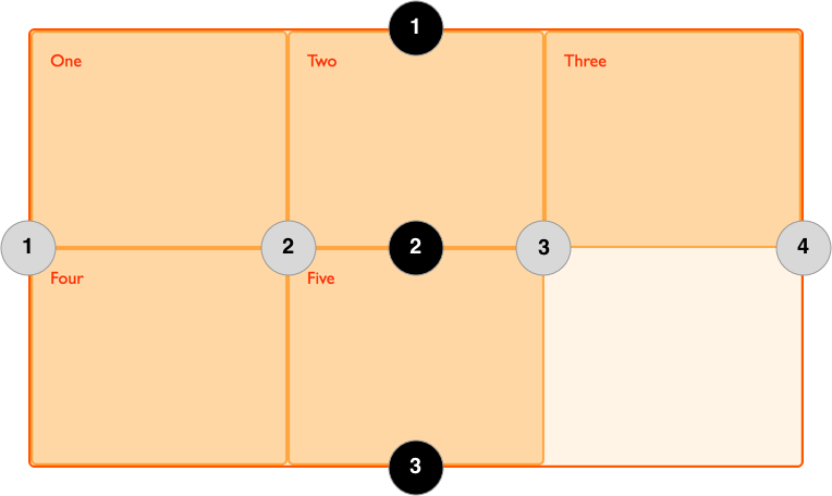
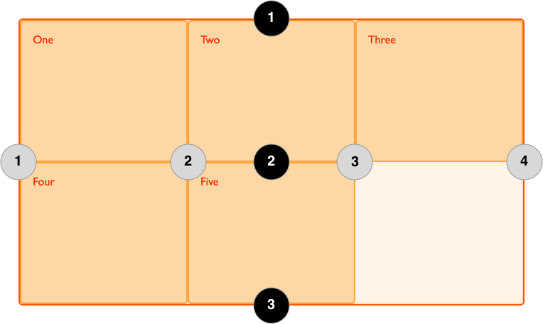
}When we define grid-template-columns and grid-template-rows, we are defining an explicit grid system that has column lines and row lines.
For example, inside main, the column lines are 1, 2, and 3 (from left to right). And the row lines are 1, 2, and 3 (from top to bottom).
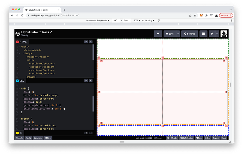
To see the grid lines in Chrome, open Developer Tools and then click on the Layout tab and tick Grid overlays.
We can use these lines to place the children of main anywhere on this grid.
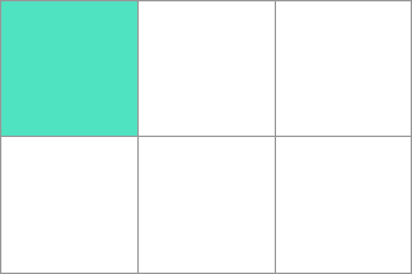
For example, let’s place the :first-child at:
- grid-column: from line
2to line3 - grid-row: from line
1to line2
section:first-child {
 grid-column: 2 / 3;
 grid-row: 1 / 2
}
To visualize it, let’s give it a background-color of yellow:
section:first-child {
grid-column: 2 / 3;
grid-row: 1 / 2;
background-color: yellow;
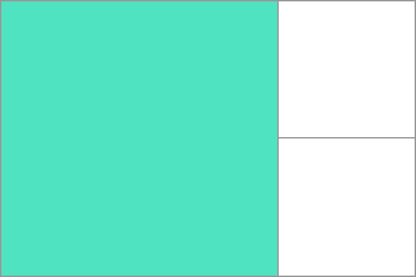
}If we want, we can even span it across two rows:
section:first-child {
 grid-column: 2 / 3;
 grid-row: 1 / 3;
 background-color: yellow;
}
Instead of specifying a row line, we can also simply write span 2:
section:first-child {
 grid-column: 2 / 3;
 grid-row: 1 / span 2;
 background-color: yellow;
}
If we prefer, there is another method we can use to place the children of main anywhere on our grid.
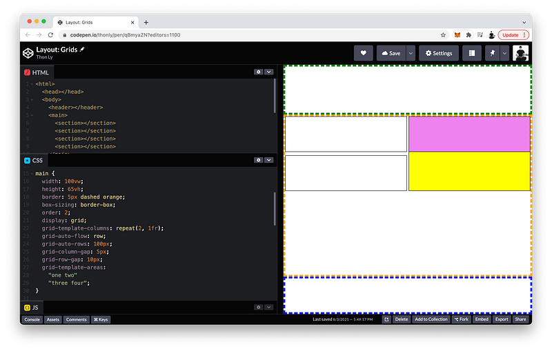
On the top row, let’s name the left box as area one and the right box as area two. On the bottom row, let’s name the left box as area three and the right box as area four.
Then, on the parent, we can define the grid-template-areas as:
“one two”for the top row“three four” for the bottom row
main {
 flex: 7;
 border: 5px dashed orange;
 display: grid;
 grid-template-columns: repeat(2, 1fr);
 grid-template-rows: repeat(2, 1fr);
 grid-template-areas:
  "one two"
  "three four";
}
With these areas defined, let’s try placing the :last-child at grid-area two:
section:last-child {
 grid-area: two;
}
To visualize it, let’s give it a background-color of violet:
section:last-child {
 grid-area: two;
 background-color: violet;
}
As you can see, this places the :last-child on top of the :first-child. The reason is because by default their stacking order follows their order in the HTML Tree.
HTML Tree Order => Stacking OrderIf we want, we can change their stacking order by using the z-index which is 0 by default:
section:first-child {
 grid-column: 2 / 3;
 grid-row: 1 / span 2;
 background-color: yellow;
 z-index: 0;
}section:last-child {
grid-area: two;
background-color: violet;
z-index: 0;
}If we want the :first-child to be on top, we simply give it a higher z-index.
For example: 1
section:first-child {
 grid-column: 2 / 3;
 grid-row: 1 / span 2;
 background-color: yellow;
 z-index: 1;
}section:last-child {
grid-area: two;
background-color: violet;
z-index: 0;
}But let’s make the :last-child on top instead by giving it an even greater z-index: 2
section:first-child {
 grid-column: 2 / 3;
 grid-row: 1 / span 2;
 background-color: yellow;
 z-index: 1;
}section:last-child {
grid-area: two;
background-color: violet;
z-index: 2;
}Moreover, if we want a grid system that is more flexible, we can define an implicit grid system by removing one dimension: grid-template-columns or grid-template-rows
For example, let’s remove grid-template-rows. In its place, we can define a grid-auto-flow and set it to row:
main {
 flex: 7;
 border: 5px dashed orange;
 display: grid;
 grid-template-columns: repeat(2, 1fr);
 grid-auto-flow: row;
 grid-template-areas:
  "one two"
  "three four";
}
This makes the row behave like flex-wrap!
We can also specify a height for these automatic rows using grid-auto-rows.
For example: 100px
main {
 flex: 7;
 border: 5px dashed orange;
 display: grid;
 grid-template-columns: repeat(2, 1fr);
 grid-auto-flow: row;
 grid-auto-rows: 100px;
 grid-template-areas:
  "one two"
  "three four";
}
Finally, in between the columns, we can specify a gap using grid-column-gap.
For example: 5px
main {
 flex: 7;
 border: 5px dashed orange;
 display: grid;
 grid-template-columns: repeat(2, 1fr);
 grid-auto-flow: row;
 grid-auto-rows: 100px;
 grid-column-gap: 5px;
 grid-template-areas:
  "one two"
  "three four";
}
Likewise, we can specify a gap between the rows as well using grid-row-gap.
For example: 10px
main {
 flex: 7;
 border: 5px dashed orange;
 display: grid;
 grid-template-columns: repeat(2, 1fr);
 grid-auto-flow: row;
 grid-auto-rows: 100px;
 grid-column-gap: 5px;
 grid-row-gap: 10px;
 grid-template-areas:
  "one two"
  "three four";
}
The finished Codepen:
Summary
Flexbox is amazing when we want to align children elements along one axis. But if we want to align them along both axes, it is better to use CSS Grid to create an invisible grid system upon which we can place the children elements.
To create a grid system, we set the display to grid on the parent element.
main {
  display: grid;
}
Then, we can define the grid tracks using grid-template-rows and grid-template-columns.
These tracks can be defined using any length units. If we want, we can also use fraction units which behave like flexboxes that expand to fill the parent container.
grid-template-columns: 1fr 1fr 1fr;Like flexboxes, we can think of
frunits as slices of a whole pizza. We are free to cut up the whole pizza into as many equal fractions as we desire.
If the track sizes are repetitive, we can use the repeat() shortcut:
grid-template-columns: repeat(3, 1fr);When we define grid-template-columns and grid-template-rows, the tracks created are part of the explicit grid.
If one axis is not defined, its corresponding tracks may still be created as part of the implicit grid.
These implicit tracks can be controlled using:
- grid-auto-flow
- grid-auto-rows
- grid-auto-columns
As such, they behave like flex-wrap.
The grid lines are numbered from left to right, and top to bottom:
This makes it possible to place children elements anywhere on the grid by using grid-column and grid-row.
We can place elements in any grid cell:
Or, we can span them across multiple cells:
Gutters are the gaps in between the track rows and track columns.
To create them, we can use row-gap and column-gap.
column-gap: 10px;
row-gap: 1em;
Multiple elements can be placed on the same cell.
When this happens, the elements stack on top of one another according to their order in the HTML Tree.
To change this default order, we can use the z-index.
z-index: 2;Don’t worry if CSS Grid is still confusing. We will study it some more in Unit 3!
Concept Quiz
Take my Programming Concept Quiz to check your understanding! For every correct choice, you will earn SW Coins which you can redeem for coupons towards the purchase of any of my Udemy courses!
Sample Quiz Questions for Lesson 15:
Question 1:
Which display type is best for aligning elements that respect both axes?
- inline-block
- block
- flex
- grid
Question 2:
Which grid property is NOT declared on the parent element?
- display
- grid-template-rows
- grid-template-columns
- grid-auto-flow
- grid-auto-rows
- grid-auto-columns
- z-index
- grid-row-gap
- grid-column-gap
Question 3:
Which grid property is NOT declared on the children elements?
- grid-column
- grid-row
- grid-area
- grid-template-areas
Question 4:
repeat(4, 2fr) is equal to:
- 1fr 1fr
- 2fr 2fr
- 2fr 2fr 2fr 2fr
- 1fr 1fr 1fr 1fr
Question 5:
Which grid property does NOT create an explicit grid?
- grid-template-rows
- grid-template-columns
- grid-auto-flow
Question 6:
Which grid property does NOT relate to the implicit grid?
- grid-auto-row
- grid-auto-columns
- grid-template-areas
Question 7:
Grid lines are numbered from:
- right to left, bottom to top
- left to right, bottom to top
- right to left, top to bottom
- left to right, top to bottom
Question 8:
We CANNOT span elements across multiple grid cells?
- True
- False
Question 9:
A lower z-index will make the element appear on the:
- bottom
- top
Question 10:
grid-auto-flow behaves like flex-wrap.
- True
- False
Question 11:
fr units behave like flexboxes.
- True
- False
Question 12:
Only direct children can be placed on the grid system created by the parent element.
- True
- False
→ Programming Concept Quiz for Chapter 15
Coding Exercises
Check out my Interactive Coding Exercises to put to practice what you have learned! There, you will also find interactive hints to help you understand each line of code. Likewise, for every correct solution, you will earn SW Coins which you can redeem for coupons towards the purchase of any of my Udemy courses!
→ Interactive Coding Exercises for Chapter 15
Syntax Flashcards
Review what you have learned by playing my Syntax Flashcard Game! These flashcards are designed to help you commit to memory all the new code syntaxes you learned in this lesson. Likewise, for every correct answer, you will earn SW Coins which you can redeem for coupons towards the purchase of any of my Udemy courses!
→ Syntax Flashcard Game for Chapter 15
Next Steps
Congrats on completing Unit 2: Lesson 10 of 13! 🎉
Unit 1: 100% Completed
Unit 2: 77% Completed
Unit 3: 0% Completed
Unit 4: 0% Completed
Unit 5: 0% Completed
Bonus Unit 6: 0% Completed
Bonus Unit 7: 0% Completed
Overall Progress: 15% Completed→ Join Remote Frontend Cohort Program
Next Lesson
Since we can now effortless create any page layout of our choosing, we are ready to add actual content! In the next lesson, we will begin by learning how to add texts. Sounds simple enough on the surface, but we will also look under the surface. Believe it or not, plain texts are HTML elements too except they are just tag-less. On the DOM Tree, they exist as textNodes. In the next lesson, we will use JavaScript to help us study these textNodes in detail. Texts are so ubiquitous (especially on a platform like Medium) that they seem trivial, but nothing is further from the truth. Mastering textNodes will help us glimpse the incredible technology powering a writing platform like Medium!
→ Chapter 16: HTML Text Nodes in JavaScript
When you use my referral link above 👆 to become a Medium member, all proceeds will be donated towards the construction of the Silicon Wat Campus for children in Ukraine and Cambodia ❤️