
Chapter 14: Responsive Layouts with CSS Flexbox
A Complete Frontend Developer Textbook for Beginners (2023 Edition)

This is the textbook version of Lesson 14 of 100 from the Udemy video course: A Complete Frontend Developer Course for Beginners
Overview
This lesson covers the following HTML tags, CSS properties, and JavaScript commands for the first time:
HTML
None.
CSS
JS
None.
This lesson begins with this Codepen. Code along with me to increase retention!
Lecture
All websites have a header section, a main section, and a footer section.
Together, these sections create the layout of a page.
In this lesson, we learn how to use the header element, the main element, and the footer element to create layouts.
<html>
 <head></head>
 <body>
  <header></header>
  <main></main>
  <footer></footer>
 </body>
</html>
First, let’s remove the default margin in body:
body {
 margin: 0;
}
This allows our layout to take up the entire viewport.
For our header section, our main section, and our footer section, let’s divide them into three rows that always cover the entire viewport even after resizing.
header {

}
main {
}footer {
}To do this, each of these sections will have a width of 100vw:
header {
 width: 100vw;
}
main {
width: 100vw;
}footer {
width: 100vw;
}As for the height, let’s make the header: 20vh
header {
 width: 100vw;
 height: 20vh;
}
In main, let’s make the height: 65vh
main {
 width: 100vw;
 height: 65vh;
}
And in footer, let’s make the height: 15vh
footer {
 width: 100vw;
 height: 15vh;
}
As long as they add up to 100vh, we can be confident that they take up the entire viewport.
height: 20vh + 65vh + 15vh = 100vhTo visualize these sections, let’s give them a border.
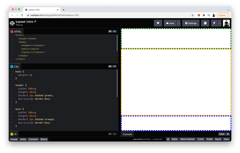
For the header border, let’s make it 5px, dashed, and green:
header {
 width: 100vw;
 height: 20vh;
 border: 5px dashed green;
}
For the main border, let’s make it 5px, dashed, and orange:
main {
 width: 100vw;
 height: 65vh;
 border: 5px dashed orange;
}
And for the footer border, let’s make it 5px, dashed, and blue:
footer {
 width: 100vw;
 height: 15vh;
 border: 5px dashed blue;
}
As you can see, by adding borders, our layout has grown beyond the viewport as evidenced by the appearance of the scrollbars.
To prevent this as we have done in previous lessons, we can simply change the box-sizing to border-box for each section:
header {
 width: 100vw;
 height: 20vh;
 border: 5px dashed green;
 box-sizing: border-box;
}
main {
width: 100vw;
height: 65vh;
border: 5px dashed orange;
box-sizing: border-box;
}footer {
width: 100vw;
height: 15vh;
border: 5px dashed blue;
box-sizing: border-box;
}
Perfect! 😁
Try resizing the UI window to check! 👇🏼
Indeed, our layout always fills the entire viewport!
Awesome, right? 😄
In fact, this is the most common layout and even has a special name: The Holy Grail
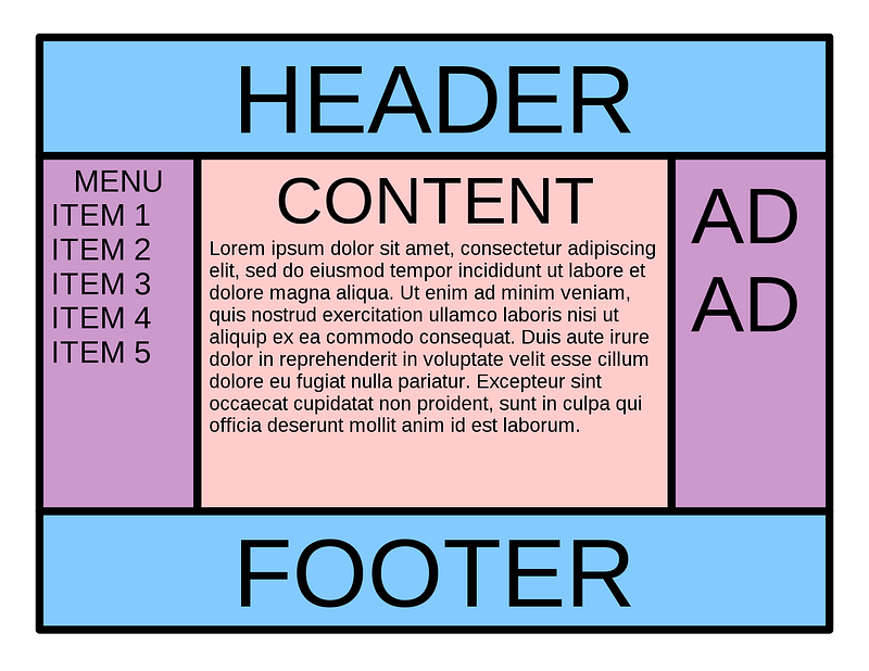
In the next lecture, we will add some subsections to our main section as depicted in the Holy Grail!
Inline Block
To start, let’s add two subsections to our layout for simplicity. Inside the main section, let’s create a left subsection and a right subsection.
main section: left subsection + right subsectionFirst, we need tags in our HTML code. As the children of main, let’s create two section tags:
<html>
 <head></head>
 <body>
  <header></header>
  <main>
   <section></section>
   <section></section>
  </main>
  <footer></footer>
 </body>
</html>
Let’s make the left subsection, the :first-child:
section:first-child {

}
And the right subsection, the :last-child:
section:last-child {

}
:first-childand:last-childare examples of pseudo-class selectors which we will cover in detail in Unit 3.
To make them take up the entire main section, their height both need to be 100%, and their width need to be 50% each:
section:first-child {
 width: 50%;
 height: 100%;
}section:last-child {
width: 50%;
height: 100%;
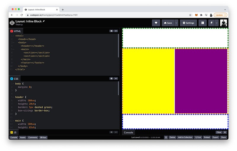
}To visualize them, let’s give the left subsection a background-color of yellow, and the right subsection a background-color of purple:
section:first-child {
 width: 50%;
 height: 100%;
 background-color: yellow;
}section:last-child {
width: 50%;
height: 100%;
background-color: purple;
}As you can see, by default the left yellow subsection takes up the entire line, pushing the right purple subsection to the next line.
The reason is because the display is set to block by default:
section:first-child {
 width: 50%;
 height: 100%;
 background-color: yellow;
 display: block;
}section:last-child {
width: 50%;
height: 100%;
background-color: purple;
display: block;
}To make them appear on the same line, we can change them to inline-block:
section:first-child {
 width: 50%;
 height: 100%;
 background-color: yellow;
 display: inline-block;
}section:last-child {
width: 50%;
height: 100%;
background-color: purple;
display: inline-block;
}Why is it still not working? 🤔
The reason is because the border takes up 5px on all sides, making the subsections a little too wide.
If we shorten the width to 49% for example, now they can both fit inside the main section:
section:first-child {
 width: 49%;
 height: 100%;
 background-color: yellow;
 display: inline-block;
}section:last-child {
width: 50%;
height: 100%;
background-color: purple;
display: inline-block;
}
Of course, if we want, we can also follow these steps to create subsections inside the header and the footer too.
However, as you have witnessed, getting the column sections to fit precisely is frankly imprecise. In fact, this layout method is actually deprecated!
The finished Codepen:
In the next lecture, we will explore a powerful CSS Module that makes creating rows and columns for layouts easy and precise.
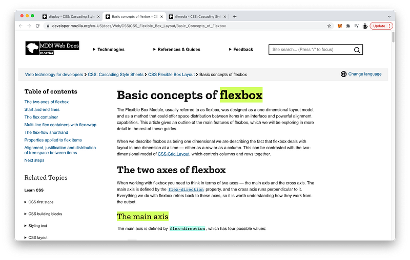
CSS Flexbox
Now, let’s take a look at the powerful display type called Flexbox which enables us to easily align elements into rows or columns.
The children of body are header, main, and footer:
<html>
 <head></head>
 <body>
  <header></header>
  <main>
   <section></section>
   <section></section>
  </main>
  <footer></footer>
 </body>
</html>
If we want to stack them into one column, on the parent we set the display to flex, and flex-direction to column:
body {
 margin: 0;
 display: flex;
 flex-direction: column;
}
It looks like nothing has changed, but using display flex instead of the default block, we can easily do some really amazing things.
For example, we can now easily reorder the children of body. For instance, let’s make the header appear last:
header {
 width: 100vw;
 height: 20vh;
 border: 5px dashed green;
 box-sizing: border-box;
 order: 3;
}
Let’s make the main appear first:
main {
 width: 100vw;
 height: 65vh;
 border: 5px dashed orange;
 box-sizing: border-box;
 order: 1;
}
And let’s make the footer appear second:
footer {
 width: 100vw;
 height: 15vh;
 border: 5px dashed blue;
 box-sizing: border-box;
 order: 2;
}
Without Flexbox, to do the same thing, we would have to rearrange the HTML code itself — not a best practice because that could adversely affect the semantic meaning of our HTML code and downstream dependencies in our CSS code and JavaScript code.
Now, let’s witness how easy it is to refactor the subsections of main to use Flexbox instead!
In programming, to refactor means to restructure our code to improve its readability, efficiency, and/or maintainability. It is a best practice in our industry which we will do constantly throughout this course.
To use it, remember:
We have to declare it on the parent!
main {
 width: 100vw;
 height: 65vh;
 border: 5px dashed orange;
 box-sizing: border-box;
 order: 1;
 display: flex;
}
Since we want to stack them into one row, we set flex-direction to row:
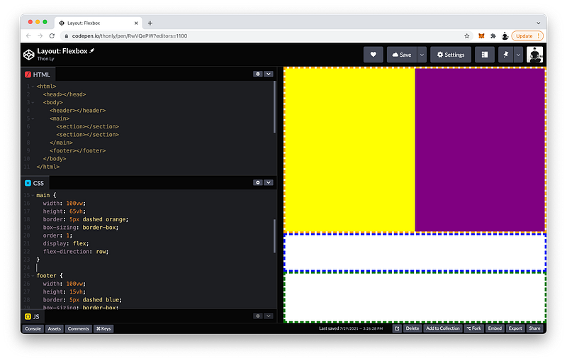
main {
 width: 100vw;
 height: 65vh;
 border: 5px dashed orange;
 box-sizing: border-box;
 order: 1;
 display: flex;
 flex-direction: row;
}
Now, the children of main are flexboxes which mean they will automatically expand to fill up their parent.
In order words, we don’t need display inline-block anymore:
section:first-child {
 width: 49%;
 height: 100%;
 background-color: yellow;
 display: inline-block; // delete
}section:last-child {
width: 50%;
height: 100%;
background-color: purple;
display: inline-block; // delete
}And the height will always expand to 100% by default, and the width can now add up to 100%:
section:first-child {
 width: 50%;
 height: 100%;
 background-color: yellow;
}section:last-child {
width: 50%;
height: 100%;
background-color: purple;
}As you can see, with Flexbox we can easily create a row of boxes that precisely fits.
Instead of a row of boxes, what if we want to quickly change it to a column of boxes.
main {
 width: 100vw;
 height: 65vh;
 border: 5px dashed orange;
 box-sizing: border-box;
 order: 1;
 display: flex;
 flex-direction: column;
}
As you can see, we would also need to switch the width and height to fill up the parent:
section:first-child {
 height: 50%;
 width: 100%;
 background-color: yellow;
}section:last-child {
height: 50%;
width: 100%;
background-color: purple;
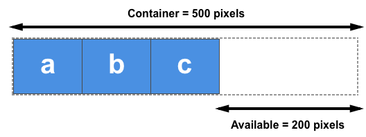
}That’s quite a lot of changes to make, especially if we have more than 2 boxes!
To make it super easy to change the direction of our boxes, Flexbox lets us specify a flex property instead of width and height.
Let’s give it 1 fraction each:
section:first-child {
 flex: 1;
 background-color: yellow;
 display: inline-block;
}section:last-child {
flex: 1;
background-color: purple;
display: inline-block;
}This means that they will expand and share their parent container evenly.
Now, let’s witness what happens when we change the flex-direction back to row.
main {
 width: 100vw;
 height: 65vh;
 border: 5px dashed orange;
 box-sizing: border-box;
 order: 1;
 display: flex;
 flex-direction: row;
}
No need to switch the width and height like before!
So much easier, right? 😄
The finished Codepen:
In the next lecture, we will go over one important use case that makes this feature truly invaluable.
Media Queries
With Flexbox, we now have the ability to easily make our layout responsive.
What does that mean?
Our layout may look great on a tablet for example, but what if it’s on a smartphone where the screen is much smaller?
Wouldn’t it be cool when the viewport is below a certain width, our layout for main automatically converts from a row of boxes to a column of boxes instead?
Using Flexbox, we can now easily make this possible!
To check if the viewport width is below a certain width, we can use a special CSS at-rule called @media:
@media ()Then, inside the parentheses, we set the max-width to 480px for example:
@media (max-width: 480px)This means that when the viewport width is 480px or below, we can tell it to execute whatever CSS statements we want inside the curly braces:
@media (max-width: 480px) {

}
For example, in the main, change the flex-direction to column:
@media (max-width: 480px) {
 main {
  flex-direction: column;
 }
}
Let’s test it out on the UI window!
Make the width above 480px… And then below 480px…
Super cool, right? 😎
Since the flex property is so awesome, let’s study it in a little more detail.
The flex property is actually a shorthand that combines:
- flex-grow
- flex-shrink
- flex-basis
Together in that order. The defaults are:
section:first-child {
 flex: 1 1 auto;
 background-color: yellow;
}
Written out, the long hand looks like this:
section:last-child {
 flex-grow: 1;
 flex-shrink: 1;
 flex-basis: auto;
 background-color: purple;
}
As you have witnessed, flex-grow tells the child box how many fractions of the parent container to use. The default is 0 fractions.
On the other hand, flex-shrink tells the child box how many fractions of the parent container to NOT use. The default is 1 fraction.
Finally, flex-basis sets the initial size of the child box. The default is auto which means to take up as much of the parent container as possible.
Let’s do some examples!
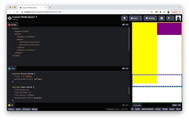
For the purple box, let’s change the flex-grow to 0, and the flex-basis to 100px:
section:last-child {
 flex-grow: 0;
 flex-shrink: 1;
 flex-basis: 100px;
 background-color: purple;
}
These settings mean the box can shrink but cannot grow. In effect, a flex-basis of 100px becomes the maximum size that’s possible.
Let’s do another example!
For the yellow box, let’s change the flex-shrink to 0 instead, and the flex-basis to 100px as well:
section:first-child {
 flex: 1 0 100px;
 background-color: yellow;
}
Conversely, these settings mean the box can grow but cannot shrink. In effect, a flex-basis of 100px now becomes the minimum size that’s possible.
If flex-grow, flex-shrink, and flex-basis are still confusing, they will be covered in greater detail in Unit 3.
Finally, let’s look at flex-wrap. On the parent, by default it is set to nowrap:
@media (max-width: 480px) {
 main {
  flex-direction: column;
  flex-wrap: nowrap;
 }
}
Which means that even if its children take up too much space:
section:first-child {
 flex: 1 0 500px;
 background-color: yellow;
}
They will always remain on the same line.
If we want them to go to the next line whenever they take up too much space, we can change flex-wrap to wrap:
@media (max-width: 480px) {
 main {
  flex-direction: column;
  flex-wrap: wrap;
 }
}
In fact, the flex-direction and flex-wrap go hand-in-hand such that we can use a shorthand called flex-flow:
@media (max-width: 480px) {
 main {
  flex-flow: column wrap;
 }
}
The flex-direction comes first, while the flex-wrap comes second.
Per CSS, when two rulesets have identical specificity, priority will be given to the ruleset that appears last. For this reason, we write our media query after the first
mainruleset because we want the newmainruleset to replace it.
The finished Codepen:
Summary
The CSS display property determines how an element appears, or how an element’s children are laid out.
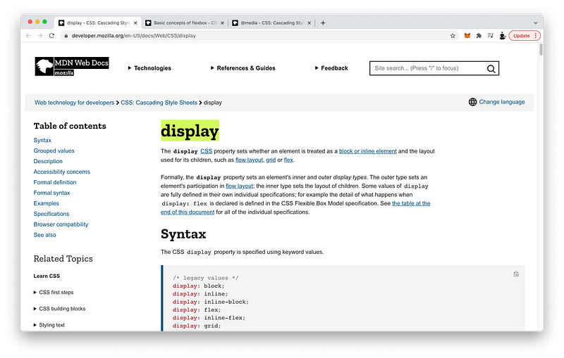
As a block, the element has line breaks before and after itself.
As inline-block, the element does not have them. Therefore, adjacent elements will be on the same line.
A display value of
inlineis possible too, but width and height will be ignored.
Flexbox
When we set the display of an element to flex, its children become flexboxes.
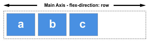
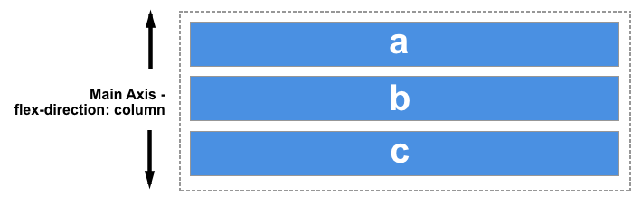
Flexbox aligns the children along the main axis which is controlled by the flex-direction property.
The possible values are:
rowrow-reversecolumncolumn-reverse
When the flex-direction is row or row-reverse, the boxes are aligned into 1 row.
When the flex-direction is column or column-reverse, the boxes are aligned into 1 column.
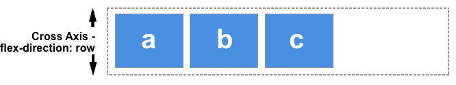
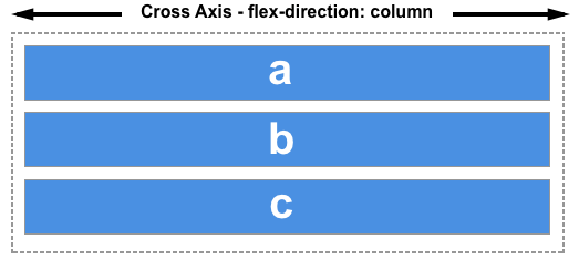
Opposite the main axis is the cross axis.
If we want the boxes that are too large or too many to wrap to the next row or column, we can use flex-wrap.
flex-wrap: wrap;The flex-direction and flex-wrap can be combined using the flex-flow shorthand.
flex-flow: row wrap;Using flex-grow, flex-shrink, and flex-basis on the children, we can control how the children boxes take up the parent container (total available space).
- Flex-basis determines the initial size of the child box.
- Flex-grow determines how many fractions of the parent container the child box can use.
- Flex-shrink determines how many fractions of the parent container the child box should NOT use.
Flex-grow and flex-shrink use fraction units to make dividing up the parent container intuitive.
If it’s not obvious how fractions work, the next lesson will explain them in more detail.
These flex properties can be combined using the flex shorthand.
flex: 1 1 auto;Again, if these flex properties are still confusing, they will be covered in greater detail in Unit 3.
Media Queries
These flex properties affect the children boxes along the main axis only. In effect, this makes it super easy to switch the flex-direction whenever necessary.
flex-direction: row <-> columnConsequently, by combining Flexbox with Media Queries, we can easily make the layout responsive to any device sizes by changing the flex-direction from row to column, and vice versa.
@media (max-width: 480px) {
 main {
  flex-direction: column;
 }
}
Flexbox also lets us decide how to distribute our children elements along both the main axis and cross axis, which will be discussed in Unit 3.
Concept Quiz
Take my Programming Concept Quiz to check your understanding! For every correct choice, you will earn SW Coins which you can redeem for coupons towards the purchase of any of my Udemy courses!
Sample Quiz Questions for Lesson 14:
Question 1:
A layout always consists of the following sections except:
- header
- main
- section
- footer
Question 2:
Which display type generates line breaks before and after the element?
- inline
- block
- flex
- grid
Question 3:
Which display type does NOT generate any line breaks?
- inline
- block
- flex
- grid
Question 4:
Which display type is best for aligning elements along one direction?
- inline
- block
- flex
- grid
Question 5:
Which flex property is NOT declared on the parent element?
- display
- flex-direction
- flex-wrap
- flex
Question 6:
Which flex property is NOT declared on the children elements?
- order
- flex-grow
- flex-shrink
- flex-basis
- flex-flow
Question 7:
Which flex value creates a minimum length of 100px?
flex: 1 1 100px;flex: 0 1 100px;flex: 1 0 100px;
Question 8:
Which flex value creates a maximum length of 100px?
flex: 1 1 100px;flex: 1 0 100px;flex: 0 1 100px;
Question 9:
Flexboxes apply only to the direct children of a parent element.
- True
- False
→ Programming Concept Quiz for Chapter 14
Coding Exercises
Check out my Interactive Coding Exercises to put to practice what you have learned! There, you will also find interactive hints to help you understand each line of code. Likewise, for every correct solution, you will earn SW Coins which you can redeem for coupons towards the purchase of any of my Udemy courses!
→ Interactive Coding Exercises for Chapter 14
Syntax Flashcards
Review what you have learned by playing my Syntax Flashcard Game! These flashcards are designed to help you commit to memory all the new code syntaxes you learned in this lesson. Likewise, for every correct answer, you will earn SW Coins which you can redeem for coupons towards the purchase of any of my Udemy courses!
→ Syntax Flashcard Game for Chapter 14
Next Steps
Congrats on completing Unit 2: Lesson 9 of 13! 🎉
Unit 1: 100% Completed
Unit 2: 69% Completed
Unit 3: 0% Completed
Unit 4: 0% Completed
Unit 5: 0% Completed
Bonus Unit 6: 0% Completed
Bonus Unit 7: 0% Completed
Overall Progress: 14% Completed→ Join Remote Frontend Cohort Program
Next Lesson
With Flexbox, we can now easily align elements into rows or columns. But, what if we want to align them into rows AND columns? In the next lesson, we will learn about an even more powerful CSS Module that lets us do just that!
→ Chapter 15: Responsive Layouts with CSS Grid
When you use my referral link above 👆 to become a Medium member, all proceeds will be donated towards the construction of the Silicon Wat Campus for children in Ukraine and Cambodia ❤️


#/media/File:HolyGrail.svg)