
Chapter 13: CSS Gradients
A Complete Frontend Developer Textbook for Beginners (2023 Edition)

This is the textbook version of Lesson 13 of 100 from the Udemy video course: A Complete Frontend Developer Course for Beginners
Overview
This lesson covers the following HTML tags, CSS topics, and JavaScript commands for the first time:
HTML
None.
CSS
- transparent
- linear-gradient()
- repeating-linear-gradient()
- radial-gradient()
- repeating-radial-gradient()
- conic-gradient()
- repeating-conic-gradient()
JS
None.
This lesson begins with this Codepen. Code along with me to increase retention!
Lecture
In this lesson, we examine a special kind of image called gradients, and there are three types.
Regular images are static but gradients are dynamic images generated by CSS. This means they can be changed on the fly.
Let’s do an example!
HTML Window:<html>
<head></head>
<body>
<header></header>
<main></main>
<footer></footer>
</body>
</html>Linear Gradients
For the background-image, instead of giving it a link to a static image, let’s tell CSS to generate a dynamic image. The first type is called a linear-gradient.
For example, from red to green:
main {
 background-color: violet;
 background-image: linear-gradient(red, green);
}
As you can see, a linear-gradient() creates linear bands of colors, and in this example, they are from red to green.
linear-gradient() => linear bands of colorsAlso notice that this dynamic image has completely covered the violet background. As you already know, CSS places background-image on top of background-color.
As we have learned in the previous lesson, CSS allows multiple layers of background images. They can be any static or dynamic images in any order.
Let’s add another layer: linear-gradient() from blue to orange
main {
 background-color: violet;
 background-image:
  linear-gradient(blue, orange),
  linear-gradient(red, green);
}
A comma is required to separate these two layers. The order we write here will be the order that we see.
To see the bottom layer, for example, we can replace orange with rgb(0, 0, 0, 0) which produces total transparency:
main {
 background-color: violet;
 background-image:
  linear-gradient(blue, rgb(0, 0, 0, 0)),
  linear-gradient(red, green);
}
Now, we can see the green from the bottom layer.
main {
 background-color: violet;
 background-image:
  linear-gradient(blue, rgb(0, 0, 0, 0)),
  linear-gradient(red, green);
}
In fact, this total transparent color is used so often that it has its own special keyword: transparent
main {
 background-color: violet;
 background-image:
  linear-gradient(blue, transparent),
  linear-gradient(red, green);
}
Let’s add another layer: linear-gradient() from yellow to purple:
main {
 background-color: violet;
 background-image:
  linear-gradient(yellow, purple),
  linear-gradient(blue, transparent),
  linear-gradient(red, green);
}
By default, the orientation is to bottom:
main {
 background-color: violet;
 background-image:
  linear-gradient(to bottom, yellow, purple),
  linear-gradient(blue, transparent),
  linear-gradient(red, green);
}
If we want, we can change it to top:
main {
 background-color: violet;
 background-image:
  linear-gradient(to top, yellow, purple),
  linear-gradient(blue, transparent),
  linear-gradient(red, green);
}
to left:
main {
 background-color: violet;
 background-image:
  linear-gradient(to left, yellow, purple),
  linear-gradient(blue, transparent),
  linear-gradient(red, green);
}
to right:
main {
 background-color: violet;
 background-image:
  linear-gradient(to right, yellow, purple),
  linear-gradient(blue, transparent),
  linear-gradient(red, green);
}
Or even, to any corner. For example, to top left:
main {
 background-color: violet;
 background-image:
  linear-gradient(to top left, yellow, purple),
  linear-gradient(blue, transparent),
  linear-gradient(red, green);
}
In fact, we can even specify an exact degree: 33deg
main {
 background-color: violet;
 background-image:
  linear-gradient(33deg, yellow, purple),
  linear-gradient(blue, transparent),
  linear-gradient(red, green);
}
Color Hints, Stops, and Starts
Let’s add another layer: linear gradient(), to right from green to blue:
main {
 background-color: violet;
 background-image:
  linear-gradient(to right, green, blue),
  linear-gradient(33deg, yellow, purple),
  linear-gradient(blue, transparent),
  linear-gradient(red, green);
}
By default, the gradient transitions evenly from one color to the next at 50%:
main {
 background-color: violet;
 background-image:
  linear-gradient(to right, green, 50%, blue),
  linear-gradient(33deg, yellow, purple),
  linear-gradient(blue, transparent),
  linear-gradient(red, green);
}
This value in between these two colors is called a color hint. If we want, we can change it to any value we like.
For example, instead of in the middle at 50%, we can move it to 80%:
main {
 background-color: violet;
 background-image:
  linear-gradient(to right, green, 80%, blue),
  linear-gradient(33deg, yellow, purple),
  linear-gradient(blue, transparent),
  linear-gradient(red, green);
}
Moreover, using linear-gradient(), we can transition through as many colors as we want.
To demonstrate, let’s create a rainbow: linear-gradient(), to bottom:
- from
red - to
orange - to
yellow - to
green - to
blue - to
indigo - then
violet
main {
 width: 100vw;
 height: 100vh;
 background-color: violet;
 background-image:
  linear-gradient(to bottom, red, orange, yellow, green, blue, indigo, violet),
  linear-gradient(to right, green, 80%, blue),
  linear-gradient(33deg, yellow, purple),
  linear-gradient(blue, transparent),
  linear-gradient(red, green);
}
We could even specify color stops. For example:
redstop at15%orangestop at30%yellowstop at45%greenstop at60%bluestop at75%indigostop at90%- and
violetstop at100%
main {
 background-color: violet;
 background-image:
  linear-gradient(to bottom, red 15%, orange 30%, yellow 45%, green 60%, blue 75%, indigo 90%, violet 100%),
  linear-gradient(to right, green, 80%, blue),
  linear-gradient(33deg, yellow, purple),
  linear-gradient(blue, transparent),
  linear-gradient(red, green);
}
Since violet is the last color, it will always stop at 100% by default, so this color stop is optional:
main {
 background-color: violet;
 background-image:
  linear-gradient(to bottom, red 15%, orange 30%, yellow 45%, green 60%, blue 75%, indigo 90%, violet),
  linear-gradient(to right, green, 80%, blue),
  linear-gradient(33deg, yellow, purple),
  linear-gradient(blue, transparent),
  linear-gradient(red, green);
}
We could also create hard lines using color starts. For example:
redstart at0%stop at15%orangestart at15%stop at30%yellowstart at30%stop at45%greenstart at45%stop at60%bluestart at60%stop at75%indigostart at75%stop at90%- and
violetstart at90%stop at100%
main {
 background-color: violet;
 background-image:
  linear-gradient(to bottom, red 0% 15%, orange 15% 30%, yellow 30% 45%, green 45% 60%, blue 60% 75%, indigo 75% 90%, violet 90% 100%),
  linear-gradient(to right, green, 80%, blue),
  linear-gradient(33deg, yellow, purple),
  linear-gradient(blue, transparent),
  linear-gradient(red, green);
}
Again, this value (100%) is optional. Since red is the first color, it will always start at 0% by default, so this color start is also optional:
main {
 background-color: violet;
 background-image:
  linear-gradient(to bottom, red 15%, orange 15% 30%, yellow 30% 45%, green 45% 60%, blue 60% 75%, indigo 75% 90%, violet 90%),
  linear-gradient(to right, green, 80%, blue),
  linear-gradient(33deg, yellow, purple),
  linear-gradient(blue, transparent),
  linear-gradient(red, green);
}
As you can see, a hard line is created whenever the stop value of one color is equal to the start value of the next color:
stop value of 1st color = start value of 2nd color => hard lineRepeating Linear Gradients
Now, let’s learn how to repeat linear gradients. First, let’s add another layer: linear-gradient(), to bottom right from purple to white
main {
 background-color: violet;
 background-image:
  linear-gradient(to bottom right, purple, white),
  linear-gradient(to bottom, red 15%, orange 15% 30%, yellow 30% 45%, green 45% 60%, blue 60% 75%, indigo 75% 90%, violet 90%),
  linear-gradient(to right, green, 80%, blue),
  linear-gradient(33deg, yellow, purple),
  linear-gradient(blue, transparent),
  linear-gradient(red, green);
}
Second, let’s add some color starts and stops. Let’s make purple start at 0% and stop at 50%, and let’s make white start at 50% and stop at 100%:
main {
 background-color: violet;
 background-image:
  linear-gradient(to bottom right, purple 0% 50%, white 50% 100%),
  linear-gradient(to bottom, red 15%, orange 15% 30%, yellow 30% 45%, green 45% 60%, blue 60% 75%, indigo 75% 90%, violet 90%),
  linear-gradient(to right, green, 80%, blue),
  linear-gradient(33deg, yellow, purple),
  linear-gradient(blue, transparent),
  linear-gradient(red, green);
}
If we want to repeat this pattern, we simply change linear-gradient() to repeating-linear-gradient():
background-color: violet;
 background-image:
  repeating-linear-gradient(to bottom right, purple 0% 50%, white 50% 100%),
  linear-gradient(to bottom, red 15%, orange 15% 30%, yellow 30% 45%, green 45% 60%, blue 60% 75%, indigo 75% 90%, violet 90%),
  linear-gradient(to right, green, 80%, blue),
  linear-gradient(33deg, yellow, purple),
  linear-gradient(blue, transparent),
  linear-gradient(red, green);
}
However, it’s not repeating…
Why?
The reason is because we need to specify color bands that add up to less than 100%.
repeating-linear-gradient(): total color bands < 100%For example, let’s make each band 10% in length by changing purple from 0% to 10%, and white from 10% to 20%:
background-color: violet;
 background-image:
  linear-gradient(to bottom right, purple 0% 10%, white 10% 20%),
  linear-gradient(to bottom, red 15%, orange 15% 30%, yellow 30% 45%, green 45% 60%, blue 60% 75%, indigo 75% 90%, violet 90%),
  linear-gradient(to right, green, 80%, blue),
  linear-gradient(33deg, yellow, purple),
  linear-gradient(blue, transparent),
  linear-gradient(red, green);
}
This means we should expect 10 bands in total. Let’s count to verify:
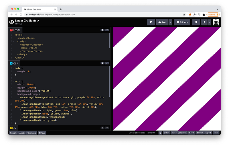
So as you can see, CSS will repeat the linear-gradient() until 100% is reached.
The finished Codepen:
Radial Gradients
The second type of gradient is called a radial-gradient.
Let’s see an example: background-image is radial-gradient() from yellow to lightblue
main {
 background-color: violet;
 background-image: radial-gradient(yellow, lightblue);
}
Of course, we can specify as many colors as we like.
As you can see, using radial-gradient(), the colors radiate from the center.
radial-gradient() => colors radiate from centerLike linear-gradient(), we can position this center anywhere. By default, it’s at the center:
main {
 background-color: violet;
 background-image: radial-gradient(at center, yellow, lightblue);
}
If we want, we can move it to at top:
main {
 background-color: violet;
 background-image: radial-gradient(at top, yellow, lightblue);
}
at bottom:
main {
 background-color: violet;
 background-image: radial-gradient(at bottom, yellow, lightblue);
}
at left:
main {
 background-color: violet;
 background-image: radial-gradient(at left, yellow, lightblue);
}
at right:
main {
 background-color: violet;
 background-image: radial-gradient(at right, yellow, lightblue);
}
Or, at any corner. For example, at top right:
main {
 background-color: violet;
 background-image: radial-gradient(at top right, yellow, lightblue);
}
Of course, like linear-gradient(), we can specify an exact location. For example, at 50% from the left, and 40% from the top:
main {
 background-color: violet;
 background-image: radial-gradient(at 50% 40%, yellow, lightblue);
}
Like linear-gradient(), we can also specify color hints:
main {
 background-color: violet;
 background-image: radial-gradient(at 50% 40%, yellow, 20%, lightblue);
}
Color starts:
main {
 background-color: violet;
 background-image: radial-gradient(at 50% 40%, yellow 0%, 20%, lightblue);
}
And color stops:
main {
 background-color: violet;
 background-image: radial-gradient(at 50% 40%, yellow 0% 19%, 20%, lightblue);
}
Now, let’s discuss the differences. First, let’s create another layer: radial-radient(), at 30% from the left, and 40% from the top, from red to yellow
main {
 background-color: violet;
 background-image:
  radial-gradient(at 30% 40%, red, yellow),
  radial-gradient(at 50% 40%, yellow 0% 19%, 20%, lightblue);
}
Unlike linear gradients, we can specify the size of radial gradients. For example, we can make it as large as the closest-side:
main {
 background-color: violet;
 background-image:
  radial-gradient(closest-side at 30% 40%, red, yellow),
  radial-gradient(at 50% 40%, yellow 0% 19%, 20%, lightblue);
}
Or, closest-corner:
main {
 background-color: violet;
 background-image:
  radial-gradient(closest-corner at 30% 40%, red, yellow),
  radial-gradient(at 50% 40%, yellow 0% 19%, 20%, lightblue);
}
Or, farthest-corner:
main {
 background-color: violet;
 background-image:
  radial-gradient(farthest-corner at 30% 40%, red, yellow),
  radial-gradient(at 50% 40%, yellow 0% 19%, 20%, lightblue);
}
Or, farthest-side:
main {
 background-color: violet;
 background-image:
  radial-gradient(farthest-side at 30% 40%, red, yellow),
  radial-gradient(at 50% 40%, yellow 0% 19%, 20%, lightblue);
}
In fact, we can even specify an exact radius:
main {
 background-color: violet;
 background-image:
  radial-gradient(100px at 30% 40%, red, yellow),
  radial-gradient(at 50% 40%, yellow 0% 19%, 20%, lightblue);
}
By default, this shape is actually an ellipse with a horizontal radius and a vertical radius of 100px:
main {
 background-color: violet;
 background-image:
  radial-gradient(ellipse 100px 100px at 30% 40%, red, yellow),
  radial-gradient(at 50% 40%, yellow 0% 19%, 20%, lightblue);
}
To make them different, we can write: 80px for the horizontal radius and 50px for the vertical radius:
main {
 background-color: violet;
 background-image:
  radial-gradient(ellipse 80px 50px at 30% 40%, red, yellow),
  radial-gradient(at 50% 40%, yellow 0% 19%, 20%, lightblue);
}
Again, the ellipse keyword is optional because it is the default:
main {
 background-color: violet;
 background-image:
  radial-gradient(80px 50px at 30% 40%, red, yellow),
  radial-gradient(at 50% 40%, yellow 0% 19%, 20%, lightblue);
}
If the ellipse keyword is used, both radii need to be specified even if they have the same length.
ellipse => requires both radiiFinally, like linear gradients, we can also make radial gradients repeat. Let’s do an example: repeating-radial-gradient(), a circle with a radius of 100px located at the center from red to orange
main {
 width: 100vw;
 height: 100vh;
 background-color: violet;
 background-image:
  repeating-radial-gradient(circle 100px at center, red, orange),
  radial-gradient(ellipse 100px 50px at 30% 40%, red, yellow),
  radial-gradient(at 50% 40%, yellow 0% 19%, 20%, lightblue);
}
As you can see, the length of each ring is 100px which is repeated to cover the entire background.
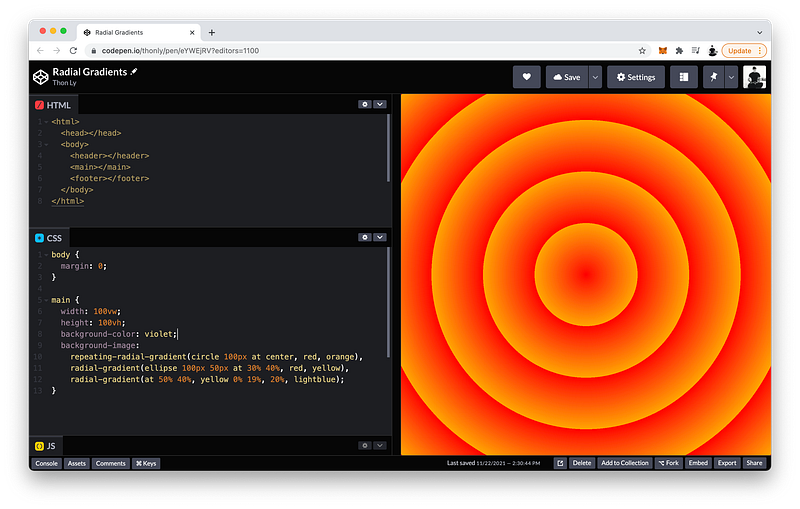
When the circle keyword is used, only one radius can be specified.
circle => requires 1 radiusThe finished Codepen:
Conic Gradients
The third type of gradient is called a conic-gradient.
Let’s see an example: background-image is conic-gradient() from red to violet
main {
 background-color: violet;
 background-image: conic-gradient(red, violet);
}
Again, we can specify as many colors as we like.
As you can see, a conic-gradient() spirals clockwise around a center like a cone.
conic-gradient() => colors spiral clockwise around centerLike radial gradients, we can position this center anywhere. For example, at 30% from the left, and 40% from the top:
main {
 background-color: violet;
 background-image: conic-gradient(at 30% 40%, red, violet);
}
By default, the spiral begins from 0deg:
main {
 background-color: violet;
 background-image: conic-gradient(from 0deg at 30% 40%, red, violet);
}
If we want, we can change this to any angle we want. For example, 45deg:
main {
 background-color: violet;
 background-image: conic-gradient(from 45deg at 30% 40%, red, violet);
}
Like linear and radial gradients, we can specify color starts and color stops. For example, red is from 0deg to 90deg, and violet is from 90deg to 360deg:
main {
 background-color: violet;
 background-image: conic-gradient(from 45deg at 30% 40%, red 0deg 90deg, violet 90deg 360deg);
}
360deg is a full circle.
If we combine this with a radial-gradient(), we can create a pie chart.
For example:
radial-gradient()at 30%from the left, and40%from the top (to give it the same center)- starting from
transparentfrom0%to20% - and ending at
whitefrom20%to100%
main {
 background-color: violet;
 background-image:
  radial-gradient(at 30% 40%, transparent 0% 20%, white 20% 100%),
  conic-gradient(from 45deg at 30% 40%, red 0deg 90deg, violet 90deg 360deg);
}
Lastly, like linear and radial gradients, we can also make conic gradients repeat.
Let’s demonstrate this by creating a roulette wheel:
repeating-conic-gradient()from 0degat center- from
redtoblack
main {
 background-color: violet;
 background-image:
  repeating-conic-gradient(from 0deg at center, red, black),
  radial-gradient(at 30% 40%, transparent 0% 20%, white 20% 100%),
  conic-gradient(from 45deg at 30% 40%, red 0deg 90deg, violet 90deg 360deg);
}
If a roulette wheel has 36 pockets, each pocket should be 10deg in length.
Therefore:
redis from0degto10deg- and
blackis from10degto20deg
main {
 background-color: violet;
 background-image:
  repeating-conic-gradient(from 0deg at center, red 0deg 10deg, black 10deg 20deg),
  radial-gradient(at 30% 40%, transparent 0% 20%, white 20% 100%),
  conic-gradient(from 45deg at 30% 40%, red 0deg 90deg, violet 90deg 360deg);
}
As you can see, the red and black repeat until 360deg is reached.
Now, let’s use radial-gradient() to make it into a wheel:
radial-gradient()circleat center- from
white0%to45% - to
transparent45%to65% - then
whiteagain from65%to100%
main {
 background-color: violet;
 background-image:
  radial-gradient(circle at center, white 0% 45%, transparent 45% 65%, white 65% 100%),
  repeating-conic-gradient(from 0deg at center, red 0deg 10deg, black 10deg 20deg),
  radial-gradient(at 30% 40%, transparent 0% 20%, white 20% 100%),
  conic-gradient(from 45deg at 30% 40%, red 0deg 90deg, violet 90deg 360deg);
}
The result:
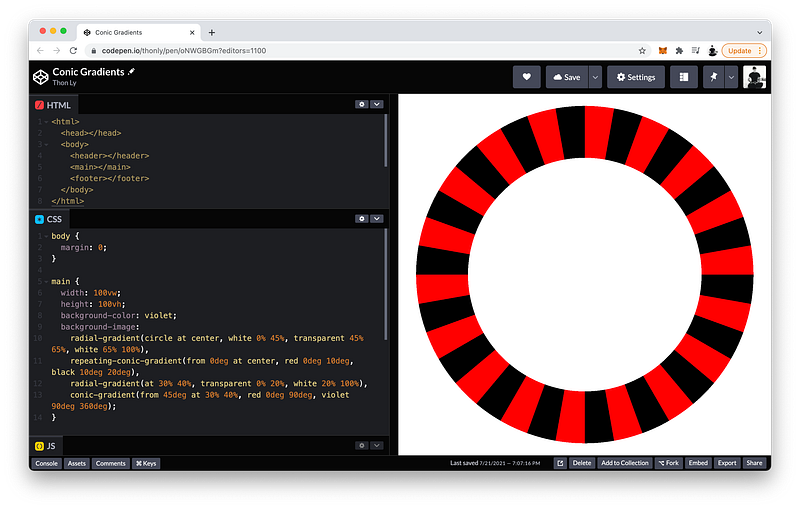
Cool, right? 😎
By creatively combining different types of gradients and taking advantage of transparency, almost any shapes and patterns can be created!
The finished Codepen:
Summary
In this lesson, we learned about three different types of gradients which are a special kind of image that is dynamically generated by CSS.
The three types are:
linear-gradient()radial-gradient()conic-gradient()
We also learn how to make them repeat using
repeating-linear-gradient()repeating-radial-gradient()repeating-conic-gradient()
Linear Gradients
A linear-gradient() creates bands of colors that progress in a straight line.
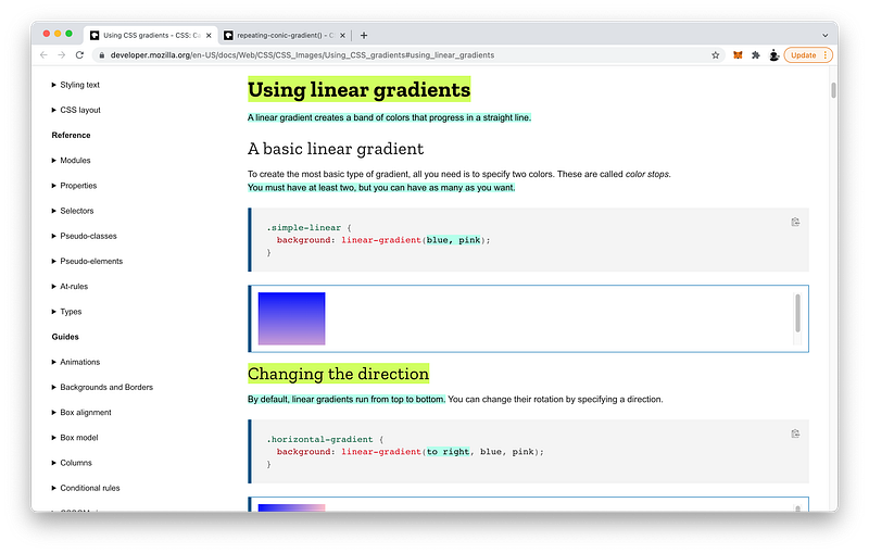
For this to work, we need to specify at least 2 colors, and we can have as many as we want.
By default, linear gradients run from top to bottom. To change it, we can specify a direction:
linear-gradient(to bottom, blue, pink)Also by default, the colors are positioned evenly. If we want, we can control this by specifying color stops:
linear-gradient(to left, lime 28px, red 77%, cyan)We can also specify color starts to create hard lines:
linear-gradient(to bottom left, cyan 50%, palegoldenrod 50%);Again, whenever the color start of one color is the color stop of the next color, a hard line is created.
Also by default, the gradient transitions evenly from one color to the next. To control this, we can specify color hints in between any two adjacent colors:
linear-gradient(blue, 10%, pink);Radial Gradients
A radial-gradient() radiates out from a central point.
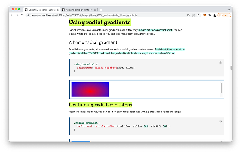
By default, it is an ellipse matching the aspect ratio of the background with its center located at the center of the background.
We can change this center by specifying a location:
radial-gradient(at 0% 30%, red 10px, yellow 30%, #1e90ff 50%)Like linear gradients, we can specify color starts and stops:
radial-gradient(red 10px, yellow 30%, #1e90ff 50%)We can also control the size of the radial gradients using keywords such as:
closest-cornerclosest-sidefarthest-cornerfarthest-side
radial-gradient(closest-side at 25% 75%,
      red, yellow 10%, #1e90ff 50%, beige)
Or, we can use an exact length:
radial-gradient(50px at 25% 75%,
      red, yellow 10%, #1e90ff 50%, beige)
We can specify an ellipse with a specific horizontal radius and vertical radius:
radial-gradient(ellipse 50% 50px,
      red, yellow 10%, #1e90ff 50%, beige)
Or, we can specify a circle with one specific radius:
radial-gradient(circle 50px,
      red, yellow 10%, #1e90ff 50%, beige)
Conic Gradients
A conic-gradient() rotates around a center point in a clockwise direction.
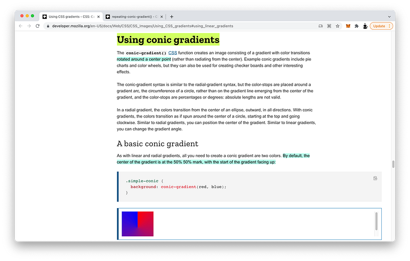
Like radial gradients, this center point is located at the center of the background by default, and it begins at 0 degrees facing up.
To change the center point, we can specify a location:
conic-gradient(at 0% 30%, red 10%, yellow 30%, #1e90ff 50%)We can also change where it starts by specify an angle:
conic-gradient(from 45deg, red, orange 50%, yellow 85%, green)Of course, like linear and radial gradients, we can specify color hints, color starts, and color stops:
conic-gradient(from 45deg, red, orange 50%, yellow 85%, green)Repeating Gradients
Finally, we can make all three types of gradients repeat.
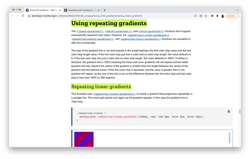
To make linear gradients repeat, ensure that the total length of the color bands is less than the size of the background.
repeating-linear-gradient(-45deg, red, red 5px, blue 5px, blue 10px)When this happens, CSS will repeat the pattern until the entire background is covered.
Likewise, to make radial gradients repeat, ensure that the total length of the color rings is less than the size of the background.
repeating-radial-gradient(black, black 5px, white 5px, white 10px)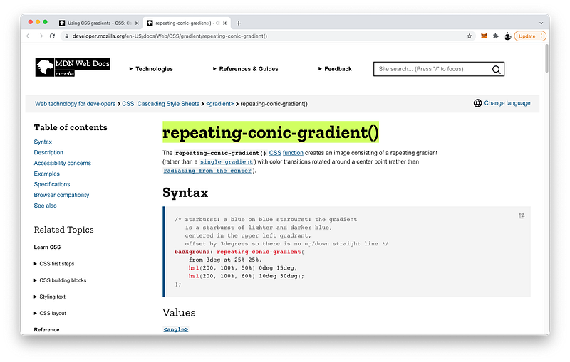
Similarly, to make conic gradients repeat, ensure that the total length of the color slices is less than 360 degrees.
repeating-conic-gradient(from 3deg at 25% 25%, hsl(200, 100%, 50%) 0deg 15deg, hsl(200, 100%, 60%) 10deg 30deg)Again, when these conditions are met, CSS will repeat the gradient pattern until the entire background is covered.
Concept Quiz
Take my Programming Concept Quiz to check your understanding! For every correct choice, you will earn SW Coins which you can redeem for coupons towards the purchase of any of my Udemy courses!
Sample Quiz Questions for Lesson 13:
Question 1:
CSS Gradients are:
- Static images
- Static colors
- Dynamic images
- Dynamic colors
Question 2:
Which type of gradient creates linear bands of colors?
- linear-gradient()
- radial-gradient()
- conic-gradient()
Question 3:
Which type of gradient radiates out from a center point?
- linear-gradient()
- radial-gradient()
- conic-gradient()
Question 4:
Which type of gradient spirals clockwise around a center point?
- linear-gradient()
- radial-gradient()
- conic-gradient()
Question 5:
Multiple layers of background images are NOT allowed.
- True
- False
Question 6:
The transparent keyword is equal to:
- rgb(255, 255, 255)
- rgb(255, 255, 255, 255)
- rgb(0, 0, 0)
- rgb(0, 0, 0, 0)
Question 7:
Which value controls where the transition occurs?
- color hint
- color start
- color stop
Question 8:
Which value controls where the color begins?
- color hint
- color start
- color stop
Question 9:
Which value controls where the color ends?
- color hint
- color start
- color stop
Question 10:
We can specify as many colors to transition as we want.
- True
- False
Question 11:
To create a hard line, the color stop of the color must equal the color start of the next color.
- True
- False
Question 12:
By default, the first color will start at 0.
- True
- False
Question 13:
By default, the last color will stop at 100%.
- True
- False
Question 14:
By default, a radial-gradient() is a:
- circle
- ellipse
Question 15:
A conic-gradient spirals counterclockwise.
- True
- False
Question 16:
A full circle is equal to:
- 0deg
- 90deg
- 180deg
- 360deg
Question 17:
To create a gradient, one color is enough.
- True
- False
Question 18:
To make linear gradients repeat, the total length of the color bands must be ____ than the size of the background.
- less
- greater
Question 19:
To make radial gradients repeat, the total length of the color rings must be ____ than the size of the background.
- less
- greater
Question 20:
To make conic gradients repeat, the total length of the color slices must be ____ than the size of the background.
- less
- greater
→ Programming Concept Quiz for Chapter 13
Coding Exercises
Check out my Interactive Coding Exercises to put to practice what you have learned! There, you will also find interactive hints to help you understand each line of code. Likewise, for every correct solution, you will earn SW Coins which you can redeem for coupons towards the purchase of any of my Udemy courses!
→ Interactive Coding Exercises for Chapter 13
Syntax Flashcards
Review what you have learned by playing my Syntax Flashcard Game! These flashcards are designed to help you commit to memory all the new code syntaxes you learned in this lesson. Likewise, for every correct answer, you will earn SW Coins which you can redeem for coupons towards the purchase of any of my Udemy courses!
→ Syntax Flashcard Game for Chapter 13
Next Steps
Congrats on completing Unit 2: Lesson 8 of 13! 🎉
Unit 1: 100% Completed
Unit 2: 62% Completed
Unit 3: 0% Completed
Unit 4: 0% Completed
Unit 5: 0% Completed
Bonus Unit 6: 0% Completed
Bonus Unit 7: 0% Completed
Overall Progress: 13% Completed→ Join Remote Frontend Cohort Program
Next Lesson
If you have successfully developed the critical and creative thinking to combine multiple gradients to generate almost any design pattern of your imagination, then you are ready to take on the challenge of designing page layouts that can adapt to any device screen size. In the next two lessons, we will learn about two powerful CSS technologies called Flexbox and Grid to make creating responsive layouts easier than ever before!
→ Chapter 14: Responsive Layouts with CSS Flexbox
When you use my referral link above 👆 to become a Medium member, all proceeds will be donated towards the construction of the Silicon Wat Campus for children in Ukraine and Cambodia ❤️