
Chapter 12: CSS Background
A Complete Frontend Developer Textbook for Beginners (2023 Edition)

This is the textbook version of Lesson 12 of 100 from the Udemy video course: A Complete Frontend Developer Course for Beginners
← Chapter 11: CSS Colors in RGB and HSL
Overview
This lesson covers the following HTML tags, CSS properties, and JavaScript commands for the first time:
HTML
None.
CSS
- background-image
- background-blend-mode
- background-size
- background-repeat
- background-origin
- background-position
- background-attachment
- box-sizing
JS
None.
This lesson begins with this Codepen. Code along with me to increase retention!
Lecture
In this lesson, we cover all the background properties which mostly relate to the background-image. Finally, we combine them all into a nice shorthand!
HTML Window:<html>
<head></head>
<body>
<header></header>
<main></main>
<footer></footer>
</body>
</html>Image
Thus far, we have learned how to add a background-color to any HTML element.
body {
width: 75vw;
height: 75vh;
border: solid red;
background-color: lightgreen;
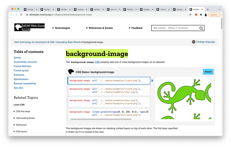
}Now, let’s learn how to add a background image to any element.
To add a background image to the body, for example, we write:
body {
 width: 75vw;
 height: 75vh;
 border: solid red;
 background-color: lightgreen;
 background-image:
}
Then, we specify the URL of our image:

body {
 width: 75vw;
 height: 75vh;
 border: solid red;
 background-color: lightgreen;
 background-image: url(https://interactive-examples.mdn.mozilla.net/media/examples/lizard.png);
}
Like background-color, notice that even though the body is only 75% of the viewport:
body {
 width: 75vw;
 height: 75vh;
 border: solid red;
 background-color: lightgreen;
 background-image: url(https://interactive-examples.mdn.mozilla.net/media/examples/lizard.png);
}
The background-image completely fills the viewport.
Let’s contrast this with main by giving it a background-image as well:
main {
 width: 50vw;
 height: 50vh;
 background-color: green;
 background-image: url(https://interactive-examples.mdn.mozilla.net/media/examples/lizard.png);
}
As you can see, the background-image here only applies within the dimensions of main.
Also note the order in which background-color and background-image are layered on top of one another.
Here, we can see that the background-color is on the bottom layer, while background-image is on the top layer.
Top Layer: background-image
Bottom Layer: background-color
The finished Codepen:
Blend Mode
Let’s now look at other background properties one by one. As we have seen, the background for the body element always covers the entire viewport.
As such, some background properties do not work on the body element.
Therefore, we will demo on the main element only.
main {

}
First, let’s make it full screen by giving it a width of 100vw, a height of 100vh, and a background-color of green so we can see it:
main {
 width: 100vw;
 height: 100vh;
 background-color: green;
}
It is showing scrollbars because it’s a little bit larger than the viewport. The reason is because the body element has a default margin of 8px:
body {
 margin: 8px;
}
Let’s remove this margin:
body {
 margin: 0;
}
Now, the main element is exactly the size of the viewport.
Let’s add a background-image:
main {
width: 100vw;
height: 100vh;
background-color: green;
background-image: url(https://interactive-examples.mdn.mozilla.net/media/examples/lizard.png);
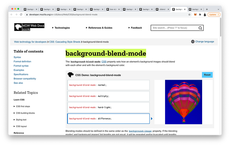
}If we want to blend this background-image with the background-color, we can use background-blend-mode. The default is normal:
main {
 width: 100vw;
 height: 100vh;
 background-color: green;
 background-image: url(https://interactive-examples.mdn.mozilla.net/media/examples/lizard.png);
 background-blend-mode: normal;
}
But if we want, we can make it multiply:
main {
 width: 100vw;
 height: 100vh;
 background-color: green;
 background-image: url(https://interactive-examples.mdn.mozilla.net/media/examples/lizard.png);
 background-blend-mode: multiply;
}
Or, screen:
main {
 width: 100vw;
 height: 100vh;
 background-color: green;
 background-image: url(https://interactive-examples.mdn.mozilla.net/media/examples/lizard.png);
 background-blend-mode: screen;
}
Or any of the following:
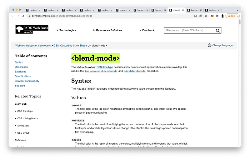
overlaydarkenlightencolor-dodgecolor-burnhard-lightsoft-lightdifferenceexclusionhuesaturationcolorluminosity
Size and Repeat
As you can see, background-image repeats by default.
This is achieved with the background-repeat property, and a value of repeat:
main {
 background-repeat: repeat;
}
If we want, we can make it repeat only in the x-direction:
main {
 background-repeat: repeat-x;
}
Or, in the y-direction:
main {
 background-repeat: repeat-y;
}
If we don’t like how some images are cropped, we can stretch the images so that they fit using:
main {
 background-repeat: round;
}
If we don’t want the images to stretch, we can use:
main {
 background-repeat: space;
}
Of course, we can tell it not to repeat:
main {
 background-repeat: no-repeat;
}
We can also control the size of each image using background-size.
main {
 background-repeat: no-repeat;
 background-size:
}
If we want to make the image as large as possible, we can use:
main {
 background-repeat: no-repeat;
 background-size: contain;
}
If we want it to completely cover the background, we can use:
main {
 background-repeat: no-repeat;
 background-size: cover;
}
Note that the image might be cropped to achieve this.
Of course, we can specify the exact width and height that we want:
main {
 background-repeat: no-repeat;
 background-size: 300px 100px;
}
If we want to specify just the width while maintaining the right proportion, we can set the height to auto:
main {
 background-repeat: no-repeat;
 background-size: 300px auto;
}
Likewise, if we want to specify just the height while maintaining the right proportion, we can set the width to auto :
main {
 background-repeat: no-repeat;
 background-size: auto 100px;
}
Clip and Origin
Now, let’s look at the background-origin property which is similar to the background-clip property that we have already seen.
To see its effects, let’s make the border: solid, 30px, and red with a transparency of 50% using RGB
main {
 width: 100vw;
 height: 100vh;
 border: solid 30px rgb(100%, 0%, 0%, 50%);
}
Let’s also make the padding: 20px
main {
 width: 100vw;
 height: 100vh;
 border: solid 30px rgb(100%, 0%, 0%, 50%);
 padding: 20px;
}
Notice that by adding the padding and border, our main element is now larger than the viewport.
main {
 width: 100vw;
 height: 100vh;
 border: solid 30px rgb(100%, 0%, 0%, 50%);
 padding: 20px;
}
Which is evidenced by the scrollbars.
If we want, we can make it exactly fit the viewport by using the box-sizing property.
By default, it is set to content-box:
main {
 width: 100vw;
 height: 100vh;
 border: solid 30px rgb(100%, 0%, 0%, 50%);
 padding: 20px;
 box-sizing: content-box;
}
Which means the height and the width are just the height and the width of the content area:
content-box: width x height = contentIf we set it to border-box instead:
main {
 width: 100vw;
 height: 100vh;
 border: solid 30px rgb(100%, 0%, 0%, 50%);
 padding: 20px;
 box-sizing: border-box;
}
The height and width will also include the padding and the border:
border-box:width x height = content + padding + borderAs you can see now, the scrollbars disappear because our main element is now exactly the size of the viewport.
We have learned that with background-clip, we can control how much the background-color covers.
main {
 background-color: green;
}
To make it cover only the content area,
background-color => contentwe can use content-box:
main {
 background-color: green;
 background-clip: content-box;
}
To make it also cover the padding area,
background-color => content + paddingwe can use padding-box:
main {
 background-color: green;
 background-clip: padding-box;
}
To make it cover all the way to the border,
background-color => content + padding + borderwe can use border-box (which is the default):
main {
 background-color: green;
 background-clip: border-box;
}
Similarly, we can control how the background-image is positioned using background-origin.
If we want it to start at the content area,
background-image => contentwe can use content-box:
main {
 background-image: url(https://interactive-examples.mdn.mozilla.net/media/examples/lizard.png);
 background-origin: content-box;
}
If we want it to start at the padding area,
background-image => paddingwe can use padding-box (which is the default):
main {
 background-image: url(https://interactive-examples.mdn.mozilla.net/media/examples/lizard.png);
 background-origin: padding-box;
}
Finally, if we want it to start at the border area,
background-image => borderwe can use border-box:
main {
 background-image: url(https://interactive-examples.mdn.mozilla.net/media/examples/lizard.png);
 background-origin: border-box;
}
To summarize:
box-sizing => width x height
background-clip => background-color
background-origin => background-image
Position and Attachment
Relative to the background-origin, we can also set the background-position. By default, it is located at the top left:
main {
 background-image: url(https://interactive-examples.mdn.mozilla.net/media/examples/lizard.png);
 background-origin: border-box;
 background-position: top left;
}
If we want, we can change it to:
main {
 background-image: url(https://interactive-examples.mdn.mozilla.net/media/examples/lizard.png);
 background-origin: border-box;
 background-position: top right;
}
Or:
main {
 background-image: url(https://interactive-examples.mdn.mozilla.net/media/examples/lizard.png);
 background-origin: border-box;
 background-position: bottom right;
}
Or:
main {
 background-image: url(https://interactive-examples.mdn.mozilla.net/media/examples/lizard.png);
 background-origin: border-box;
 background-position: bottom left;
}
Or:
main {
 background-image: url(https://interactive-examples.mdn.mozilla.net/media/examples/lizard.png);
 background-origin: border-box;
 background-position: center left;
}
Or:
main {
 background-image: url(https://interactive-examples.mdn.mozilla.net/media/examples/lizard.png);
 background-origin: border-box;
 background-position: center center;
}
Etc!
We can even specify an exact distance. For example, 100px from the left, and 50px from the top:
main {
 background-image: url(https://interactive-examples.mdn.mozilla.net/media/examples/lizard.png);
 background-origin: border-box;
 background-position: 100px 50px;
}
Now, let’s make the main element overflow by changing the width to 150vw and the height to 150vh:
main {
 width: 150vw;
 height: 150vh;
 background-image: url(https://interactive-examples.mdn.mozilla.net/media/examples/lizard.png);
 background-origin: border-box;
 background-position: 100px 50px;
}
When we scroll, the background-image also scrolls.
This is determined by the background-attachment property, which is set to scroll by default:
main {
 width: 150vw;
 height: 150vh;
 background-image: url(https://interactive-examples.mdn.mozilla.net/media/examples/lizard.png);
 background-origin: border-box;
 background-position: 100px 50px;
 background-attachment: scroll;
}
If we set it to fixed instead:
main {
 width: 150vw;
 height: 150vh;
 background-image: url(https://interactive-examples.mdn.mozilla.net/media/examples/lizard.png);
 background-origin: border-box;
 background-position: 100px 50px;
 background-attachment: fixed;
}
The background-image will not scroll.
The finished Codepen:
Shorthand
To review, CSS lets us control:
main {
 background-color: green;
 background-image: url(https://interactive-examples.mdn.mozilla.net/media/examples/lizard.png);
 background-repeat: no-repeat;
 background-attachment: fixed;
 background-origin: border-box;
 background-clip: border-box;
 background-position: 100px 50px;
 background-size: auto 100px;
 background-blend-mode: luminosity;
}
If we want to write a lot less, CSS also gives us a simple shorthand property called background:
main {
   background:
}
Using this shorthand, we can just write:
main {
   background: green url(https://interactive-examples.mdn.mozilla.net/media/examples/lizard.png) no-repeat fixed border-box border-box 100px 50px / auto 100px;
}
background-blend-mode is not yet supported.
background-origin needs to appear before background-clip:
main {
   background: green url(https://interactive-examples.mdn.mozilla.net/media/examples/lizard.png) no-repeat fixed border-box border-box 100px 50px / auto 100px;
}
And background-position needs to appear before background-size separated by a /:
main {
   background: green url(https://interactive-examples.mdn.mozilla.net/media/examples/lizard.png) no-repeat fixed border-box border-box 100px 50px / auto 100px;
}
Other than this, the order of the other properties does not matter.
The finished Codepen:
Multiple Background Images
You may be wondering why you should learn this complicated shorthand. A good use case is when we want to layer multiple images together.
To appreciate this shorthand, let’s do an example using the longhand first! Like before, to add the first background-image on main, we can write:
main {
 background-color: green;
 background-image: url(https://interactive-examples.mdn.mozilla.net/media/examples/lizard.png);
 background-repeat: no-repeat;
 background-position: center;
 background-size: 75%;
 background-blend-mode: luminosity;
}
Let’s now try to add the same background-image on top. To do this, we simply include the same url and then a comma:
main {
 background-color: green;
 background-image: url(https://interactive-examples.mdn.mozilla.net/media/examples/lizard.png), url(https://interactive-examples.mdn.mozilla.net/media/examples/lizard.png);
 background-repeat: no-repeat;
 background-position: center;
 background-size: 75%;
 background-blend-mode: luminosity;
}
To make the top image not repeat also, we simply write no-repeat and then a comma:
main {
 background-color: green;
 background-image: url(https://interactive-examples.mdn.mozilla.net/media/examples/lizard.png), url(https://interactive-examples.mdn.mozilla.net/media/examples/lizard.png);
 background-repeat: no-repeat, no-repeat;
 background-position: center;
 background-size: 75%;
 background-blend-mode: luminosity;
}
Likewise, to position the top image at the center too, we simply write center and then a comma:
main {
 background-color: green;
 background-image: url(https://interactive-examples.mdn.mozilla.net/media/examples/lizard.png), url(https://interactive-examples.mdn.mozilla.net/media/examples/lizard.png);
 background-repeat: no-repeat, no-repeat;
 background-position: center, center;
 background-size: 75%;
 background-blend-mode: luminosity;
}
Likewise again, to set the top image background-size to 35%, we simply write 35% and then a comma:
main {
 background-color: green;
 background-image: url(https://interactive-examples.mdn.mozilla.net/media/examples/lizard.png), url(https://interactive-examples.mdn.mozilla.net/media/examples/lizard.png);
 background-repeat: no-repeat, no-repeat;
 background-position: center, center;
 background-size: 35%, 75%;
 background-blend-mode: luminosity;
}
Finally, to set the top image background-blend-mode to difference, we simply write difference and then a comma:
main {
 background-color: green;
 background-image: url(https://interactive-examples.mdn.mozilla.net/media/examples/lizard.png), url(https://interactive-examples.mdn.mozilla.net/media/examples/lizard.png);
 background-repeat: no-repeat, no-repeat;
 background-position: center, center;
 background-size: 35%, 75%;
 background-blend-mode: difference, luminosity;
}
In this way, as long as we separate each layer with a comma, bearing in mind its exact order in the list, we can add as many background images as we like.
Note that there can only be one background-color.
Let’s compare and contrast this with the shorthand! To add the first background-image on main, we write:
main {
 background: green url(https://interactive-examples.mdn.mozilla.net/media/examples/lizard.png) no-repeat center / 75%;
}
Again, background-blend-mode is not yet supported in the shorthand.
Similar to the longhand, to add a top layer, we simply write:
main {
 background:
  url(https://interactive-examples.mdn.mozilla.net/media/examples/lizard.png) no-repeat center / 35%,
  green url(https://interactive-examples.mdn.mozilla.net/media/examples/lizard.png) no-repeat center / 75%;
}
Note that since there can only be one background-color, it can only be declared on the bottommost layer.
Which method is easier for you? Short or long?
What if there were not 2, but 10 layers?
As the number of layers increases, it may become increasingly more difficult to keep track of all the properties that belong to each layer. In such cases, the shorthand may be perfect! 😄
The finished Codepen:
Summary
In this lesson, we dived deep into the background-image.
To include it, we write url() and then specify the link to the image:
background-image: url(https://interactive-examples.mdn.mozilla.net/media/examples/lizard.png);If we want to blend the background-color and background-image together, it is possible with the background-blend-mode. By default, it is normal:
background-blend-mode: normal;We can make them:
- multiply
- hard-light
- difference
- etc!
For a complete list, check out this MDN article:
By default, the background-image repeats:
background-repeat: repeat;If we want, we can make it repeat in only one direction:
background-repeat: repeat-x;Or, not at all:
background-repeat: no-repeat;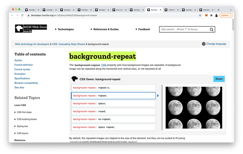
We can also specify the size of the background-image. We can contain it within our element:
background-size: contain;
Or, cover our entire element with it:
background-size: cover;
We can also specify the exact width and height we want:
background-size: 200px 100px;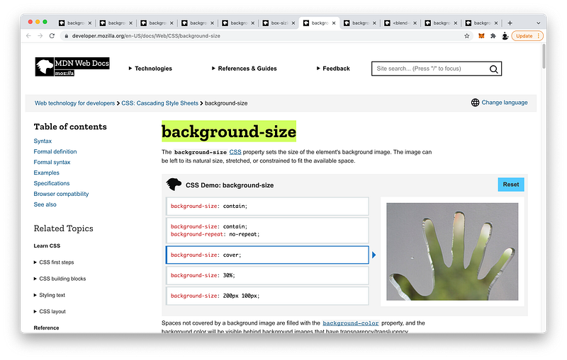
Then, we looked at the box-sizing property to control how the CSS width and height properties are defined.
By default, they represent the width and height of the content area:
box-sizing: content-box;With border-box, we can make them include the padding and border areas as well:
box-sizing: border-box;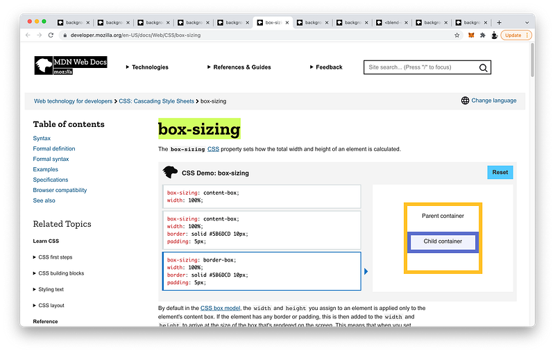
With background-clip, we can limit the background-color to just the content area:
background-clip: content-box;Or, extend it to the padding:
background-clip: padding-box;Or, to the border:
background-clip: border-box;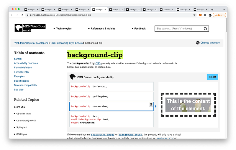
With background-origin, we can begin our background-image at the content area:
background-origin: content-box;Or, at the padding area:
background-origin: padding-box;Or, at the border area:
background-origin: border-box;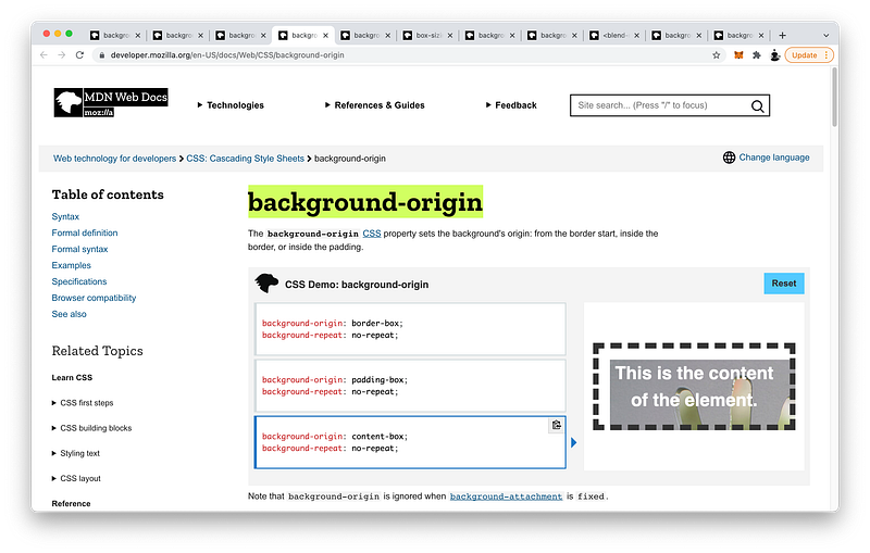
Relative to this background-origin, we can position our background-image anywhere on the element. We can place it at the top:
background-position: top;
The left:
background-position: left;
The center:
background-position: center;Or, an exact location:
background-position: bottom 50px right 100px;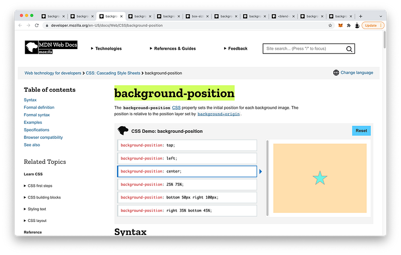
Finally, with background-attachment, we can fix our background-image even while scrolling:
background-attachment: fixed;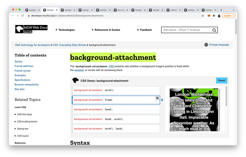
As you can see, CSS gives us a lot of background properties to control. To make this easy, we can use this simple shorthand:
background: left 5% / 15% 60% repeat-x url("../../media/examples/star.png");background-origin needs to precede background-clip, and background-position needs to precede background-size separated by a /.
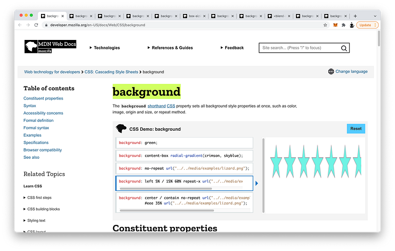
Besides this, the other background properties can appear in any order.
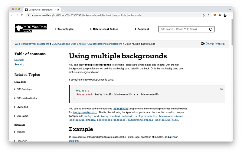
Lastly, we looked at how to layer multiple background images on the same element. As long as we separate each layer with a comma, we can use the longhand or shorthand to add as many as we like!
Concept Quiz
Take my Programming Concept Quiz to check your understanding! For every correct choice, you will earn SW Coins which you can redeem for coupons towards the purchase of any of my Udemy courses!
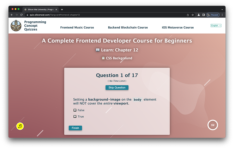
Sample Quiz Questions for Lesson 12:
Question 1:
Setting a background-image on the body element will NOT cover the entire viewport.
- True
- False
Question 2:
background-color will appear on the top layer while background-image will appear on the bottom layer.
- True
- False
Question 3:
The body element has a default margin of how much?
- 5px
- 8px
- 10px
Question 4:
Background-blend-mode blends background-image with background-color.
- True
- False
Question 5:
Which CSS statement repeats the background-image in only the y-direction?
- background-repeat: repeat;
- background-repeat: repeat-x;
- background-repeat: repeat-y;
- background-repeat: no-repeat;
Question 6:
Which CSS statement makes the background-image as large as possible without cropping?
- background-size: cover;
- background-size: contain;
- background-size: 100% 100%;
Question 7:
Which CSS statement will make the background-image height as long as possible while still maintaining its proportion?
- background-size: 100% auto;
- background-size: auto 100%;
- background-size: auto auto;
Question 8:
Which CSS statement makes the CSS width and height equal to the dimensions of the content area?
- box-sizing: content-box
- box-sizing: padding-box
- box-sizing: border-box
Question 9:
Which CSS statement makes the CSS width and height equal to the dimensions of the border’s outer edge?
- box-sizing: content-box;
- box-sizing: padding-box;
- box-sizing: border-box;
Question 10:
Which CSS statement will make the background-color extend to the outer edge of the content area?
- background-clip: content-box;
- background-clip: padding-box;
- background-clip: border-box;
Question 11:
Which CSS statement will make the background-color extend to the outer edge of the padding area?
- background-clip: content-box;
- background-clip: padding-box;
- background-clip: border-box;
Question 12:
Which CSS statement will make the background-color extend to the outer edge of the border area?
- background-clip: content-box;
- background-clip: padding-box;
- background-clip: border-box;
Question 13:
Which CSS property controls where the background-image begins?
- background-attachment
- background-origin
- background-position
Question 14:
Which CSS property controls where the background-image appears relative to the background-origin?
- background-attachment
- background-origin
- background-position
Question 15:
Which CSS property controls how the background-image behaves when scrolling?
- background-attachment
- background-origin
- background-position
Question 16:
When using the background shorthand, background-origin needs to precede background-clip.
- True
- False
Question 17:
When using the background shorthand, background-position and background-size need to be separated by a /.
- True
- False
→ Programming Concept Quiz for Chapter 12
Coding Exercises
Check out my Interactive Coding Exercises to put to practice what you have learned! There, you will also find interactive hints to help you understand each line of code. Likewise, for every correct solution, you will earn SW Coins which you can redeem for coupons towards the purchase of any of my Udemy courses!
→ Interactive Coding Exercises for Chapter 12
Syntax Flashcards
Review what you have learned by playing my Syntax Flashcard Game! These flashcards are designed to help you commit to memory all the new code syntaxes you learned in this lesson. Likewise, for every correct answer, you will earn SW Coins which you can redeem for coupons towards the purchase of any of my Udemy courses!
→ Syntax Flashcard Game for Chapter 12
Next Steps
Congrats on completing Unit 2: Lesson 7 of 13! 🎉
Unit 1: 100% Completed
Unit 2: 54% Completed
Unit 3: 0% Completed
Unit 4: 0% Completed
Unit 5: 0% Completed
Bonus Unit 6: 0% Completed
Bonus Unit 7: 0% Completed
Overall Progress: 12% Completed→ Join Remote Frontend Cohort Program
Next Lesson
Now that we have mastered background-color and background-image, we’re perfectly ready to learn about CSS Gradients. In the next lesson, we will learn how to create linear gradients, radial gradients, and conic gradients. Moreover, we will learn how to repeat them and combine them to generate some really interesting shapes and patterns!
When you use my referral link above 👆 to become a Medium member, all proceeds will be donated towards the construction of the Silicon Wat Campus for children in Ukraine and Cambodia ❤️


