
Building a Customized Tooltip in Power BI
Creating customized tooltips in Power BI can significantly enhance the user experience by providing additional context and insights directly within your visualizations. This article guides you through the process of building these tooltips, ensuring your reports are both informative and visually appealing.
Tooltips are small pop-up boxes that appear when you hover over a data point in a visual. They provide additional information without cluttering the main report. By customizing these tooltips, you can tailor the information to better suit the needs of your audience.
Key Highlights:
Understanding Tooltips:
- Tooltips provide additional context and details.
- They help keep the main report clean and focused.
Benefits of Custom Tooltips:
- Enhance data storytelling by displaying relevant details.
- Improve user interaction and engagement with the report.
- Offer a cleaner and more organized way to present supplementary data.
Customization Options:
- Use different visual types (charts, tables, etc.) within the tooltip.
- Apply formatting options to match the tooltip with your report’s theme.
- Utilize dynamic content to make tooltips context-sensitive.
By following these tips and exploring the customization options, you can create powerful, customized tooltips that add depth and clarity to your Power BI reports.
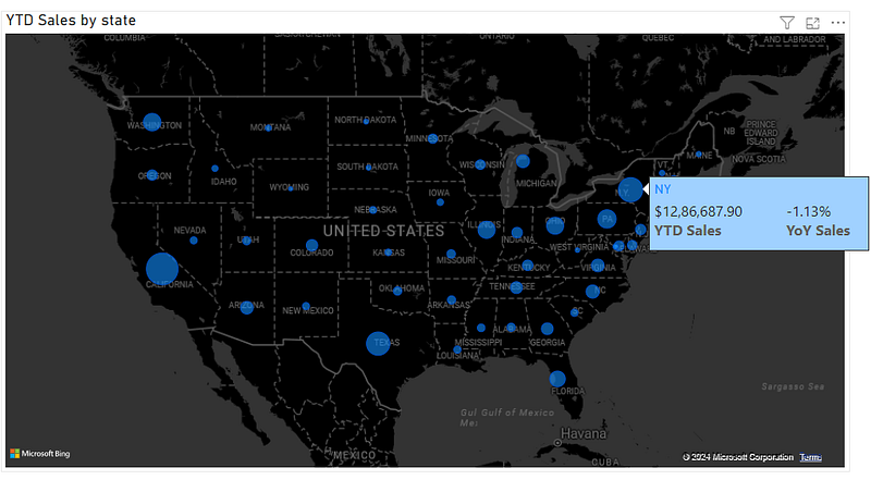
In effect you will end up with the below tooltip:
Implementation in Power BI:
Here are all the steps we will be following in the step-by-step guide to help you set it up:
- Calculating DAX for YTD Sales and YoY Sales
- Creating a Map
- Creating the Tooltip
- Setting up the Tooltip
- Adding the Tooltip to the Map
Happy learning!

1. Calculating DAX for YTD Sales and YoY Sales:
We will begin by creating a few DAX functions:
YTD Sales = TOTALYTD(SUM(ecommerce_data[sales_per_order]), Calender[Date])

This DAX requires a calendar table refer below to create one it’s easy.
PYTD Sales = CALCULATE(SUM(ecommerce_data[sales_per_order]), SAMEPERIODLASTYEAR(Calender[Date]))

CALCULATE
The CALCULATE function evaluates an expression in a modified filter context. Essentially, it allows you to change the context in which data is evaluated.
Syntax:
CALCULATE(<expression>, <filter1>, <filter2>, ...)SAMEPERIODLASTYEAR
The SAMEPERIODLASTYEAR function is a time intelligence function that returns a table with the same period in the previous year. It’s useful for year-over-year comparisons.
Syntax:
SAMEPERIODLASTYEAR(<dates>)YoY Sales = ([YTD Sales] — [PYTD Sales])/[PYTD Sales]

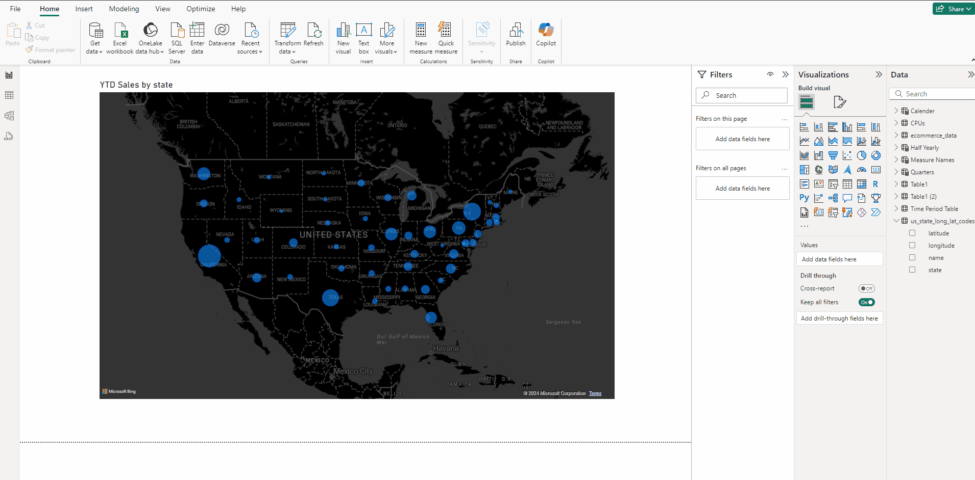
2. Creating a Map:
- Add a Map from Visualizations.
- Add state in Location section.
- Add YTD Sales in Bubble size section.
- In Format visual → Visual → Map settings select Dark.
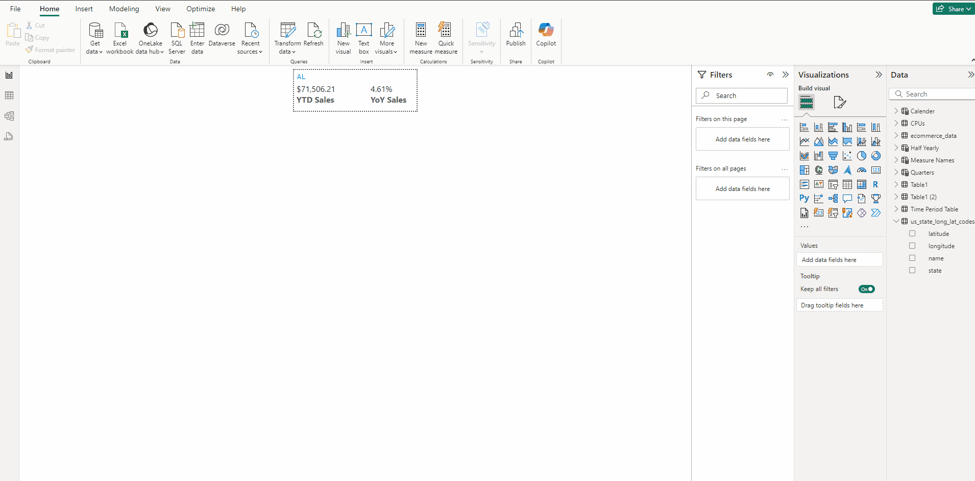
3. Creating the Tooltip:
- In a Blank page go to Canvas settings.
- In Type select Tootltip.
- Add a Multi-row card and put YTD Sales, YoY Sales and state to it.
- With card selected in Format visual → General expand Properties and in Height use 86 and in Width use 300.
- In Format visual → Visual expand Category labels and Bold the Font.
- Expand Cards and turn off Accent bar.
- Now deselect the card and in Canvas settings select Custom and use for Height 80 and for Width use 240.
4. Setting up the Tooltip:
- Select the card and in Format visual → General → Effects set Background Color to #A0D1FF.
- Now deselect the card and in Page information type CustomizedTooltip and turn on Allow use as tooltip.
5. Adding the Tooltip to the Map:
- Select the Map.
- In Format visual → General expand Tooltip, in Type keep Report page and in Page select CustomizedTooltip.
- Hover over the Bubbles to see the custom tooltip.
Thank you for your attention!
Follow me or subscribe to get all my Power BI articles!
Don’t forget to subscribe to
👉 Power BI Publication
👉 Power BI Newsletter
and join our Power BI community: