
An Introduction to React Table
A utility belt for lightweight, fast, and extendable data grids

A table, also called a data grid, is an arrangement of data in rows and columns, or possibly in a more complex structure. It is an essential building block of a user interface. I’ve built tables using Java Swing, ExtJs, Angular, and React. I’ve also used a number of third party tables. As a UI developer, there’s no escape from table components.
Build vs. buy? It is always a choice between cost and control. When there is an open-source with a proven track record, the choice becomes a no-brainer.
I would recommend using React Table, which provides a utility belt for lightweight, fast, and extendable data grids. This project started in October, 2016, with hundreds of contributors and tens of thousands of stars. It presents a custom hook, useTable, which implements row sorting, filtering, searching, pagination, row selection, infinity scrolling, and many more features.
Basic Table
As always, we use Create React App as a starting point. First, install React Table with the command npm i react-table. Then the package becomes part of dependencies in package.json.
"dependencies": {
  "react-table": "^7.1.0"
}
Change src/index.css to this for minimal table styling:
The following is a basic table, with five columns and ten rows.
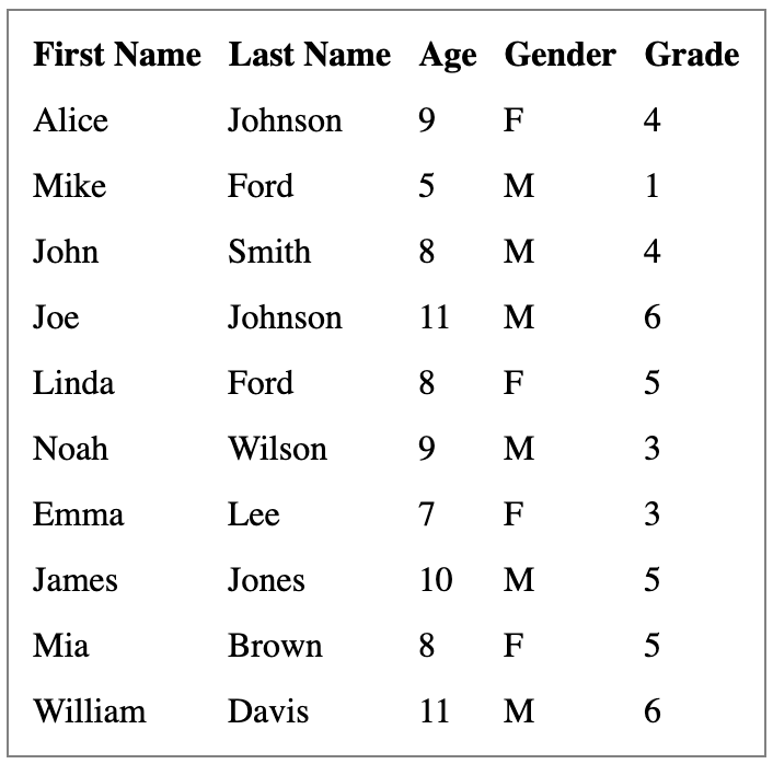
Similar to any table, a React Table is composed of columns and data:
columnsis an array of columns. Columns can be nested, which act as header groups. In addition, columns can be recursively nested as much as needed.datais an array of rows to be displayed on the table.
We set up src/dataSource.js for columns and data. In the following code, accessor serves as a column key, which is used to define each column in row data. The Column ID is generated from a string accessor or provided by the column definition. Header is the column display string or JSX. Both accessor and Header can be a function.
Replace src/App.js with our table code.
Lines 12 to 15 is useTable hook. It takes options and plugins to build a table instance. The basic options are columns and data. Plugins are optional.
In lines 7 to 11, we use a number of props from the useTable instance:
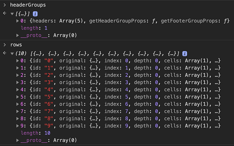
getTablePropsis a function to resolve any props needed by the table wrapper. The built-in table props is{role: “table”}, which can be customized.getTableBodyPropsis a function to resolve any props needed by the table body wrapper. The built-in table props is{role: “rowgroup”}, which can be customized.prepareRowis a function that must be called on any rows to be displayed. It is responsible for lazily preparing a row for rendering.headerGroupsandrowsare internal data structures derived from columns and data.
With the props from useTable instance, we obtain the building blocks to compose the Table in lines 18 to 40. headerGroups, rows, and columns are complex data structures, which include additional functions for use, such as getHeaderGroupProps, getHeaderProps, getRowProps, and getCellProps. You can also call column.render(‘Header’) and cell.render(‘Cell’).
Below is the translated HTML definition of the table.
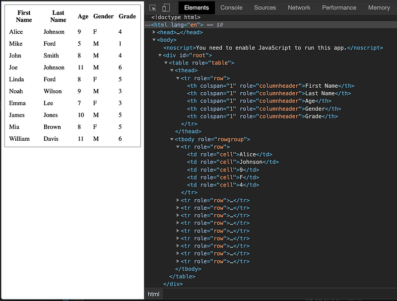
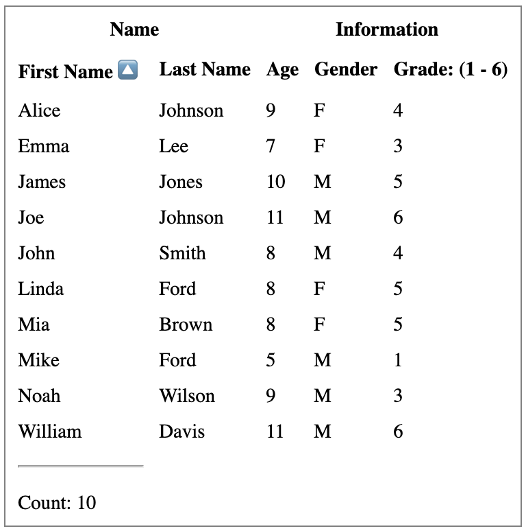
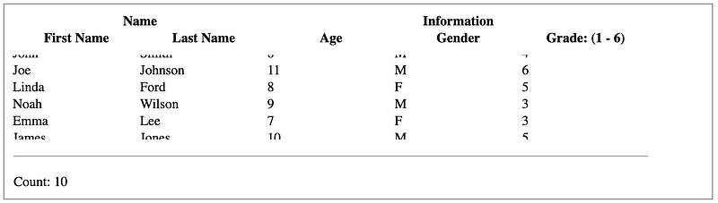
Table With Grouped Headers and Footers
Table headers can be grouped and so can footers.
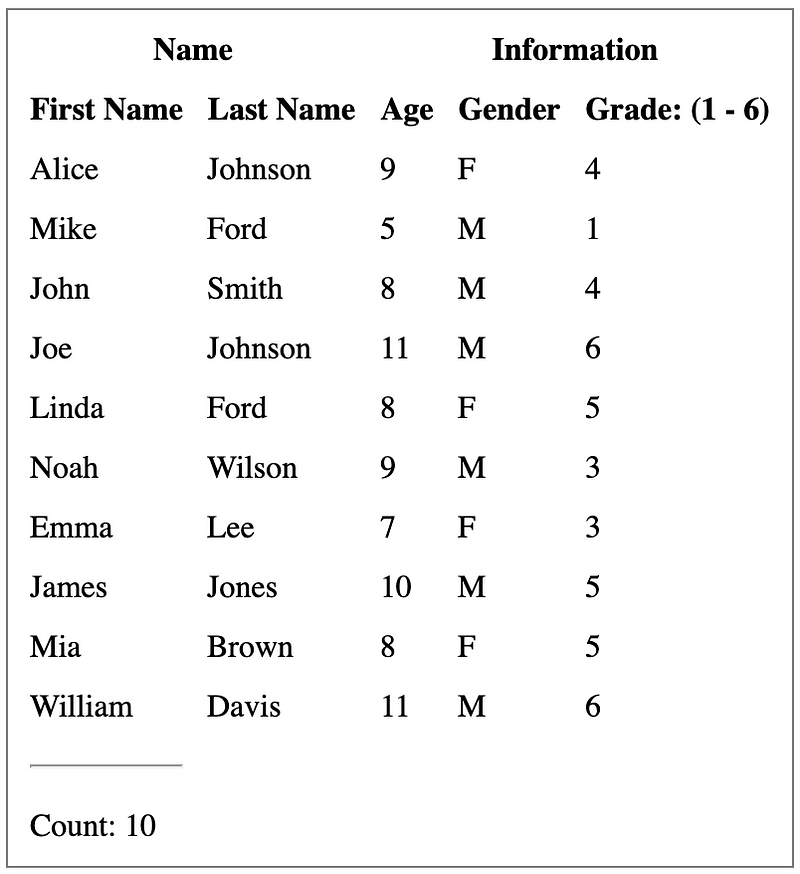
We achieve the above table by defining columns.
We use nested columns to put firstName and lastName into a group, Name, and the other three columns into another group, Information.
The column group, Name, has a footer render to calculate the total row count (lines 4 to 11).
The column, firstName, uses a separator for footer (line 15).
The column, grade, has a header render to generate a display text based on rows values (lines 36 to 54).
Here is the adjusted src/App.js to use headers and footers:
Line 10 retrieves footerGroups, which is used in lines 41 to 49 to display the table footer.
Table With Row Sorting
Row sorting is a basic table functionality. Usually it’s implemented by clicking column headers to sort the table. React Table’s plugin, useSortBy, supports single column row sorting, as well as multi-column row sorting.
The following table is sorted by First Name:
This is the revised src/App.js to perform row sorting:
At line 18 the plugin useSortBy is supplied.
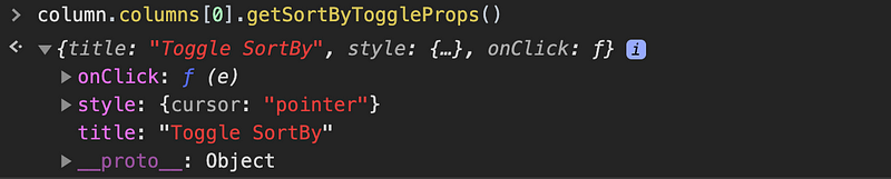
Line 27 uses getSortByToggleProps(), a function that resolves any props needed while toggling the sort direction.
Lines 29 to 31 display a descending or ascending arrow for sorted column.
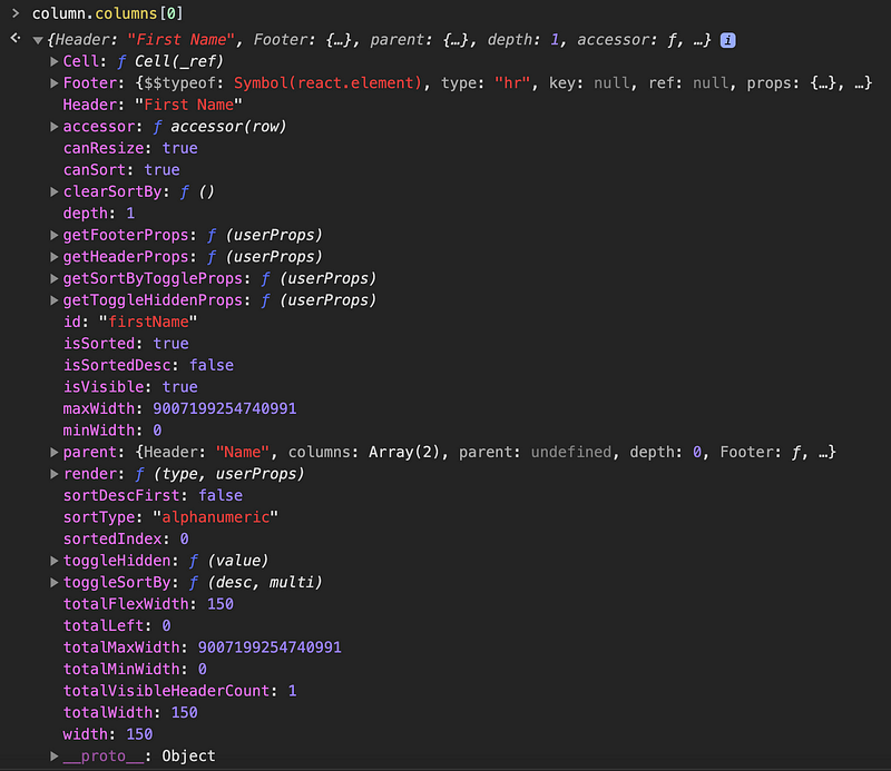
The sortable column, firstName, has the following props:
Clicking a column header will toggle between ascending, descending, and no sort. If you shift-click a column header, the other column sort states will be preserved and the new column will be sorted afterwards. This ends up with multi-sort.
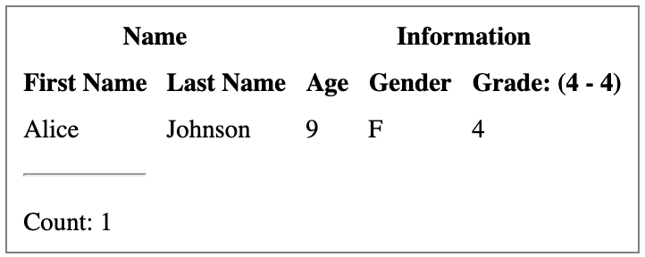
Table With Filters
Row filtering is also a basic table functionality. It filters table rows based on filter criteria for a single column or multiple columns. React Table’s plugin, useFilters, supports row sorting,
This is the same table that we’ve already used, except that it’s filtered to only retain rows where firstName starts with A. The current count is 1.
For rows to be filtered by relevant column filters, filtering functions need to be provided. Here’s the modified column definition for firstName in src/dataSource.js. It defines a filter at line five to perform the filtering task.
Here’s the revised src/App.js:
At line 26 the plugin useFilters is supplied.
Lines 17 to 24 set up the initial filter state.
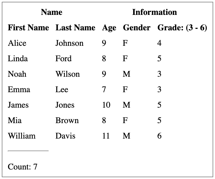
Table With Global Filtering
useGlobalFilter is the hook that implements global row filtering. It filters table rows on any cell value in the table. It’s also called searching.
This is the same table that we’ve used, except that it’s filtered to retain rows with text “A” or “a” in any cell. The current count is seven.
Here’s the revised src/App.js:
At line 21 the plugin useGlobalFilter is supplied.
Lines 17 to 19 set up the initial globalFilter. It is a string or a function.
useGlobalFilter can be used in conjunction with useFilters. The order of these two hooks depends on the performance characteristics.
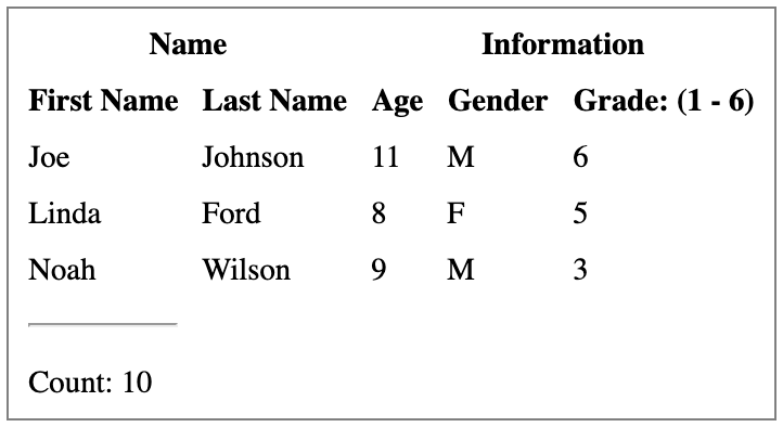
Pagination Table
usePagination is the hook that implements row pagination, which splits a large amount of data to pages and displays one page at a time.
For our ten row table, if we make page size to be three lines, the following user interface displays the second page. Here, the total count is still ten. We could add buttons to show the previous and next pages.
Here’s the revised src/App.js:
At line 22 the plugin usePagination is supplied.
Lines 17 to 20 set up the initial pagination parameters. The page index is 0 based, therefore the second-page index is 1.
Here page is retrieved from line 11. It is used to display visible rows by line 39.
Pagination With Server Data
For all the features that we have shown - row sorting, filtering, searching, and pagination - a manual flag can be set up. It means the actual data is fetched outside of the table. From the user interface, it seems table is operating row sorting, filtering, searching, pagination, and various manipulations, but in fact manipulations are performed at the server-side.
We use pagination as an example to show how to get the second-page data from an external source.
We need to modify theName column in src/dataSource.js. Line four gets the total count from the external pageCount.
Here’s the revised src/App.js:
Line 23 sets manualPagination to be true, and line 24 provides pageCount based on an external source.
Lines 29 to 31 are simulation to fetch external data.
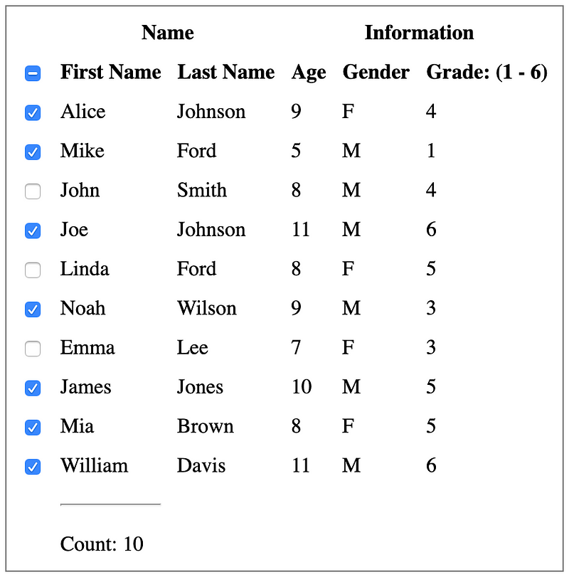
Table With Row Selection
useRowSelect is the hook that implements row selection, which toggles row selection. Typically, an empty box indicates a row is not selected and a checkmark indicates a row is selected. The table commonly has an indication at the header to show whether all rows are selected — if they are, the header displays a checkmark. If every row is unselected, the header displays an empty checkbox. If some rows are selected, the header displays a dash for an indeterminate state. Therefore, we need a checkbox for three states: unselected, selected, and indeterminate.
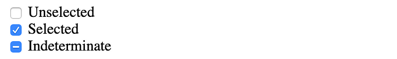
In HTML, an <input type=”checkbox”> can only be set with checked and unchecked states. However, the indeterminate attribute can be set by JavaScript: checkbox.indeterminate = true.
We create src/IndeterminateCheckbox.js for a React IndeterminateCheckbox component. It supports three states via two props: checked and indeterminate. indeterminate is set through a forwardRef:
Now we’re ready to implement row selection for our table:
This is src/dataSource.js:
This is src/App.js:
At line 19 the plugin, usePagination is supplied.
Lines 20 to 33 set up the IndeterminateCheckbox for table header and rows. Since React Table allows sub-rows, rows use IndeterminateCheckbox as well.
You run the code and find out it does not work. What happened?
Currently, useRowSelect does not work with React.StrictMode. You need to remove strict mode from src/index.js:
Table With Infinity Scrolling
Instead of a paginated table, infinity scrolling displays a scrollbar. Users can scroll down until they reach the end. It’s not exactly infinity scrolling, but useBlockLayout can be used to implement something similar. It renders headers and cells to be inline-block divs. Column widths are fixed, with default values of 150px.
Although there are only ten rows, a table with a fixed height can be scrolled up and down.
There are no changes in src/dataSource.js.
The following is the revised src/App.js:
At line 14, totalColumnsWidth is retrieved to set the body width by line 63.
At line 20, the plugin useBlockLayout is supplied.
Lines 23 to 45 are the render function for rows.
From the following Inspect window, we can see the styles for each row and cell. Every row definition is in HTML, regardless of whether it’s viewable or not. It’s not true infinity scrolling that only renders partial rows.
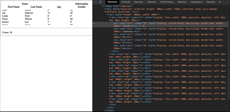
Lines 59 to 66 displays a FixedSizedList defined in react-window. It sets the height to be 100px and each row’s height to be 20px. Therefore, there are five visible rows.
Conclusion
React Table offers many plugins, which can be combined. For simplicity, each of our examples only uses one plugin. These examples are simpler than examples provided by React Table because our purpose is to demonstrate how each plugin works.
To make things more interesting, you can also check out Ant Table in the Ant Design System.
Thanks for reading. I hope this was helpful. You can see my other Medium publications here.


