
A Beacon of Design
How Poul Henningsen practically invented ‘mood lighting’ and lit the way for artists to use light as their main medium
Poul Henningsen was a journalist, critic, author, playwright, political commentator, and writer of comic songs, though he’s best known as an architect and commercial designer. In 1924, he was commissioned by the Louis Poulsson Company to experiment with the new electric lighting technologies and became one of the first to treat light as an art medium. He saw light as an intangible sculptural element, its form dependent on the opacity, translucence, and reflectiveness of the objects that interrupted it and the environment that contained it.
He recognised the psychological effect that lighting can have on a place and how it may create an emotional response. He was talking about what we might now call ‘mood lighting’. He began to use the ranges of brightness, intensity, softness, and colour tone in a way akin to any artist consciously employing the formal language of line, colour, shape, value, movement, and spatial relationships. Central to his practice was a philosophy that the differences between art and design should be blurred. Aesthetics and function should be equally important in both disciplines, even if so-called ‘art’ need not have an immediately obvious practical or mechanical function.
Here, his medium was light. His ‘canvas’ the air and the surfaces that the light interacted with, beginning within the light-housing and ending at the boundaries of the space. A ‘room’ is never empty. The negative space is filled with a mass of air. Light may be introduced to pervade this volume and reveal the forms within. Although Henningsen often designed lighting for specific commissions, where he was able to respond to the space, his control was usually limited to the materials used in the lamp fittings.
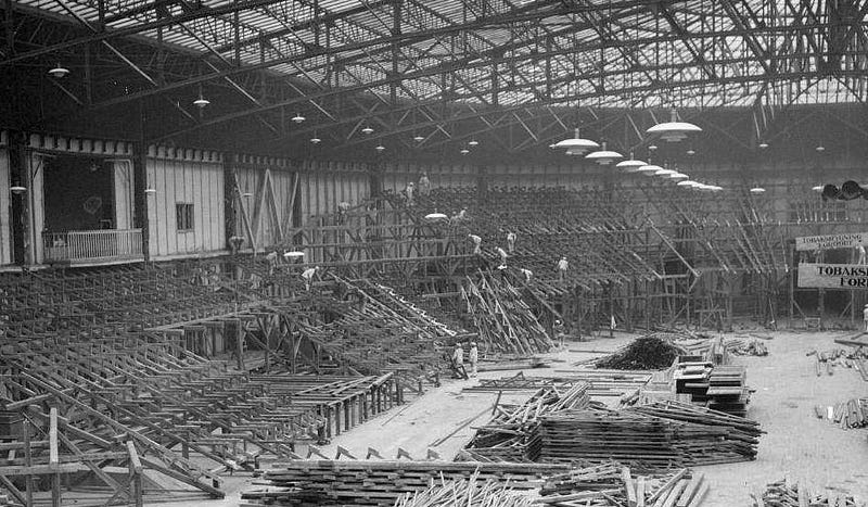
An important proponent of the 1920s Functionalism that would propel Scandinavian design into the global spotlight, his radical reductionism was noted by his contemporaries in the Bauhaus and, in turn, the German Design School’s credo of ‘truth to materials’ and quest for functional simplicity is palpable in his work. Not least in the elegant PH Lamps, for which he was awarded a gold medal at the 1925 International Exhibition of Modern Decorative and Industrial Arts, a major World Fair hosted in Paris. As a result, he won the commission for the Louis Poulsson Company to provide similar lighting for the Forum København, a huge arena-style convention and events venue, which was nearing completion and opened the following year, in 1926.
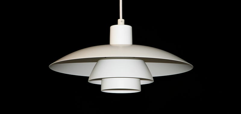
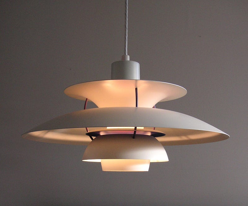
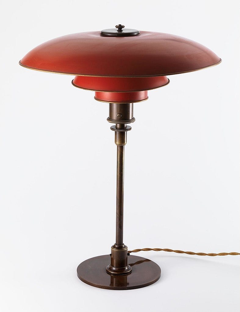
A key feature of Henningsen’s lampshade designs is that the bulb is obscured by a series of diffusers that eliminate glare whilst scattering the light more efficiently. In this case they are pressed steel discs, distorted into ‘saucers’ and partial domes of varying parabola.
Just like Christopher Dresser, the botanist and ‘father of product design’ who initiated the ‘Form Follows Function’ approach, Henningsen looked to the expression of perfection found in nature where anything not ‘Fit for Purpose’ doesn’t last long. He, too, looked to natural forms in the petals of flowers, the domed cap of a mushroom, where he found pleasing balance and simple beauty. The poetic idea of a fuchsia blossom is clear to see, though he also sought to reference the elegance of the human form. The graceful pirouette and perhaps the traditional ballet tutu may also be detected.
Of course, the designer would’ve been aware of the pleasing sculptural rhythm he’d created here but that was not his sole intention. Bear in mind that this was before coloured bulbs were available. At the time, lightbulbs with tungsten filaments had only been in commercial production for little over a decade. Electric illumination was cutting-edge and whilst it offered much brighter interior lighting than domestic gas had, it could also be harsh and ‘clinical’. Instead of approaching the design of lamps as merely a decorative container for the bulb, he was exploring new ways to extend functionality.
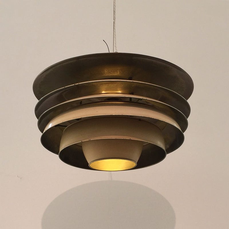
Henningsen was interested in the different ways lighting — its brightness, tones and colour — appeared to change the mood of those present. He saw the potential for enhancing that mood through subtle means of varying the brightness, to soften contrast, and by controlling the hue. This he did by painting the steel diffusers in subtle, and later not-so-subtle, colour tones.
Pale reds and oranges had the effect of ‘warming’ the light, creating a more relaxed, cosy, mood. Blues and greens still softened the illumination but had a ‘cooling’ effect that was better to read by or see truer colours, because that end of the spectrum part-corrected the yellow glow of tungsten. Plain white or raw steel was suitable for the workplace and municipal areas as they maintained the intensity. The light was also better scattered, which minimised shadows and softened the transition as one stepped into, or out of, the virtual cones of illumination.
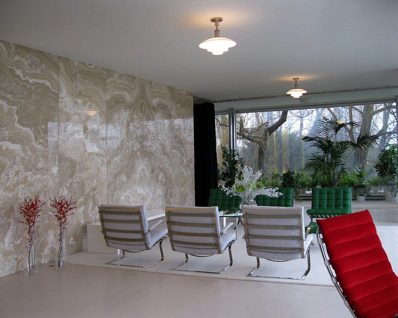
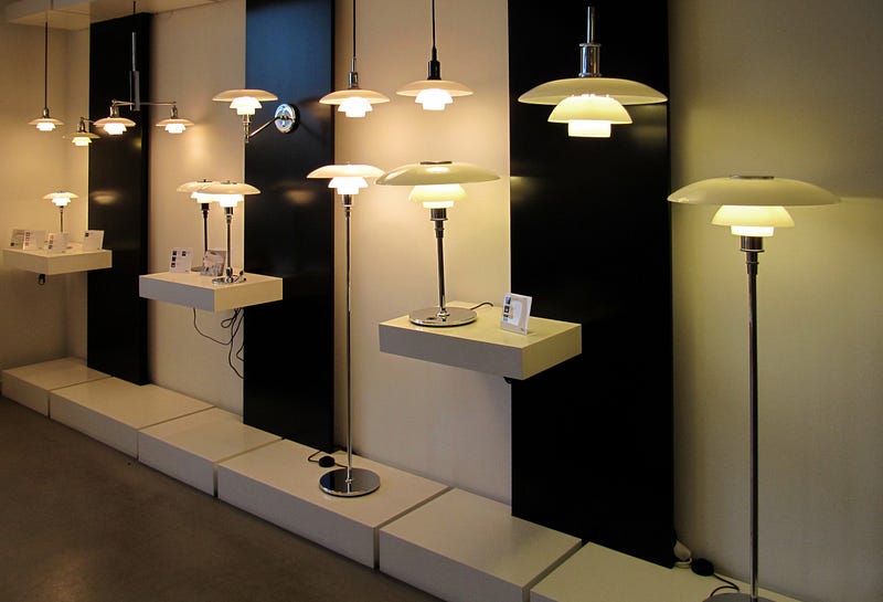
He also adapted the PH design for table, desk and standard lamps. Versions manufactured using ‘frosted’ glass were offered as an alternative and these allowed a softer, more even illumination that proved popular in domestic settings. A chandelier design was showcased in the Danish Pavilion at the 1929 International Exposition in Barcelona. It was there that the Bauhaus designers of the German Pavilion, Ludwig Mies van der Rohe and Lilly Reich, saw the designs and selected PH Lamps for Villa Tugendhat which they completed in 1930, its design echoing the now iconic Barcelona Pavillion.
,_onyxov%C3%A1_st%C4%9Bna.JPG)
As the innovative artists and designers of the Bauhaus found themselves at odds with the Nazi regime, so did Poul Henningsen. He was already editing Kritisk Revy / The Critical Review, the most influential design magazine of Denmark with a remit of encouraging designers to look forward to the needs of the twentieth-century and break free from outmoded traditions. He also wrote political columns for a handful of major journals including Politiken, the national broadsheet, when he felt he had to speak out more publicly against the German aggression that he saw escalating towards war. Initially, he did this by writing a series of revues including sketches and comic songs that often used double-meanings to lampoon fascist ideology.
He was fired from Politiken, in 1938 for his political views and not long after that, in 1940, Nazi forces invaded Denmark. Henningsen continued to write resistance poems during the first few years of the occupation. When Danish Jews started to disappear, deported to concentration camps, he and another innovative Jewish designer, Arne Jacobsen, took up the offer one night in 1943 to be rowed across the sea to neutral Sweden.
It seems this was a timely decision because instead of being listed for the concentration camps, orders had been issued to murder Henningsen and his family in their home and burn it down as a warning to other dissenters. This directive had come from the Head Nazi of Denmark, Wilfred Petersen, in reprisal for being mentioned by name in one of Henningsen’s satirical songs.
With the defeat of the Nazi Regime, the war in Europe ended and Henningsen returned to his homeland where he campaigned for peaceful diplomacy between the new governments and called for humanitarian aid for the impoverished people of Germany. His first major post-war commission was to redesign Copenhagen’s Tivoli Gardens Concert Hall, which had been destroyed by disgruntled Danish Nazis near the end of the war.
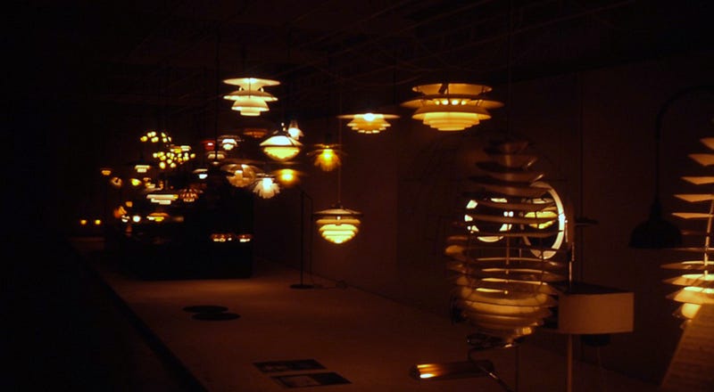
He picked up his braided careers once more, continuing to write for prestigious journals and also penned popular poems and songs for children. These included Der var Engang en Abe / There Once was a Monkey, which remains well-known in Denmark to this day. He continued developing his lighting designs, producing the most elegant and internationally significant iterations of the PH Lamp during the 1950s.
Some more elaborate variations were launched in the 1960s that were adjustable. The PH Kontrast involved several ‘saucers’ and allowed the user to change the bulb position and so regulate the intensity of the illumination. The multiple tiers were also in different colours so the cast could be altered through warmer and cooler tones. Definitely ‘mood lighting’.
It was early days, but Poul Henningsen’s pioneering use of light as an expressive medium lit the way for future fine artists like Lilian Lijn, Dan Flavin, James Turrell, Olafur Eliasson, and several others who would use light as a prime component in their work.
* All images are used with permission or presented here for educational purposes under fair usage policy.