
You Are a Victim of These 7 Deceptive Business Practices
The bad and ugly side of business.
My Story
Since 2008, I have been a happy customer of GoDaddy.
Whether it’s their products (domains, hosting, email, applications) or their customer support, they have always been a delight for most part.
However, there’s one thing about them that’s been bothering me for quite some time now. Let me share my latest domain-purchase experience that I did not complete..
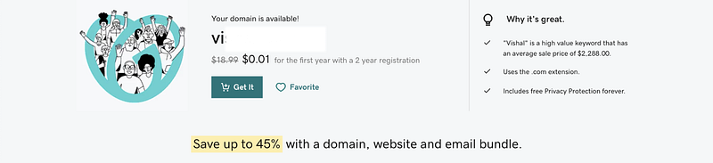
I logged in and searched for a domain I was looking for. It was available at an unbelievable price — $0.01 for the first year with a 2-year registration. Sounds cool, I thought.
I added it to the cart.. and then the cart total showed me.. wait for it..
$75.97
😳!!
Even though I was multi-tasking while shopping for the domain, I avoided making a blind purchase. I’m not suggesting that GoDaddy was charging more than what it had advertised.
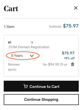
But it certainly tricked me into buying more than what I had in mind. You can see from the picture that it sneaked in a purchase of 5-year period, instead of the 2-year that I would otherwise buy.
And it didn’t end here. GoDaddy typically recommends to buy same name with more extensions (domain.info, domain.us, domain.net.. ), which is fine. But say, you choose a bundle of 3 along with your main domain.
If you then add a domain protection plan, it would assume that you’re buying protection for the complete bundle, not just your main domain — adding 4x price in your shopping cart, without asking you!
This experience is an example of a deceptive pattern: Sneak into Basket.
What are deceptive patterns?
Deceptive Patterns
Deceptive patterns (or dark patterns) are carefully designed UI experiences that trick the users into:
- making them do something they didn’t want to, OR
- finding an escape to something they were annoyed with, OR
- making them take action without full awareness
Manipulation of user behavior in today’s cognitive-overloaded brain is quite easy, really.
Many designers (and businesses) successfully deploy these deceptive patterns, knowing how their user will respond to certain interruptions or ignore certain drab-looking messages — during a key moment of purchase.
The types of patterns and the examples that follow next, will make it painfully clear that we all have experienced a few or almost all of these — perhaps without knowing what they are called.
I know I have been on the receiving end of several of these patterns. But as a designer, I am completely aware of and stay clear of supporting or advocating these.
1. Forced Continuity
This occurs when you’re asked your credit card information for a free trial, and the info on automatic renewal (or its cancelation) is hidden.
It’s not easy to opt out from the trial before it ends and there are no reminders. I have written emails disputing the charges on my credit card on multiple occasions.
Apple is one of the few businesses who truly practices good UX, including a clear message for any of its subscription renewals post-trial period. For other services, I set a reminder to myself that pops one day before the trial ends 😅.
2. Roach Motel
Easy to get in, almost impossible to get out! Typically occurs with premium service subscriptions.
Amazon is a prime (I’m a pun lover 😁) example. And similarly many apps and services make it super convenient to sign up, but never offer a graceful exit.
3. Sneak Into Basket
When you try to buy something, and something gets added unknowingly either through “negative-option” (a confusing opt-out button/checkbox) or by hiding the clear picture during checkout.
Case in point: GoDaddy, and many others who exhibit this pattern.
4. Confirmshaming
When you try to decline a service, and it uses an insulting and guilt-driven message to manipulate you into buying (or continuing) the service.
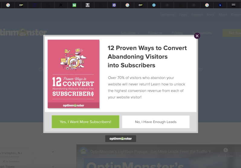
Optinmonster service as an example of confirmshaming
Optinmonster can be crowned as a master of deceptive patterns, as it uses several of those. What you see in the picture is an example of it trying to guilt the user into opting for something.
Messages like: “No, I have enough leads” are carefully crafted to induce shame in the user.
More such examples you might have seen:
“Nope, I don’t care enough” ..
“No, I don’t like to have a good time” ..
“No thanks, I don’t want to look the best” ..
“I’m happy being fat” ..
“I don’t read” .. etc.
5. Scarcity
When you’re pushed into buying something by showing a limited inventory and also suggesting that people are currently viewing the same thing with an interest to buy.
Many businesses use this effectively. Expedia for instance, employs this as a fair method on their site (shown in picture).
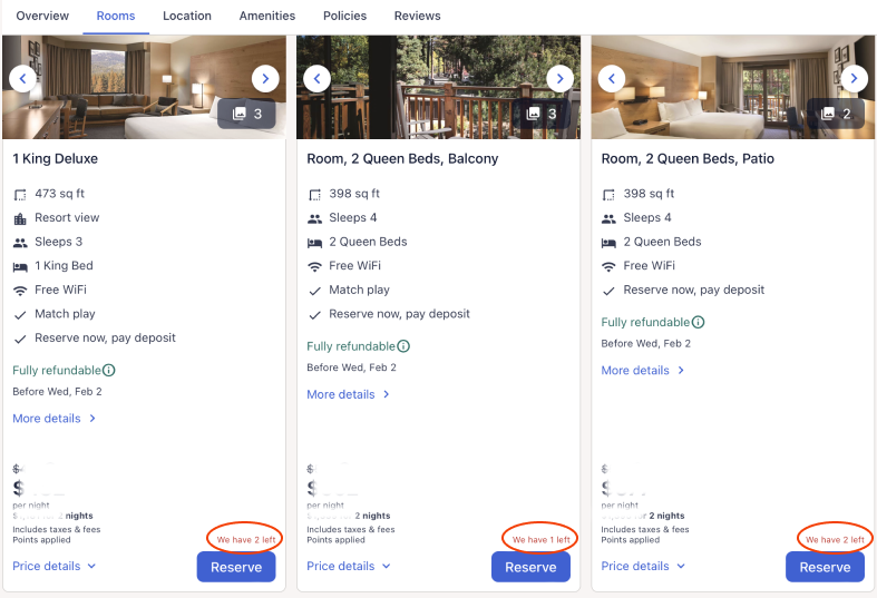
Urgency scarcity example shown in hotel booking via Expedia
However, many sites like Booking.com use fake numbers to create a sense of scarcity. Hence the deceptive pattern.
6. Urgency
When you’re pressed into buying something at a fantastic limited period offer.
This pattern is quite closely related to scarcity, but on the account of time instead of inventory. The deception lies in how some sites advertise a limited time offer, but secretly have the same offer via Facebook or Instagram all year long.
For instance, Doodly took good advantage of FOMO by having a limited offer of $67 as a one-time fee, instead of their annual subscription. But the limited offer strangely lasted for more than a year.
Many other sites — apparel, accessories, and others — offer fake limited period deals, tricking the user into buying something NOW that they may not even need.
7. Disguised Ads
When you click on something, assuming it is valid content, but it turns out to be an ad that takes you to another site.
Various sites that offer any form of downloads — software, images, graphical assets, fonts, documents, etc.. have ads embedded in their pages that look like actual page content or call to action buttons.
But they exist to collect your click and transport you to another site.
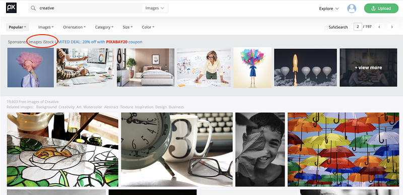
One site I use frequently for images is Pixabay. When you search for any image, the search results show a grid of images to choose from.
But the first row of images is actually a premium set from iStock — which they mention, albeit in a subtle grey text — easy to miss. Even as a frequent visitor, I have made the mistake of clicking one of those on multiple occasions.
More Deceptive Patterns
Definitions credited to: Harry Brignull, Dark Patterns
- Privacy Zuckering — when you’re tricked into sharing more personal info than you really intended
- Hidden costs — when you get to the last step of a checkout to discover additional charges
- Misdirection — when something purposefully grabs your attention and draws you away from something that’s important
- Bait and switch — when you set out to do something, but a different, undesirable thing happens
- Trick questions — when you provide an answer in a form that has a question that appears to ask something, but is asking something else
Food For Thought
Why are these patterns succeeding to manipulate users? Because they use (rather misuse) the psychology of humans. In today’s world, the cognitive overloaded human is impatient, bored, lazy, annoyed, busy, and forgetful.
The deceptive patterns clearly take advantage of users — who are acting impulsively, looking for excitement, skim-reading everything, searching for short-cuts, getting upset with hurdles, having little leisure time, and remembering only urgent things.
Few countries and regions have made some of these patterns illegal to use; this is a great step in the right direction.
Designers and businesses should use psychology as the tool for defining better customer experience.
Sadly, many use psychology to create one or more dark patterns — that make the business profitable, but in return make them manipulative.
Copyright © 2022 Vishal Mehta. All Rights Reserved.
Thanks for reading!
If you enjoyed this story, you may like this one too:
👉 If you enjoy reading about random stuff, please subscribe to my stories.
👉 Get unlimited stories by all the wonderful writers on Medium — by signing up for a membership (less than $5/mo). Here’s my referral link.
References and reading material:
[1]: Brignull, Harry. Dark Patterns — https://www.darkpatterns.org
[2]: Interaction Design Foundation. Literature on Dark Pattern — https://www.interaction-design.org/literature/topics/dark-pattern
[3]: Wintermeier, Nikole. (June 22, 2020). Dark Patterns Examples in eCommerce — https://blog.crobox.com/article/dark-patterns
[4]: Lomas, Natasha. (July 1, 2018). WTF is dark pattern design? — https://techcrunch.com/2018/07/01/wtf-is-dark-pattern-design/
[5]: Singh, Arjit. (July 4, 2021). Recognize deceptive patterns in UX design — https://bootcamp.uxdesign.cc/recognize-deceptive-patterns-in-ux-design-31bf1b782930


