
Writing CSS with Accessibility in Mind
An introduction to web accessibility. Tips on how to improve the accessibility of your web sites and apps with CSS.
This article is also available in Russian, thanks to Workafrolic, in Portuguese, thanks to Maujor, and in Japanese, thanks to Keita Nakanishi.
If you’re not into reading, there’s a recording of me talking about most of the things in this article at CSS Conf Budapest.
About a year ago I started to focus more on web accessibility. The most effective method of learning for me is teaching others. That’s one of the reasons why I’m talking at meetups and conferences and why I’m writing articles about the topic. I wrote about Progressive Enhancement for Smashing Magazine and about accessibility basics here on Medium. This article is the third in a series of collections of accessibility tips. They’re in no particular order, you can read Writing HTML with accessibility in mind and Writing JavaScript with accessibility in mind now or later if you’re interested.
I made my first website about 17 years ago when CSS was still relatively new. Since then a lot of things have changed and CSS now gives us an incredible set of tools to style the web. We went from Verdana to Webfonts, from fixed widths to Responsive Web Design, from table-based layouts to Grid, and we don’t have to use images anymore for borders, fonts or shadows. We have custom properties, Feature Queries, calc() and numerous new units. This of course is only a subset of the great developments of the last years.
While this wide range of properties and endless ways of solving tasks with CSS makes our lives easier, it also creates the potential to worsen the experience for our users. It’s actually possible to make a website inaccessible in just three lines of CSS.
In this post I’ve collected techniques, considerations and approaches that will help you write more accessible CSS. The collection starts with basic concepts and well-known properties and covers some of the newer stuff at the end.
In the end it got way bigger than expected, so here’s a handy menu so you can jump directly to a section that interests you the most:
- From legible to readable text
- Using content in pseudo elements cautiously
- The screen is not the only medium
- Fallback for property values with incomplete support
- There are many ways to hide content
- You can’t trust bad contrast
- Color alone should not be the only source of information
- Taking care of order
- Focus on what’s important: focus
- Grid and flat document structures
Enjoy!
From legible to readable text
Images, icons and videos are an integral part in today’s web design, but text still makes up the majority of content on most websites. It’s important to spend a good amount of time styling, testing and fine-tuning font properties because text must be readable no matter the device.
Increasing font size
There was a time were a 12px font size for body text was standard, but with the rise of devices with higher resolutions the average font size settled somewhere between 15 and 18px for a while. In recent years, it has risen again to 20px and up, which is a good thing. Text must be big enough for reading on smartphones and increase with the size of the screen in order to still be readable from distance on big screens like TVs.
As the characteristics of typefaces may differ a lot, it doesn’t make sense to define a standard minimum size, but 18–20px probably is a good starting point for smaller screen sizes. Of course, there’s a lot more to say about font size, but that would be too much for this article. I suggest you read Your Body Text Is Too Small by Christian Miller for more details.
Setting line height
The default line height in browsers is at roughly 1.2. According to the Web Content Accessibility Guidelines it should be at least 1.5 within paragraphs in blocks of text.
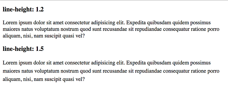
line-height of 1.2 compared to a paragraph with a line-height of 1.5Text within a paragraph with adjusted line height isn’t just better readable, but often also visually more appealing.
Aligning text to the left or right
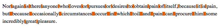
Even though some of us may prefer justified over left or right aligned text because it looks nicer, it’s considered bad practice. text-align: justify modifies word spacing to create same length lines. Those uneven spaces can harm readability and be very distracting. Breaking up words when necessary could be a solution, but CSS Hyphenation isn't well supported and might not work as expected.
Defining paragraph widths
According to several sources designers should strive for 45 to 85 characters per line since the ideal width for a paragraph is supposedly 65 characters.
When defining widths of text blocks the ch unit may come in handy since 1ch is equivalent to the width of the zero (0) character. It also changes as the font-family or font-size changes.
p {
  /* Maximum width of 65characters */
  max-width: 65ch;
}
If you are using any type of responsive typography technique make sure test your site on very large screens. If there’s no limit to your font sizes, text may become unreadable at a certain viewport size. If you want to know how to set limits or if you’re unfamiliar with responsive typography, read Mike Riethmullers article Precise control over responsive typography.
Using content in pseudo elements cautiously
We can use the pseudo elements ::before and ::after to add CSS at the very beginning or at the very end of an element. It gives us a pretty common and handy way of adding design elements to our components, but it also allows to add content using the content property. In the sense of the separation of concerns we shouldn't do that.
h2 {
  content: "DON'T DO THIS";
}
Our content should be in HTML files, in a database, or coming from an API, but not in our CSS. Sometimes we use the content property for adding non-text content like font icons or special characters. If we do that, we need to remember that some screen readers recognize and announce generated content. If the generated content is purely presentational, make sure to hide it from assistive technology, for example by using aria-hidden.
<span class="icon icon-key" aria-hidden="true"></span>The screen is not the only medium
Even though we live in a digital age, people still print stuff. Make sure that your pages are accessible and usable even when printed out our saved as PDF. All you have to do is to add a @media block to your CSS and tweak the styling of elements that don't look right or hide those that don't make sense on paper, like navigation or ads.
@media print {
  .header {
    position: static;
  }
nav {
display: none;
}
}One of the issues with printed web pages is that links are completely useless because you don’t know where they’re are leading. Luckily CSS gives us a way of revealing the values of attributes and showing them on screen (or paper in this case).
@media print {
  a[href^="http"]:not([href*="mywebsite.com"])::after {
    content: " (" attr(href) ")";
  }
}
These lines will display the value of the href attribute next to every link that has a href attribute, which starts with http, but doesn't have mywebsite.com in its value.
Firefox and especially Chrome offer tools for testing and debugging print style sheets.
If you want to dig deeper, I’ve collected a number of tips and tricks for working with print styles.
Fallback for property values with incomplete support
Sometimes we find ourselves in a situation where we want to use a certain property value but can’t because it’s not supported in some browsers. That shouldn’t stop us from using it as long as we provide a fallback. Often we don’t even need Feature Queries or any other feature detection to do that.
Let’s say you want to use the vmax unit, which IE and older versions of Edge don't understand.
div {
  width: 50vmax; /* Doesn't work in IE and older versions of Edge */
}
In order to provide a fallback, you simply set the width property to something less ideal, but something the browser will understand, e.g. width: 50vw. In the next line you set it to the actual value you want.
div {
  width: 50vw;
  width: 50vmax;
}
Browsers that don’t understand vmax will interpret width: 50vw and simply skip width: 50vmax. On the other hand, browsers that do understand it will first interpret width: 50vw and then width: 50vmax. Since the vmax declaration comes after the vw declaration, the vmax version is what users will get.
There are many ways to hide content
Headings in HTML are very useful when it comes to outlining a document. By using headings <h1> - <h6> you tell the browser and other software how your document is structured and how parts of your document relate. It's very important to have a sound document outline, it's good for SEO and it helps screen reader users navigate your site. It may happen that you have to implement a design where there are no headings even though it would make sense to have them. That's often the case when the design itself conveys structure. In such a case, you don't simply remove headings from the markup, but you hide them visually. It must be clear how your document is structured with or without CSS.
This is of course just one example, visually hiding labels in forms is another one (even tough from a UX perspective you shouldn’t hide labels).
In CSS there are several ways of hiding content and it’s up to you to choose the right technique for the right scenario.
Hiding content from everyone
By using the hidden attribute or setting visibility: hidden and/or display: none you hide content completely. Users can't see it and screen readers or search engines can't read it.
Hiding content visually
Hiding content only visually isn’t that easy. You have to make sure that it’s still accessible to screen readers, you have to deal with browser quirks and you have to decide what happens when the element is focused. Of course, people already did that and there are solutions you can use.
I did some research and as it turns out there are many different approaches. That’s why I asked some experts about their opinion and I dissected the recommended technique to fully understand what’s happening.
.visually-hidden {
  /* Remove the item from normal flow */
  position: absolute;
  /* Workaround for falsely pronounced, smushed text */
  white-space: nowrap;
  /* Set it to the smallest possible size (some screen readers ignore elements with zero height and width) */
  width: 1px;
  height: 1px;
  /* Hide overflowing content after resizing */
  overflow: hidden;
  /* Reset any property that may change the elements size */
  border: 0;
  padding: 0;
  /* Clipping defines what part of an element should be displayed. */
  /* Deprecated clip property for older browsers */
  clip: rect(0 0 0 0);
  /* clip-path for newer browsers. inset(50%) defines an inset rectangle that makes the content disappear.  */
  clip-path: inset(50%);
    /* It seems like at the moment nobody is quite sure why margin: -1px is there. On top of that it seems to cause issues (see: https://github.com/h5bp/html5-boilerplate/issues/1985). */
  margin: -1px;
}
Save this class somewhere and use it whenever you want to hide content visually and still make is accessible to assistive technology and search engines.
Skip links
The class from the preceding section is also suited for usage as a skip link. A skip link is a link that is initially visually hidden, but visible on focus. It should be one of the first items on the page to give screen reader and keyboard users the chance to immediately skip introductory content and jump right to the main content. Basically, it’s just an anchor link that will take the user to a specific part of the page.
Try it yourself in this Code Pen, press Tab to reveal the skip link.
Hiding content semantically
Sometimes it makes sense to display content visually, but hide it from screen readers, for example when you’re using icons. It that case add the aria-hidden attribute to the element you want to hide and set it to true.
<button>
  <span class="icon icon-hamburger" aria-hidden="true"></span>
  <span class="text">Menu</span>
</button>
Others
There are other ways of hiding content, like negative text-indent or zero font-size or height. While some of them work, there are certain caveats. Read Techniques for hiding text on webaim.org for details.
You can’t trust bad contrast
Our designs must provide enough contrast between text and background in order to be legible. People with low vision benefit from high contrast as well as people without visual impairments. Just think about using your smartphone outside on a sunny day.
What is color contrast and why is it important
According to the World Health Organization about 4% of the population are visually impaired. 7 to 12% of men and less than 1% of women have some form of color-vision deficiency. Many of those impairments reduce sensitivity to contrast, and in some cases the ability to distinguish colors.
Two colors are contrasting when they’re from different segments of the color wheel. Broadly speaking, the bigger the difference of two colors the higher the contrast. For us as web designers and developers it’s not just about contrast by itself, but how well it works applied to text. The contrast between text and its background must at least be high enough so that it can be read by people with moderately low vision. Of course, we don’t have to guess if we meet this criterion, the Web Accessibility Initiative (WAI) has defined a ratio for measuring it.
The minimum contrast ratio
The contrast ratio tells how high the contrast for text in certain sizes and widths on a specific background is. The ratio can range from 1:1 to 21:1. It’s 1:1 if both compared colors are the same and 21:1 if black and white are the colors in opposition.
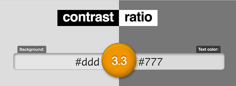
According to the Web Content Accessibility Guidelines (WCAG) 2.0 we must ensure that a contrast ratio of at least 4.5:1 exists between a background and its text (or images of text). This applies for text that is less than 24px (if not bold) and less than 19px (if bold). For larger text a ratio of 3:1 is sufficient. Those are the minimum numbers to meet level AA criteria. To pass level AAA the minimum ratio for normal text is 7:1 and 4.5:1 for bold text. It's no required for conformance, but if we're using icons we should try to use icons that meet the contrast provisions for text.
I told my friend Daniel about the ratio and that it’s important that we get it right on a project we’re currently working on. After tinkering with different combinations, he called me and said that this was harder than he thought. The issue isn’t that there aren’t enough visually pleasing combinations, but that in the last years designer have gotten used to using low contrast pairings. Small agencies as well as big companies, like Apple or Google, are guilty of following this unfavorable design trend.
Though age has indeed taken its toll on my eyesight, it turns out that I was suffering from a design trend.
There’s a formula for calculating the contrast ratio, but don’t worry, you don’t have to dig out your old calculator. There are tools.
Measuring contrast ratio
In Chrome Canary it’s possible to display the contrast ratio directly in Dev Tools. Remy Sharp shares how in a blog post.
There are many tools for testing color contrast and accessibility in general. The following list isn’t extensive, but a small collection of tools I prefer.
Online
- contrast ratio by Lea Verou Quick and easy contrast checker in the browser
- Colour Contrast Check by Jonathan Snook Contrast checker in the browser with some more options
- Wave tool Browsertool for checking contrast and more
- Accessible Color Spaces by Kevin Gutowski Color picker with automatic contrast check
Browserextensions and DevTools
- Chrome DevTools Audits Panel Chrome 60 shipped with a new audits panel, powered by Lighthouse. Among others it gives sites accessibility scores and lists issues.
- tota11y Great browser extension for testing contrast, the document outline and more.
- aXe “Automated tool to find Accessibility defects on your web site by using the aXe Chrome extension.”
Others
- Color Contrast Analyser for Sketch “A Sketch plugin that calculates the color contrast of two layers and evaluates it against the WCAG.”
- More color contrast tools
High contrast experiences
Using high contrasting colors is great, but people who have low vision still may want to alter the colors used by websites. There are many different user needs and accordingly there is also a variety of methods for changing colors available. That fact entails a certain unpredictability and makes it hard for us to make sure that our pages are always fully accessible. That’s why we shouldn’t just rely on meeting level AA or AAA criteria for contrast, but also test our websites thoroughly and consider providing high contrast alternatives.
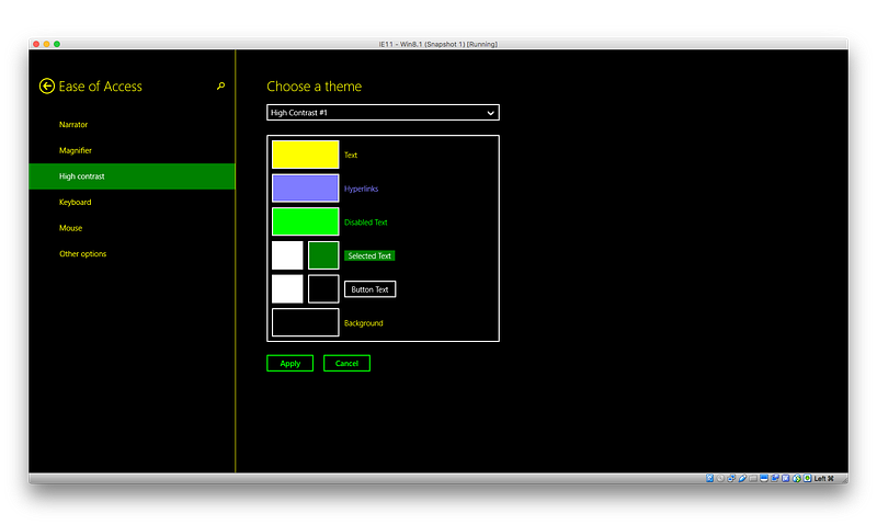
High contrast mode on Windows
On Windows there’s a high contrast option in the settings. Users may define their own color settings or choose a predefined theme.
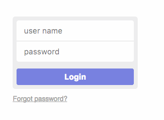
I made a simple login form (the first of four screenshots; inspired by: https://dribbble.com/shots/1687064-Simple-Login-Form) and tested it with different high contrasting themes.
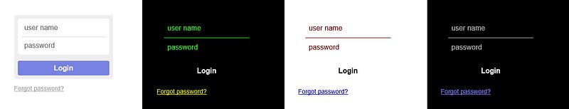
Anika Henke wrote about how users change colors on websites. She describes that while testing a form she discovered that input fields became invisible and buttons unrecognizable. You can see the same thing happening in the above screenshot. If it wasn’t for the placeholder text, users wouldn’t know that there are two input fields. A quick fix was to add a default border for inputs and buttons (not tested across browsers).
You can use media queries to detect if high contrast mode is active and provide specific styles.
/* High contrast mode active */
@media (-ms-high-contrast:active) {
}
/* High contrast mode with specific black on white theme */
@media (-ms-high-contrast:black-on-white) {
}/* High contrast mode with specific white on black theme */
@media (-ms-high-contrast:white-on-black) {
}Patrick H. Lauke shares his thoughts and concerns about those media features in Windows High Contrast Mode: the limited utility of -ms-high-contrast. In response Greg Whitworth pointed out that the feature’s “sole purpose is to aid in providing users with contrast sensitivity a better experience. As such, you shouldn’t necessarily care about what the specific color is. To some extent, you shouldn’t even care how your site looks; but how it functions in high contrast.”.
High contrast Chrome extension
There’s also a high contrast extension for Google Chrome that lets users browse the web with several high-contrast color filters designed to make it easier to read text.
High contrast alternatives
If there are parts of your design that don’t have sufficient contrast, it is still possible to meet WCAG criteria using the Alternate Version clause. According to that you must provide users with either a link to a high contrast version of the page or a control on the page that can change the page so that all aspects conform.
There are some criteria for this alternative:
- The link or control must be placed prominently on the page.
- The link or control must itself meet the contrast requirement.
- The new page must contain all the same information and functionality as the original page.
- The new page must meet all the desired criteria.
Testing with NoCoffee
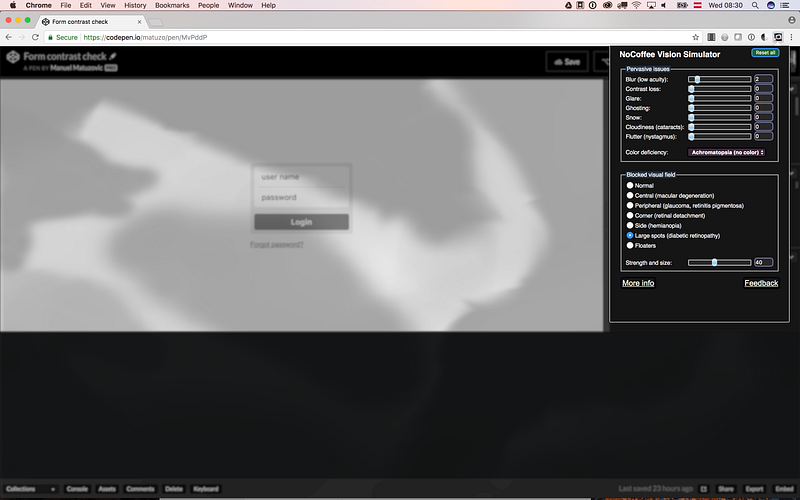
Meeting the criteria is one thing, but testing with real people is another. Not all of us have the means for professional testing. Fortunately, NoCoffee provides us with a quick and easy way for simulating low vision, color deficiencies and blocked visual fields. It can be helpful for understanding the problems faced by people with slight to extreme vision problems.
Color alone should not be the only source of information
As already mentioned, a very high percentage of men have color vision deficiencies. There are different types too. Deuteranomaly, one of the most common, makes it difficult to differentiate between red and green. We should avoid using colors alone as visual cues because interfaces may become unusable for people with color vision deficiency.
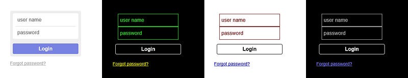
I took the form from the previous example and added borders to the input fields to indicate success and error states. The following screenshot shows that color alone doesn’t suffice for giving users feedback. The border colors are either not visible at all or wrong.
Adding simple icons may help to improve the accessibility and user experience.
Another example are links. They also shouldn’t differentiate from normal text by color alone. It’s best to keep underlines on links.
Taking care of order
There are numerous ways of changing the order in which items are laid out. For example, there’s order and flex-direction for Flexbox or order, flex-auto-flow and of course explicit placement for Grid. While those properties are really helpful, they may create a disconnect between the DOM order and visual presentation of content.
In the following example you can see a gallery, in which the images have been positioned using several grid properties.
At first glance, there doesn’t seem to be an issue, but when you use the keyboard to jump from image to image, you will see that the order is completely unpredictable. There’s no way of knowing which image will be highlighted next, when you press the Tab key. Now combine that with missing focus styles and you've created the perfect worst case scenario.
Unpredictable or wrong order doesn’t just concern keyboard users. Screen readers announce contents in DOM order, the software is not affected by ordering in CSS, but its users are. You might think that screen reader users don’t care about the visual representation of content. That’s not always the case because not all screen reader users are blind. Some have low vision or learning disabilities and use screen readers to supplement what they see on the screen.
Those ordering issues don’t just apply for flex- or grid-items, but for any sort of positioning. It’s important to order content in a way where it makes sense without styles and then check if it corresponds with the order in the design. If not, you may have to rethink your design. Whatever you do don’t blindly reorder elements in your markup just because you’re not able to position them in CSS correctly.
Watch Rob Dodson’s Does reordering content affect accessibility? and read Adrian Roselli’s Source Order Matters for more details.
Focus on what’s important: focus
I’ve already written about keyboard navigation basics and focusable elements in Writing Javascript with Accessibility in Mind. Before you keep reading jump to that article real quick if you’re completely new to the topic.
It’s important to make sure that your websites are navigable by keyboard. A lot of users rely on a keyboard when they surf the web. Among them are people with motor disabilities, blind people and people who don’t have hands or cannot use a mouse or track pad for whatever reason.
There are several things you can do in CSS to provide styles for focusable elements.
Selecting focused items
You can select focusable items in their focus state by using the :focus pseudo-class and apply styles to them.
a:focus {
  background-color: #000000;
  color: #FFFFFF;
}
Default focus styles are not very consistent across browsers, often ugly and in some cases they do not play well with your design. It’s advised to provide custom focus styling that improves the user experience and fits your design.
Whatever you do, don’t just remove the default outline (dotted outline, blue or orange ring) without providing alternate styles. Users who depend on the keyboard as their primary way of navigation won’t be able to use your site, if they don’t know where the focus is.
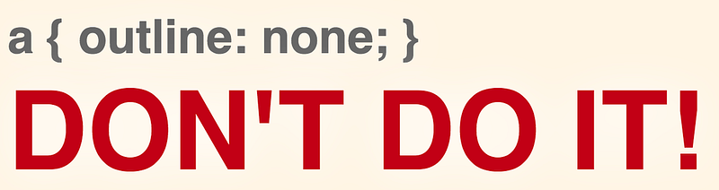
That’s not just a tip, but a level AA criterion.
Differentiating between keyboard and mouse users
As already mentioned, one of the things that frustrates designers is that there are a lot of inconsistencies between browser when it comes to focus styles. Another source of frustration is that focus styles are also visible when users use the mouse on some focusable elements. Sometimes it’s not necessary to show them, it might even be distracting for mouse users and aesthetically unpleasant.
Removing the outline property is not an option because then the component wouldn't be accessible to keyboard users anymore. What we need is a way to differentiate between keyboard and mouse usage. That will be possible with the :focus-ring pseudo-class which is part of the CSS Level 4 selectors specification. “The :focus-ring pseudo-class applies while an element matches the:focus pseudo-class, and the UA determines via heuristics that the focus should be specially indicated on the element (typically via a "focus ring").” (Source: CSS Selectors Level 4 Draft)
/* Remove the default outline */
:focus {
  outline: none;
}

/* Add an outline only when it should be visible */
:focus-ring {
  outline: 2px solid blue;
}
Unfortunately, at the moment no browsers support the standard implementation of :focus-ring (Firefox supports -moz-focus-ring), but there is a lightweight poly-fill that will add a .focus-ring class when appropriate.
/* If JavaScript is active and works, select all focusable elements that do not have the .focus-ring class and remove the outline */.js-focus-ring :focus:not(.focus-ring) {
outline-width: 0;
}For more details watch Rob Dodson's a11ycasts episode, Focus Ring!
Styling elements with focused children
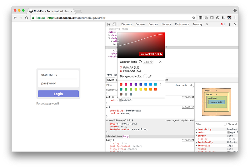
:focus-within is a relatively new pseudo class and already supported in most major browsers. It lets you select an element which has child elements that are currently focused.
form:focus-within {
  box-shadow: 0 0 4px 6px rgba(80,88,156,0.2);
}
You can see that in action on CodePen.
For more details on focus basics watch What is Focus? on YouTube.
Grid and flat document structures
When we’re building a new site we usually start by writing HTML. We choose the right mark-up and put elements in logical order. When the document is valid, well-structured and the order makes sense we add CSS. Before CSS Grid Layout, making layouts could get very tricky, especially when DOM order and the order in the design didn’t correspond. float, position and sometimes even Flexbox were in some situations not flexible enough and we would get tempted to change DOM order. Thanks to Grids explicit placement and its areas we have all the flexibility we need to position items. This is great, but Grid also introduces a new temptation that could comprise our document structure.
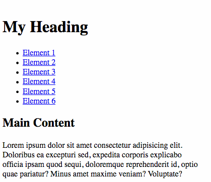
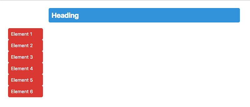
Let’s say you have the following design and you use a h2 and a ul for those items because that's what makes the most sense for you.
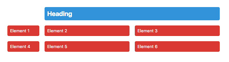
<div class="wrapper">
  <h2>Heading</h2>
  <ul>
    <li><a href="#">Element 1</a></li>
    <li><a href="#">Element 2</a></li>
    <li><a href="#">Element 3</a></li>
    <li><a href="#">Element 4</a></li>
    <li><a href="#">Element 5</a></li>
    <li><a href="#">Element 6</a></li>
  </ul>
</div>
Putting those elements in columns and positioning the <h2> is fairly easy,.. or at least it seems like it is.
.wrapper {
  display: grid;
  grid-template-columns: 120px repeat(2, 1fr);
  grid-gap: 20px;
}
h2 {
grid-column: 2 / -1;
}
That doesn’t look exactly like expected. The problem is that only direct children of a grid container are laid out on the grid, which in that case are <h2> and <ul>, but you want the <li>s to act as grid items. The worst solutions for this is flattening the structure and getting rid of the <ul> and transforming the <li> to <div>s so that they're direct children of the grid container.
The best solution would be to set the display property of the <ul> to subgrid, but unfortunately subgrid didn't make it into Level 1 of the specification and we have to wait some more until it ships.
You could use display: contents on the <ul>, but Firefox is currently the only browser that supports it. display: contents causes an element's children to appear as if they were direct children of the element's parent, ignoring the element itself.
Ultimately, you have to define another grid for the <ul>. This isn't ideal, but still better than flattening the structure of your document and compromising semantics. Since this is a very basic example and the list spans the whole grid, you can inherit some values from the parent grid.
ul {
  /* span the whole grid */
  grid-column: 1 / -1;
/* create another grid and inherit the values from the parent grid */
display: inherit;
grid-template-columns: inherit;
grid-gap: inherit; /* overwrite display for browsers that understand display: contents */
display: contents;
}You can see both solutions in action on CodePen.
Conclusion
Even though this post covers quite a few things, it’s by far not everything you need to know about CSS and accessibility. On the other hand, it’s also more than just a starting point. By getting DOM and focus order right and by caring about high contrast and generally by designing with accessibility in mind, you’re already doing a great job. If you put a little more accessibility consideration in every new page or site you’re making, you’re making the web a better place.
Designing with constraints in mind is simply designing well.
I hope that you’ve enjoyed reading and learned something new. If you have questions or any sort of feedback, please leave a comment or contact me via twitter.
Thanks to my mentor Aaron Gustafson for helping me with this article.
More accessibility tips
This article is the third in a series of four. The last one is in the works and soon to be released.
- Writing HTML with accessibility in mind
- Writing JavaScript with accessibility in mind
- Writing CSS with accessibility in mind
- Up next: Learn how to design and develop with accessibility in mind
Thank you for reading and please don’t forget to like and share this article if you enjoyed it.
While I work on the next post, you can check out some other stuff I wrote:
Further reading and resources
From legible to readable text
- Your Body Text Is Too Small by Christian Miller
- How the Web Became Unreadable by Kevin Marks
- Why is Vertical Rhythm an Important Typography Practice? by Zell Liew
- Precise control over responsive typography by Mike Riethmuller
Using content in pseudo elements cautiously
- Accessibility support for CSS generated content by Léonie Watson
The screen is not the only medium
- I totally forgot about print style sheets by Manuel Matuzović
Fallback for property values with incomplete support
- CSS and progressive enhancement by Michael Scharnagl
There are many ways to hide content
- Techniques for hiding text
- Beware smushed off-screen accessible text by J. Renée Beach
- a11y.js: Hiding DOM elements
- Bulletproof Accessible Icon Fonts by Zach Leatherman
You can’t trust bad contrast
- How users change colours on websites by Anika Henke
- Color Contrast And Why You Should Rethink It by Cathy O’ Connor
- What is Color Contrast? by Rachel R. Vasquez
- A Beginner’s Guide to Contrasting Colors by Jacci Howard Bear
Color alone should not be the only source of information
- Be Kind to the Color Blind by Chris Champbell
- On Link Underlines by Adrian Roselli
Taking care of order
- Not All Screen Reader Users Are Blind by Adrian Roselli
- Source Order Matters by Adrian Roselli
Focus on what’s important: focus
- a11y.js: Default Browser Focus Outline Styles
- Keyboard-Only Focus by Roman Komarov
Grid and flat document structures
- Modern CSS Layout, power and responsibility by Rachel Andrew


