
Why Medium’s New Symbol Rubs Us Wrong Way
We may learn to live with it, but we may not learn to love it.
Some of the writers I follow have voiced their reactions to Medium’s new logo. So far I haven’t encountered anyone who likes the symbol. It puzzles me. In order for it to get placed in front of millions of people overnight, the people of Medium must have fallen madly in love with it.

Why, then, this wide gap of taste between Medium and its users? It seemingly appeared out of nowhere with little or no warning.
Abracadabra. Here I am. Love me or leave me.
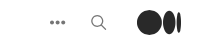
Upon first seeing it, many people stated that they mistook it as a glitch. That is how sudden and disorienting its arrival was. My first reaction was, What is it? Where is Medium? I thought Medium had been swallowed by the dots that looked like a black hole.
The effect of it was similar to coming home after a long day and finding the walls of your home painted bright pink. Okay, maybe I am exaggerating a bit. But I wasn’t alone. Others since have expressed how confused they were at first, and perhaps still are.
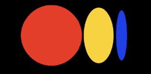
According to Medium, its new symbol represents an ellipses and the following idea:
The symbol, like our illustration style, is inspired by language and typography. It is born from the ellipses: a punctuation mark that represents an unfinished or impending thought, an idea to come, what’s next. This is, again, what happens on Medium — there’s always a new idea, always more to the story.
The symbol is meant to be an addition to its familiar wordmark logo:
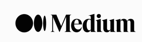
When viewed together, they make sense. What is confusing is that the symbol often appears on its own without the wordmark, like a child separated from her parent.
Medium explains this lonesome appearance of the symbol, saying:
Medium is a platform for creators to express themselves, so our brand should never get in the way of yours. When you read on Medium, a symbol allows Medium the brand to take a backseat to let individual publications and writers shine.
Now we all have the ability to custom design our headers and upload our own logos or images. So Medium’s symbol merely serves as a button to go back to the homepage. People who stumble onto Medium articles may not know at first that they are on Medium.
It’s admirable of Medium to do this for its writers, but it may prove to be a bad idea in the long run. Only time will tell. Jim Woods, for one, expressed his concerns about this risky branding move.
I have some thoughts about why we are not unanimously in love with this symbol:
- We naturally fear and resist change.
- It reminds us of the uncertainty of our times, our lives, and this very platform (on a subconscious level).
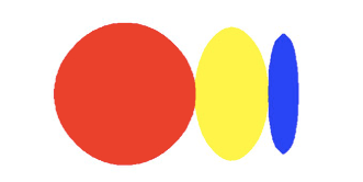
- It is too abstract to mean something we can all identify. Roz Warren wrote a funny post about how, to her Medium pals, it looks like anything but an ellipses.
- It embodies the fickle nature of our prematurely “ellipsing” ideas.
- It appears like a black hole that sucks our writings into the unknown (depending on our mood).
- It appears to be an exact mirror image of the existing logo of Bee Home. Oh, no! (Linda Caroll wrote about this here)
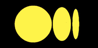
I am now more or less used to the symbol, but I can hardly suppress my urge to brighten it.
And, doesn’t it kind of remind us of Bees?
A Final Word
For better or worse, the symbol has arrived and is likely here to stay. Who knows what will come next and when! With time, we will likely get used to these changes and perhaps even embrace them. We may never learn to love Medium’s new symbol, but we can most definitely learn to live with it.


