

When you obscure the data you lose a chance to deliver your insight
Incremental Improvements #16: Stacked column chart alternative
There are times when you can use more than one chart type to show your data and you will be completely fine. But you have probably already noticed that in most cases some charts are better than the others. Why is that? Simply because they deliver the story better.
This week I’ll show you such an example. Theoretically, the chart choice is good, but somehow the insight got lost. I had to go through the charts a couple of times to understand them properly. And I don’t want to upset you but the great majority of your audience won’t bother that much. So what can you do about it? Well, just make sure that the insight is straightforward and no one will have a chance to miss it.
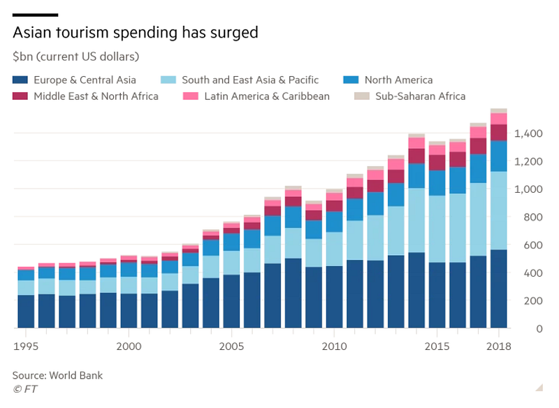
Let’s take a look at the chart below, the main message is that Asian tourism spending has surged, but the chosen data visualization doesn’t reflect that. Because the data is presented as a stacked column chart, we mainly focus on overall value rather than on the change in each of the categories. This happens because only the bottom category has a common baseline. And this is just the beginning of the poor design choices of this chart. Have you spotted any other?
Original DataViz by The Financial Times
Good data visualization solutions✔️
Elements that work in this chart
- Highlighting time intervals — is done extremely well in this chart. Firstly, only major timestamps are labeled, which declutters the x-axis. Secondly, the endpoint is also provided, so the time span is visible.
- Carefully thought out layout — The most prominent part of the chart is the data itself and everything else is only secondary information that helps us understand what we are looking at. Another good design decision that works well in this chart is putting the y-axis on the right side, closer to the highest numbers. This small change makes comparison easier.
- Informative header — that explains why we are looking at this chart and also determines what we should focus on.
Bad data visualization choices❌
Elements that don’t work in this chart
- Chart type choice — Personally, I’m not a big fan of stacked column charts, they almost always obscure the data and can be easily replaced by a line chart. In order to compare the trends of the two categories, we have to be crosseyed or have extraordinary working-memory capacity, which the vast majority of the audience is lacking.
- Adding a legend — Usually, the category names can be successfully incorporated into the chart, so there is no need for a separate legend. In our case, we can place the category name next to the line so we don’t have to jump back and forth between the data and the legend.
- Color coding — The color selection is not the worst because colors are easily distinguishable thanks to the order of the placement (note that if the order of the colors was different we would end up with diverging palette which would be a mistake in this case), but somehow it doesn’t do the justice to the story. The main focus is on the change in Asian tourism and the category can’t be easily spotted, we have to read the whole legend to understand the data.
*You really have to analyze the data thoroughly, to see that the chart refers to both Europe & Central Asia and South and East Asia & Pacific. I myself noticed it only after the second time I read the original article. If the two categories were having similar eye-catching colors (i.e. shades of pink, orange, or red) and other categories were more muted, then the insight would be more straightforward.
How to make this data visualization better❔
Step-by-step improvements

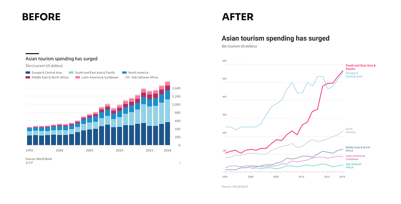
- Switch to line chart — Because we are focusing on the change over time in each of the categories, using the line chart is a better option. This way we can both analyze the overall trend for the region and compare it with the other. Another advantage of this change is a more accurate comparison thanks to the narrower range of the y-axis.
- Remove the legend — and place the category’s name at the end of the line. This way, you limit the work that the audience has to do — instead of jumping all over the chart, they will just see the connection. I encourage you to try it yourself with the Before and After picture below. Compare the Middle East & North Africa with South and East Asia & Pacific. In which version understanding the color-coding was easier?
- Use color to focus the user’s attention — The last thing that will help to tell the story is guiding the user’s attention. We can do this in two ways, by using an eye-catching color or by making the thing bigger. I combined those elements by selecting the saturated pink color, using a bolder line, and increasing the size of the label. This way the South and East Asia & Pacific is the first thing we can see.
EDIT: After reading the original article for the second time, I realized that the author analyzed the first two categories together (Europe & Central Asia together with South and East Asia & Pacific). In this case, the combined group has a common baseline and can be analyzed using the bar chart. But then the other elements of the chart are problematic. 1) Classification (the share of Asian and European tourism in the first of the categories is unclear), 2) Naming (putting Central Asia first would help to mentally group those categories), 3) Color-coding (we could use a similar color for Asian-related categories and greyed out the rest). Nevertheless, I would still recommend switching to the line chart and stressing two categories at the same time.
What do you think about these changes? Would you improve something else? If you have some suggestions for the next makeover feel free to drop them in the comments.
Links
- Original article: Tourism deals lingering blow to global economy
- Original chart: Asian tourism spending has surged
About Incremental Improvements
This is a series dedicated to small changes that can be done in order to make a visual design better. In each post, I analyze the data visualization to see what works, what doesn’t, and what to do to improve it.
You can find the list of all previous makeovers here