

Poor chart choices that I made so you can avoid them
How NOT to use pie charts, line charts, and bar charts
You probably have seen some charts that seem to look okay, but there is something strange with them. They are either hard to understand or they deliver misleading insight. I guess each one of us has a chart like this in our portfolio.
I was going through my old work and, unfortunately, I came across … plenty of examples. So I decided to share some of the most common mistakes that I used to make, with some alternatives on how to avoid them.
But first, let’s take a step back and think about a good chart? Do you know what defines it? Many people think that the crucial thing for a chart is its beauty but in fact, what really matters is its functionality.
Graphics, charts, and maps aren’t just tools to be seen, but to be read and scrutinized. The first goal of an infographic is not to be beautiful just for the sake of eye appeal, but, above all, to be understandable first, and beautiful after that; or to be beautiful thanks to its exquisite functionality.
— Cairo, Alberto. The Functional Art.
Always start with the purpose
There is no mystical knowledge behind selecting a proper chart. You should be guided by the purpose and choose the chart based on that. There are some materials that come in handy while making this decision. One of them is the diagram by Dr. Andrew Abela titled Chart Suggestion — A Thought Starter.
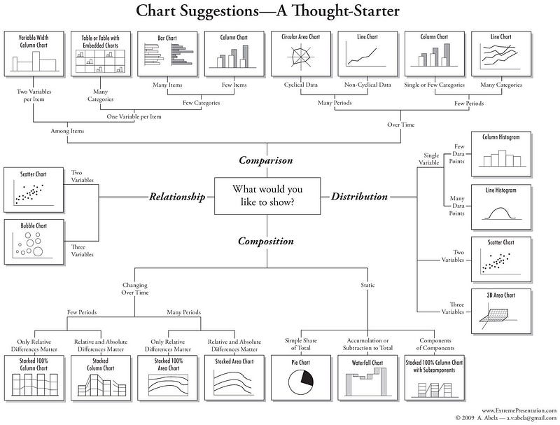
As you can see the central point of this diagram is selecting a purpose by answering the question “What would you like to show?”. You can choose one out of four choices:
- Comparison
- Distribution
- Composition
- Relationship
By specifying other areas such as the number of variables and periods you end up with the chart that is best suited for your specific case.
Although the graph might seem quite complicated, it covers all of the steps of picking the right chart. And what would happen if you don’t follow this graph? Well, check these common examples of chart misusage.
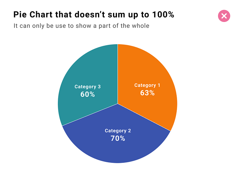
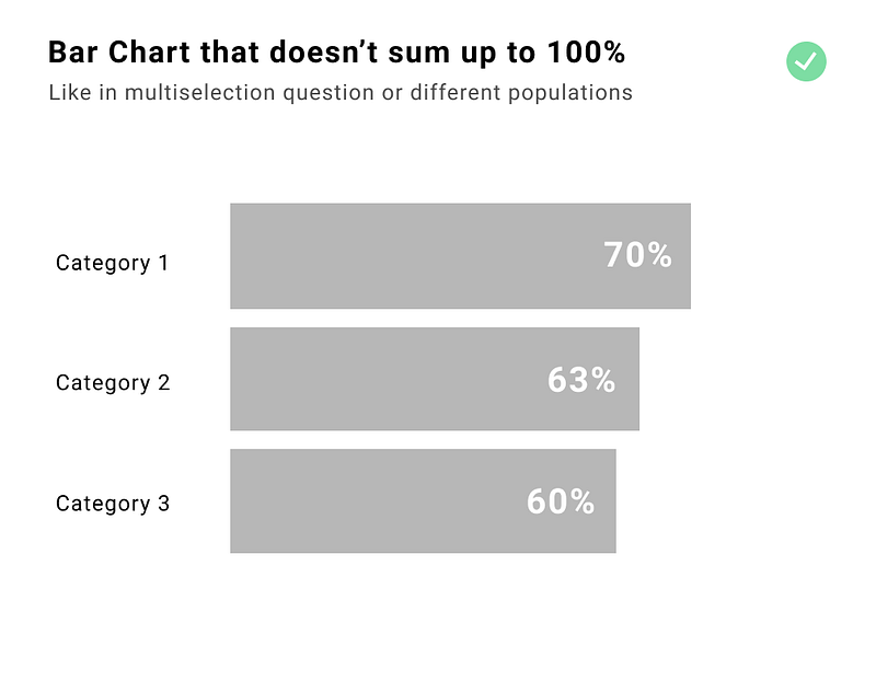
Pie charts that don’t sum up to 100%
Using a pie chart, in general, is not recommended but for sure you should not use it if the data sum up to more than 100%. As you can see from the graph above the purpose of the pie chart is to show the share of the total. The ideal use case for a pie chart is showing a composition of two or three categories among the whole population, such as gender or dichotomic answers (yes/no, good/bad, agree/disagree).
Common cases when data doesn’t sum up to 100%:
- not including all categories
- showing multiselection question
- showing one measure in different populations
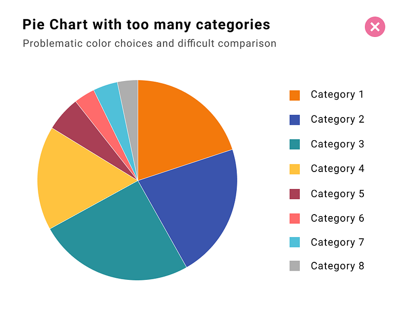
Pie charts with too many categories
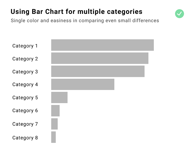
Pie charts are only useful for showing a simple share of the total (preferably for two or three categories). If you want to compare more categories use a bar chart instead. The comparison is much easier and an additional advantage is limiting the palette to a single color.
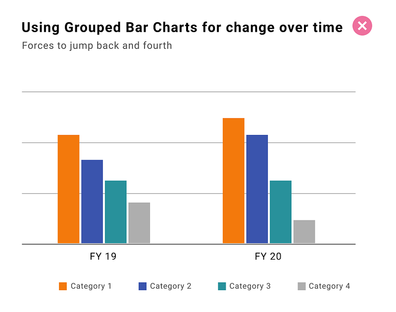
Stacked bar charts to compare different categories over time
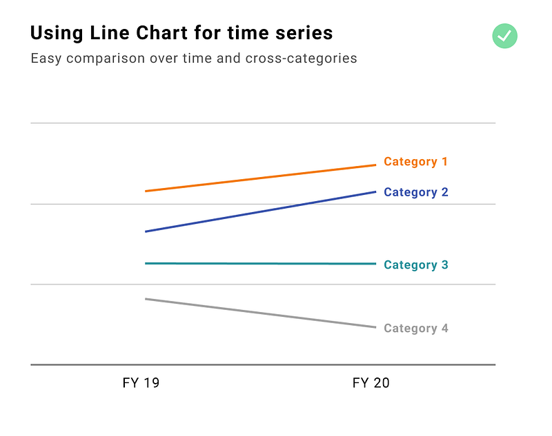
Bar charts are great to show precise value — the human eye is best accommodated to see differences in length, but jumping from one column to the other while checking the category and the axis is just too much. The best solution is to use a line chart, instead. This way we can focus on the slope which immediately indicates the change over time. And if we place category names next to the line we don’t have to jump between the chart and the legend.
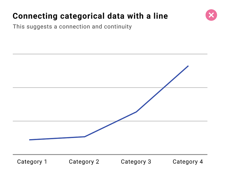
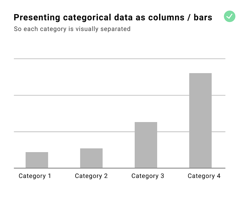
Line chart for connecting categorical data
Connecting the points suggests a connection and continuity between them. That’s why categorical data should not be placed on the x-axis of the line chart. Based on the length of the category name we should use a bar chart or a column chart. If text is not oriented horizontally it becomes harder (and slower) to read. That’s why when we have categories with longer names we should use a bar chart. On the x-axis of the line chart, you should put a continuous measure, preferably time-related.
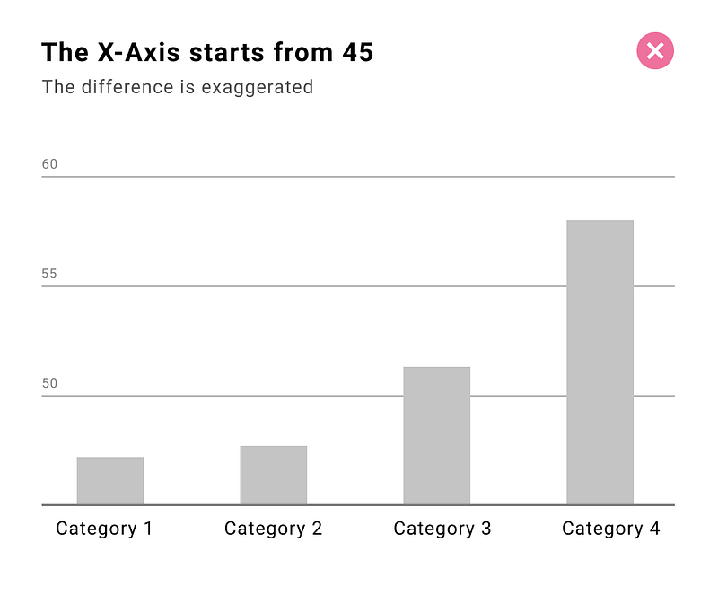
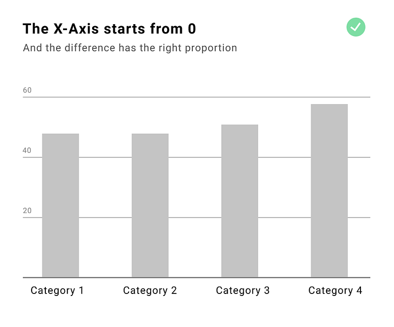
A column chart that doesn’t starts at zero
In general, the default approach should be including 0 in the axis of all charts. There are some exceptions to this rule for example when you encode your data with the position — like in the line chart, dot chart, or scatter plot. But if we encode our data with the length we SHOULD ALWAYS INCLUDE 0 otherwise, the chart will be misleading. Compare the examples below — on both charts we have the same data but on the left side the difference is exaggerated and the last category looks 5 times bigger than the first one when in fact it is only 28% bigger.
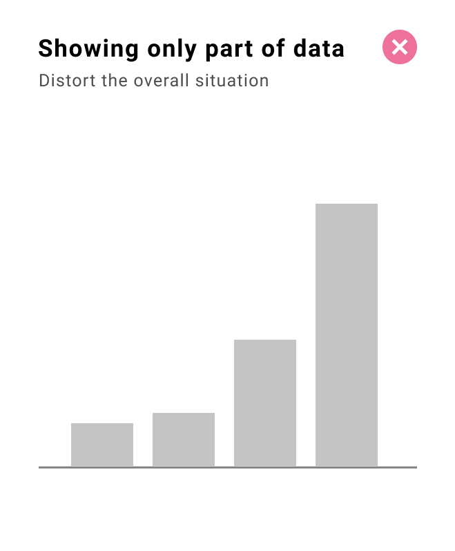
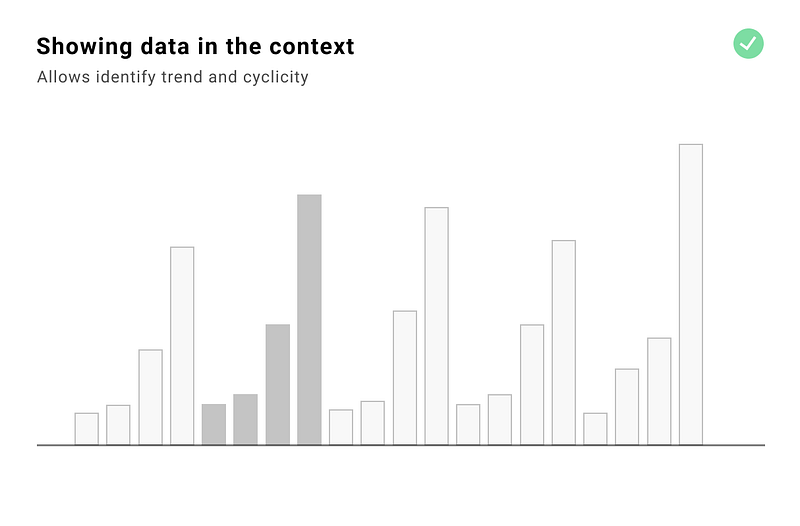
Not providing context
We should not cherry-pick the data to support the story. It is especially important when we are choosing a timeframe, and picking the categories to compare our data against. To provide proper context we should consider:
- history — and provide a wider range of dates
- periodicity — provide at least two cycles
- surrounding — show your data against the competition, other categories, or countries
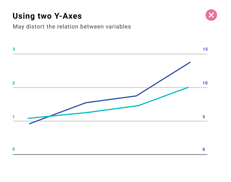
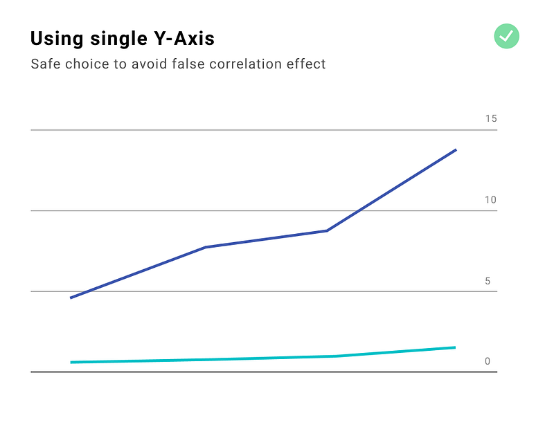
Using two Y-Axes
Why using dual axes is not ideal? When we have separate axes we can manipulate the scale and the magnitude can shrink or expand for each metric. This is typically done to imply correlation and causation. Just because the lines are synchronized it doesn’t mean there is an actual correlation — it might be the effect of scale manipulation.
Useful links and resources
- The Functional Art: An introduction to information graphics and visualization
- Advanced Presentations by Design: Creating Communication that Drives Action


