
What developers should know about UX
With the rise of UX practice as a pillar of effective human/machine communication, many developers are still unaware of its importance. Let’s go through some guidelines.

1. Prototyping and iterating
Great UIs are not easy to achieve and may require several iterations until the ideal solution is designed — the one less complex but providing all the functionality. Paper prototyping of a user interface is a technique that lets you iterate quickly and cheaply. It produces low-fidelity (lo-fi) prototypes (throw-away prototype, mockup, or wireframe).
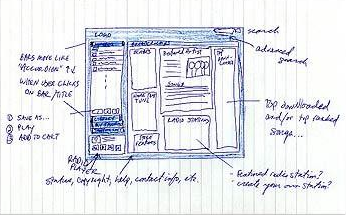
This technique should precede any GUI implementation since it:
- offers a forecast of how the product will evolve;
- gives the chance to test several UI alternative proposals;
- has very low costs associated (simple and fast, only needing pen and paper);
- serves as a means of communication and synchronization between the actors;
- can serve as a requirement specification technique;
- allows you to get continuous feedback from users (and others) and spot errors from early stages;
- involves and inspires the project’s stakeholders.
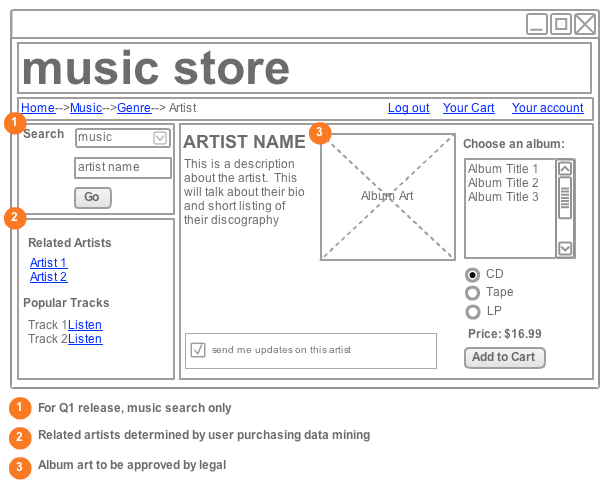
The phases in which it’s most useful are at the project start and before creating/changing a new UI feature (screen, window, page, or similar).
2. Visual metaphors and affordances
In interface design, a visual metaphor (or interface metaphor) is an analogy established between a known system and the interface to be developed. Recall that one of the 10 Nielsen heuristics defends to “Match between system and the real world”.
In the same way that we resort to practical examples to explain things in everyday life, visual metaphors explain’ UIs (or parts of it). For example, using ‘❤️’ →‘favorite’, ‘mail’ →‘email’, ‘form’→‘web form’, ‘dossier’→‘tab-based interface’, ‘toast in toaster’ → ‘toast notification’. A more complex example is Google Maps, which inherits most concepts of a physical map. There is also bad usage of metaphors (e.g. hamburger).

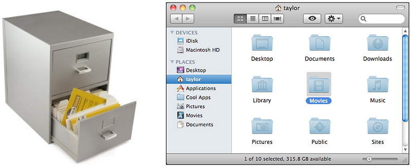
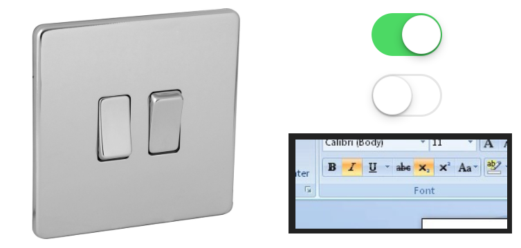
An interface metaphor is characterized by one or more (perceived) affordances. An affordance is the ability of an object to convey its action (e.g. a doorknob tells us that it will open the door).
The motivation for using those metaphors is to significantly accelerate the creation of a mental model in users’ heads (i.e. their apprehension of the application’s conceptual model). Since we’re taking advantage of the knowledge that users already have from the real world, it gets easier for them to understand the concepts inherent to the application.
The choice of the right metaphor must precede any interface creation or addition of new functionality. However, choosing metaphors and affordances is not an easy task. One of the golden rules is to not force it: if it needs many adaptations, we’re on the wrong track.
A metaphor is just a conduit for the transportation of ideas between minds. (Tim Rohrer)
3. Existing systems and design patterns
As Jakob Nielsen claims, an application must take into account “Consistency and standards”. It’s crucial to seek inspiration from established systems (e.g. Windows, Gmail, Google Maps, iPhone). In addition to giving positive evidence, they’re known by the target community thus reducing the questions in users’ heads and taking advantage of the existing knowledge they have from other systems. The learning curve of the application in question is then improved.
You should read the UI guidelines for the system you are developing in/to (e.g. Apple Human Interface Guidelines, Design for Android, Windows Design). One example in Android is to associate ‘swipe down’ with ‘content update’ and never with another operation. Let’s look at more concrete examples:

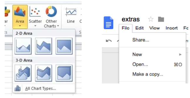
These examples taken from existing systems are in fact patterns — the same way that code development should rely on design patterns (e.g. encapsulation, proxy, abstraction), interaction design should rely on interaction design patterns. Only after studying them, you can start to recognize/use them. These patterns are tested and reusable solutions to typical interaction design problems. They should not be confused with visual metaphors, although the concept is similar. Let’s look at two examples:
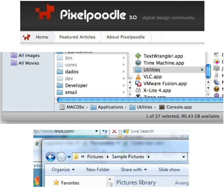
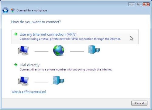
We should not use patterns without first formulating the problem. Only then can we search for the pattern, and if necessary adapt it to the application. These patterns are usually organized into pattern repositories. Some companies have even their own library of standards. There are also online libraries (e.g. GoodUI, UI Design Patterns, and Welie).
4. Autonomy and independence
An “independent and autonomous interface” does not rely on animations, sound, colors (i.e. could be used in black and white), shortcuts, and help (i.e. explanations and instructions) to be understood and used. It doesn’t mean you shouldn’t have them — you just shouldn’t depend on them. Of course, sometimes contextual (inline) help can be of great value, but at least you should try to design the UI without depending on it.
5. Flow of tasks
People usually perform procedures sequentially. The tasks they perform on a day-to-day basis follow a logical order. In an application or website, this must be respected as well. For example, while searching for a car on a seller's website, it doesn’t make sense to ask for the model before the car is made; in an application dialog, it’s not logical to place “OK”/“Cancel” on top; also don’t make the user admit he/she has already read something that is below.
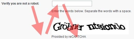
In Western cultures, the natural order of reading is from top to bottom, from left to right. This has several implications. One is that what’s on the right side can be easily ignored. For example, on forms where there’s important content on the right side, several users may simply not see it.
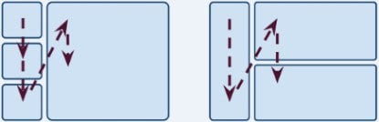
Also, take into account the natural ordering of items. For example, decide on the order to present items in dropdown boxes — be aware that the alphabetical order isn’t always the best choice.

At a more macro level (information architecture), it’s critical to use storyboards to define the workflows of tasks that an application supports. Its goal is to try to illustrate, in a comic book fashion, the sequence of screens needed to perform a task.
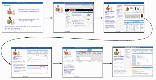
In short, try to put yourself in the “users’ shoes”, respecting the natural order by which they accomplish tasks and expect the arrangement of the items. And of course, test the various proposals using low-level prototypes.
6. Contextuality and encapsulation
Contextuality is the ability of a user interface to offer what users need when/where they need it. One shouldn’t have to search for buttons, menus, options, help, etc; an interface should be simple and built in such a way that the user only takes a moment to look for what he/she needs.
On the other hand, we shouldn’t offer options where/when the user doesn’t need them. For example, a context menu should only contain contextual items. This seems obvious, but it’s a common mistake to put items out of context (e.g. options that don’t affect the selected file).
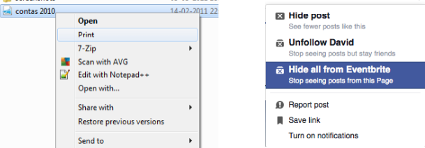
On a related note, avoid spreading related options (of an entity) across the interface. For example, whenever I see my shopping cart, I expect related options (e.g. view, checkout) to be placed nearby and grouped together. This could be called encapsulation of related functionality.
In general, if I need contextual help, I expect to be shown the most contextual page rather than a general one that forces me to search for the topic.
Actions (e.g. delete, edit, copy, etc.) should be placed on toolbars inside the panel where they make sense:
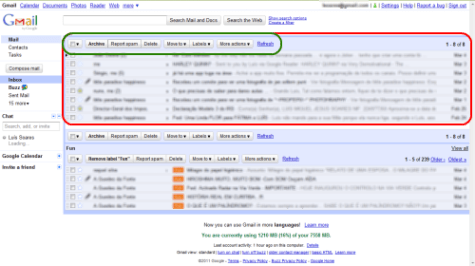
Scroll bars should be placed on the component that they affect (e.g. a tree), rather than scroll the browser viewport.
There are many more examples that could be given, but in short: give users what they need, where and when they need it — neither more nor less.
Finally, it must be stressed that the context must be kept at all costs: operations that require screen changes (often time-consuming) make the user easily lose context. That said, be careful when using wizards and splitting the tasks across screens. In web apps, consider implementing single-page interfaces.
7. Consistency
Consistency in interface design is to give users what they’re waiting for, by reusing interface concepts whenever possible. Here we aren’t talking about inter-consistency (with other systems) but rather intra-consistency (internal).
We should always use the same representations for the same concepts. The relationship between a concept and its representation must be one-to-one. For example, if a card is used to represent a meal (in a meals app), I expect that same card to be used elsewhere for that same concept.
Never increase, beyond what is necessary, the number of entities required to explain anything. (William of Ockham)
In other words, the same representation should be used to convey always the same message/action and not multiple different actions. This applies for example to images (icons, logos, and other visual artifacts), text (e.g. feedback messages) — which should be consistent in grammar and terminology, positions, size and shape (Gestalt laws), layouts (e.g. use templating), styles (e.g. bold can represent a concept), sounds.
The advantage for the users is that they learn the software’s concepts faster since they can easily know what to expect and have fewer artifacts to deal with and learn. The more concepts, the harder it gets.
Consistency creates cognitive leverage: once you have learned how something is done in one place, you can use that knowledge to understand other places that use that same approach […] assumptions made based on familiar-looking situations will be safe. (John Ousterhout, A Philosophy of Software Design)
8. Simplicity and visual load
Simplicity is not trivial to achieve. As you add features, it’s easy to get a confusing and less usable interface. For each added feature we should question all the UI. It must be regarded as perfection: we must walk towards it, even though we know it to be unattainable.
Perfection is achieved, when there is nothing more to add, but when there is nothing left to take away. (Antoine de Saint-Exupery)
This is one of Nielsen’s most important heuristics: “Aesthetic and minimalist design”.
When we add an artifact to a GUI (icon, button, table, etc.), we must consider whether its added value justifies its weight. The ideal user interface of a ‘screen’ is one that condenses more functionality with less visual load (just as the ideal sentence is the smallest, but passing more information).
A feature, if often used, should be much “closer” to the user: fewer clicks/steps/screens/etc. The more it’s used, the more visual importance you must grant it. Less common features should be more “hidden”.
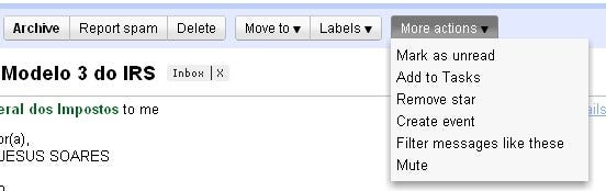
Each time we add functionality to a screen, we must analyze the whole visual load and, if necessary, redesign it. Features are not to be designed isolated.
A good exercise is to remove visual artifacts that you believe aren’t necessary, and then test how the interface behaves without them. For example:
- Remove everything that distracts the user and doesn’t bring added value (e.g. unnecessary animations);
- Try to remove inline instructions (you can add them again later; this is just to test if you could redesign to avoid them);
- Relegate to the foreground what the user does most, and to the background what he uses least (progressive disclosure);
- Use a visual hierarchy: the importance of something must be proportional to its visual load (e.g. text size);
- Consider interaction patterns that reduce visual weight (e.g. tabs, filters, dropdown menus, collapsible panes, etc.).
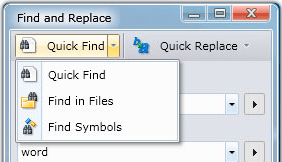
But keep in mind that some decisions to simplify (e.g. dropdown menu to select gender, wizards, tabs) can also be a bad option since they hide available options and add extra clicks.
One constraint to having a minimalist UI is when you have to deal with legacy applications: we should respect the historical reasons and know how to manage the change: for example, by making the ideal prototype, but by launching it in stages.
Only experience and iterations can help achieve the goal of simplicity. The good news is that low-level prototypes bear low costs.
TL;DR
- Prototyping and iterating: iterate with low-level prototypes first to become closer to the ideal solution;
- Visual metaphors and affordances: use metaphors with physical (or at least known) systems to make the learning quicker and more familiar;
- Existing systems and design patterns: take advantage of users' knowledge of other systems and respect the underlying platform;
- Autonomy and independence: don’t let your UI depend on explanations, sounds, colors, animations, shortcuts, to be understood and used;
- The flow of tasks: respect the natural order that the users take to accomplish tasks;
- Contextuality and encapsulation: provide options where they belong and when they’re needed (e.g. inline); group similar items; avoid losing/switching context;
- Consistency: don’t provide more than one representation for each concept;
- Simplicity and visual load: keep the UI with low clutter and make sure the visual weight of items respects their importance.
Sure there would be many more tips to discuss, but I tried to summarize the topics that I consider fundamental and that are sometimes forgotten or overlooked by developers.


