
UX/UI Case Study — Improving Ryanair’s Online Flight Booking Experience
Turning my first take-home assignment into a case study.
After completing my UX/UI Design Bootcamp at Ironhack, I’ve been fully immersed in job hunting (and moving apartments, yay! 🙃), while also wanting to apply my design skills to new projects.
A couple of months ago, I interviewed for a UX/UI designer role, going through an initial chat with HR, a follow-up with the Head of UX, and a final take-home assignment.
Spoiler alert: I didn’t get the job. 😅 However, the company gave me great feedback on my assignment. Not wanting my efforts to go to waste, I have decided to write this case study to showcase my work and share the experience with other designers.
If you are not a Medium member you can still read the full case study here.
Role: UX/UI Designer Timeline: 9 hours Team: Individual Project Tools: Figma Methods: Heuristic Evaluation, Competitive Analysis, User Testing
Challenge Overview
A bit of context — the company I interviewed with focuses in designing digital solutions for airlines around the world to help increase their sales, manage their operations and improve customer relationships.
The assignment required analyzing Ryanair’s flight search flow on both mobile and desktop, and proposing three product improvements. High-fidelity designs were not mandatory, and candidates were free to use whatever techniques they felt appropiate to address the problem.
Heuristic Analysis
I decided to start by thoroughly analyzing Ryanair’s current flight search flow on both mobile and desktop, taking note of the existing features, user interface, and any potential pain points in the user journey.
This initial exploration was essential to ensure that my conclusions were not swayed by external opinions before moving on to additional research.
Desktop
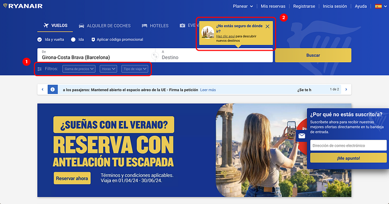
1. Inactive Filters: When searching for a flight, the filter buttons are only active when using the “browse destinations” feature (destination has to be set to “anywhere”). Having the filters remain visible when doing a standard search can confuse users.
2. Pop-up for Explore Destinations: A pop-up card suggesting the use of the explore destinations functionality appears every time you hover over the “Destination” field. This constant appearance can irritate users and contributes to the interface being perceived as cumbersome.
3. Display of Inaccessible Destinations: When selecting a destination, the list includes countries or cities that cannot be reached from the origin airport. This adds clutter to the interface and raises the question: What benefit does this information provide to the user? Why do users need to know about destinations they cannot fly to?
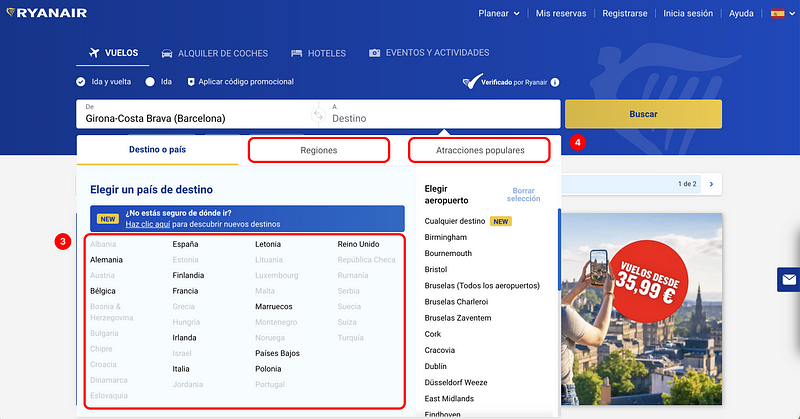
4. “Regions” and “Popular Attractions” Sections: I have doubts regarding the usefulness of this functionality as users typically plan trips with prior knowledge of where they need to fly to visit specific attractions. However, more data and user research would be needed to determine if this information is valuable to users.
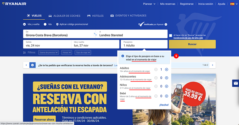
5. Redundant Text: There’s text on the interface that could be condensed or simplified. For instance, the required age of passangers at the time of travel appears multiple times: once in the blue section and again under each passenger type. This makes the design and experience feel heavy.
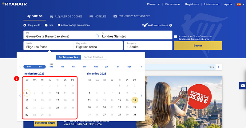
6. No Pricing Information When Selecting Dates: The current interface does not show pricing information while the user is selecting flight dates, unlike many other flight search engines that already incorporate this functionality.
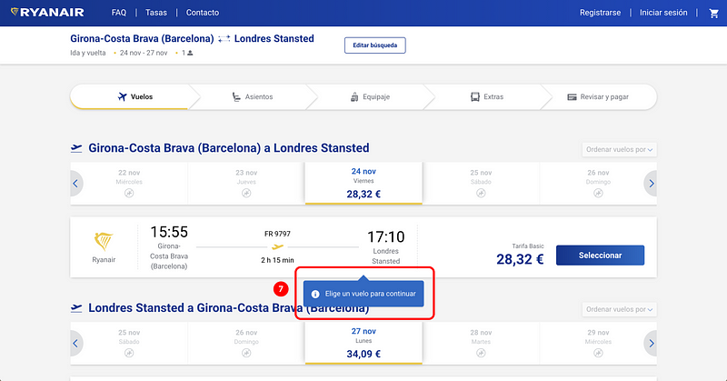
7. Premature Error Messages: When selecting flights, a pop-up appears before users have a chance to review the information. It’s important to avoid displaying error messages too early, as it can be considered a hostile pattern. This negatively impacts the user experience by making the users feel rushed, annoyed, or confused.
Mobile
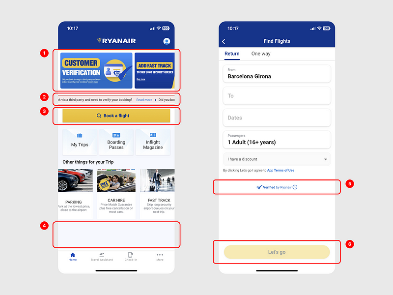
1. Overloaded Home Screen & Excessive Ads: The home screen is cluttered with too many elements competing for attention, including an abundance of ads. This detracts from the user’s primary goal of searching for flights, giving the impression that selling extras is prioritized over helping users.
2. Animated Text Banner: The animated banner is not the best way to display information, especially on narrow mobile devices, as users have to wait to read all the text. Also, the use of the color red, typically associated with error messages, could confuse users.
3. Unnecessary “Book a Flight” Button: This button adds an unnecessary extra step in the flight search flow, contrary to the goal of minimizing steps for users to find and book flights.
4. Crowded Element Arrangement: There is not enough space between the elements on the screen, causing visual fatigue. The lack of spacing also results in excessive empty space at the bottom.
5. Inconsistent Text Alignment: The text “Verified by Ryanair” is centered while other text is aligned on the left, which creates an unbalanced design.
6. Ambiguous Button Copy: The text “Let’s go” might confuse some users. Using a more generic and action-oriented text like “Search flights” would be better to prevent errors. The button is also an example of the lack of consistency in the use of styles, such as shadows, borders, and rounded corners, across the whole interface.
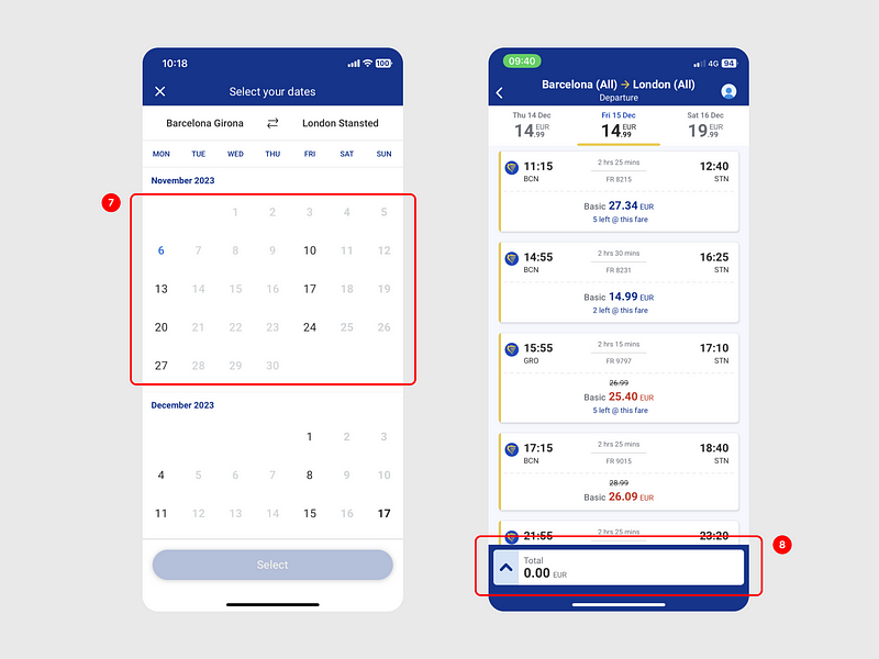
7. Absence of Price Information: As mentioned on the desktop platform, user experience could be improved by displaying the cheapest flight dates or prices under each date.
8. Unnecessary Cart Display: The cart showing 0€ is unnecessary and could be hidden until a flight has been selected, streamlining the interface.
App Reviews
I also decided to take a look at reviews of the Ryanair app on the App Store, as it’s an easy and quick way to gather insights directly from users.
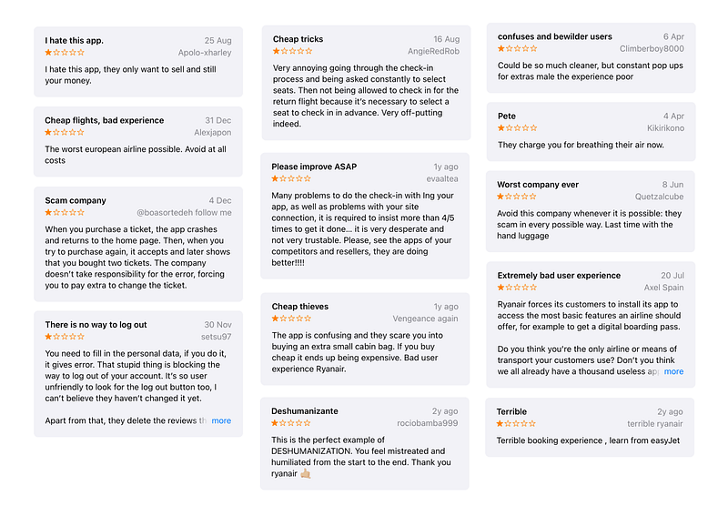
Here’s are the main findings:
- Many users find the app too complex and frustrating to use. This suggests a need for simpler navigation and design improvements.
- Some users feel the company prioritizes sales over user experience, leading to a sense of being “cheated on”. Misleading users to induce purchases is not recommended as it can provide short-term gains but will damage the company’s reputation in the long run.
Competitive Analysis
To learn more, I analyzed the flight search flows of some of Ryanair’s direct competitors that operate the same low-cost airline market, Vueling and EasyJet, to detect opportunities for improvement.
I’m not going to include the whole extensive competitive analysis, but just share some of the biggest insights.
Vueling / Desktop
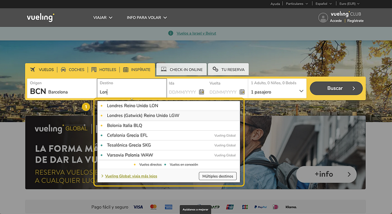
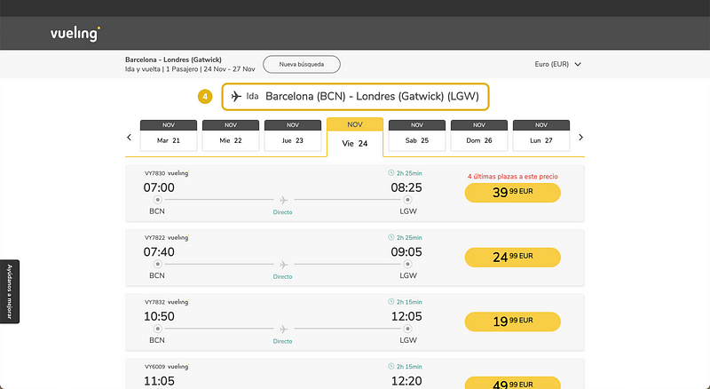
1. Vueling simplifies the design by showing only destinations you can fly to from your chosen airport. As you type, the results narrow down, making it visually easier. Plus, I like that they use colors to distinguish between direct and non-direct flights, giving you straightforward information.
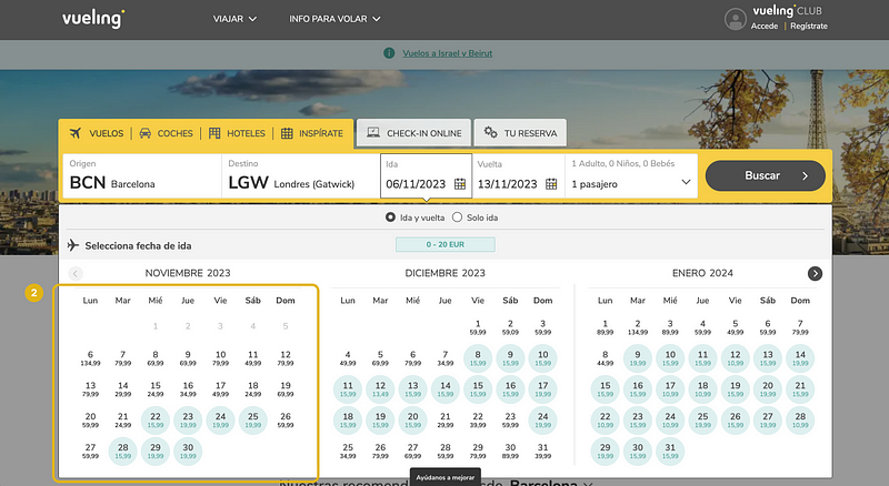
2. When selecting dates, Vueling displays the lowest price per day and uses colors to show the cheapest and most expensive dates. It’s a simple and intuitive way to give users a quick overview of the price.
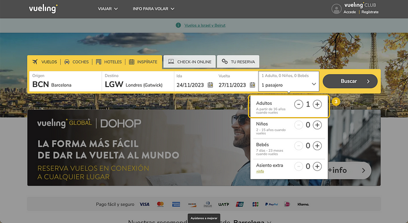
3. Vueling simplifies the age information copy. They mention it once under each passenger type, unlike Ryanair, which does it twice. Instead of saying “at the time of travel,” Vueling opts for “when you fly,” making it clearer. Small details like this matter for a user-friendly interface.
4. Vueling separates picking the outbound and return flights into two screens. This prevents confusion, ensuring users don’t accidentally choose the wrong flights for the departure and return (error prevention).
Vueling / Mobile
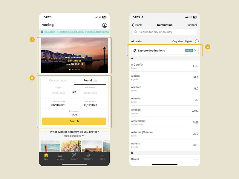
1. Vueling’s home screen strikes a balance by including offers without being too intrusive. The majority of the screen prioritizes the user’s main objective: searching for flights.
2. Searching for flights doesn’t involve an additional step. The search engine is seamlessly integrated into the home page, eliminating the need to press a button to access the search functionality.
3. Unlike Ryanair, Vueling stands out by offering the functionality to explore new destinations directly within its application.
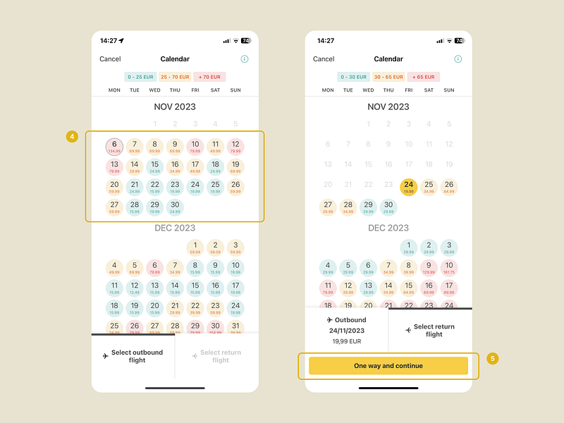
4. Just like on their website, Vueling uses the same color system to highlight dates with the most affordable flights.
5. I find this functionality particularly useful. Pressing this button allows the user to proceed with a one-way flight, even if they initially chose a round trip, without having to go back. This not only saves time and steps for the user but also provides the flexibility to change preferences seamlessly during the flight search process.
EasyJet / Desktop
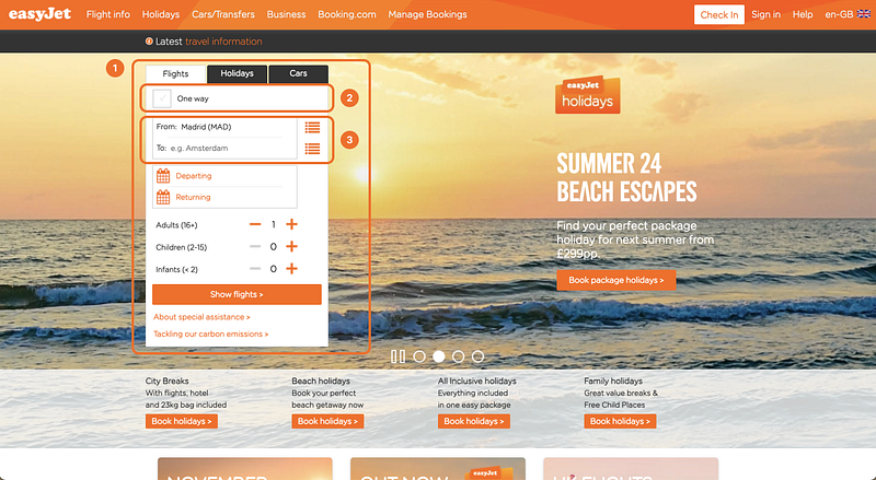
- EasyJet’s website stands out mainly due to its different layout. The search functionality is located on the left side, instead of expanding horizontally.
- Another difference is the use of a checkbox to select between one-way and round-trip options, deviating from the industry standard of using radio buttons with two options (One way/Roundtrip), as observed in both Ryanair and Vueling.
- You can either type your destination’s name or click the right icon to open the full list of destinations. I’m not a big fan of this as it forces the user to choose between two paths: clicking the icon or starting to write in the field. In contrast, with Ryanair and Vueling, clicking on the text field to start typing also opens the list of destinations.
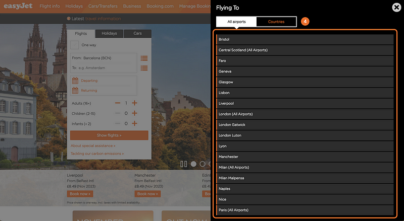
4. Similar to Vueling, EasyJet displays only those destinations that are you can fly to from the selected departure airport. Additionally, it provides the option for country-based search.
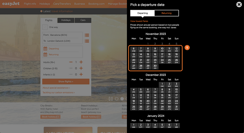
5. When selecting dates, EasyJet shows price information but lacks a color system to visually highlight the price range. I’m also not a fan of the heavy feel of the black right sidebar and the cramped layout, with information running vertically instead of using horizontal space, leaving unused space on the left side of the screen.
EasyJet / Mobile
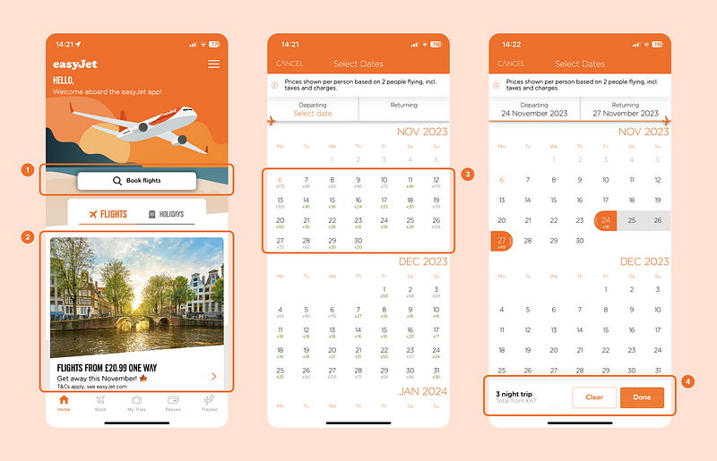
- Similar to Ryanair, in the EasyJet app users need to take an additional step by clicking a button to initiate flight searches.
- The home screen includes offers and advertisements, but it’s less overwhelming compared to Ryanair and there’s a better use of the screen space.
- When choosing dates, the app shows price information. Unlike the desktop version, it includes some color to highlight the most affordable days to fly, though it doesn’t stand out as much as in the Vueling app.
- The app provides a very useful detail by displaying the total number of nights alongside the overall trip information.
After the analysis, my own personal conclusion is that Vueling has the best user experience in terms of flight search out of the three airlines.
User Testing
To validate identified issues, I also conducted a brief “guerrilla” usability test, with the help of a friend.
His task was to search for flights from Barcelona to London on both the Ryanair website and app, asking him to share his thoughts out loud. Here are some of the key insights:
Desktop
- Overwhelmed by information, the user struggles to know where to look and how to find relevant details.
- Doesn’t understand why destinations are shown that are not available and is frustrated.
- Doesn’t like having to accept the website’s terms of use before he can search for flights.
- Concerned about making a mistake when selecting both inbound and outbout flights on the same screen.
Mobile
- Negative perception of the cluttered home screen, perceived as spam.
- Mentions how only a third of the screen is useful information and the rest are attempts to sell additional services.
- Prefers the menu to select a destionation in mobile because it only shows available destinations and it’s easier to use.
- Appreciates not having to check a terms and conditions box on mobile; a simple text clarifies that clicking the button implies acceptance.
I also had the user conduct the same flight search on competing platforms Vueling and EasyJet:
- Prefers separate screens when selecting flights for each leg of the trip.
- Prefers to see price information and cheapest days through color-coded calendars when selecting the dates.
- Preference for direct flight searches from the home screen.
- Likes the nearby airport suggestions based on the user’s location.
Improvement Proposals + New Screens
After all that research, I identified several areas for improvement. Following the assignment guidelines, I selected the most important based on user feedback and their impact on the business.
Even though the assignement did not require high-fidelity designs of the screens, I ended up designing two of the screens with some of the improvements proposed to showcase my UI skills.
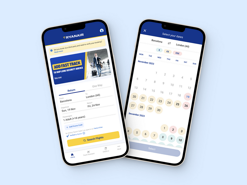
1. Remove The “Book Flight” Button
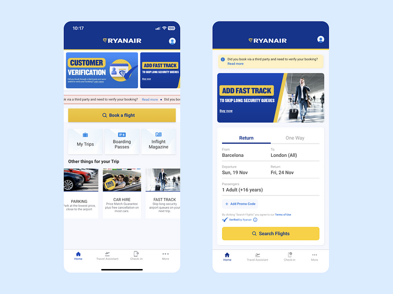
I did a quick redesign of the home screen to integrate the flight search directly onto the initial page, eliminating an extra step for users and enhancing the agility of the flight search process.
Additionally, I minimized the focus on irrelevant offers, diminishing the sense of a hard sell and prioritizing the user’s real needs.
Lastly, I refined the layout and adjusted the spacing between elements to create a more organized and comprehensible screen, improving the accessibility and overall user experience.
2. Include Price Information When Selecting Dates
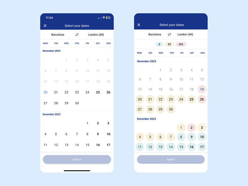
Based on research findings, it’s evident that displaying price information during date selection significantly enhances user experience, a feature commonly observed among competitors. Therefore, I’ve redesigned another screen to integrate this functionality.
Price information is now represented on the dates using a color-coded format, a system users are already familiar with. This enables users to quickly identify the cheapest or most expensive travel dates, saving them from having to go back and adjust dates if they don’t fit their budget.
3. Remove Unavailable Destinations
Showing destinations that are not possible to fly to can frustrate the user, as well as increase the information they need to process.
From the competitive analysis, we saw that no competing airlines include unavailable destinations. My proposal would be to redesign the menu, eliminating unavailable destinations and condensing the information.
4. Indicate The Flight With The Cheapest Fare
As a budget airline, Ryanair caters to customers looking for the most affordable travel options.
With this in mind, we could improve the experience by incorporating a subtle visual element to quickly identify the cheapest fare. This simplifies decision-making, leading to a faster and more satisfying search process.
Last Thoughts & Takeaways
Even though there’s some debate about take-home assignments in the design hiring process, I actually really enjoyed tackling this challenge and I also understand why they are necessary.
Though I didn’t get the role, I choose to see it as a chance to practice and improve. I’m looking forward to continuing my job search, getting better as a designer along the way. As always, any feedback is always welcome. 😊Thanks for reading!


