
Using BigQuery Admin Resource Charts
How the new Feature can save you Performance and Money

In the operation of cloud applications, costs can be saved compared to conventional on-premise variants, especially in the area of Data Analysis, where many resources only have to be made available for a short time, but if used incorrectly or without optimization, unnecessary additional costs can also arise. Google is now improving on this in its SaaS Data Warehouse Big Query.
Google had already provided the Slot Recommender here a short time ago. With this, companies can well estimate when X makes more sense than Y.
The Slot Recommender analyzes slot usage over the last 30 days and groups the usage data into percentiles. For example, if a project’s slot usage is 2,500 slots at the 99th percentile, this means that the project used less than 2,500 slots in 99% of the measurement period. It also compares the slot value to on-demand charges during the same period to determine if you can reduce costs by switching from on-demand billing to flat-rate pricing [1][2].
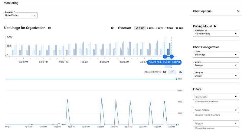
With BigQuery Admin Resource Charts you can now observe how their organization uses BigQuery slots and how their jobs perform over time. Primary use cases for Admin Resource Charts include root-cause analysis for capacity planning based on historical resource utilization and diagnosing performance changes [3].
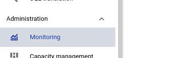
You will find that Monitoring Tool under Big Query — Administration — Monitoring.
I think this is a very useful tool to plan costs and capacities better in BigQuery. If you are interested in this topic, you might also find more about the latest updates regarding new features and services down below:
Sources and Further Readings
[1] Google, Understand slots (2022)
[2] Google, BigQuery pricing (2022)
[3] Google, Use BigQuery Admin Resource Charts (2022)