
Part 1, UI Widgets from scratch in Jetpack Compose
Tutorial Part 1 of 3 (an iOS styled Home Screen List).
Jetpack Compose is probably the most significant thing that has happened to Android in ten years, perhaps, as significant as Kotlin, coroutines, and Android Studio based on IntelliJ — this is my humble opinion, of course.
We have already begun using the SwiftUI at work, and we have plans to start using Jetpack Compose as soon as it loses its beta status. Also, even though declarative programming is not a new concept, it has recently shown great benefits, particularly for UI programming, e.g., SwiftUI, Flatter, React, and HTML, of course. So, I was reading the articles, viewing tutorials and talks, for quite a long time, but I couldn’t find time to get my hands dirty to do something useful.
The best way to learn any new technology is to build something, but, I don’t like building the “hello world” apps! I prefer doing something useful, something that solves a problem, at least for me.
Finally, when JC has turned into a beta, during one of the long weekends when the weather has locked us at home and kids preferred to play Minecraft than reading or playing together, I got enough time to begin! And as you know: — “It’s easy to begin and yet impossible to end!”
I decided to make an Android version of my existing iOS app in Compose.
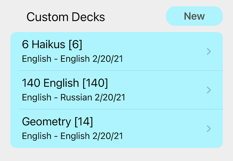
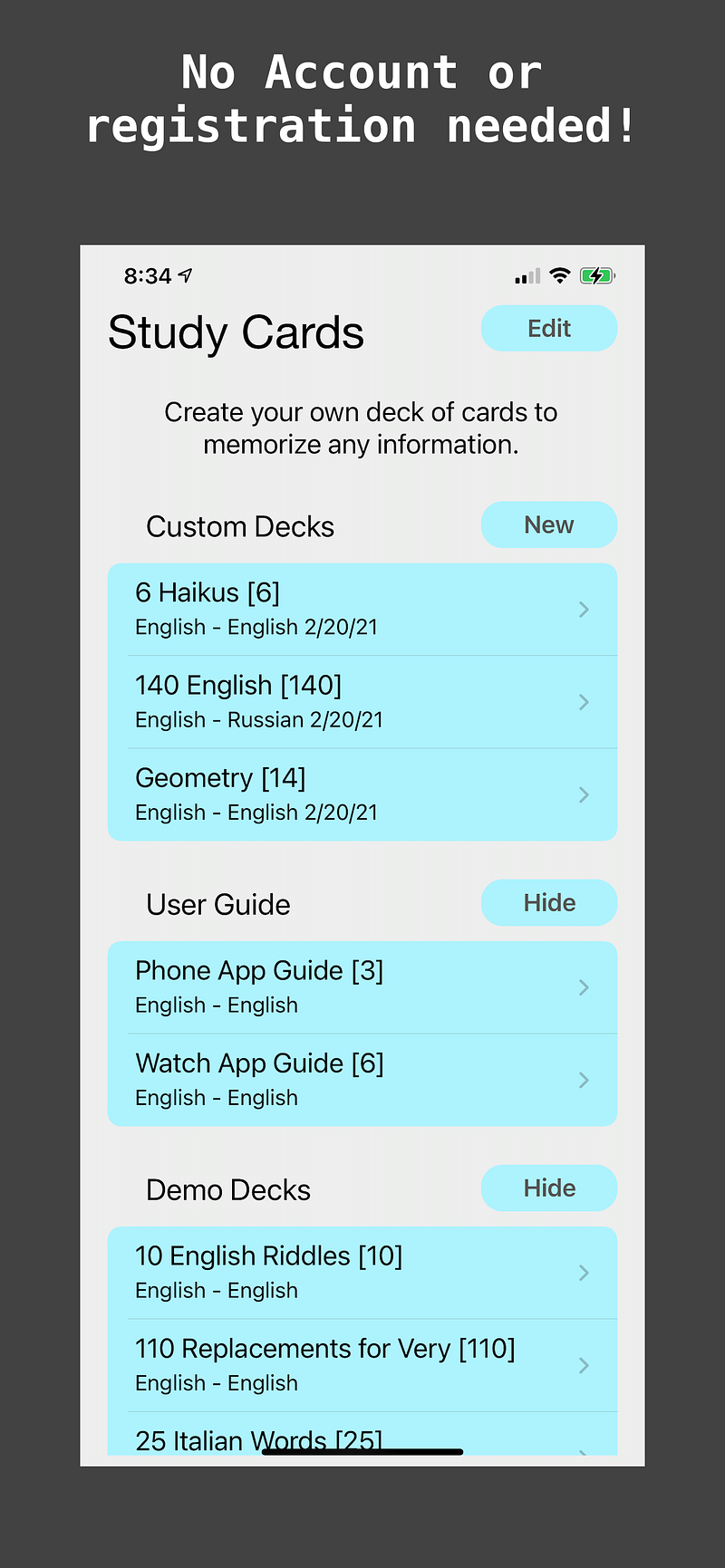
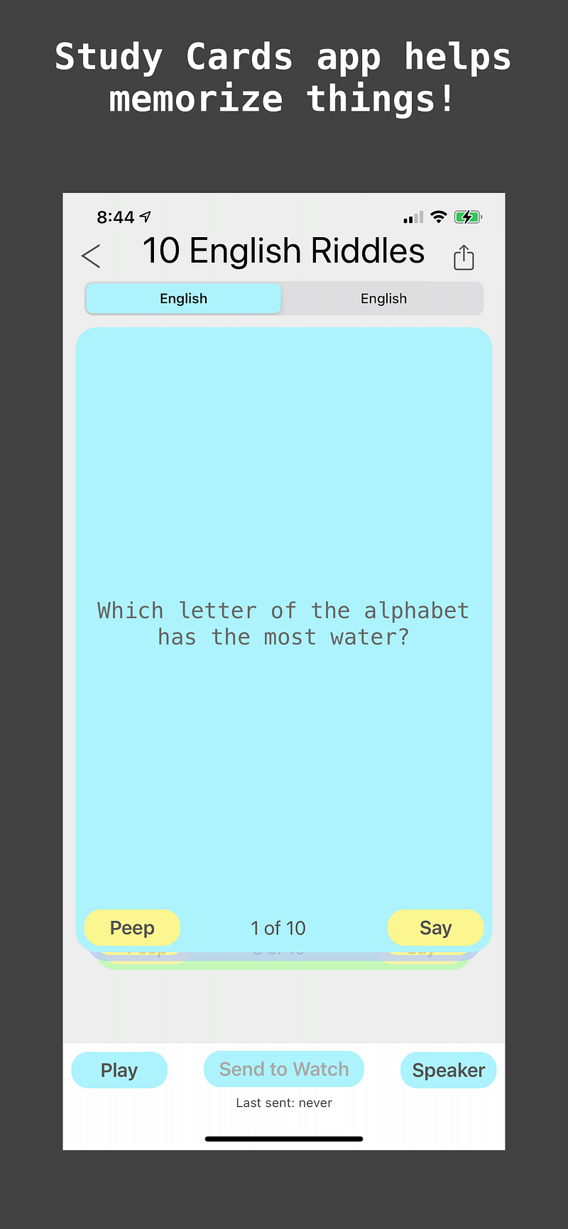
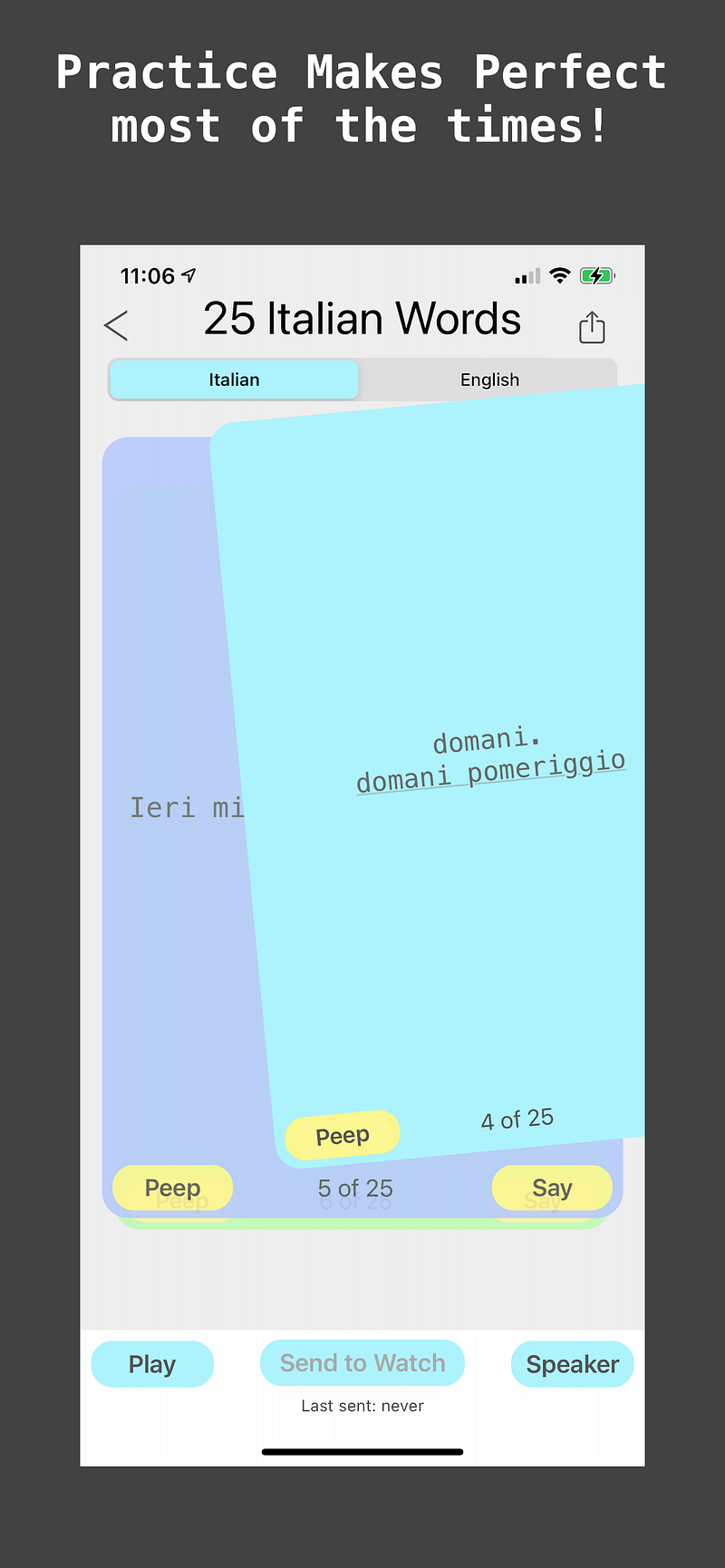
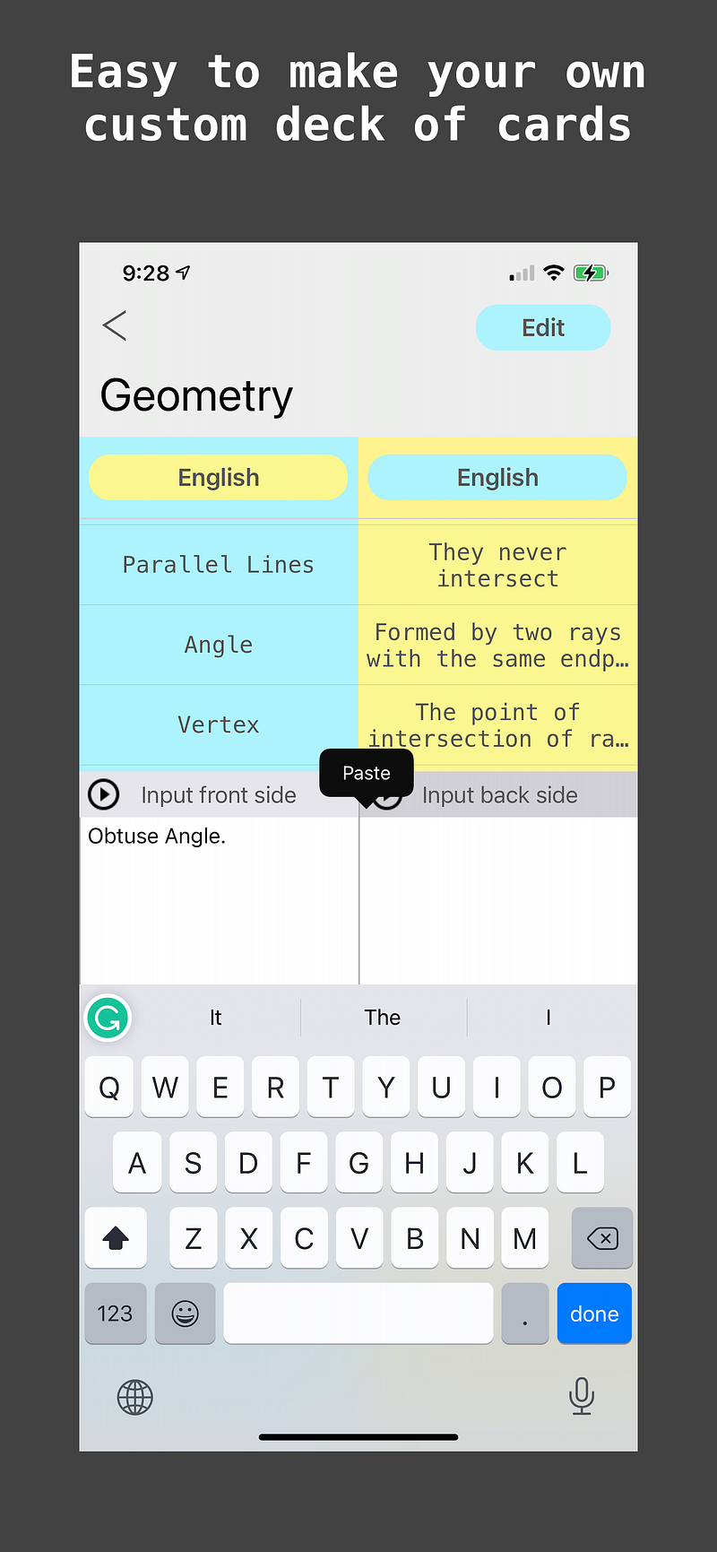
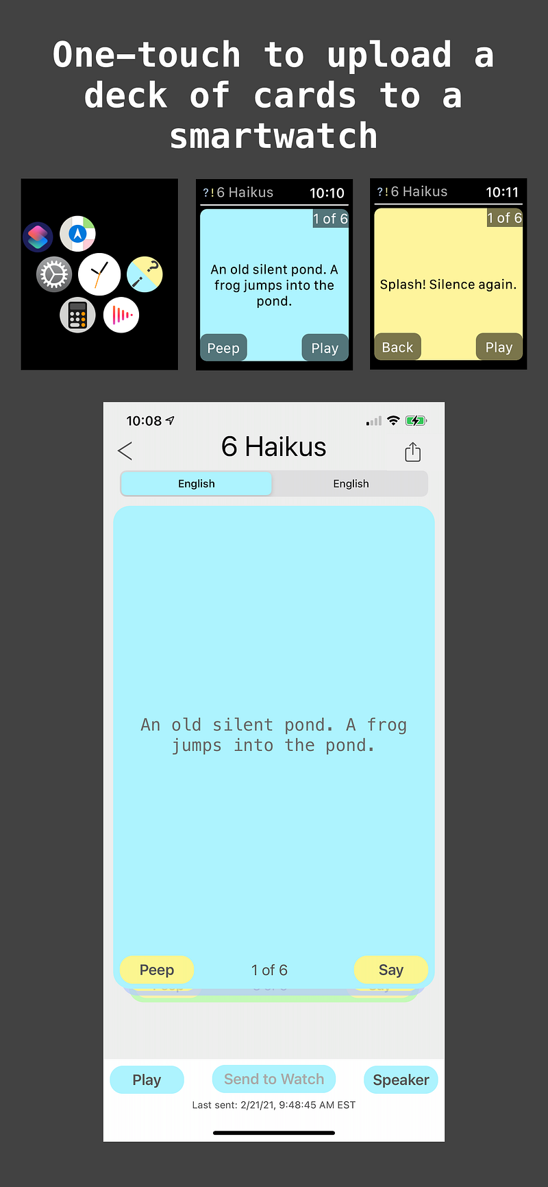
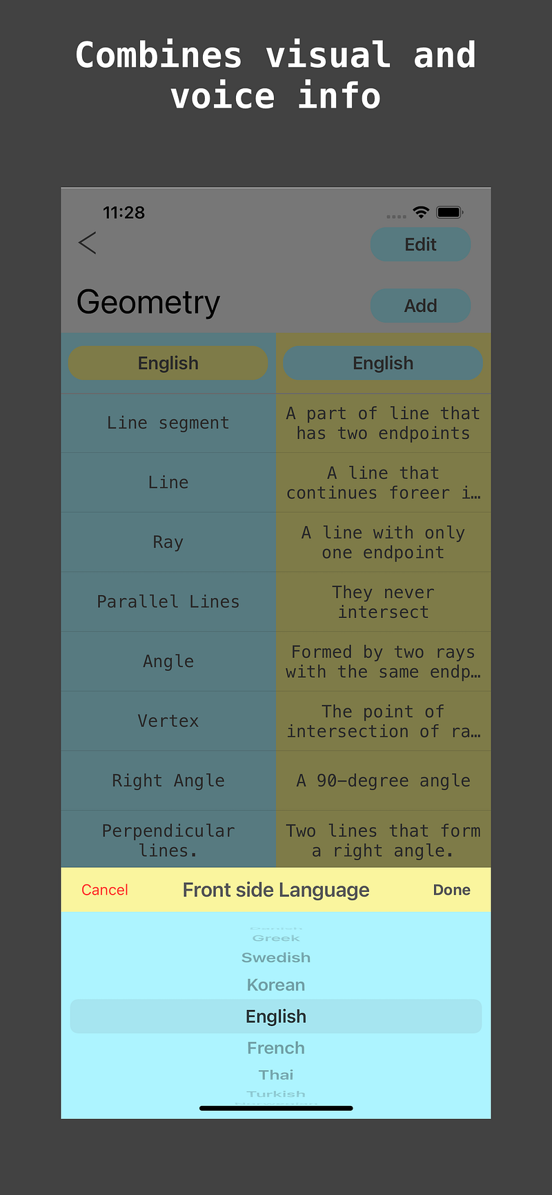
StudyCards — it’s my version of the flashcards for the humans that my kids and I use to memorize things. It’s not a hit on the market yet, but we will see what happens when the Android version is ready.
StudyCards app includes three screens, a few dialogs, animations, input text, text to speech, sharing decks, and one screen of a Watch app.
This tiny app is an ideal candidate to build while learning new technology!
In a few upcoming articles, I will show you how I implemented some UI elements from scratch:
- iOS styled List for Homescreen;
- Deck of cards for Deck Screen;
- Flip and Swipe Card animation and the Drag gesture detector for the Deck of Cards ;
I should warn you that using Compose will turn you into a big fan! And while there are only a few outdated tutorials, a few outdated answers in StackOverflow the documentation and the demo apps are pretty good and helpful. The API is predictable. And the amount of code you need to write to achieve the same functionality as with the old UI framework is astonishingly tiny. Moreover, the Compose preview mode is going to rock your world!
We’re going to make a list widget, with the rows (list items) that have a different shape depending on the number of rows and row location.
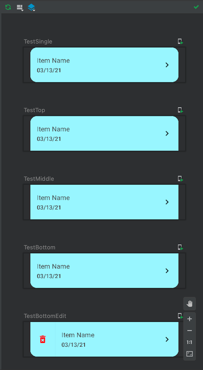
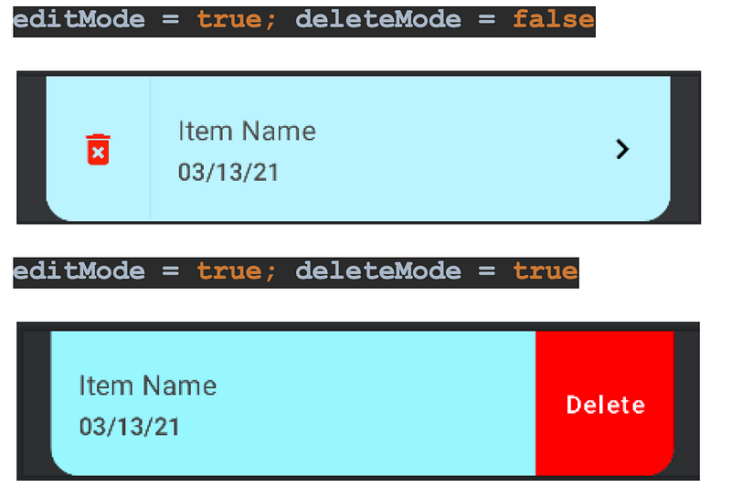
Also the list item changes its look for the edit and delete mode like in those previews, see the Figure 2 and Figure 3.
New Project and gradle config
First, let’s make a New Project using the Empty Compose Activity Template. And, let’s update the gradle file to be sure that we’re using the same JC and Kotlin version. Also, we will need this material icon dependency.
Constants
To simplify this tutorial I will not use the Jetpack Compose Theme. I will keep the colors and styles values in Constants.kt.
First Composable Function (HomeListItem)
We’re ready to begin! We create a new kotlin file, HomeListItem.kt under the package home. Then we add an enum to describe the row type, and we can create our first Composable function using the Pascal Notation. It accepts everything we need: text for the title and subtitle, current row type, a flag to turn the row into the edit mode, and the action handlers.
In this function, we determine the shape of our row. The top row should have the top left and right corners round, but the bottom corners square. The bottom row is mirroring the top row. The single row has all corners round. The row in the middle is entirely rectangular.
The root element is the vertical container — a Column it works similar to LinearLayout with the Vertical orientation. We need it to show a fine Divider line between multiple rows. But, we’re not going to show the divider not for the bottom item neither for the single one.
Then, the Horizontal container — a Row, it works similar to LinearLayout with the Horizontal orientation. Using the Modifier, we add some padding on the left and right, and make the Row clickable by adding the onClick handler. The row takes up full available Width and the predefined Height, background color, and the determined shape.
The first element in the row from the left is the delete mode button, shown in edit mode, so we shall begin from it. We define an internal state variable to manage the delete mode. And we’re going to render this button only if (editMode == true) and (deleteMode == false). The only function of this button is switching into the deleteMode. When a state changes, Jetpack Compose re-composes everything below the line where the state is defined — in this case, beginning line 2.
This is how the row looking depending on deleteMode and editMode states:
The next elements are two nested Columns: the first column takes all available space, while the second, embedded Column contains the Title and Subtitle, adds padding around the text, and tells the Text to begin from Start/Left. Please take a note that these are the only elements we’re going to render without any conditions!
A chevron icon will not be rendered, not in edit nor delete mode.
The last and the rightmost element is a delete button which we’ve discussed earlier. See Figure 3. This element will render only if the condition is true.
Jetpack Compose Preview
That’s all for the ListItem! To see all possible variations in the preview like on Figure 2, all you need to do is add those Composable functions with the @Preview annotation.
The NiceButton
Before we begin to deal with the List, let’s add a nice looking button which we will use soon. A button with rounded corners, you can see it at the top of Figure 4. Making it composable we will save 20 lines of code, next time we use it.
Composable HomeList
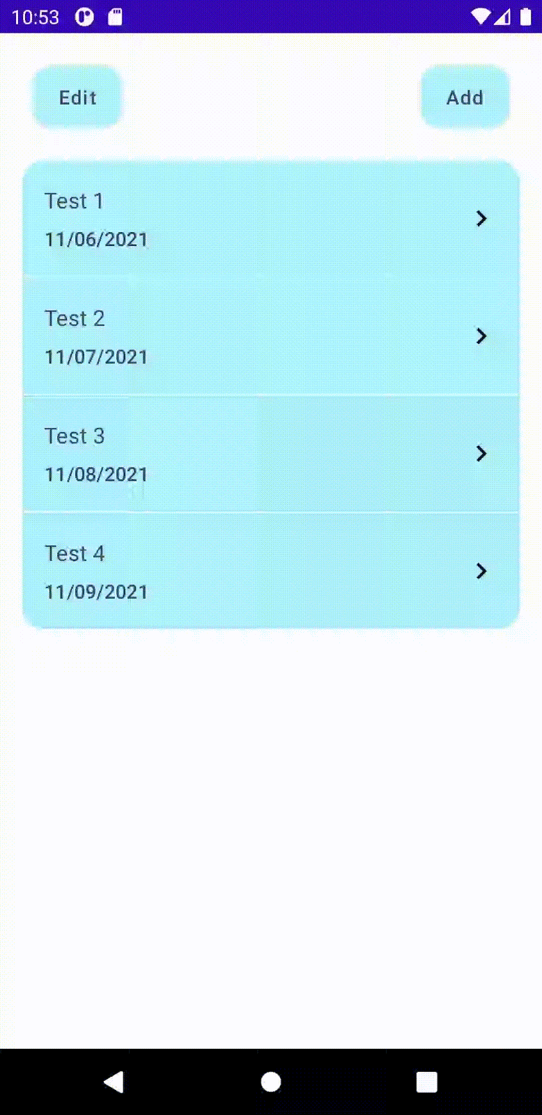
Now, when we have a composable ListItem ready, we can make a HomeList widget. This function accepts only four parameters: an edit mode flag, the source of data models, and the click and delete handlers with the Int param to pass the deleted or clicked item index. Also, note that the items are not in a simple list container but a SnapshotStateList. SnapshotStateList is a state-aware container that will make the Jetpack Compose framework run the recomposition when we adding or removing items.
Inside the function, the code is pretty straightforward. We have a special case for the single row, and otherwise, we determine the row type and emit the HomeListItem for each item in the list.
Composable HomeListLazy (LazyColumn, item, itemsIndexed)
Jetpack Compose’s approach for recycler view that’s able to render many items looks elegant. In order to be able to recycle the invisible items we need to slightly update the previous code. We can easily achieve this by using the LazyColumn. As you can see, the only differences are the LazyColumn instead of Column, and the HomeListItems nested in the additional container, an item for the single row, and itemsIndexed for the rest. These containers are similar to ViewHolder in the RecyclerView word.
HomeListLazy Preview
Now, let’s add a preview and run it in Live Preview. You can see the HomeList in action at Figure 4.
What have we learned?
With Jetpack Compose, it is much easier to build UI than it used to be on Android: no layouts, no bindings, no need to extend your custom elements of a View or a ViewGroup! Moreover, we don’t have to launch the app in Emulator or Device to check any small change. The Preview tool lets us see and test the changes almost instantly!
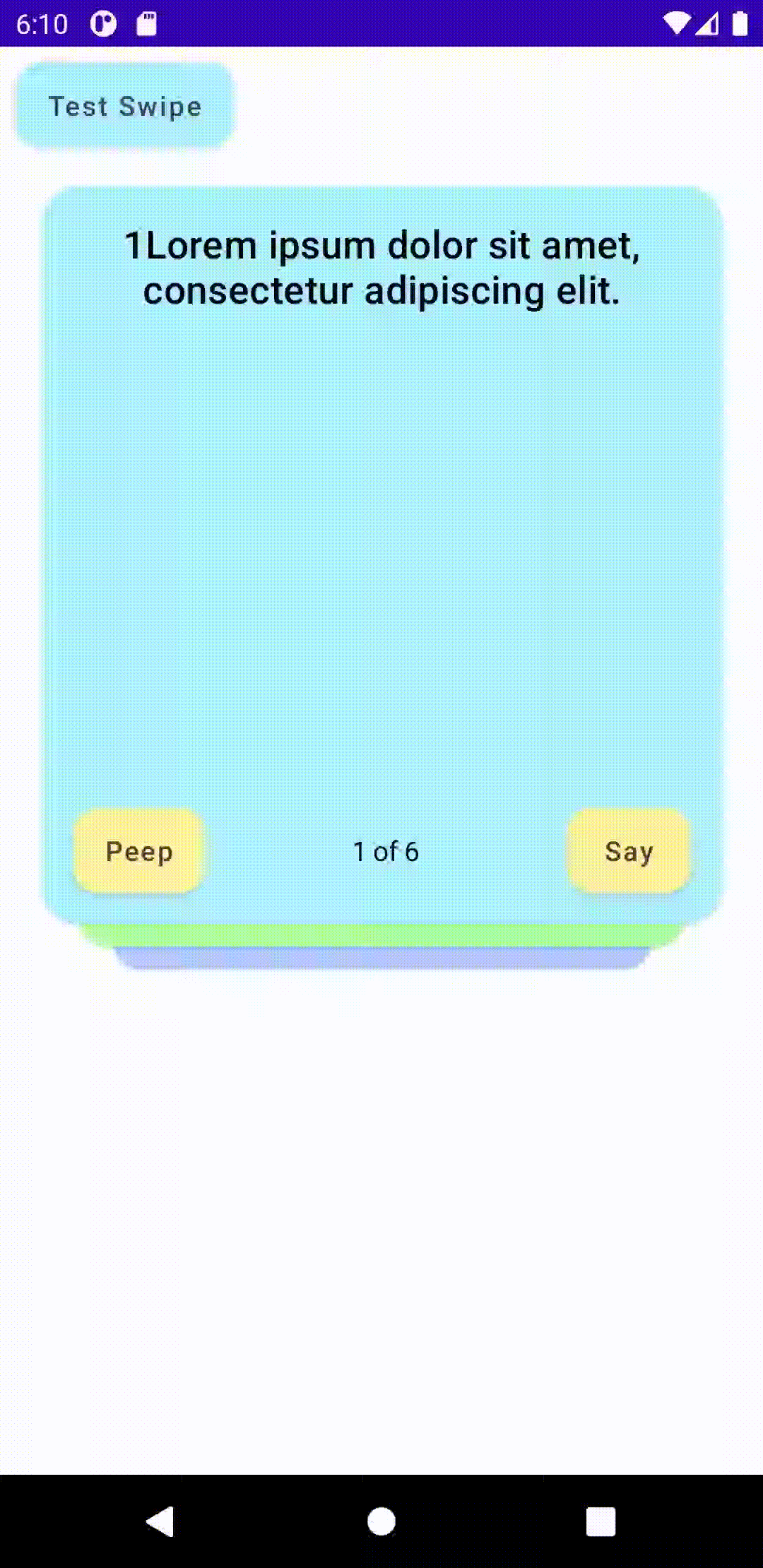
In the upcoming article, we will build the Deck of Cards (Figure 5) with the swipe and flip animation. Please stay tuned!
UI Widgets from scratch in Jetpack Compose
Demo repository:
Thinking in Compose:
StudyCards app helps to memorize things (my version of the flashcards/memory cards):
Google Play(Beta, work in progress):
https://play.google.com/store/apps/details?id=com.nes.studycards
Appstore:
https://apps.apple.com/us/app/study-cards-help-to-memorize/id1436913731
Website:


