
UI copy: Remove vs Delete
I noticed something interesting while cleaning up my Google Docs this past weekend — and it’s related to UI copy.
I was trying to get rid of a doc and saw a Remove option, yet it was accompanied with a trash can icon. The first thing that came to my mind was that trash cans were for deleting…but I am also new to this area, so what did I know?
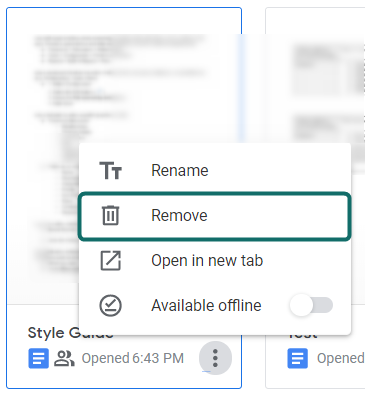
So I selected Remove, but then I was hit with a toast notification saying the doc was moved to the trash.

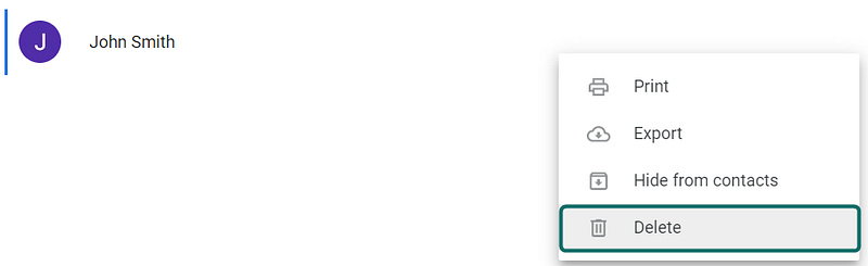
This started to feel more and more like a delete action than a remove action. I decided to investigate Google Contacts’ copy. Surprisingly, I saw they used the option of Delete with the same trash can.
By this point I realized that (at the very least) Google’s tools are a little confusing, but they might also be downright inconsistent.
Before I could confirm the latter claim I needed to do a little more research on what Delete and Remove really mean in the context of software — as I am not a developer.
Unfortunately, Medium did not provide much help (which is why I am writing this article 🙃).
I turned to my colleague — and UX Unicorn — Masha S. She was able to successfully differentiate the two.
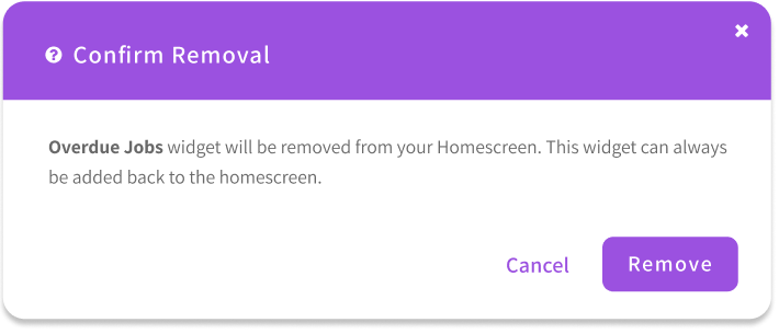
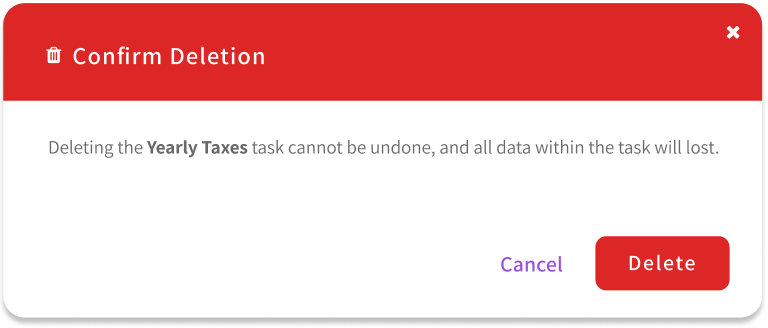
Delete means something gets erased from the system completely. Remove means that it still exists in the system, just not visible in the UI. So I guess I would describe deleting as erasing from backend and removing as hiding from frontend.
She went on to explain some more, in context to the software we work on.
For example, we have different types of widgets that are always available to the user, but it’s up to them if they want to see them or not. If they remove a widget, nothing will change on the backend. But if they delete something (element/user/etc.), the information will be gone forever.
This made all the sense in the world, but then why was google being liberal with these words?
I dug a little deeper and realized Docs and Contacts could both be restored. Furthermore, deleting an email can be restored and removing a Google Sheet could be restored. Everything in Google’s suite can be restored. So why are they using different action names? Maybe they know the inconsistency and it’s not worth changing it. Or maybe their Style Guide does not call it out and no one has put the time in to set up some clear rules.
In this scenario, don’t be Google. Make it clear to users what you will be doing with their objects/items. Educate them what the difference is. The below info can be your guide to achieving this.
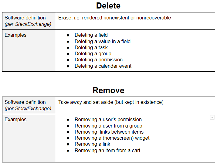
Definitions of ‘Delete’ and ‘Remove’, with examples.
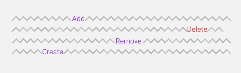
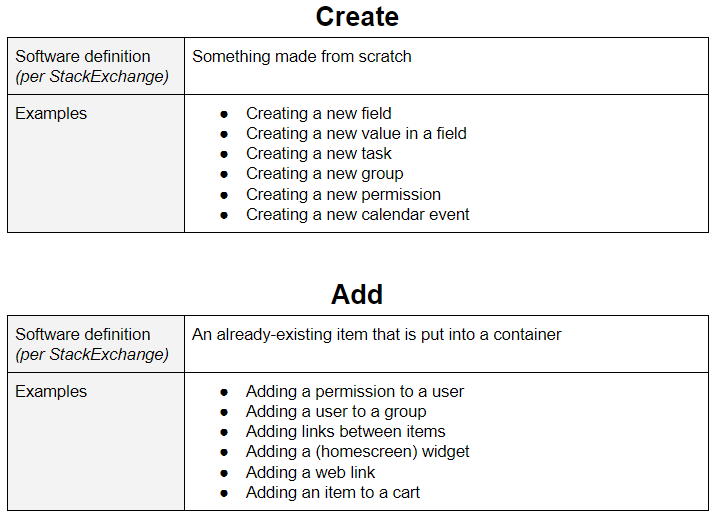
What about ‘Create’ and ‘Add’?
In most cases, Create can be paired with Delete, and Add can be paired with Remove.
Where should I be using this copy?
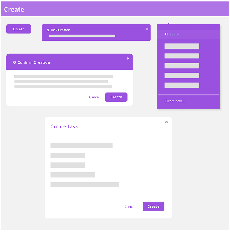
Everywhere! This knowledge should not just be implemented on buttons or dropdown options. Create a consistent experience and add it to all components of your application, like buttons, toast notifications, dropdowns, alerts, headers, dialogs, etc.
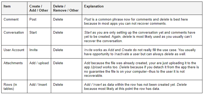
‘Create’ and ‘Add’ Can’t be used for everything, right?
Correct. Here is a list of items that do not have to follow the norm.
So how do I educate my users?
In the descriptions of alerts you can subtly describe what Remove / Delete / Add / Create mean.
There are potential learning opportunities in micro-copy and empty state copy as well!
In review
It can be frustrating trying to be consistent with Delete/Remove, and Create/Add, but I promise the extra effort is worth it for your users. I hope one day the differences between these actions will be common knowledge to users and designers alike.
Did I miss anything or do you disagree with any of my statements? Would be happy to hear any and all feedback!


