
Design Guide: Alerts
The Dos and Don’ts of Alert Design
I booked a last-minute flight to New York last week and of course was rewarded with a seat in the emergency exit row. It was an early flight, so once I boarded the plane, I put my headphones in and started to drift asleep.
This was a rookie mistake. I was shortly awoken by the flight attendant and told to take off my headphones. How could I forget — the dreaded exit row speech. The flight attendant mandated our full attention as she read Delta’s exit row rules, and at the end I needed to explicitly agree to the terms (out loud).
So, what did I agree to? I have no idea.
Let’s recap. I was forced awake, forced to take off my headphones and forced to make eye contact with the flight attendant — and still her message was ignored.
So, in our alerts, how in the world are we supposed to inform and guide our users to make the right decision when they are way more preoccupied than I was on my early flight? Well, by good design of course.
Let’s start with the anatomy of an alert modal:
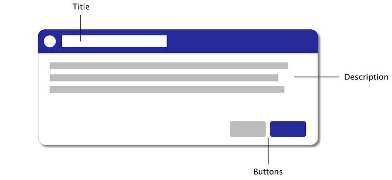
All alerts should contain at the very minimum a Title, a Description and a pair of action buttons (primary / secondary). Before we go into more detail of these components, let’s talk placement and background of alerts.
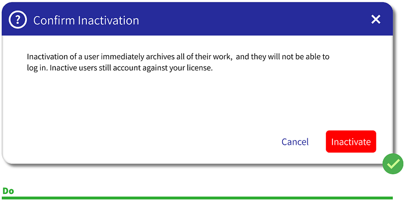
Placing alerts in the very middle (or slightly above the middle) of the page is best practice. It’s easy to develop, optimizes discoverability for the user and will never be far away from the cursor.
The background should be dimmed to highlight the alert and to signify that this is a modal (required before interacting with the page behind it). I like a black background with 0.55 opacity, but not blurred. You never know if a user may want to see some of the info behind the alert to make a decision. (Not saying that users should need to rely on info behind an alert, but why not accommodate this possibility?)

Buttons
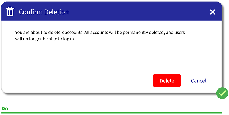
All alerts should be accompanied with primary and secondary buttons. Almost everyone gets this right. But button order can be a nuisance.
Mac likes the primary buttons on the left while Windows likes it on the right. I have no personal preference — but as a user I get annoyed when it is not the same throughout the app. Provide your users with some consistency here, so they know what to expect.
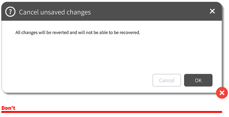
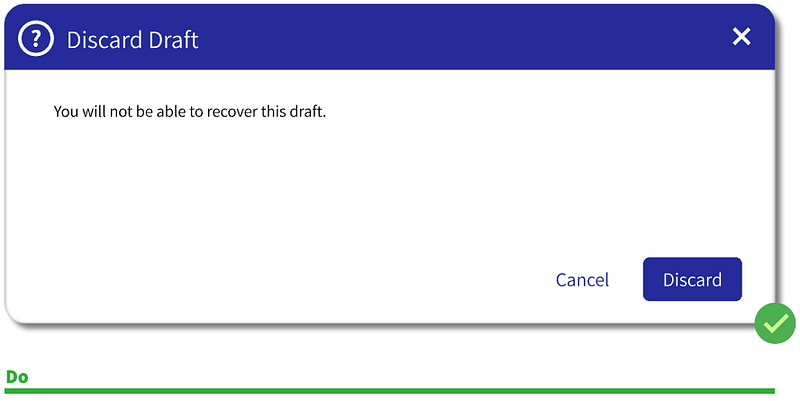
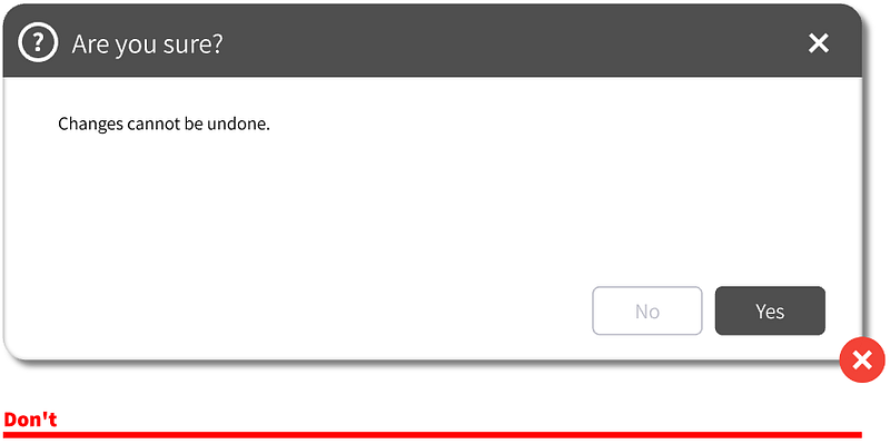
Button names should not be ‘Yes’ / ‘No’ or ‘OK’ / ‘Cancel’. These are generic and confusing.
Primary buttons should have more weight to it, so it is best to have the secondary button be grey or a ghost button. (I personally like text buttons with no outline at all.)
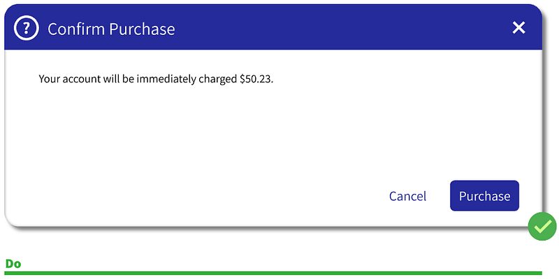
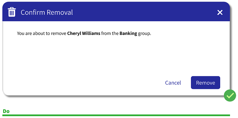
Primary button color can be almost any color as long as it is not a negative in feeling (red, yellow, orange).
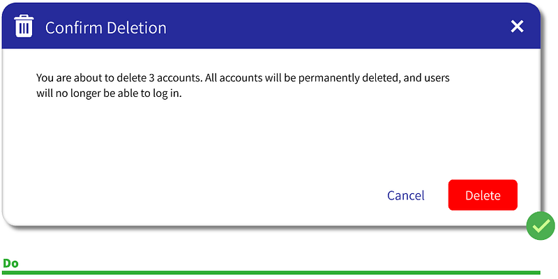
The only exception to a positive button color is when the alert is confirming a high-impact deletion. In this case, you WANT the primary button to be red.
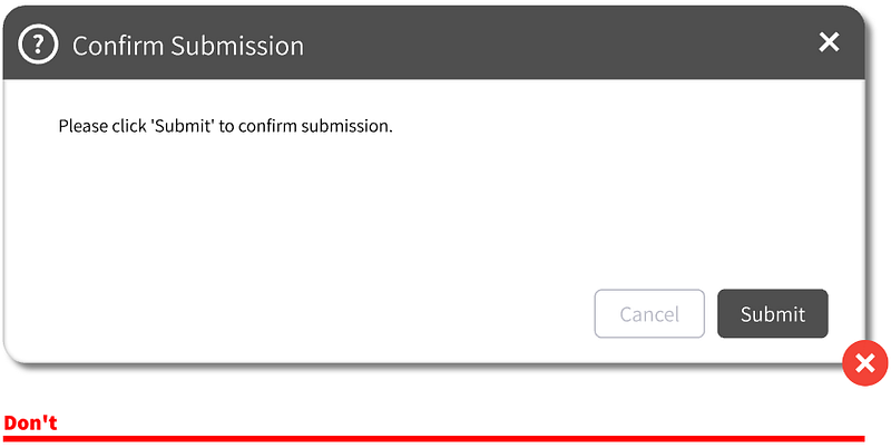
‘OK’ option is fine if there is only one button in the alert, but usually in these cases you’d just want to leverage notifications.
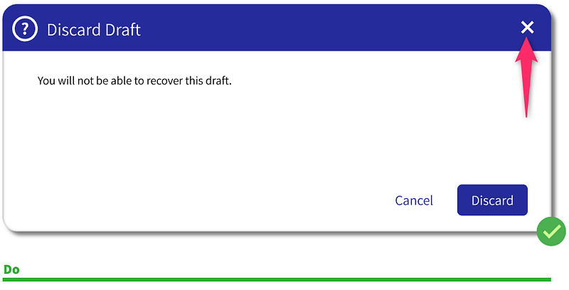
The Title
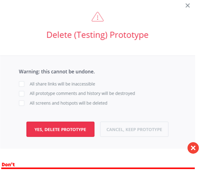
The Title should clearly explain why the user was halted. This means explaining what will happen (if it is a confirmation alert) or what has just happened (if it is an error alert). Keep it to less than 6 words but do not be vague. Remember, the user may not know what he/she just did. Just as likely, they could be multitasking. (As a good rule of thumb, you should always design with the assumption that users are multitasking).
Do not make the Title a question as this will force you to use ‘Yes’ / ‘No’ buttons, which as discussed previously, are not ideal. Still not convinced? See below.
The Description
Do not repeat yourself — pretend like the Title is the first sentence of the Description. It should have flow, with no repetitive information.
The most important part is for the Description is to provide the results / repercussions of what just happened or what will happen if you proceed. This is the area where you might persuade the user to Cancel.
Like the Title, the description should not end in a question. This usually adds unnecessary text and just provides another opportunity to make the alert confusing.
Extras
For high-impact deletions you may want to add more friction to the alert experience. You can switch the order of the primary and secondary buttons or put less weight on the primary button.
For very-high-impact deletions you can add even more friction.
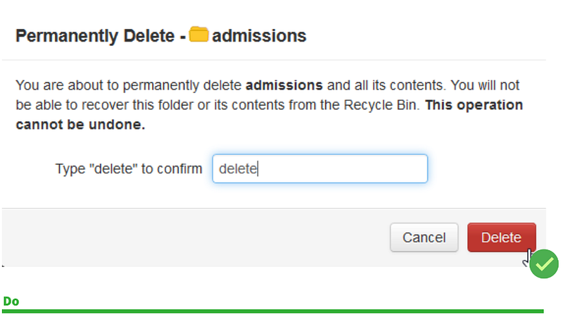
But don’t go too far.
Alerts should have the Exit button. Sure, it does the same thing as Cancel but people are used to it so why not add it?
As Don Norman from The Design of Everyday Things says:
The [user] tends to focus upon the action rather than the object that is being acted upon.
Therefore, we should stress the object with italics or bold lettering:
Anything else you consider vital to alert design? Anything you disagree with? Interested to hear any and all feedback!


