Barplot using R ggplot | Towards AI
Tutorial on Barplots using R’s ggplot Package
Using R’s “ggplot” package for barplots of three different datasets
This tutorial will discuss how bar plots can be generated using R’s ggplot package using 3 examples. Another tutorial on data visualization using python’s matplotlib package can be found here: Tutorial on Data Visualization: Weather Data.
1. 2016 Market Share for Electric Vehicles
This code plots the global market share for electric vehicles (EV) for selected countries using the global_EV_2016.csv dataset: The global EV data obtained from this report: https://www.iea.org/publications/freepublications/publication/GlobalEVOutlook2017.pdf.
The code for this example can be downloaded from this repository: https://github.com/bot13956/2016_market_share_electric_cars_using_R.
Import Necessary Libraries
library(readr)
library(tidyverse)
Data Importation and Preparation
data<-read_csv("global_EV_2016.csv",col_names = FALSE)
head(data)
data<-data[-c(1,2),]
names(data)<-c("country","sales_bev","stock_bev","sales_phev","stock_phev","shares")
head(data)
Generate Barplot for Data Visualization
data%>%drop_na(shares)%>%mutate(shares=parse_number(shares))%>%
       filter(shares>=0.91)%>%
       ggplot(aes(reorder(country, shares),shares))+
       geom_col(fill="blue")+
       coord_flip()+ theme(axis.title.x=element_blank())+
       theme(axis.title.y=element_blank())+
       ggtitle("Market share of electric vehicles in selected countries (%)")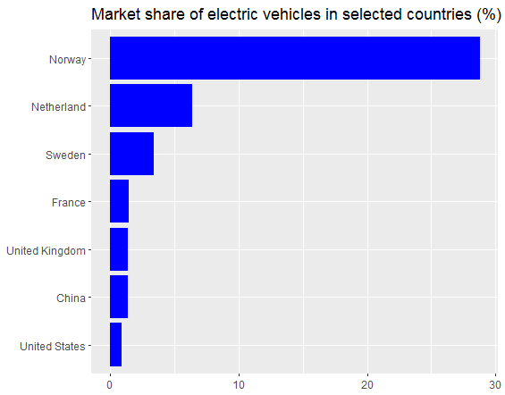
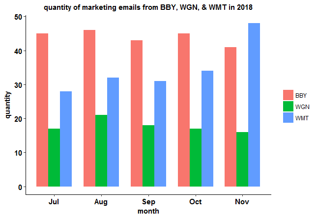
2. Barplot for personal marketing emails
This code produces barplots of personal marketing emails from Best Buy Electronics (BBY), Walgreens Pharmaceuticals (WGN), & Walmart Retail (WMT) over a 5-month period using the marketing_emails.csv dataset.
The code for this example can be downloaded from this repository: https://github.com/bot13956/barplot_marketing_emails.
Import Necessary Libraries
library(readr)
library(tidyverse)
Data Importation and Preparation
df<-read.csv("marketing_emails.csv")
df<-df%>%mutate(digit = seq(5,1,-1))
df%>%head()
df2<-data.frame(digit=c(df$digit,df$digit,df$digit),type=sort(as.vector(replicate(5,c("BBY","WGN","WMT")))),
                quantity=c(df$Best,df$Walgreen,df$Walmart))
df2%>%head(n=10)
Generate Barplots for Data Visualization
df2%>%ggplot(aes(digit,quantity,fill=type))+geom_col(position = "dodge", width = 0.75)+
  xlab("month")+ ylab("quantity")+
  scale_x_continuous(breaks = as.integer(seq(1,5)), labels = c('Jul','Aug','Sep','Oct','Nov'))+
  ggtitle("quantity of marketing emails from BBY, WGN, & WMT in 2018")+theme_classic()+
  theme(
    plot.title = element_text(color="black", size=11, hjust=0.5, face="bold"),
    axis.title.x = element_text(color="black", size=11, face="bold"),
    axis.text.x = element_text(color="black", size=11, face="bold"),
    axis.text.y = element_text(color="black", size=11, face="bold"),
    axis.title.y = element_text(color="black", size=11, face="bold"),
    legend.title = element_blank()
  )
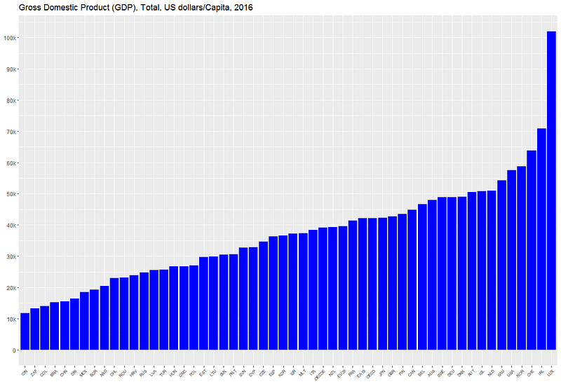
3. 2016 GDP Barplot for Selected Countries
This code generates a barplot for 2016 GDP for selected countries using the gdp.csv dataset which can be obtained from this website: https://data.oecd.org/gdp/gross-domestic-product-gdp.htm.
The code for this example can be downloaded from this repository: https://github.com/bot13956/GDP_barplot_using_R.
Import Necessary Libraries
library(tidyverse)
library(scales)
Data Importation and Preparation
data<-read.csv("gdp.csv")
head(data)
names(data)[1]="location"
ind<-order(data$Value)
data<-data%>%mutate(location=location[ind],Value=Value[ind])
Generate Barplot for Data Visualization
data%>%ggplot(aes(reorder(location,Value),Value))+geom_col(fill="blue")+
scale_y_continuous(breaks=seq(0,100000,10000),               labels=c("0","10k","20k","30k","40k","50k","60k","70k","80k","90k","100k"))+
theme(axis.text.x = element_text(angle = 45, hjust = 1,size=6))+
theme(axis.title.x=element_blank())+
theme(axis.title.y=element_blank())+
ggtitle("Gross Domestic Product (GDP), Total, US dollars/Capita, 2016 ")
In summary, we’ve shown how barplots can be generated using R’s ggplot package.