Data Visualization, Python
Tutorial on Data Visualization: Weather Data
Weather data analysis and visualization using Python’s Matplotlib
Data Visualization is more of an Art than Science. To produce a good visualization, you need to put several pieces of code together for an excellent end result. This tutorial demonstrates how a good data visualization can be produced by analyzing weather data.
This code performs the following:
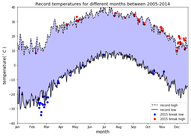
- It returns a line graph of the record high and records low temperatures by day of the year over the period 2005–2014. The area between the record high and record low temperatures for each day of the year is shaded.
- Overlays a scatter of the 2015 data for any points (highs and lows) for which the ten-year record (2005–2014) record high or record low was broken in 2015.
Dataset: The NOAA dataset used for this project is stored in the file weather_data.csv. This data comes from a subset of the National Centers for Environmental Information (NCEI) Daily Global Historical Climatology Network (GHCN-Daily). The GHCN-Daily is comprised of daily climate records from thousands of land surface stations across the globe. The data was collected from data stations near Ann Arbor, Michigan, United States.
The complete code for this article can be downloaded from this repository: https://github.com/bot13956/weather_pattern.
1. Import necessary libraries and dataset
import matplotlib.pyplot as plt
import pandas as pd
import numpy as np
df=pd.read_csv('weather_data.csv')
df.head()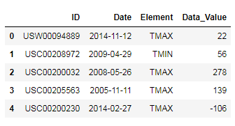
2. Data preparation and analysis
#convert temperature from tenths of degree C to degree C
df['Data_Value']=0.1*df.Data_Valuedays=list(map(lambda x: x.split('-')[-2]+'-'+x.split('-')[-1], df.Date))
years=list(map(lambda x: x.split('-')[0], df.Date))df['Days']=days
df['Years']=yearsdf_2005_to_2014=df[(df.Days!='02-29')&(df.Years!='2015')]
df_2015=df[(df.Days!='02-29')&(df.Years=='2015')]df_max=df_2005_to_2014.groupby(['Element','Days']).max()
df_min = df_2005_to_2014.groupby(['Element','Days']).min()
df_2015_max=df_2015.groupby(['Element','Days']).max()
df_2015_min = df_2015.groupby(['Element','Days']).min()record_max=df_max.loc['TMAX'].Data_Value
record_min=df_min.loc['TMIN'].Data_Value
record_2015_max=df_2015_max.loc['TMAX'].Data_Value
record_2015_min=df_2015_min.loc['TMIN'].Data_Value3. Generate Data Visualization
plt.figure(figsize=(10,7)) plt.plot(np.arange(len(record_max)),record_max, '--k', label="record high") plt.plot(np.arange(len(record_max)),record_min, '-k',label="record low") plt.scatter(np.where(record_2015_min < record_min.values), record_2015_min[record_2015_min < record_min].values,c='b',label='2015 break low')plt.scatter(np.where(record_2015_max > record_max.values), record_2015_max[record_2015_max > record_max].values,c='r',label='2015 break high') plt.xlabel('month',size=14) plt.ylabel('temperature($^\circ C$ )',size=14) plt.xticks(np.arange(0,365,31), ['Jan','Feb', 'Mar','Apr','May','Jun','Jul','Aug','Sep','Oct','Nov','Dec']) ax=plt.gca() ax.axis([0,365,-40,40]) plt.gca().fill_between(np.arange(0,365),record_min, record_max, facecolor='blue',alpha=0.25) plt.title('Record temperatures for different months between 2005-2014',size=14) plt.legend(loc=0) plt.show()In summary, we’ve shown how a simple data visualization plot can be generated using Python’s Matplotlib library.
The complete code for this article can be downloaded from this repository: https://github.com/bot13956/weather_pattern.


