
Training a Transformer Model to Predict 1-Minute Stock Prices: Tutorial with Code Samples (Part 2)
Discover How to Build an Interpretable Transformer Model for High-Frequency Stock Price Prediction, with Confidence Intervals for Risk Management.
Disclaimer: Stock price prediction is inherently uncertain, and this tutorial is intended for educational purposes only. The model and methods discussed here should not be interpreted as financial advice or relied upon for actual trading decisions. While the Temporal Fusion Transformer (TFT) model provides confidence intervals that can help assess risk, no model can fully account for the unpredictable nature of financial markets. Always conduct thorough research and consult with financial professionals before making investment decisions. This blog uses outdated data dating back to July 2024, some charts may not be accurate anymore.
Welcome back to our series on building a high-frequency stock price prediction model using the Temporal Fusion Transformer! In Part 1, we covered the fundamentals of data collection and preparation, focusing on gathering minute-level data for highly liquid stocks. Now, we’ll dive deeper into the market microstructure and explore how various factors like earnings events, volume patterns, and volatility interact to create trading opportunities. By understanding these relationships, we’ll be able to engineer more meaningful features for our TFT model. If you haven’t read Part 1 yet, I recommend checking it out first to understand our data pipeline and initial preprocessing steps. Let’s dive into the fascinating world of market microstructure and technical analysis!
1. Stock Universe Overview
Before we start building complex features, it’s crucial to understand the composition of our stock universe. In Part 1, we filtered our initial dataset to include only the most liquid stocks. Now, let’s analyze the fundamental characteristics of these companies.
Fetching Fundamental Data
First, we’ll gather essential fundamental data for each stock in our universe using the yfinance library. This includes sector classification, share structure, and earnings dates:
import yfinance as yf
import json
from tqdm import tqdm

fundamental_data = {}
maybe_delisted = []
for stock in tqdm(df["symbol"].unique(), desc="Fetching fundamental data..."):
    ticker = yf.Ticker(stock)
    try:
        ticker_info = ticker.info
        fundamental_data[stock] = {
            "earning_dates": [date for date in ticker.earnings_dates.index if DATA_START.date() <= date.date() < DATA_CUTOFF.date()],
            "sector": ticker_info["sector"],
            "industry": ticker_info["industry"],
            "total_shares": ticker_info["sharesOutstanding"],
            "float_shares": ticker_info["floatShares"],
        }
    except Exception as e:
        maybe_delisted.append(stock)
        continue
for stock in fundamental_data.keys():
    fundamental_data[stock]["earning_dates"] = [date.strftime("%Y-%m-%d %H:%M:%S") for date in fundamental_data[stock]["earning_dates"]]
with open("fundamental_data.json", "w") as f:
    json.dump(fundamental_data, f)

df = df[df["symbol"].isin(list(fundamental_data.keys()))] # df is the same dataframe from part 1. It holds the minute level bars.
df = df[~(df["symbol"] == "GOOGL")] # Google has 2 classes of shares, their price is identical, so we will remove one
We end up with a dictionary containing fundamental data about our symbols. For example, to see fundamental data on $AAPL, we can do this:
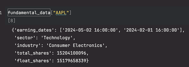
Note: in this tutorial we only use data starting from 2024–01–01 so we filter the earning dates accordingly.
Now that we have our fundamental data, let’s analyze the sector distribution of our stock universe:
import pandas as pd
import matplotlib.pyplot as plt
import seaborn as sns

fundamental_df = pd.DataFrame.from_dict(fundamental_data, orient='index')
sector_industry_counts = fundamental_df.groupby(['sector', 'industry']).size().unstack(fill_value=0)
sector_totals = sector_industry_counts.sum(axis=1)
sector_industry_counts = sector_industry_counts.loc[sector_totals.sort_values(ascending=False).index]
plt.figure(figsize=(12, 8))
sector_industry_counts.plot(kind='bar', stacked=True, colormap='viridis', figsize=(12, 8))

plt.title('Number of Stocks per Sector and Industry')
plt.xlabel('Sector')
plt.ylabel('Number of Stocks')
plt.legend(title='Industry', bbox_to_anchor=(1.05, 1), loc='upper left', fontsize='small')
plt.tight_layout()
plt.show()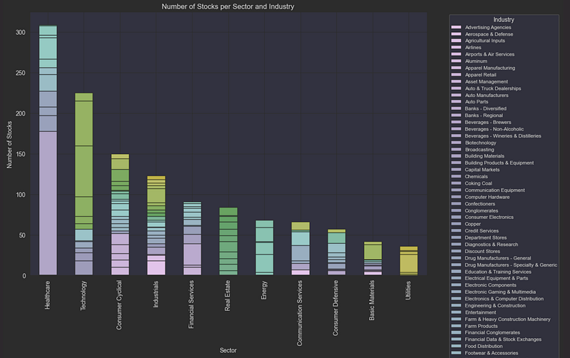
This analysis reveals that our stock universe is well-diversified across major sectors, with particular concentration in Technology, Healthcare, and Financial Services. This diversity is important for our model as it will need to learn patterns that generalize across different types of stocks.
Market Capitalization is a key metric that traders use to assess a stock’s size. It is calculated by multiplying the stock price by the total number of shares outstanding. In the intraday dataframe context, I will use the opening price of the day as the stock price to calculate market cap. Then I divide by 1M to get the market cap in millions.
df["market_cap"] = df.groupby(["symbol", "date"])["open"].transform("first") * df["symbol"].apply(lambda x: fundamental_data[x]["total_shares"]).astype(float) / 1_000_000
# Top 20 stocks by market capitalization
top_20_stocks = df.groupby("symbol")["market_cap"].last().nlargest(20)

# Step 3: Plot the top 20 stocks
plt.figure(figsize=(12, 8))
top_20_stocks.sort_values().plot(kind='barh', color='skyblue')
plt.title("Top 20 Stocks by Market Capitalization")
plt.xlabel("Market Capitalization (in millions)")
plt.ylabel("Stock Symbol")
plt.show()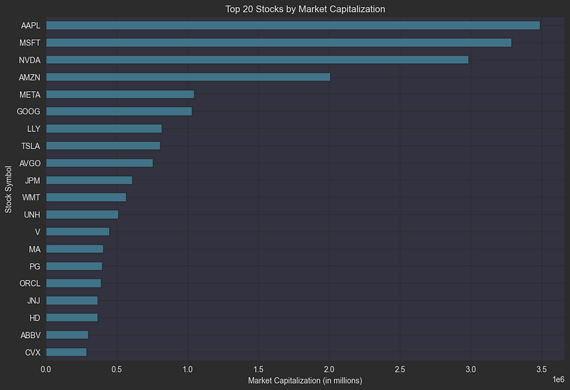
Let’s dive into one of the most crucial metrics for day traders: volatility. Think of volatility as a measure of how “jumpy” a stock’s price is — how much it tends to move up and down over time. This movement is captured in two key ways: Volatility measures how dramatically a stock’s price swings in either direction. It’s like a stock’s “personality profile”: some stocks are calm and steady, while others are wildly unpredictable. Higher volatility stocks are generally considered riskier, but they’re particularly attractive to day traders because bigger price swings create more opportunities for profit (though also more potential for loss). To quantify this behavior, we use Historical Volatility, which is calculated by:
- Taking the standard deviation of daily returns
- Normalizing by the opening price
- Annualizing the result (multiplying by √252, the number of trading days in a year)
This gives us a standardized way to compare the “nervousness” of different stocks, regardless of their price levels. A stock with 30% annualized volatility tends to move much more dramatically than one with 15% volatility.
df_daily = df.groupby('symbol').resample('D').agg({
    'close': 'last'
}).dropna() # dropna to remove Saturdays and Sundays
# Calculate the daily log returns
df_daily['return'] = df_daily.groupby('symbol')['close'].transform(lambda x: np.log(x / x.shift(1)))
# Calculate the rolling standard deviation of the daily returns
window_size = 30
df_daily['rolling_std'] = df_daily.groupby('symbol')['return'].rolling(window=window_size, min_periods=1).std().reset_index(0, drop=True)
# Annualize the volatility
df_daily['hist_vol'] = (df_daily['rolling_std'] * np.sqrt(252))
df_daily['hist_vol'] = df_daily['hist_vol'].fillna(method='bfill')
# Merge the daily historical volatility back into the original DataFrame
df_daily["symbol"] = df_daily.index.get_level_values(0)
df_daily["datetime"] = df_daily.index.get_level_values(1)
df_daily = df_daily.reset_index(drop=True)
df_daily["date"] = df_daily["datetime"].dt.date
minute_index = df.index
df = df.merge(df_daily[['symbol', 'date', 'hist_vol']], on=['symbol', 'date'], how='left').set_index(minute_index)
Share Float: Understanding Trading Dynamics
Share float represents the number of shares actually available for public trading. While a company might have millions of shares outstanding, the float is typically smaller, calculated by subtracting restricted shares (held by insiders, employees, and major shareholders) from the total shares outstanding.
Float size significantly impacts trading dynamics:
- Low float stocks (fewer freely tradable shares) tend to experience more volatile price movements because even moderate trading volume can create significant price pressure
- High float stocks typically show more stable price action as it takes substantially more volume to move the price
Traders closely watch float levels because:
- Price Impact: Smaller floats mean each trade has a potentially larger impact on price
- Liquidity Risk: Low float stocks may experience wide bid-ask spreads and rapid price changes
- Trading Volume: The float-to-volume ratio helps gauge how much of the available supply is actively trading
When trading low float stocks, be aware that:
- Price movements can be more dramatic and unpredictable
- Position sizing becomes crucial due to liquidity constraints
- Exit prices may deviate significantly from expected levels due to wider spreads
df["shares_float"] = df["symbol"].apply(lambda x: fundamental_data[x]["float_shares"])
hist_and_float_df = df.groupby('symbol').agg({
    'hist_vol': 'mean',
    'shares_float': 'last',
    'market_cap': 'mean'
}).dropna()

# Create a 1x2 grid of plots
fig, axes = plt.subplots(1, 2, figsize=(18, 8))

# Plot 1: Shares Float vs. Historical Volatility
sns.scatterplot(data=hist_and_float_df, x='shares_float', y='hist_vol', alpha=0.5, ax=axes[0])
axes[0].set_xscale('log')
axes[0].set_yscale('log')
axes[0].set_title('Shares Float vs. Historical Volatility')
axes[0].set_xlabel('Shares Float')
axes[0].set_ylabel('Historical Volatility')

# Plot 2: Market Cap vs. Shares Float
sns.scatterplot(data=hist_and_float_df, x='market_cap', y='hist_vol', alpha=0.5, ax=axes[1])
axes[1].set_xscale('log')
axes[1].set_yscale('log')
axes[1].set_title('Market Cap vs. Historical Volatility')
axes[1].set_xlabel('Market Cap (in millions)')
axes[1].set_ylabel('Historical Volatility')

# Show the plots
plt.tight_layout()
plt.show()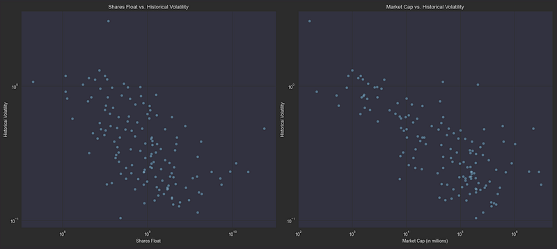
The scatter plots confirm these relationships visually — both share float and market cap show a clear negative correlation with volatility. Stocks with smaller floats and lower market caps (left side of each graph) consistently exhibit higher volatility (higher on the y-axis), while larger, more liquid stocks cluster in the lower-right portion of both plots, demonstrating more stable price action.
Average True Range (ATR): Measuring Intraday Volatility
The Average True Range (ATR) is a powerful tool for measuring a stock’s intraday volatility. Unlike standard volatility measures that only look at closing prices, ATR captures the full range of price movement throughout the trading day, making it particularly valuable for day traders.
How ATR Works: 1. First, we calculate the True Range (TR) for each day, which is the greatest of:
- Current high minus current low
- Current high minus previous close
- Previous close minus current low
2. Then, the ATR is calculated as a 14-day moving average of these True Range values. The formula accounts for all price gaps and limit moves, providing a comprehensive view of price volatility.
When analyzing ATR:
- Higher ATR values indicate more volatile stocks with larger price swings
- Lower ATR values suggest more stable, predictable price movement
- ATR is typically normalized by dividing by the stock’s price to allow comparison across different price levels
Here’s how we implement the calculation:
df_daily = get_daily_df(df,{
    'close': 'last',
    'high': 'max',
    'low': 'min'
})
minute_index = df.index
df_daily["TR"] = ta.true_range(high=df_daily['high'], low=df_daily['low'], close=df_daily['close'])
df_daily["ATR"] = ta.atr(high=df_daily['high'], low=df_daily['low'], close=df_daily['close'], length=14)
df = df.merge(df_daily[['symbol', 'date', 'ATR', 'TR']], on=['symbol', 'date'], how='left')
df.set_index(minute_index, inplace=True)
df["ATR"] = df["ATR"].fillna(method='bfill')
df["TR"] = df["TR"].fillna(method='bfill')
df["ATR"] = df["ATR"] / df["close"] # Normalize ATR by the stock price
df["TR"] = df["TR"] / df["close"] # Normalize TR by the stock price
While both ATR and historical volatility measure price movement, they capture different aspects of market behavior. Let’s visualize their relationship to understand how they complement each other:
- ATR focuses on intraday price ranges and includes gaps between trading sessions
- Historical volatility looks at the dispersion of daily returns over time
By plotting these metrics against each other, we can identify stocks that:
- Show high volatility in both measures (potentially good day trading candidates)
- Have high daily volatility but lower intraday ranges (gap-prone stocks)
- Display large intraday moves but more consistent daily closes
# plot correlation between ATR and hist_vol
data = df.groupby("symbol").agg({"hist_vol": "mean", "ATR": "mean"}).dropna()
plt.figure(figsize=(12, 8))
sns.scatterplot(data=data, x="ATR", y="hist_vol")
plt.title("ATR vs Historical Volatility")
plt.xscale("log")
plt.yscale("log")
plt.xlabel("ATR")
plt.ylabel("Historical Volatility")
plt.show()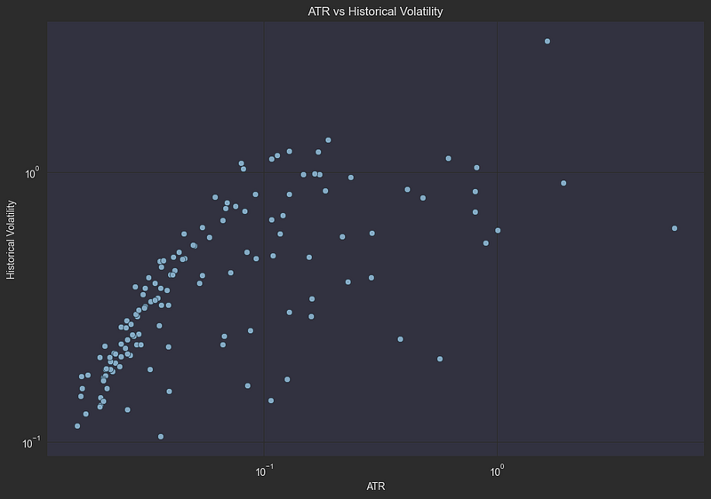
The logarithmic scatter plot reveals a remarkably strong positive correlation between ATR and historical volatility, with points forming a clear diagonal pattern. This tight relationship makes sense: stocks that experience large intraday price swings (high ATR) tend to also show significant day-to-day variation in returns (high historical volatility). The few outliers scattered away from the main trend line might represent stocks with unusual trading patterns, such as those affected by major news events or corporate actions.
Understanding Earnings Events
Earnings announcements represent pivotal moments in a stock’s trading cycle. These quarterly events can trigger dramatic price movements as the market digests new information about a company’s performance. Let’s explore why these dates matter and how we can measure their impact:
Why Earnings Matter:
- Companies report their financial results either before market open (“BMO”) or after market close (“AMC”)
- The stock price reaction depends on how actual results compare to market expectations
- These events often lead to the largest single-day moves in a stock’s price
- Heightened volatility typically persists for several days following the announcement
To quantify the impact of earnings, we’ll compare price volatility on post-earnings days versus normal trading days. We calculate this using the range-to-ATR ratio, which measures how much more volatile a stock is compared to its typical daily movement:
from pandas._libs.tslibs.offsets import BDay

def get_next_trading_day(datetime):
    bdays = BDay()
    the_day_after = datetime + timedelta(days=1)
    is_business_day = bdays.is_on_offset(the_day_after)
    while not is_business_day:
        the_day_after = the_day_after + timedelta(days=1)
        is_business_day = bdays.is_on_offset(the_day_after)
    return the_day_after

fundamental_data_df = pd.DataFrame.from_dict(fundamental_data, orient='index').explode("earning_dates").dropna()

def get_date_following_earning(date_str):
    datetime_ = datetime.strptime(date_str, "%Y-%m-%d %H:%M:%S")
    if datetime_.hour < 16:
        return datetime_.date()
    else:
        return get_next_trading_day(datetime_).date()

fundamental_data_df["date_after_earnings"] = fundamental_data_df["earning_dates"].apply(get_date_following_earning)
fundamental_data_df["date"] = fundamental_data_df["earning_dates"].apply(lambda x: datetime.strptime(x, "%Y-%m-%d %H:%M:%S").date())
df_index = df.index
df = df.merge(fundamental_data_df.reset_index()[["index", "date", "date_after_earnings"]], left_on=["symbol", "date"], right_on=["index", "date"], how="left").drop(columns=["index"]).rename(columns={"date_after_earnings": "is_earnings_day"}).fillna(False).set_index(df_index)
df["is_earnings_day"] = df["is_earnings_day"].apply(lambda date: True if date else False)

# range is defined as the intra-day price range of a stock
range = df.groupby(["symbol", "date"])["high"].transform("max") - df.groupby(["symbol", "date"])["low"].transform("min")
df["range_to_ATR_ratio"] = range / df["close"] / df["ATR"]
plot_agg = df.groupby(["symbol", "is_earnings_day"])["range_to_ATR_ratio"].mean().reset_index()
# plot boxplot of TR to ATR ratio on earnings days
plt.figure(figsize=(12, 8))
sns.boxplot(data=plot_agg, x="is_earnings_day", y="range_to_ATR_ratio")
plt.title("Range to ATR ratio on earnings days")
plt.show()
The boxplot clearly demonstrates the significant impact of earnings announcements on price volatility. Let’s break down what we’re seeing:
Normal Trading Days (False):
- Median range/ATR ratio around 0.7–0.8
- Tight interquartile range showing consistent behavior
- Few outliers below 0.5
Post-Earnings Days (True):
- Median range/ATR ratio approximately 1.0
- Much wider interquartile range (0.8 to 1.4)
- Several extreme outliers reaching above 2.5x normal range
- Bottom whisker still similar to normal days, indicating not all earnings cause volatility
This visualization confirms that post-earnings days typically experience about 40–50% more price movement than normal trading days, with some stocks showing more than double their usual volatility. This stark difference makes earnings dates an essential feature for our TFT model, as it can help:
- Adjust prediction confidence intervals
- Account for potentially larger price movements
- Better calibrate risk management parameters
Understanding Trading Volume Dynamics
Volume is a crucial indicator of market activity that helps validate price movements and identify significant trading opportunities. Let’s break down two key volume metrics:
Trading Volume fundamentals:
- Represents the total number of shares exchanged during a period
- High volume often signals: — Strong institutional participation — Important price levels being established — Market-moving news or events — Increased likelihood of trend continuation
Average Daily Volume (ADV):
- Calculated as the 30-day moving average of daily volume
- Provides a baseline for normal trading activity
- Formula:
ADV = Mean(Daily Volume over past 30 days)
Relative Volume (Rel Vol):
- Measures current trading activity compared to typical levels
- Calculated as:
Cumulative Volume / Average Daily Volume - Interpretation: — Rel Vol = 1.0: Trading at normal pace — Rel Vol > 1.0: More active than usual — Rel Vol < 1.0: Less active than usual
- Time-sensitive: A rel vol over 0.7 at noon might indicate high activity (since only half the trading day has passed)
For example, if a stock typically trades 1 million shares per day:
- 400,000 shares by 10:00 AM → Rel Vol = 0.4 (very active morning)
- 1.5 million shares by close → Rel Vol = 1.5 (high-volume day)
df_daily = get_daily_df(df,{
    'volume': 'sum'
})
df_daily = df_daily[df_daily["volume"] > 0]
df_daily["average_volume"] = df_daily.groupby("symbol")["volume"].rolling(window=30, min_periods=1).mean().reset_index(0, drop=True)
df_index = df.index
df = df.merge(df_daily[["symbol", "date", "average_volume"]], on=["symbol", "date"], how="left").set_index(df_index)
df["rel_volume"] = df.groupby(["symbol", "date"])["volume"].cumsum() / df["average_volume"]
Let’s test an important trading hypothesis: Does unusually high early-morning volume predict increased volatility for the rest of the day? We’ll examine this by looking at a specific scenario:
Our Test Conditions:
- Time: 10:00 AM (first half-hour of trading)
- Volume Threshold: Relative volume > 0.5
- What This Means: Half a day’s typical volume traded in just 30 minutes
- Measurement: Compare price ranges between high-volume and normal days
high_rel_vol_at_10 = 0.5 # 50% of average daily volume traded in the first half hour
df["is_high_rel_early_candle"] = (df["rel_volume"] > high_rel_vol_at_10) & (df["hour"] == 9)
df["high_rel_volume_day"] = df.groupby(["symbol", "date"])["is_high_rel_early_candle"].transform("max")
# plot boxplot of TR to ATR ratio on high rel volume days compared to regular days
plot_agg = df.groupby(["symbol", "high_rel_volume_day"])["range_to_ATR_ratio"].mean().reset_index()
plt.figure(figsize=(12, 8))
sns.boxplot(data=plot_agg, x="high_rel_volume_day", y="range_to_ATR_ratio")
plt.title("Range to ATR ratio on high rel volume days")
plt.show()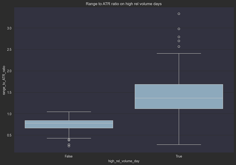
This visualization confirms our hypothesis: when half a day’s volume trades in the first 30 minutes, we can expect:
- Nearly double the typical price range
- Much more unpredictable price action
- Higher probability of extreme moves
Let’s test a common trading belief: that high volume validates price movements. The idea is that moves backed by strong volume are more likely to continue, while moves on low volume might reverse. We’ll analyze this by:
What We’re Measuring:
- Initial Move: Stock’s change from open price at 10:00 AM
- Continuation: Average price change between 10:00 AM and 12:00 PM
- Volume Context: Relative volume at 10:00 AM
change_from_open_at_10 = df[(df["hour"] == 10) & (df["minute"] == 0)].groupby(["symbol", "date"])["change_from_open"].first().reset_index()
change_from_open_10_12 = df[(df["hour"] < 12) & (df["hour"] >= 10)].groupby(["symbol", "date"])["change_from_open"].mean().reset_index()
rel_volume_at_10 = df[(df["hour"] == 10) & (df["minute"] == 0)][["symbol", "rel_volume", "date", "ATR"]]
joined = change_from_open_at_10.merge(change_from_open_10_12, on=["symbol", "date"], suffixes=("_10", "_10_12_mean"))
joined = joined.merge(rel_volume_at_10, on=["symbol", "date"]).rename(columns={"rel_volume": "rel_volume_10"})
# we want to focus on days where the move is large in the first half hour of the day, like days where the change from open is greater than the ATR
joined = joined[joined["change_from_open_10"].abs() > joined["ATR"]]
change_bins = [-np.inf, -0.10, -0.075, -0.05, -0.025, 0.025, 0.05, 0.075, 0.10, np.inf]
change_labels = ['<-10', '-10 to -7.5', '-7.5 to -5', '-5 to -2.5', '-2.5 to 2.5', '2.5 to 5', '5 to 7.5', '7.5 to 10', '>10']
# Bin the change_from_open_10 values
joined['change_bin'] = pd.cut(joined['change_from_open_10'], bins=change_bins, labels=change_labels, include_lowest=True)
joined["is_positive_change"] = joined["change_from_open_10"] > 0
joined["continuation_move"] = joined["change_from_open_10_12_mean"] - joined["change_from_open_10"]
print(f"Average rel volume at 10:00: {joined['rel_volume_10'].mean()}")
# Scatter plot for negative days
plt.figure(figsize=(10, 6))
sns.scatterplot(x='rel_volume_10', y='continuation_move', hue='change_bin', data=joined, palette='coolwarm', legend='full')
plt.title("Scatter Plot of Continuation vs Relative Volume with Change Bins")
plt.xlabel("Relative Volume at 10 AM")
plt.ylabel("Continuation (10 AM - 12 PM)")
plt.legend(title='Change from Open at 10:00')
plt.vlines(0.65, min(joined['continuation_move']), max(joined['continuation_move']), colors='r', linestyles='dashed')
plt.show()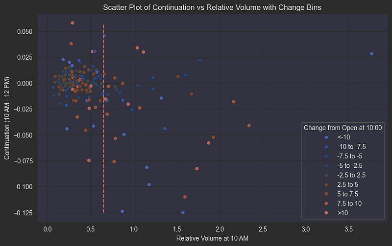
Let’s break down this complex but revealing scatter plot that shows the relationship between early trading volume and price movement patterns:
- X-axis: Relative volume at 10:00 AM (compared to average daily volume)
- Y-axis: Price change from 10:00 AM to 12:00 PM (measuring continuation or reversal)
- Color coding: Change from open at 10:00 AM (indicates the initial price direction)
The plot reveals fascinating market behavior patterns:
- High Volume Up Moves (red dots, high x-value):
- When stocks rise significantly on high relative volume in the first half-hour
- These moves tend to reverse during the next two hours
- Suggests potential profit-taking or short-term resistance
2. High Volume Down Moves (blue dots, high x-value):
- Sharp early declines on high volume
- More likely to continue falling through the morning session
- Consistent with panic selling behavior and negative sentiment cascade
3. Average/Low Volume Patterns:
- When relative volume is below the 0.6 threshold
- Price movements show no clear continuation or reversal bias
- Suggests insufficient conviction from market participants
This asymmetric behavior between up and down moves on high volume provides valuable insight for our prediction model, particularly in identifying potential continuation vs reversal scenarios during the crucial morning trading session.
While we chose 10:00 AM and a two-hour window for this analysis, traders might want to experiment with different timeframes (like 9:45 AM or 10:30 AM) and different continuation windows. Similarly, the 0.6 relative volume threshold could be adjusted based on individual trading strategies or specific market conditions. The TFT model we’ll build will help us identify optimal parameters for these decisions.
Wrapping Up Part 2: From Data to Market Insights
In this part of our series, we’ve deep-dived into the fascinating world of market microstructure and uncovered several key relationships that will be crucial for our TFT model:
- Market Structure: We analyzed our universe of liquid stocks across different sectors and market caps, establishing a robust foundation for our model.
- Volatility Metrics: We explored how different measures of volatility (historical volatility and ATR) correlate and complement each other, helping us better understand price movement patterns.
- Event Impact: We quantified how earnings announcements significantly increase price volatility, with post-earnings days showing 40–50% larger price ranges.
- Volume Dynamics: We discovered that early-day volume patterns can predict increased volatility, and we examined how volume confirms or contradicts price movements.
Coming Up in Part 3: From Market Mechanics to Machine Learning
Now that we understand the fundamental market dynamics, we’re ready to transform these insights into a powerful predictive model. In Part 3, we’ll:
- Build a comprehensive feature set using technical analysis indicators, including: — Moving averages and momentum indicators — Support and Resistance lines
- Train our Temporal Fusion Transformer to predict the minute-level close prices in a forward window, including confidence intervals.
If you’ve enjoyed our deep dive into market microstructure and want to see how we transform these insights into a trading model, be sure to follow me for Part 3. Give me some claps if you found this analysis helpful, or even buy me a coffee using the PayPal link down below!


