
POETRY
Tips for Correctly Formatted Poetry on Medium Posts
These style guide tips will help you present well-polished, publishable poetry blog posts on the Medium platform.
The Medium platform is a great place to share poetry, but the Medium editor software is not particularly easy for poets to navigate when they first begin to share work here. This will be a brief, no-fluff style guide for poets to understand how to use the editorial features in the Medium editor to present poetry correctly and clearly.
Easy Navigation Guide∘ POETRY
· For Poetry Posts
· The body of the poem — Correct Use of Editorial Features
∘ Using Line Spacing Correctly
∘ Using Bold and Italics Features Correctly
∘ Using Quote Features Correctly
∘ Using Separators Correctly
∘ Using Drop Cap Feature correctly
∘ For more great poetry tips:How to use each of the formatting options in the Medium editor has been covered thoroughly by Casey Botticello in his article The Best Medium Article Formatting Guide, so I will refer you there for the how-to for each feature.
For Poetry Posts
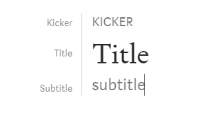
KICKER (use H2=small T in the editor) (then hit enter) Title (use H1=Large T in the editor) (then hit enter) Subtitle (use H2=small T in the editor) (then hit enter)
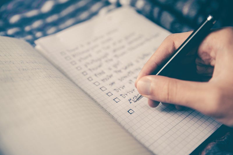
After these three things are done, add your picture and your image credit.
Hard enter to begin your post.
The body of the poem — Correct Use of Editorial Features
Using Line Spacing Correctly
For each stanza; type each line and at the end of a line hit shift + enter’ to get rid of that pesky auto double line spacing. Only hit ENTER alone (this is a hard Enter) at the end of a stanza to add that extra space between stanzas.
Correct: This is a poem merely for demonstrative purposes and it does not rhyme.
This is stanza two so you can see what the stanzas look like.
Incorrect: This is a poem
merely for demonstrative
purposes and it
does not rhyme.
This is stanza two
so you can see
what the stanzas
look like.
In the incorrect example — it is nearly impossible to read with all the extra spacing. It appears to be a collection of EIGHT ONE-LINE STANZAS. Very confusing for the reader and very NON-poetic.
Note: There is no trick to do this on mobile. If you want poetry presented correctly, you will have to edit it on a laptop or desktop.
Using Bold and Italics Features Correctly
Using the same fake poem:
Correct use of bold:
This is a poem merely for demonstrative purposes and it does not rhyme.
This is stanza two so you can see what the stanzas look like.
Bold is meant to make a word or phrase stand out. Not an entire poem as the poet below has done by putting the entire poem in bold. This is not a fashion statement. Less bold is more.
Incorrect use of bold:
This is a poem merely for demonstrative purposes and it does not rhyme.
This is stanza two so you can see what the stanzas look like.
Using the same fake poem:
Correct use of italics:
This is a poem merely for demonstrative purposes and it does not rhyme.
This is stanza two so you can see what the stanzas look like.
Likewise, italics are meant to make a word or phrase stand out. It is more subtle than bold and often adds a bit of paused thought by the reader on a descriptive word you may want to emphasize. Not an entire poem as the poet below has done by putting the whole poem in italics. Again, less italics is more.
Incorrect use of italics:
This is a poem merely for demonstrative purposes and it does not rhyme.
This is stanza two so you can see what the stanzas look like.
It may be pretty this way and sometimes entire stanzas are done this way if the poem has an “internal thought” interjected. But know how to use italics properly and let your poem speak for itself. Use the bold and italics emphasis where appropriate.
Using Quote Features Correctly
Using the same fake poem:
Incorrect use of quote #1 feature (hitting the quote in the editor once):
This is a poem merely for demonstrative purposes and it does not rhyme.
This is stanza two so you can see what the stanzas look like.
What the above means is that this is a QUOTE of something. If you use this feature for your stanzas or poem, you are implying that it is a quote from some one else or even one of your other poems, and worse, there is no credit given to the above quote. It is unclear and should not be done this way. Save this feature for:
This is a poem by a famous poet and you want to quote the poem — by famous poet X
Similarly, you can choose the quote a second time in the editor and it does this:
This is a poem merely for demonstrative purposes and it does not rhyme.
This is stanza two so you can see what the stanzas look like.
This is a pull-quote feature and should NOT be used to make a stanza “stand out”. What this quote feature does is allow you to pull a quote from somewhere else in the article and insert it for the reader to see it a second time and narrow in on that special one-liner or phrase.
This is a pull-quote feature and should NOT be used to make a stanza “stand out. (Like this — a quote from the paragraph before that I pull-quoted here to make you read it again)
This pull-quote feature is not a way to make poetry bigger or better. It may feel creative and many poets are using the feature this way — but tread lightly with this so you do not look like you have no idea how this feature is to be used. Many publications will reject your work with any of the above errors in formatting.
Using Separators Correctly
The three dots: (By hitting control + Enter)
Like so:
This is used as a separator and yes, you may use it any time you want a separation. Between ALL stanzas would get repetitive but if the poem takes a drastic turn called a volta, (or also in poems with a scene change or a 3-part poem with distinct parts, as examples) the three-dot Medium separator is well-used between these parts of the poem.
In poetry, the volta, or turn, is a rhetorical shift or dramatic change in thought and/or emotion. Turns are seen in all types of written poetry. — Google definitions
For stanzas in a continuing narrative, it is best to use a hard enter to put the double space between the stanzas. Personally, I use this feature very rarely as a separator in a poem and usually to indicate a jump in time as demonstrated in my poem the skin i am in, which skips along a chronological timeline of experiences.
Using Drop Cap Feature correctly
Drop cap is a design feature often used for creative writing. Many people (like myself) find it distracting for poetry but should you feel it necessary, here’s how to use it:
Correct use of Drop Cap:
This is a poem merely for demonstrative purposes and it does not rhyme.
This is stanza two so you can see what the stanzas look like.
Using drop cap for the first line in a poem is ok. Do not use it for every stanza.
Incorrect use of Drop Cap:
This is a poem merely for demonstrative purposes and it does not rhyme.
This is stanza two so you can see what the stanzas look like.
For more great poetry tips:
Thanks for reading. Follow Fiddleheads & Floss Poetry publication or the editorial tab on The POM publication for more writing and poetry tips and editorial perspective
Christina M. Ward is a published poet, a professional poetry editor and a freelance writer.


