
How to Format a Story
This is How I Make My Stories Attractive.
From head to toe process. Might not be your thing and it’s not set in stone. I will constantly update it.

I decided to share with you my process. I read suggestions from other writers here on Medium. And it is my pleasure to show you what I use to get a well-formatted story.
This is not the best way to format your story by any means. This is what I find most of the time the most visually appealing to me.
You’re welcome to apply those to your stories and you can give me feedback on what I could improve.
Let’s start.
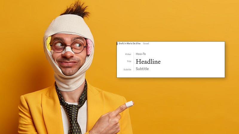
Head.
This is where your Headline or Title goes. I try to keep my headlines between 8 to 10 words. Not too short but not too long.
The readers skim your headline when they are scrolling through dozens of stories. They will read the first three words and the last three. Then will decide if the Title intrigues them. Your image will also play a part in that. More into that later.
Besides the Title, you will have space for a Subtitle. Here you can go more in detail on what the Headline is referring to. Be specific about what the reader will find in the story.
If you press Enter on the Title, it will create a space line on the top. Here you can write your Kicker. This is the general understanding what is the meta of the story. Whether is about writing, an opinion piece, or whatever you can think of that relates to your story.
The Main points for your head are ready. Now let’s move on to the content body.
Body.
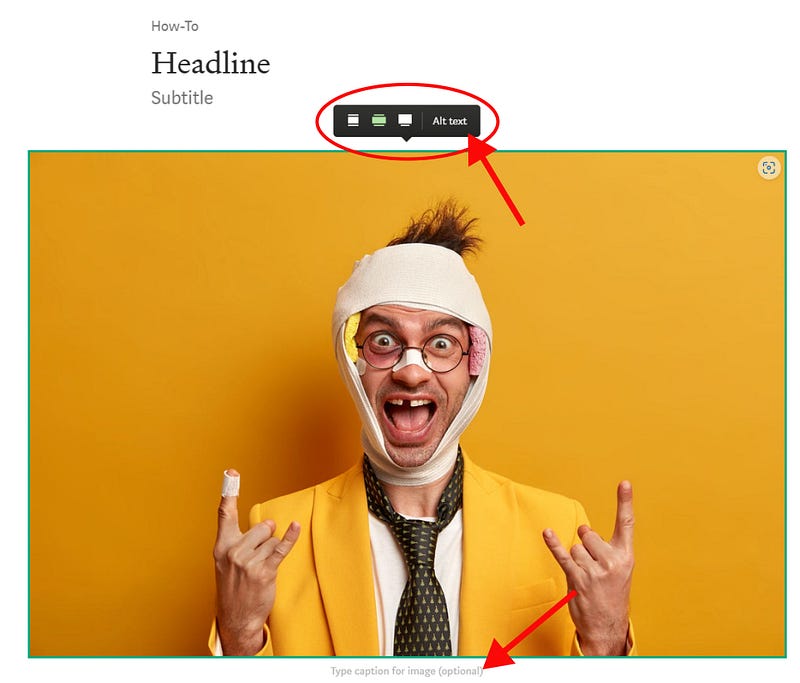
I add the main image first. The image I place here will be overboarding the edges of the text. It gives a nice look. And I always use horizontal images rather than vertical ones. The latter is harder on the reader who has to scroll more to read your piece and could put someone off if it is too big.
The image has more to format than only adding the image and how big you want it to be.
There’s an option to add an alt text. For the visually impaired, this is a great help in understanding what’s the content of your image. Finally and equally important the caption. There is no right or wrong here just write whatever you feel like.
I try to be funny (failing most of the time) or write something related to the story.
Oh! And always provide your source reference. If it is yours write “Image by the author” or something like that. For free image source websites, I link the source image to the description.
Intro and Main Points.
Intro
After the main image, I start with an Intro. This is not mandatory but it helps get the reader to understand what’s about to read. It helps build a bit of momentum to keep them engaged with the rest of the story.
This is hard to nail though, and can either nail it or break it. If you suck at it, the reader goes away. You can also skip the Intro completely and jump straight to the action. Many writers take this option.
In the end, it’s up to you to decide what’s the best course of action to keep the reader engaged.
Main Points
The Main Point is where I tell my story. It’s where I try to provide value. It can be through learned lessons, How-to’s, and any content that solves an issue or provides a solution for a reader.
Remember you’re not doing this to keep a journal. There are dedicated notebooks for that. I use Leuchtturm 1917. I like my handwriting on a smooth surface.
I like wiping my ass in silk. Sue me.
Use Subtitles to split the main points of your story. Use subheadings when one of the Main Points becomes too lengthy to break it a little bit. Remember, you need to make your story aesthetically pleasing to the eye.
Don’t fall into the trap of a long paragraph block.
Pfft! I’m out, not going to read that! — The reader.
I keep paragraphs to a maximum of three sentences. And that sentence varies in length, you want to give it rhythm to your writing. I don’t overdo the use of single sentences, a personal option, and what I learned from my favorite writers.
There’s an arsenal of options for formatting your text. From different types of quotes, bold and italic. Quotes are a bit obvious when to use them. You can quote yourself or another author’s sentence.
Keep it relevant to the story.
I use italics to emphasize a sentence or my thoughts or inner monologue. I use bold to make a word or sentence that I find important stand out for the rest of the text.
Last but not least, use of hyperlinks or embedded links. Very rarely I make use of the latter. It’s a personal choice, nothing against it — if it is too much it will disrupt the reading.
I’m a fan of hyperlinks to a particular text in a sentence. It’s very subtle, and you can associate a link to another relevant article or website of yours. You’re letting the reader discover on their own if they want to click on that link or not.
Toe.
This is your Call-To-Action or CTA for friends. Here you can go creative. I’ve seen many things from different writers. The most common is a newsletter subscription. Others add a personal touch with a signature ending.
You can check what I’m currently leaving for the reader. It’s up to you what you want to suggest to the reader what to do next.
The sky is the limit!
Your reader might not like the sky you’re offering but that’s a different story.
Thanks For Reading!
Before you go, if you like what you read please clap, and leave a comment or your feedback.
It will help me grow and understand what readers like to hear from me.


