
The Problems That Happen When People Look at Charts of Exponential Growth
Whether we're looking at climate change data, investment growth, or spread of pandemic-level viruses, the charts we normally see don’t begin to tell the whole story.
Related
• What Does “Exponential Growth” Really Mean, and How Does It Work? • The Rule of 72 — a Shortcut That Makes Anyone Look Like a Math Genius • Pressing Where It Hurts: How to Win Fights That Matter • Life Expectancy vs. Healthcare Costs in the U.S. (and Japan, Germany, France, Spain, Portugal, etc.)
Potential to Change the Way You Think
• (Part 5 • Smart Man’s Disease) Six Behavioral Barriers That Prevent You from Changing the Status Quo • Should It Be Up to Our Children to Win the War Against Climate Change? • Why Are Fundamental Human Values Critically Important for Successful, Enduring Brands? • The 2 Reasons Populations Are Collapsing in Developed Countries Around the World
When TV news shows an exponential curve that is just going straight up, you can’t get much info from a chart like that other than:
- It was flat for a while and nothing was happening.
- There’s an elbow of the curve where it’s starting to go up.
- Then the curve goes vertical and starts heading straight up.
That’s about it.
Unfortunately, that doesn’t do justice to the conversation (1) that we probably need to have and (2) that we could have if this chart info were shown to us in a smarter way.
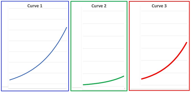
Take a look at these 3 curves. I’ve covered up the X-axis and Y-axis information so that all you can see is the shape of the curves.
Question for readers:
Which curve — #1, #2, or #3 — shows the most growth from beginning to end, and which curve shows the least growth?
Take a moment and think about your answers. Don’t overthink it — just do the best you can in 10 or 20 seconds, max.
We will come back to your answers and see how you did in a moment.
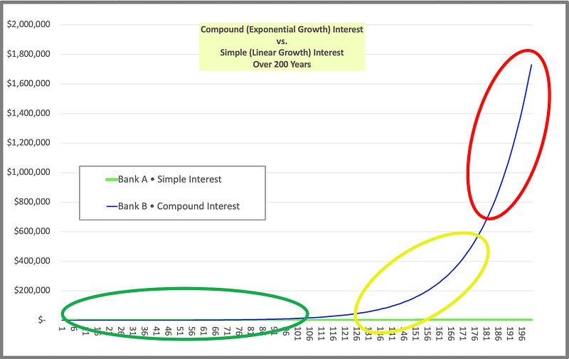
Now let’s return to the chart that we were looking at in the previous article, “What Does “Exponential Growth” Really Mean, and How Does It Work?”
Let’s also add in X-axis and Y-axis info for the 3 charts we just saw:
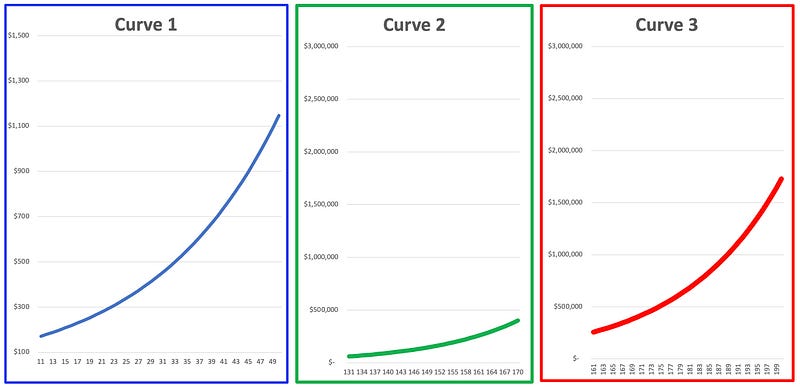
If you click on the image above and zoom in, you will see that each of the 3 curves has 40 years of data from different sections of the chart from yesterday.
- Chart 1 goes from Year 11 to Year 50.
- Chart 2 goes from Year 131 to Year 170.
- Chart 3 goes from Year 161 to Year 200.
The answer to the quiz:
Since every point on that 200-year curve from yesterday was exactly 5% larger than the point before it, the correct answer to the quiz question is…
…all three curves are the same in terms of growth from beginning to end!
Let’s now see how the three curves fit in with the chart from yesterday:
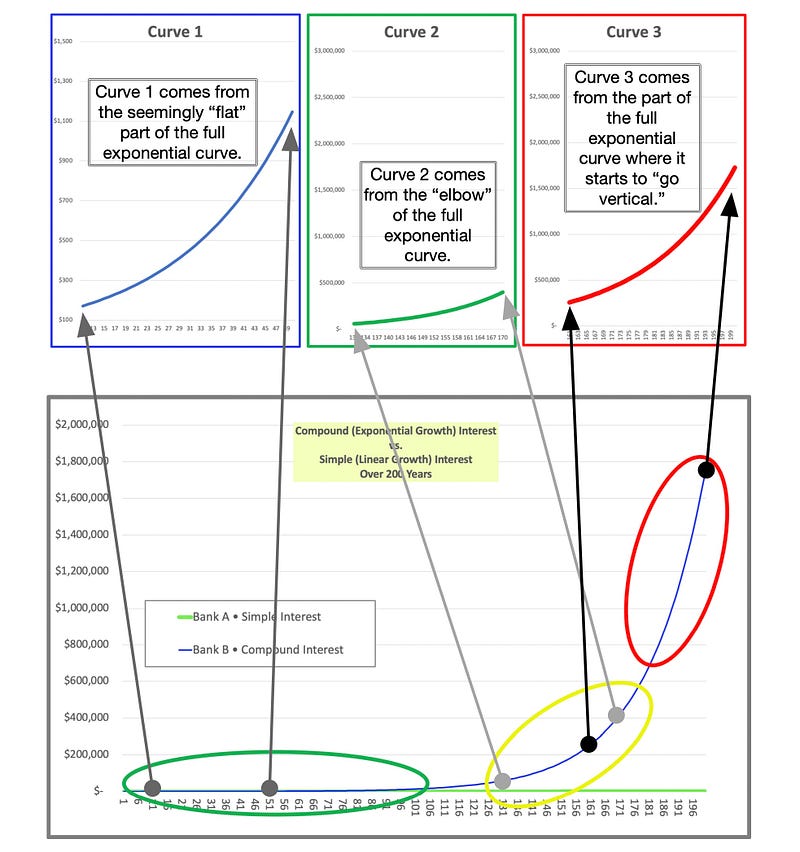
This chart is busy and crowded — my apologies for that. I will keep the observations simple.
The key takeaways are:
- The scale of the Y-axis — where it starts at the low end of the axis and where it gets up to at the high end — makes a HUGE difference in how the chart looks. The difference between Curve 1 and Curve 2 illustrates this perfectly.
- Look at Curve 1. If I had used the same Y axis scale on Curve 1 that I did on Curve 2 or Curve 3, Curve 1 would’ve looked like the flatline that it was in the earlier chart with the green, yellow, and red ovals.
- If I had used the same Y axis scale with Curve 1 as I did on the original chart, we would be getting NO useful information from Curve 1.
However, when we adjust the Y axis to let us see what's actually going on with the flat-line portion of the curve, we can see pretty clearly that it is an exponential curve.
That’s important information to have, but it got lost in the original curve, didn’t it?
Here is the problem with using a linear y-axis.
First, by “linear,” I mean that each unit of the Y-axis — each hash mark as we go up the Y-axis — is the same size as the previous hash mark and the same size as the next hash mark.
So going from 5 to 6 is exactly as much distance on the page or on the laptop screen as going from 501 to 502 would be.
When we use a linear Y-axis, there is a problem that we just can’t get around:
- If we use a Y axis that is appropriate to the right hand side of the exponential curve as I did above, it works just fine for the right side of the curve, but all we can see on the left side is a FLAT LINE.
- And if we use a Y-axis scale that works for the left hand side of the exponential curve so that we could see a shape like the one in Curve 1 above, then — oops — the right hand side of the curve is going to be the size of a 40-story building. In other words, it’s not going to fit on your laptop screen or on a piece of paper!
So what’s the solution?
The solution is to change the Y-axis so that we can (1) show an exponential curve across a wider range of values but (2) still see some detail at all levels.
The “wider range of values” (or “orders of magnitude”) that we are talking about can go from very small — 1s or 10s or 100s of “units” up to millions, billions, or trillions.
There IS a way we can transform the Y-axis scale so that an exponential curve will go from being (1) a curve that looks like the curves above into (2) a straight line across different orders of magnitude.
We will be able to see useful information on the curve whether the value is 10 or 200 or 10,000, or 500,000,000.
To make this happen, we use something called a “logarithmic function.”
Without going into the math and calculus behind this, let me just describe what it will do for us.
- Making the Y-axis of our charts logarithmic has the effect of turning an exponential curve into a straight line.
- It also makes each unit on the Y-axis 10 times larger than the previous unit.
So the straight line that our exponential curve turns into will have the same slope (or angle) at all parts of our exponential curve.
Here is how it would look:
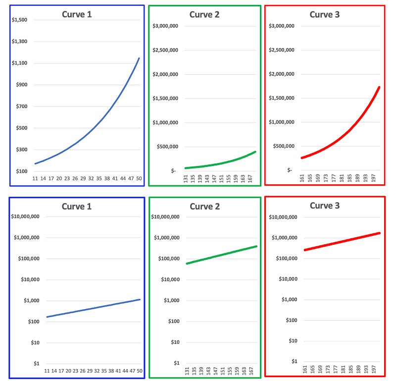
Each of the three charts on the top row (above) has a linear Y-axis.
Each of the three charts on the bottom row has a logarithmic (or log) Y-axis.
See how the exponential curves on the top row have each become a straight line?
Also notice how the scale of the Y-axis on all 3 charts in the bottom row now goes from $1 up to $10 million.
Finally, let’s look at the original 200-year compound interest chart and see what it looks like when we make its Y-axis logarithmic.
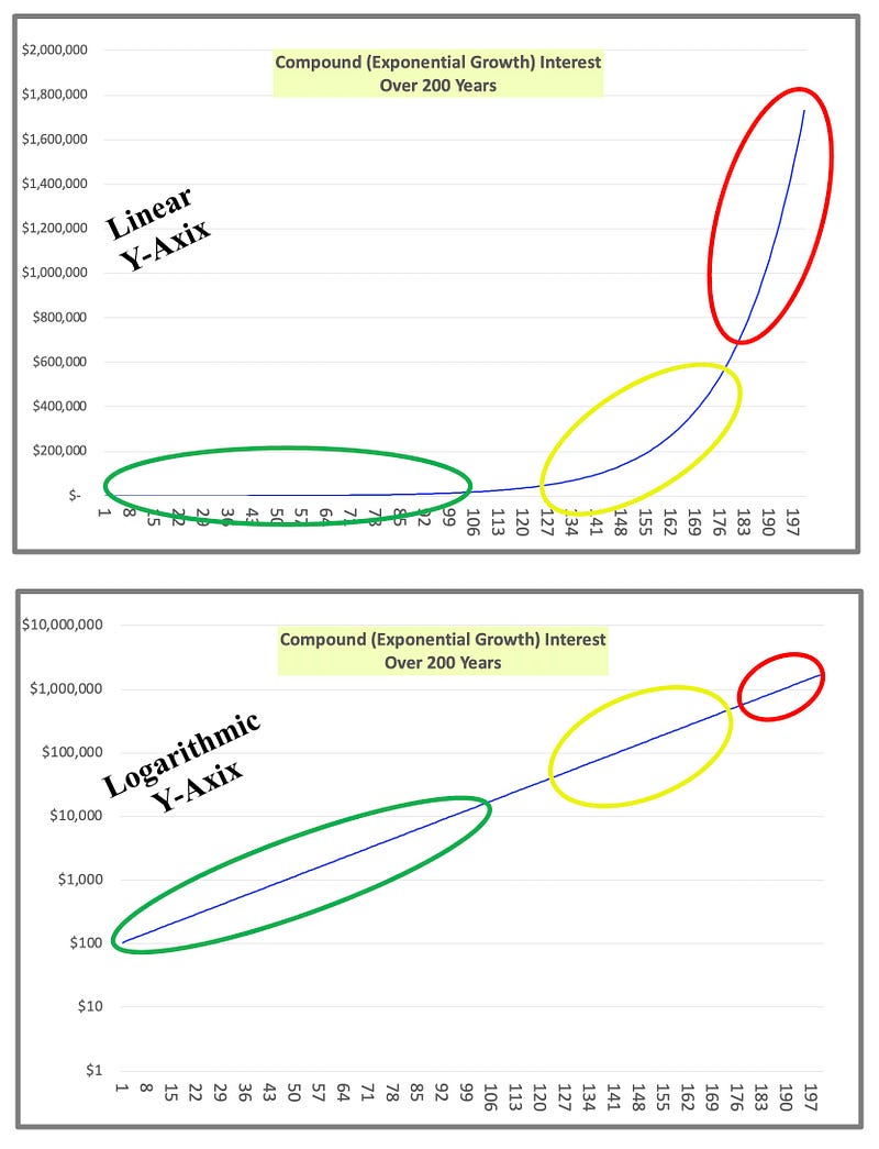
Ok, what are the advantages and disadvantages of a log scale Y-axis?
Advantages
- First and foremost, it lets you spot an exponential curve faster, earlier, and easier. This is true whether we’re looking at investment returns over decades, increases in transistors on chips over the past 60 years, or Covid spread among the population during the first 18 months of the pandemic.
- You are able to see information across different orders of magnitude.
- You know that if you’re seeing a straight line that is going up at all, then you have an exponential curve. “Straight line on a log scale = exponential curve”
- Increasing slope of straight line = higher growth rate of exponential curve
Disadvantages
- You can’t just “eyeball the curve” to easily see that one point is twice as big or three times as big as another point. Transforming the Y-axis from linear to log takes that ability away from us.
Now that we have some tools we can really use, I will shift the focus in the next couple articles toward how this helps us with real world situations.
This is where it gets interesting.
Thank you for reading, subscribing, clapping, and sharing — I appreciate you sharing your time and attention!
Related
• What Does “Exponential Growth” Really Mean, and How Does It Work? • The Rule of 72 — a Shortcut That Makes Anyone Look Like a Math Genius • Pressing Where It Hurts: How to Win Fights That Matter • Life Expectancy vs. Healthcare Costs in the U.S. (and Japan, Germany, France, Spain, Portugal, etc.)
Potential to Change the Way You Think
• (Part 5 • Smart Man’s Disease) Six Behavioral Barriers That Prevent You from Changing the Status Quo • Should It Be Up to Our Children to Win the War Against Climate Change? • Why Are Fundamental Human Values Critically Important for Successful, Enduring Brands? • The 2 Reasons Populations Are Collapsing in Developed Countries Around the World
If you appreciate my writing, please share it on social media.
Want unlimited access to all Medium articles? Become a member!
Again, thank you for reading, subscribing, clapping, and sharing — your time and attention are deeply appreciated!