
The Definitive NBA City Edition Jersey Rankings
All 30 #CityEdition jerseys, ranked from worst to first
The NBA kick started the post-Christmas sports conversation Wednesday morning with the release of 30 Nike City Edition uniforms that NBA teams will wear as alternates later this season. The NBA knows how to take over the news cycle, and the new jerseys had some fans buzzing and others booing. The jerseys are meant to be something special to each city or location, and you can read about some of the historical context or significance elsewhere. We’re here to rank they jerseys by awesomeness, from worst to first. Let’s get to it.
30. Oklahoma City Thunder 29. Los Angeles Clippers 28. Dallas Mavericks
These three may as well all be tied for dead last. They’re all abominations.
Dallas looks like an alternate jersey for the Tune Squad. Harrison Barnes would be the worst Monstar of all time.
The Clippers jersey looks like it was designed in about six minutes on Microsoft Word 2003 with the help of Clippy the Office Assistant. At least they stayed on brand.
But that would probably still be a better Thunder jersey than the actual one chosen. How does OKC manage to make worse and worse jerseys every year? It’s honestly impressive at this point.
27. Utah Jazz 26. Phoenix Suns 25. San Antonio Spurs
Some apparently like the Jazz jersey, which is a nice enough Sun Rise concept in theory that continues in progressively darker gradients into red and darker red shorts. But the jersey itself is way too reminiscent of the 80s Houston Astros, and who goes to Utah to see a sunrise anyway?
If anyone deserves a sunrise uniform, it ought to be Phoenix. Instead they went with the ever tacky “Los Suns” on a boring purple field. Phoenix has so many other beautiful jerseys, and the spacing here is all off and looks like “LOSSONS” which looks French and nasal-y.
Someone please tell San Antonio to stop with the camouflage already.
24. Cleveland Cavaliers 23. Atlanta Hawks 22. Detroit Pistons
Cleveland is “The Land” and you need to defend it, we get it. The coloring is all off and it just feels like you’re trying too hard on this one, Cleveland. But what else is new?
Atlanta is whatever. It looks like another crappy knockoff of their already crappy real jerseys, like some bad pajamas you’d wear to a rave.
Detroit is just boring. Motor City is fun, but you couldn’t think of anything else?
21. Brooklyn Nets 20. Memphis Grizzlies 19. Houston Rockets
Boring. All boring. Do better.
(Yes, Memphis is a throwback to a 1968 sanitation strike but I asked for a cool jersey, not a homework assignment.)
18. Orlando Magic 17. Minnesota Timberwolves 16. Los Angeles Lakers
We need to talk about this Black Mamba jersey. Are we really dedicating an entire jersey to one player (who was not the greatest Laker of all time)? It feels wrong to have a Lakers jersey with no purple, but the black snakeskin grows on you and like any good 6-for-24 snake, this jersey found its way sneaking further and further up my rankings. Let’s just leave it here and move on.
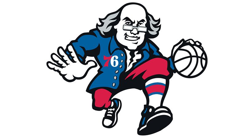
15. Golden State Warriors 14. New York Knicks 13. Philadelphia 76ers
There’s a lot going on in that center Warriors logo, and the “Prosperity” at the bottom right is just a little too on the nose. Yeah, yeah, expensive tickets and light years and stuff. The colors are a bit overwhelming.
I’m all for a nod to the FDNY in New York — I just don’t like the way the jersey came out. The logo is too big, and the random horizontal underarm stripe is all wrong.
Philly’s jersey is lovely, it just doesn’t look unique. Philadelphia has so much history and an awesome secret Benjamin Franklin logo. This jersey is nice enough, and the John Hancock-y Declaration of Independence script is cool, but it feels like they could have done so much more.
12. Denver Nuggets 11. Milwaukee Bucks 10. Charlotte Hornets
I’m not sure how the Nuggets snuck into the top 12, but the pick axe thing is pretty cool.
The cream on the Bucks just works. Besides, you know any true Wisconsinite loves a good cream.
Charlotte get the Air Jordan in place of the Nike Swoosh, plus “Buzz City” and the teal-purple cross fade. It’s a bit New Age-y on the whole but nicely done.
9. Toronto Raptors 8. Indiana Pacers 7. Boston Celtics
The purple has long since faded from Toronto’s jerseys, but black and gold works. They’ve gone hard with the #WeTheNorth thing, even though both Portland and Minnesota play at a higher latitude, but Canada gonna Canada.
Indiana did well to add checkers, an offset racing stripe, and a circle number as a nod to their Indy 500 heritage, which is both a race and also the winning percentage goal of just about every Pacers team in memory.
Boston has too much history to do anything too crazy, so they didn’t. They kept it simple and added the subtle parquet floor design to the gray. Perfect.
6. Washington Wizards 5. New Orleans Pelicans 4. Sacramento Kings
The Wizards still have one of the dumbest team names in sports, but they’ve done well with these clean white jerseys, emphasizing “The District” and adding another great alternate to the uniform rotation. Minus points for feeling the need to include “Of Columbia.”
You look at the Pelicans jersey and you just immediately recognize it as a New Orleans hat tip to Mardi Gras. That’s the entire point of this city jersey exercise, so job done. The colors, the font, the “NOLA,” everything is perfect.
The Kings brought something completely different, using their Kansas City colors with an updated logo featuring a lion, a basketball, and a crown. Gorgeous — now they just need some real players who can wear them.
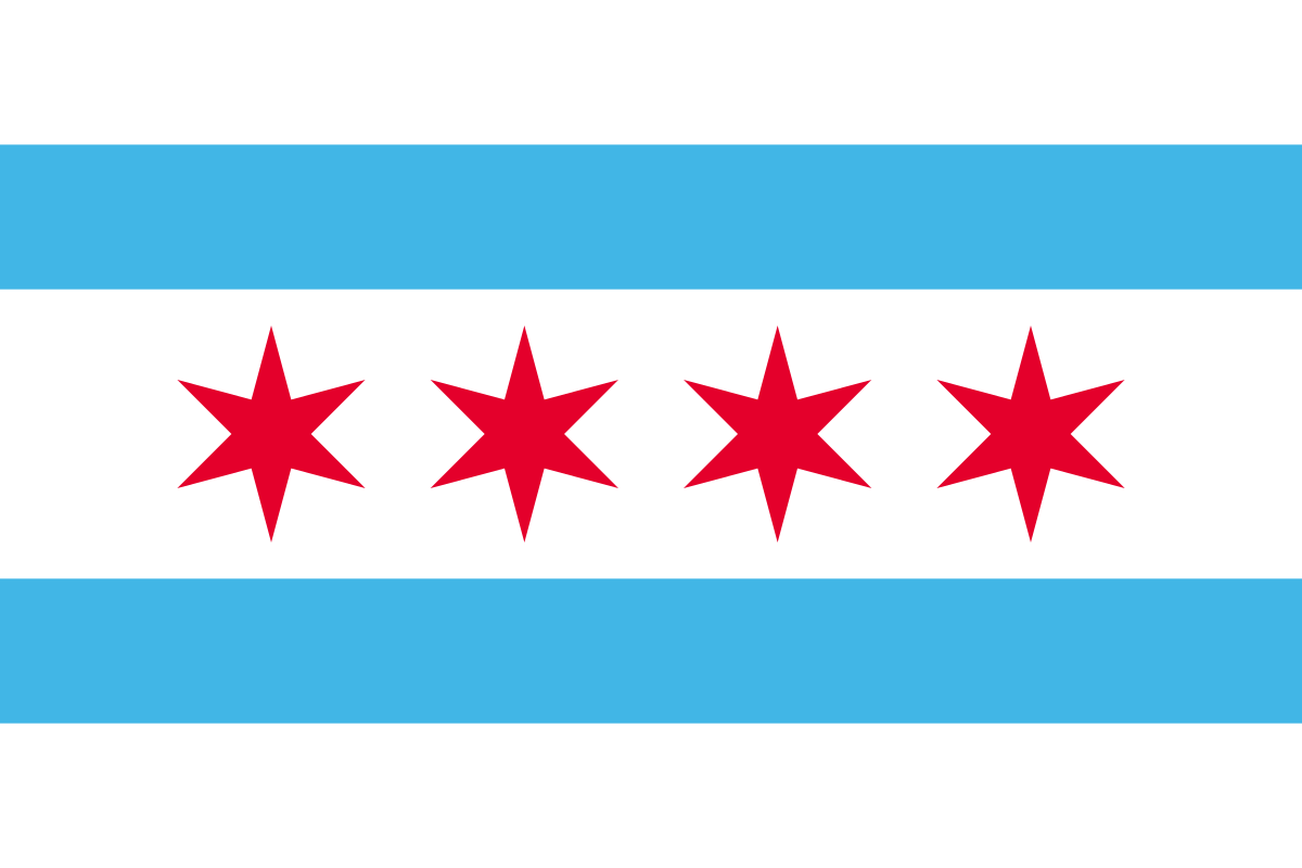
3. Portland Trail Blazers 2. Chicago Bulls 1. Miami Heat
These Portland jerseys are exceptional. The lowercase “rip city” is great. The pinwheel piping is wonderful. And then the Dr. Jack Ramsay plaid to top it all off is just *chef’s kiss*.
Chicago is perfect and I’d buy an MJ 23 right now. The throwback Chicago script is lovely, it’s a clean look, and any true Chicagoan loves the four Chicago stars like their own child.
But the #1 jersey is really no contest. The Miami Vice uniforms are everything. Miami should never wear another jersey again.
All jersey images released from team sites and compiled from Twitter.
Follow Brandon on Medium or @wheatonbrando for more sports, humor, pop culture, and life musings. Visit the rest of Brandon’s writing archives here.