
Storytelling with Visualization — Which Area Has the Highest Socio-Economic Score, and Why
Demonstrated using real-life geographic data
Background
Once in a while, for more efficient allocation of resources, the Government may collect data from individuals or households about their demographic characteristics, such as age, gender, and country of birth, as well as their socio-economic characteristics, such as income, occupation and spend. Some of these data are then aggregated by geographic regions and made available to the public.
In Australia where I live, the Government through the Australian Bureau of Statistics (ABS) calibrates an index called the Index of Economic Resources (IER), which scores the relative socio-economic status of a geographic region using a range of variables sourced from the 5-yearly Census data collection.
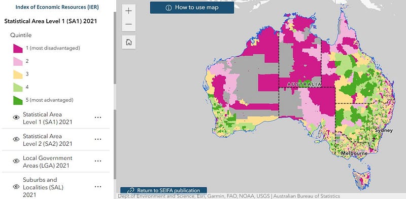
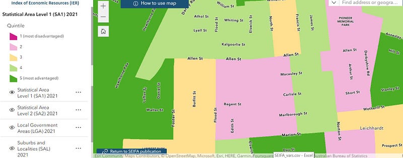
IER can be aggregated by various digital boundaries which divide Australia into geographic regions of different sizes. For instance, the State boundary (dashed line in Image 1) divides Australia into 8 States and Territories, whereas the Statistical Area 1 (SA1) boundary (in Image 2) divides Australia into much more granular regions, at times a cluster of just a number of streets.
Upon checking the IER in different regions on an interactive map provided by the ABS, as shown in the images below, I found that IER is quite different by regions even at a street level, and I ponder what may be the drivers for this.
Can we uncover how ABS differentiates the IER scores by geographic regions using visualizations? Read on!
The Data
Thankfully, the ABS made it very easy for us to obtain the IER scores by SA1 as well as the supporting variables in one place, which is under the Data Download section of this webpage, for “Standardised Variable Proportions data cube”[1].
For the purpose of this article, I’ll be providing the Python code to create a set of visualisations which may help readers understand the contribution of each supporting variable to the SA1’s IER score.
I’ll start by loading the required packages, reading in and inspecting the data.
## Load the required packages

import matplotlib as mpl
import matplotlib.pyplot as plt
import seaborn as sns

import numpy as np
import pandas as pd

import polars as pl
import hiplot as hip
## Read and inspect data
data_proportion = pd.read_excel('/content/gdrive/MyDrive/SEIFA/Statistical Area Level 1 (SA1), Standardised Variable Proportions, SEIFA 2021.xlsx',
sheet_name = 'Table 4', header = 5, usecols = 'A:Q')
data_proportion.head()At first glance as shown in the image below, it appears that the naming convention of the columns for the supporting variables may not be self-explanatory.
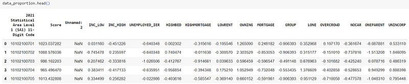
To address this, ABS provides a data dictionary for the 14 variables used to calibrate the IER score here. To summarise:
- INC_LOW: Percentage of people living in households with stated annual household equivalised income between $1 and $25,999 AUD
- INC_HIGH: Percentage of people with stated annual household equivalised income greater than $91,000 AUD
- UNEMPLOYED_IER: Percentage of people aged 15 years and over who are unemployed
- HIGHBED: Percentage of occupied private properties with four or more bedrooms
- HIGHMORTGAGE: Percentage of occupied private properties paying mortgage greater than $2,800 AUD per month
- LOWRENT: Percentage of occupied private properties paying rent less than $250 AUD per week
- OWNING: Percentage of occupied private properties without a mortgage
- MORTGAGE: Per cent of occupied private properties with a mortgage
- GROUP: Percentage of occupied private properties which are group occupied private properties (e.g. apartments or units)
- LONE: Percentage of occupied properties which are lone person occupied private properties
- OVERCROWD: Percentage of occupied private properties requiring one or more extra bedrooms (based on Canadian National Occupancy Standard)
- NOCAR: Percentage of occupied private properties with no cars
- ONEPARENT: Percentage of one parent families
- UNINCORP: Percentage of properties with at least one person who is a business owner
Separately, the IER scores in the ‘Score’ column are standardised in the publication by ABS with a mean of 1,000 and standard deviation of 100 to show the relative socio-economic status of a particular region.
Let’s now get some visuals!
Visualization
The Python code below performs some minor transformation to get the data in the right format for visualization.
## Rename the first column (optional)
data_proportion.rename(columns = {'2021 Statistical Area Level 1  (SA1) 11-Digit Code': 'SA1'}, inplace = True)

## Create a SCORE_HIGH class column with 1 indicating a high score based on standardised mean
data_proportion['SCORE_HIGH'] = np.where(data_proportion['Score'] > 1000, 1, 0)

## Select only the columns needed for visualization
column_select = [
                 'SCORE_HIGH', 'INC_LOW', 'INC_HIGH',
                 'UNEMPLOYED_IER', 'HIGHBED', 'HIGHMORTGAGE', 'LOWRENT', 'OWNING',
                 'MORTGAGE', 'GROUP', 'LONE', 'OVERCROWD', 'NOCAR', 'ONEPARENT',
                 'UNINCORP'
                ]

data = data_proportion[column_select]

## Remove rows with missing value (113 out of 60k rows)
data_dropna = data.dropna().reset_index(drop = True)

## Create a Polars dataframe
df = pl.from_pandas(data_dropna)
We now effectively have a dataframe of 14 features and a class variable which we are trying to visualize. As opposed to performing a low-dimension one- way analysis between a single feature and the target variable (as often performed in a data science workflow for predictive modelling), the Python code below allows us to visualize interactively the relationship between all 14 features and the target variable.
df_ml = pl.concat([
    df.filter(pl.col("SCORE_HIGH") == 0).sample(5_000),
    df.filter(pl.col("SCORE_HIGH") == 1).sample(5_000),
]
) # Note that I'm selecting a sample of 5,000 data points for each class
  # as I don't want the visual to look too busy for the purpose of this demonstration

hip.Experiment.from_iterable(df_ml.to_dicts()).display()
As shown in the resultant visualization below, by choosing the ‘SCORE_HIGH’ column for coloring:
- Each line in the visualization represents a row of data. In particular, the orange line represents SA1s of relatively high IER score, and the blue line represents SA1s of relatively low IER score.
- By examining the color distribution of each individual features (which as a recap are percentages of a certain characteristic according to the data dictionary), we are able to easily tell the relationship between a particular feature and the IER score.
- By way of example, there is evidence that IER score is positively correlated with the percentage of people of high income in the SA1 region as indicated by the INC_HIGH variable, and that IER score is negatively correlated with percentage of one-parent families in the SA1 region, as indicated by the ONEPARENT variable. These observations are all intuitively sensible.
- At a high level, the IER score can be seen to be calibrated using variables related to income, property values and household compositions.
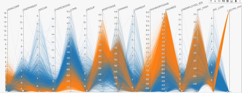
Surprisingly, with the exception of a few SA1s, most variables have a relatively clean-cut relationship with the IER score.
Enhancement
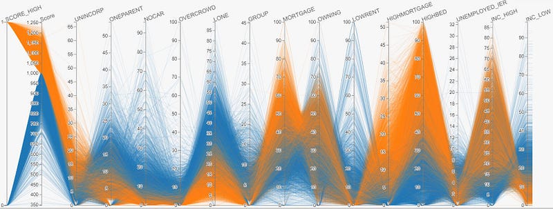
As the numerical values (i.e. percentages) as shown in the visualization above for each variable are standardised to have a mean of 0 and standard deviation of 1 as outlined in the ABS methodology, it may be difficult to interpret exactly what percentage of a particular variable contributes to a high or low IER score. For example, what percentage of people of high income, or properties of 4 or more bedrooms, is required to have an above-average IER score in a particular region?
Fortunately, upon request, ABS was able to provide the unstandardised (i.e. raw) values for each of these variables which provide a more comprehensive view as shown below.
Other Examples of Useful Visualizations
Did you know that Visualization alone can be used for predictive modelling, which may outperform predictions under a supposedly more advanced model such as Neural Network?
Using a similar high-dimension visualization technique as above, the idea is to ‘note down’ the range of values which may be predictive of a particular class.
For example, in the visualization above, to potentially predict high IER scores, the range of values we need may be UNINCORP >15%, HIGHBED > 50%, INC_LOW < 10% and etc., which can be used to formulate a simple nested IF ELSE statement (in any programming language).
The video below provides a demonstration on how to do this interactively with the visualization in Image 5 above.
To experiment further, I applied this to a fraud detection classification problem Google developed for advocating the Keras package (for building Neutral Network models), and produced the following comparative model evaluation results.
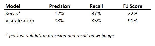
Not only did visualization outperform the Neutral Network, it also had the advantage in that by noting down the values of features which inform the ‘IF-ELSE’ rule, we are able to clearly advise the predictors in a transparent manner compared to some of the other less interpretable models such as Neural Network.
Concluding Thoughts
In this demonstration, apart from creating visualizations which help unpack the relationship between various features and the target variable, I would also like to bring to the fore the importance of being able to interpret the model and explain outputs, which may just be as important as fitting a model based solely on evaluation metrics.
I’m a big fan of visualizations, and I firmly believe that every stat tells a story. As raised in this article of mine for demonstration of another use case, my experience has been that good visualizations help greatly with story telling, ultimately adding credibility to my personal brand and building trust with stakeholders. For this reason, by itself or not, visualization is and should be an important chain in any data science pipeline.
Reference
[1] Australian Bureau of Statistics (2021), Socio-Economic Indexes for Areas (SEIFA), ABS Website, accessed 24 December 2023 (Creative Common Licence)
I have previously blogged about other visualization techniques in the following articles. If you like these, make sure you follow the writer on Medium!
Interactive Geospatial Visualization with Shape Map Visual in PowerBI
Creating Interactive Geospatial Visualisation with Python
As I ride the AI/ML wave, I enjoy writing and sharing step-by-step guides and how-to tutorials in a comprehensive language with ready-to-run codes. If you would like to access all my articles (and articles from other practitioners/writers on Medium), you can sign up using the link here!