
Status Page for Data Products — We All Need One
Effectively communicate with data users

The status page is not a new thing in the software engineering field. It is essential for many platforms in today’s fast-moving world to transparently communicate up-to-date incidents, scheduled maintenance, and real-time service status with users. It builds trust and improves communication efficiency between service providers and users, especially during downtime.
Though it has been heavily adopted by various services such as websites, cloud services, and REST APIs, it hasn’t gained enough attention in the data world.
In this article, I want to raise awareness of building a status page for data products, including but not limited to tables, views, dashboards, files, ML models, and any other data representation. In the end, I will share my solution. If the article resonates with you, please leave your comments and share your thoughts.
What is a status page?
If you are familiar with the concept of status page, feel free to skip this section.
The status page is a web page that informs visitors about the service’s current health and overall historical performance. It’s used by companies that need to keep updating their clients about the current service situation. During downtime, the page speaks for the engineering team, so the team can focus on fixing issues rather than handling repetitive client tickets. It certainly improves communication efficiency.
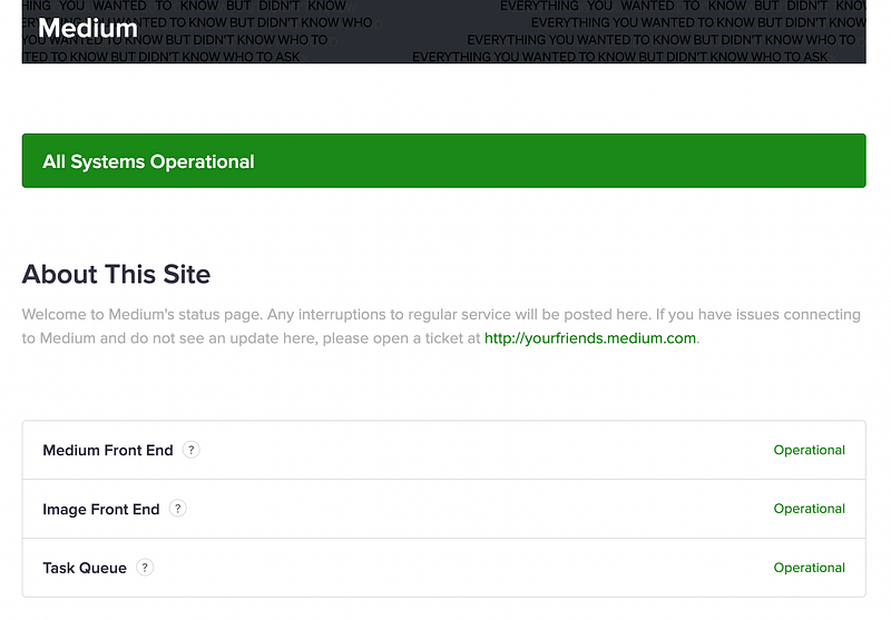
Let’s take a look at Medium’s status page as an example. The page contains three parts:
- The current operational status of the service (front-end, backend)
- The system metrics (uptime, page response time)
- The past incidents
Although every status page looks different, they share a few common goals:
- Inform users about the most up-to-date operational status of critical user-facing services. This is the top metric for a status page and the no.1 reason why people visit the page — they want to know if the service is working correctly now. Only critical user-facing services are needed, as users don’t care about internal services.
- Inform users about ongoing issues or maintenance. If the service encounters any issue or is in maintenance mode, it’s crucial to tell users why it happened, the estimated time to finish, and any updates. It’s important to keep users in the loop.
- Inform users about the historical performance of services. An overview of the past performance shows service stability, which is particularly important for services providing SLA. It gives a general picture of how stable the service is and how quickly the past incident was resolved.
Apart from these core features, some advanced status pages show system metrics over time, such as REST API response time, service uptime, etc.
For more status page examples, check out Github repo awesome-status-pages.
How to build a status page?
There are multiple ways to build a status page, and it can be very easy. We can set it up using a 3rd-party service or an open-source project. GitHub repo awesome-status-pages lists many options.

3rd-party service
Many solid status page products are there in the market: Atlassian, Better Uptime, and AdminLabs to name a few. Most of the products can be set up in a lightning speed and offer native integration with Slack, email, text message, and other communication channels.
The downside of using 3rd-party would be the cost. For Atlassian, to support a team of 10, the price starts from $99/month. Although there are cheaper providers, the cost can still be a concern for teams on a budget.
Open-source project
We can also build a status page using one of the open-source projects such as Statping, ClearStatus, Gatus, etc. Besides the fun we can get when working with open-source projects, open-source solution is better for customizing things that are impossible or expensive in the paid services, such as UI, authentication method, extra communication channels, etc. However, maintaining an open-source project requires a lot of manpower which can be an issue for small start-ups.
My piece of advice is to first check out 3rd-party solutions before going for open source. Although getting our hands dirty is fun, the amount of engineering effort isn’t necessarily worth it. Offloading the monitoring work gives engineers more time to develop new features of the services. The existing products on the market are pretty powerful and can cover most of the use cases (we will talk about what they can’t cover in the next section).
Architecture — pull v.s. push
If we go for the open-source project, it’s good to know two types of architectural designs that most status page projects choose.
Pull
In a pull-based architecture, the status page app has a cron job that fetches raw metrics from the service. The app may calculate final metrics using the raw inputs and then store them in the database. Every time the user visits the page, the web app directly gets the result from the database without further process.
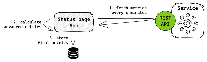
This architecture is commonly used when the service can’t provide exact metrics due to its restrictions, so the status page needs to reprocess it first. Many monitoring stacks like Prometheus use this approach to get advanced system metrics. It requires the service to provide an interface, preferably REST API, for the app to consume.
Push
In a push-based architecture, the workload is shifted to the service. An aggregator layer is supposed to process all the raw metrics and push final metrics to the status page app in a fixed interval. If the status page doesn’t receive metrics within the interval, something is wrong with the service.
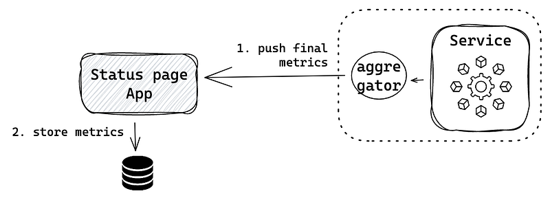
In this architecture, we decouple the business logic from the status page, keeping it lightweight, and build a separate aggregator component to process the metrics. In a big-scale organization, multiple teams want to display their custom service metrics. Push architecture allows each team to develop its own aggregation logic. The status page team is only responsible for visualization.
Why do we need a status page for data products?
We’ve discussed what a status page is and how to build it. But how can we apply this to the data domain? Why do we even need a status page for data products?
In modern data stacks, the data team is doing more than traditional ETL work. Data engineers build data products together with data analysts, data scientists, and backend engineers. As described in this article — Types of data products, data products include data platforms, data insights, and data activation. Here are a few data product examples almost every data team has:
- Data platforms — Self-hosted tools like Airflow.
- Data insights — Tables providing valuable insights.
- Data activation — REST API used by a user-facing product to get the prediction from a machine learning model.
A data user is most interested in the health of tables — telling them if the insights are reliable and the health of user-facing products. On the contrary, the health of data platforms is less relevant to them.
Most status page solutions described previously are designed for API-based services, which can be tricky for tables.
How do we define the health of a table? “The table is available” doesn’t mean “The table is healthy.” We don’t use a binary metric to determine a table's health but a combination of a few metrics: availability, freshness, correctness, uniqueness, completeness, and more. These metrics can be part of the table’s SLA, as I discussed in this article — It’s Time to Set SLA, SLO, SLI for Your Data Team — Only 3 Steps.
These metrics are dynamic due to the nature of incoming data flows, and it can be frustrating and time-wasting for data users to work with unreliable data. The rise of data observability tools helps data teams uncover data issues more efficiently. However, most tools are designed for internal data teams, which can be too technical for data users like HR, investors, business users, etc.
Given all these reasons, it’s time to think about creating a status page for data products, specifically for tables.
How to design a status page for data products
I will share a table-oriented status page solution based on my team’s infrastructure. Since this type of product is not available on the market yet, we have to go for an open-source solution with creative minds.
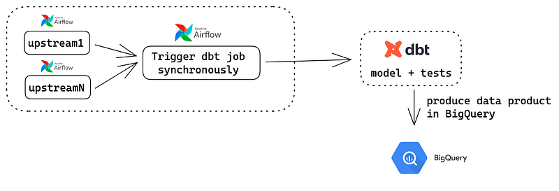
In a nutshell, my team uses a synchronous Airflow dbt Cloud Operator to trigger a dbt job, running the models and tests. The test covers all the data quality metrics, such as uniqueness, freshness, etc., and is the single source of truth.
We choose Statping as the base project because of two reasons:
- Programming languages — Engineers would love to maintain a project written in Vue js and Go.
- Pull-based architecture — Metrics provided by Airflow and dbt are pretty raw. To make meaningful metrics out of that, we need to process them, and we want that piece of logic to be part of the status page rather than maintaining an aggregator service.
This is our metric processing unit running every 5 minutes. We leverage Airflow REST API and dbt Cloud API to get raw metrics.
- Check the availability of the DAG. If DAG is unavailable or paused, all the metrics are down except during maintenance.
- If the DAG is active, check the result of the dbt task (a synchronous dbt cloud operator triggering the models and tests) in the latest DAG run. If the result is successful, then all the metrics are up.
- If the dbt task fails, then check dbt run artifacts.
- Go through the artifact file and check the result of each critical test, determining which metric is down.
- Update the overall score with the new data points.
- Repeat the process every 5 minutes.
The time interval can be dynamic, depending on the DAG frequency. For example, pulling the status every hour for a daily DAG is enough. But for an hourly DAG, the interval should be increased to every 5 minutes.
In this way, a table is treated as a regular service with its own definition of “being healthy.” By showing the real-time stats, users can decide if the table is valuable for them now. (e.g., some users don’t mind unfresh data while others might do) Data users can also use these stats to negotiate a better performance with the data team if they want the table to perform better in the future.
Conclusion
In recent years, we’ve put great effort into developing data observability tools. It’s been a game-changer for data engineers to improve their work efficiency and quality. But most tools are made for data teams which are difficult for other data users to grasp.
The status page for data products is currently a gap in the data domain that can bridge the communication gap between the data team and data users. I hope this article provides some food for thought, and I would love to hear your voices. Cheers!


