
Sharpen your mapping and data wrangling skills in R with these open data sites (code included)
These cities and governments can help you build your data analysis portfolio.
When I worked on my doctorate in public health, I used some non-traditional sources of data to better understand homicides in Baltimore City. One of those sources was a local crime activist identified as “Cham.” Their page contains a wealth of information on homicides in Baltimore. They keep a running tally of homicides, with links to news articles and other sources of information. Along the same lines is the Baltimore Sun’s database on homicides. The lead reporter on the crime beat at the time allowed me to use those data for my analysis. And then there is the Baltimore Neighborhood Indicators Alliance. Their data repository is top notch.
Of course, Baltimore City has its own Open Data site, and it is a treasure trove of information. But the “Charmed City” is not the only one where you can get some data and build up your portfolio of data analysis, data wrangling, and mapping. Many cities around the world allow scientists and interested members of the public to access their data, analyze it, and come up with some interesting projects.
For this post, I’m going to list some data from around the world, and I’ll show you some code in R to do some neat things with data from each of those sites.
New York City
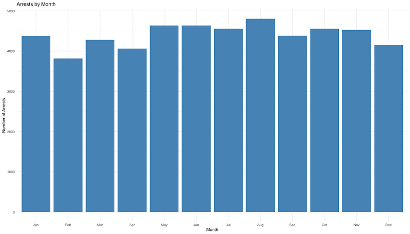
Recently, the Governor of New York and the Mayor of New York City deployed members of the National Guard, the NYPD, and state troopers to the city’s subway system. This was in response to a series of crimes on the subway that have raised concerns among the public that crime is out of control. As it turns out, the city government has an open data site, and you can get some interesting crime data from there. Maybe you can verify if there is such a “crime wave” going on.
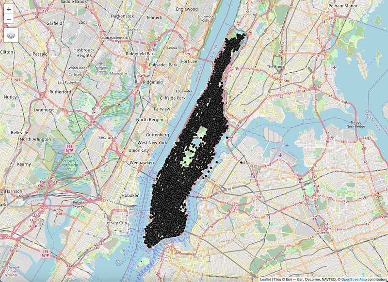
For the map below, I downloaded all the arrest data for 2023 and cleaned it up a little. Then a few lines of code using the tmap package, and I was able to put all the arrests as dots on a map. The resulting data frame had 52,800 records that included latitude/longitude information.
Here’s the code:
library(tidyverse)
# Data
arrests <- read_csv(“nypd_2023_arrests.csv”) %>% # Import from CSV
 mutate(date = lubridate::mdy(ARREST_DATE)) %>% # Change date so we can plot it
 filter(Longitude != 0 & ARREST_BORO == “M”) %>% # Only Manhattan arrests
 st_as_sf(coords = c(“Longitude”,”Latitude”)) # Save as spatial file
# Set tmap to "plot"
tmap_mode("plot")
# Plot the dots on a map
tm_tiles(server = "OpenStreetMap.Mapnik") +
  tm_shape(arrests) +
  tm_dots()
That’s it. Super simple. You can then check out the documentation of the tmap package documentation to do things like color each dot according to the type of crime, or the age group of the person arrested. There is a lot you can do, and you might find some interesting spatial patterns in there.
Or you can create a quick graph of arrests by date:
Here’s the code for that:
arrests %>%
  mutate(Month = month(date,
                       label = TRUE)) %>% # Extract the months from the date
  group_by(Month) %>%
  summarise(Arrests = n()) %>% # Count the number of arrests by the grouping variable
  ggplot(aes(x = Month,
             y = Arrests)) + # Make the plot
  geom_bar(stat = "identity",
           fill = "steelblue") + # What kind of plot and bar color
  theme_minimal() + # Add your theme
  labs(x = "Month", # Add labels
       y = "Number of Arrests",
       title = "Arrests by Month")
London
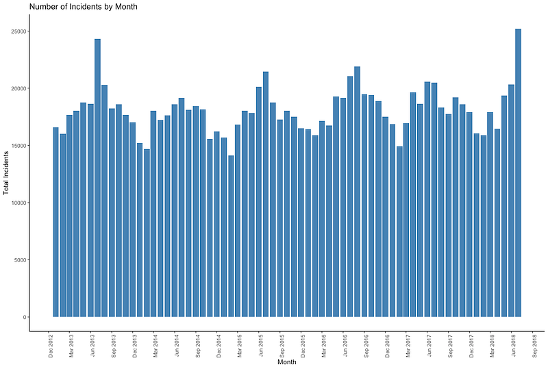
Just like other cities, London has the “London Datastore.” It is an impressive repository of information about the city of 9 million residents. (14 million if you look at the whole metropolitan area.) From that site, I was able to look at data related to safety, health, urban services, and many other topics. One thing that I found interesting was the number of reported incidents. It seemed to follow a seasonal pattern:
Here’s the code for that neat little graph:
library(tidyverse)
# Load the data you've saved from the London Datastore
data <- read_csv("LFB Incidents Data.csv")
# Wrangle and plot the data
data %>%
# Make the data "long" instead of "wide"
pivot_longer(cols = starts_with("20"), names_to = "date", values_to = "incidents") %>%
# Group by month/year
group_by(date) %>%
# Count the number of incidents by date
summarize(total_incidents = sum(incidents)) %>%
# Fix the date format
mutate(date = as.Date(paste0(date, "01"), format = "%Y%m%d")) %>%
# Make the plot
ggplot(aes(x = date, y = total_incidents)) +
# Bar plot
geom_col(fill = "steelblue") +
# Add labels
labs(title = "Number of Incidents by Month", x = "Month", y = "Total Incidents") +
# Choose a theme (Read more: https://ggplot2.tidyverse.org/reference/ggtheme.html)
theme_classic() +
# X axis as a date with labels each three months
scale_x_date(date_breaks = "3 months", date_labels = "%b %Y") +
# X axis tick labels at 90 degrees and slightly off the tick mark
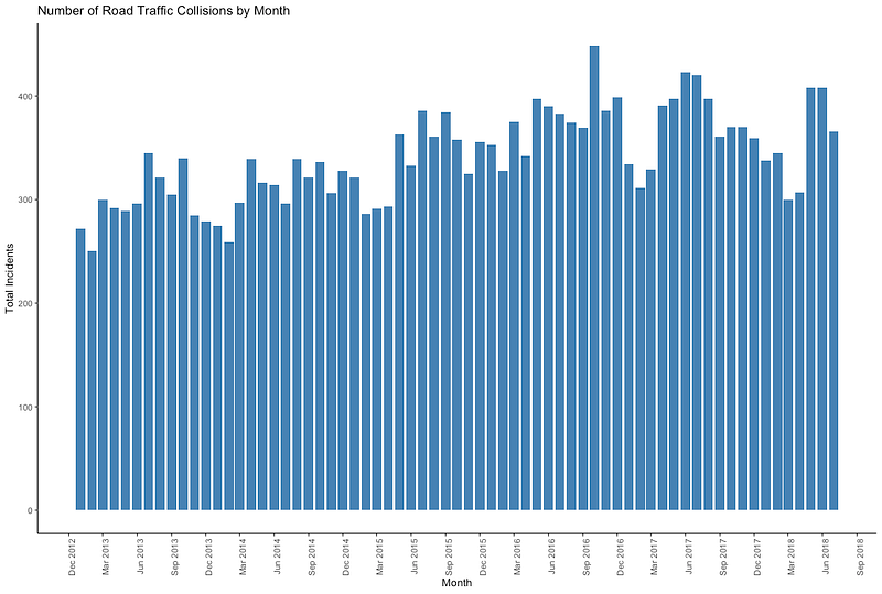
theme(axis.text.x = element_text(angle = 90, hjust = 1))Or, if you are just interested in fire brigade responses to road traffic collisions, you can use the code below to get this graph:
library(tidyverse)

# Step 1: Load the data
data <- read_csv("LFB Incidents Data.csv")

# Step 2: Wrangle and plot the data
data %>%
  # Filter for the type of incident you're interested in
  filter(Callout_type == "ROAD TRAFFIC COLLISIONS") %>%
  # Make the data "long" instead of "wide"
  pivot_longer(cols = starts_with("20"), names_to = "date", values_to = "incidents") %>%
  # Group by month/year
  group_by(date) %>%
  # Count the number of incidents by date
  summarize(total_incidents = sum(incidents)) %>%
  # Fix the date format
  mutate(date = as.Date(paste0(date, "01"), format = "%Y%m%d")) %>%
  # Make the plot
  ggplot(aes(x = date, y = total_incidents)) +
  # Bar plot
  geom_col(fill = "steelblue") +
  # Add labels
  labs(title = "Number of Road Traffic Collisions by Month", x = "Month", y = "Total Incidents") +
  # Choose a theme (Read more: https://ggplot2.tidyverse.org/reference/ggtheme.html)
  theme_classic() +
  # X axis as a date with labels each three months
  scale_x_date(date_breaks = "3 months", date_labels = "%b %Y") +
  # X axis tick labels at 90 degrees and slightly off the tick mark
  theme(axis.text.x = element_text(angle = 90, hjust = 1))
Singapore
If you ever find yourself in the city-state of Singapore, and you’re interested in not running afoul of the red light cameras, then the Singaporean government has you covered with their open data portal. Look at the locations as red dots:
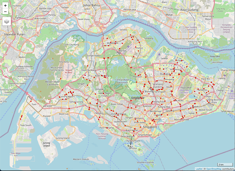
And here is the very simple code for that one:
library(tidyverse) # To wrangle data
library(sf) # To manipulate spatial features/files
library(tmap) # To create maps

# Load the shapefile
data <- read_sf("singapore_cameras/SPF_DTRLS.shp")

# Wrangle the data and make the map
tmap_mode("view") # View on an interactive map
data %>%
  # We're adding a shape to the map
  tm_shape() +
  # We want the dots of each point to be red
  tm_dots(col = "red") +
  # We want a scale bar
  tm_scale_bar()
Other cities and sources
This is only a tiny fraction of the cities with open data portals around the world. For example, the Africa Information Highway has tons of data on different cities and countries in the African continent. There, you can look at the economic outlook of Gambia, with the site giving you plenty of graphs and charts based on those data. Or you can see how the carbon dioxide emissions of Egypt have been constantly rising since 1980.
For a more comprehensive list, check out this web page from the Carleton University in Ottawa. It is the most comprehensive listing of open data I’ve found on the internet. If you’re an aspiring data analyst, epidemiologist, biostatistician, or just a plain statistician, all of those sites should give you plenty of data to wrangle and build your portfolio as you work toward that dream data job.
If you want more ideas for other projects, check out what I’ve done to analyze how many violations of federal gun laws there were in Baltimore in a given year, and which schools there had the most shooting incidents near them. Or look at Chicago’s unmet health needs. Or how to visualize wealth inequality as it pertains to violence.
Good luck. I’m rooting for you.
Hey, if you liked what you read just now, and what you read on Medium in general, why not get a membership and support our work? Click here for more information: https://medium.com/membership. Thanks!
René F. Najera, MPH, DrPH, is a doctor of public health, an epidemiologist, amateur photographer, running/cycling/swimming enthusiast, husband, father, and “all-around great guy.” You can find him working as the director of a center for public health, grabbing tacos at your local taquería, teaching at a university in northern Virginia where he is an adjunct in the Department of Global and Community Health, or teaching at the best school of public health in the world where he is an associate in the Department of Epidemiology. All opinions in this blog post are those of Dr. Najera, and do not necessarily represent the opinions of his employers, friends, family, or acquaintances.


