
Visualizing Wealth Inequalities’ Influence on Homicides in Baltimore City, 2015 to 2019
One Lorenz Curve can tell you a long story
In a previous post, I showed you different ways to visualize time data on homicides in Baltimore using data from Baltimore’s Open Data portal. For this post, I’m going to show you in one image how homicides in Baltimore are related to income, and how lower-income neighborhoods bear most of the burden of homicides in the city. First things first, let’s learn about the Lorenz Curve.
The Lorenz Curve
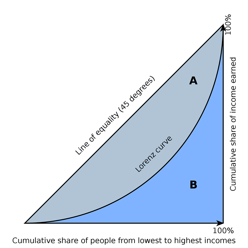
The Lorenz Curve is a very simple way to display the burden (or share) of something among different groups. For example, you can display the percent of total income on the Y axis and a list of countries on the X axis (ranked by a third variable of your choice), and you can see if income is distributed equally among the countries. If income is not distributed equally, then the variable by which you ranked those countries has something to do with that inequality. You will see that inequality by the curve not being a straight, 45-degree line, like this:
In the image above, income is (of course) related to income. But we could do the ranking by something else. A related measure, the GINI coefficient, can also help you quantify that inequality. This is useful if you compare two units, like Baltimore vs. Philadelphia.
Using some R programming and the Baltimore data, I created this:
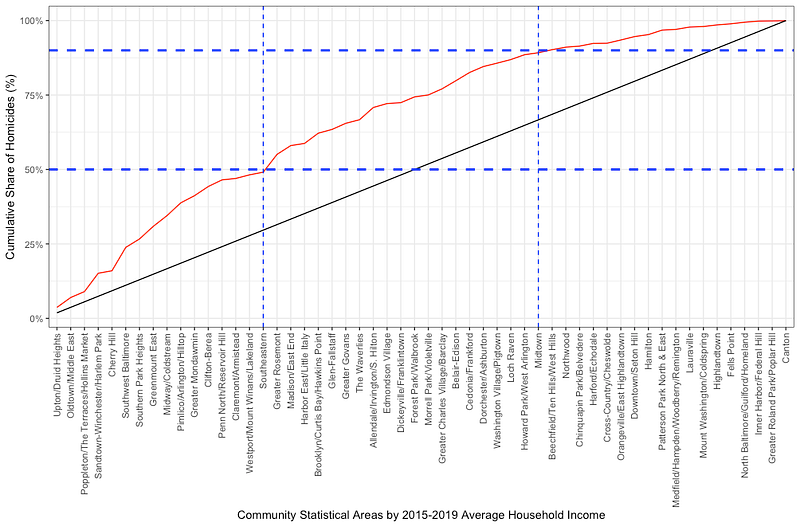
On the X axis, I have ranked the 54 Community Statistical Areas (CSAs) of Baltimore (clusters of neighborhoods) by their median household income between 2015 and 2019. On the Y axis, I have the cumulative share of the 1,657 homicides that occurred in Baltimore in those 5 years.
The black line is the “line of equality.” If income had nothing to do with homicides, all CSAs would have the same share (about 1.85%) of all homicides. The red line shows that there is an unequal burden of homicides across the CSAs.
I’ve added the blue lines to show two facts: First, the less wealthy 16 CSAs had 50% of all the homicides in the city occurring within them. Second, the wealthiest 19 CSAs had 10% of all the homicides in the city occurring within them.
What about population? More people, more homicides, right?
If you’re a good epidemiologist, you might have some questions. How are we sure that the poorest CSAs are not just more populous? Or that the wealthiest are not less populous? If you are asking this, you are correct. The inequality in homicides might just be a function of population size, with more people equaling more homicides. To visualize that, you would rank the CSAs by population, and then take another look…
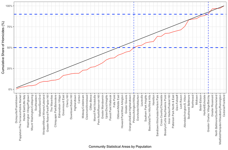
The CSAs are now ranked by population, from least populous on the left to most populous on the right. What do we see? We see 50% of the homicides were in the 31 least populous CSAs, while 10% were in the 5 most populous CSAs. (And, if you look at those 5 most populous CSAs, homicides are not equally shared there, telling us there’s some other factor at play, like income.)
What About Both Population and Income?
How would you deal with both income AND population? This is where we get into linear regressions (Poisson, more likely, since we’re dealing with counts) and other biostatistical methods to understand relationships based on more than one explanation variable (income, population) on one outcome variable (homicide count). Visualizing those results is for a later post at a later time.
For now, just know that the Lorenz Curve is a powerful visualization tool to examine the relationship between two variables, especially as it relates to the shared burden of one of those variables. It is useful in economics, and it can be useful to you in public health.
Ah, Yes… The Code
The code for the data loading:
# Bring in the data and manipulate it
income <- read.csv("Median_Household_Income.csv") %>%
  select(CSA2010, mhhi19)
homicides <- st_read("Part_1_Crime_Data_/Part_1_Crime_Data_.shp") %>%
  filter(!is.na(Latitude) | !is.na(Longitude),
         Latitude > 0,
         Longitude < 0,
         Descriptio == "HOMICIDE",
         CrimeDateT >= "2015-01-01" & CrimeDateT <= "2019-12-31")
csas <- st_read("Community_Statistical_Areas_(CSAs)__Reference_Boundaries/Community_Statistical_Areas_(CSAs)__Reference_Boundaries.shp")
population <- read.csv("Total_Population.csv") %>%
  mutate(mean_pop = (tpop10+tpop20)/2) %>% # Mean of two measurements of population in two censuses
  select(CSA2010, mean_pop) # Keep only what we need
The code for the processing of the geographic layers:
# Fix the coordinate reference system of the two layers so they are the same
csa_crs <- st_crs(csas)
homicidest <- st_transform(homicides,crs = csa_crs)
# Join the points and polygon layers, so we know which homicides belong to which CSA
point.in.poly <- st_join(homicidest,csas,join = st_within)The code for processing the data for the first graph:
# Process the data for the first curved <- point.in.poly %>% # To "point.in.poly" I want to...
count(Community, name = "N") %>% # Count the number of homicides by CSA, name that number "N"
st_drop_geometry() %>% # Get rid of the geometry, make it a data frame
left_join(income, # Join the income data
by = c("Community" = "CSA2010")) %>% # Use these variables to match the two sets
left_join(population,
by = c("Community" = "CSA2010")) %>%
arrange(mhhi19) %>% # Arrange income in ascending order
mutate(CSA_names = factor(Community, levels = Community), # Factorize the CSA to prevent plotting them alphabetically
cumulative_homicides = cumsum(N), # Calculate the cumulative sum of homicides
cumulative_pct_homicides = cumsum(N/sum(N)), # Calculate the cumulative percent of homicides
equality_line_pct = 1/54, # Calculate the percentage that each CSA should have, all things equal
equality_line = cumsum(equality_line_pct)) %>% # Calculate the line of equality
filter(!is.na(mhhi19)) # Get rid of the CSA with NAThe code for the first graph:
# First graph
d %>%
  ggplot(aes(x = CSA_names, # What is on my X axis
             y = cumulative_pct_homicides, # What is on my Y axis
             group = 1)) +
  geom_line(color = "red") + # Line color
  geom_line(aes(y = equality_line), # Adding the line of equality
            color = "black") + # Line of equality color
  scale_y_continuous(labels = scales::percent) + # Making sure Y axis is in percent
  theme_bw() + # Nice theme to display the data
  theme(axis.text.x = element_text(angle = 90, vjust = 0.5, hjust=1)) + # Rotate CSA names
  labs(x = "Community Statistical Areas by 2015-2019 Average Household Income", # Add labels
       y = "Cumulative Share of Homicides (%)") +
  geom_hline(yintercept = 0.5,
             linetype = "dashed",
             color = "blue",
             size = 1) + # Created a horizontal line to help visualize which CSAs had 50% of the homicide burden
  geom_hline(yintercept = 0.9,
             linetype = "dashed",
             color = "blue",
             size = 1) + # Created a horizontal line to help visualize what perentage of homicides the wealthiest CSAs had
  geom_vline(xintercept = 16,
             linetype = "dashed",
             color = "blue",
             size = 0.5) + # Created a vertical line to help visualize which CSAs had 50% of the homicide burden
  geom_vline(xintercept = 36,
             linetype = "dashed",
             color = "blue",
             size = 0.5) # Created a vertical line to help visualize what percentage of homicides the wealthiest CSAs had
The code for data for the second graph:
d.2 <- point.in.poly %>% # To "point.in.poly" I want to...
  count(Community, name = "N") %>% # Count the number of homicides by CSA, name that number "N"
  st_drop_geometry() %>% # Get rid of the geometry, make it a data frame
  left_join(income, # Join the income data
            by = c("Community" = "CSA2010")) %>% # Use these variables to match the two sets
  left_join(population,
            by = c("Community" = "CSA2010")) %>%
  arrange(mean_pop) %>% # Arrange population in ascending order
  mutate(CSA_names = factor(Community, levels = Community), # Factorize the CSA to prevent plotting them alphabetically
         cumulative_homicides = cumsum(N), # Calculate the cumulative sum of homicides
         cumulative_pct_homicides = cumsum(N/sum(N)), # Calculate the cumulative percent of homicides
         equality_line_pct = 1/54, # Calculate the percentage that each CSA should have, all things equal
         equality_line = cumsum(equality_line_pct)) %>% # Calculate the line of equality
  filter(!is.na(mhhi19)) # Get rid of the CSA with NA
The code for the second graph:
d.2 %>%
  ggplot(aes(x = CSA_names, # What is on my X axis
             y = cumulative_pct_homicides, # What is on my Y axis
             group = 1)) +
  geom_line(color = "red") + # Line color
  geom_line(aes(y = equality_line), # Adding the line of equality
            color = "black") + # Line of equality color
  scale_y_continuous(labels = scales::percent) + # Making sure Y axis is in percent
  theme_bw() + # Nice theme to display the data
  theme(axis.text.x = element_text(angle = 90, vjust = 0.5, hjust=1)) + # Rotate CSA names
  labs(x = "Community Statistical Areas by Population", # Add labels
       y = "Cumulative Share of Homicides (%)") +
  geom_hline(yintercept = 0.5,
             linetype = "dashed",
             color = "blue",
             size = 1) +
  geom_hline(yintercept = 0.9,
             linetype = "dashed",
             color = "blue",
             size = 1) +
  geom_vline(xintercept = 31,
             linetype = "dashed",
             color = "blue",
             size = 0.5) +
  geom_vline(xintercept = 50,
             linetype = "dashed",
             color = "blue",
             size = 0.5)
Hey, if you liked what you read just now, and what you read on Medium in general, why not get a membership and support our work? Click here for more information: https://epiren.medium.com/membership Thanks!
René F. Najera, MPH, DrPH, is a doctor of public health, an epidemiologist, amateur photographer, running/cycling/swimming enthusiast, husband, father, and “all-around great guy.” You can find him working as an epidemiologist at a local health department in Virginia, grabbing tacos at your local taquería, teaching at a university in northern Virginia where he is an adjunct in the Department of Global and Community Health, or teaching at the best school of public health in the world where he is an associate in the Department of Epidemiology. All opinions in this blog post are those of Dr. Najera, and do not necessarily represent the opinions of his employers, friends, family, or acquaintances.