
Shades of gray…
… a creative challenge without colour.
Here on Globetrotters, I use photographs as the anchor points for all my stories, and I have to admit, I need those images to help build the content of any story, even those that are prompted by the monthly challenges. I am very much an amateur in photography, but I’m nevertheless proud of the pictures I’ve taken.
And so, this month’s challenge, “Gray” was indeed a real challenge for me.
My father used to say that
“Anyone can take good colour photographs, but to take good black-and-white photographs, takes skill. So it’s good to start learning photography in black-and-white.”
Of course, these words were said in my very much younger days, when I only had a little Kodak Instamatic 100, and I could only afford black-and-white film cassettes, with 12 frames.
But my dad was right — I do remember enthusiastically taking pictures of various bits of wildlife during family holidays in the Kruger National Park. Pictures that I thought would be brilliant, but afterward, seen only in shades of gray, would only be useful for “spot-the-animal” games.
This experience somehow taught me to appreciate the value of light and dark, and certainly of composition.
So — what to do for this monthly challenge?
My first reaction was to think of photographs that I took in places that were already short of colour, but I must admit that once I removed the few remaining colours from those images, most were pretty bland, and lifeless.
Then I considered a few pictures that we still have from those long-ago, far-away black-and-white-photography days.
But old family photo albums pictures are unlikely to be very inspiring for all you Globetrotters and real photographers out there. So I decided to dig up some (colour) photographs of my own and explored which ones could actually benefit from the removal of colours.
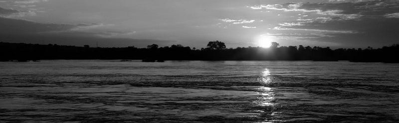
Like the header image for this story, in my view. Washing all those rich orange and blue shades from that photograph (and some cropping) turned it into something more dramatic. Accentuating the light, and the almost metallic reflections that the setting sun created on the Zambezi River.
The quality of light!
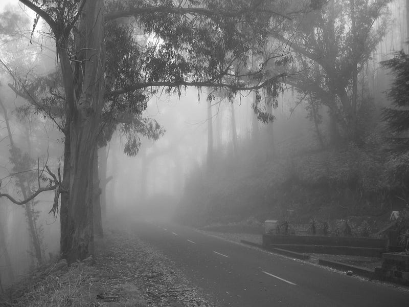
The following image is one that came to mind as I was considering this monthly challenge during the last few weeks. I remembered our drive through this forest in Madeira, back in 2009.
Yes, sometimes I can remember that far back :).
The volcanic mountains on Madeira are steep, and high. On this occasion, on the way to some or other viewpoint, we essentially drove through the clouds, where the leaves and strips of bark hanging from the eucalyptus trees, and the foggy views, provided a very spooky atmosphere.
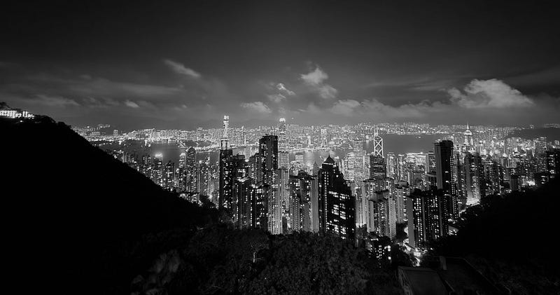
The intensity and quality of the light of an image is something very special, and frequently gets lost while we admire the range of colours. Also when considering nighttime cityscapes. Have a look at the view over a part of Hong Kong:
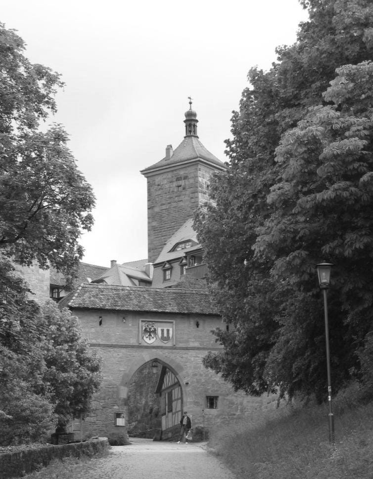
Historical buildings sometimes also look better without colours, as evidenced by the next image, during 2006. Marina and I had taken a short holiday trip into Germany, without any fixed plan or itinerary. We hit a lot of rain on the highway and pulled off at the next off-ramp. I quickly looked in a tourist guide that I had and saw that a town called Rothenburg might be interesting to visit. In my ignorance, I’d never heard of this place before.
“Serendipity”, according to a dictionary, is “the occurrence and development of events by chance, in a happy or beneficial way”. Thanks, Oxford. Anyway, serendipity resulted in us visiting this marvelous town. If you’ve never visited, or heard the various stories surrounding this place, from the Middle Ages up to WWII, then you’re really missing out!
Anyway, I digress. The following black-and-white image has a much more “forbidding” look than my coloured version had. Which is more appropriate for a medieval city wall and gate.
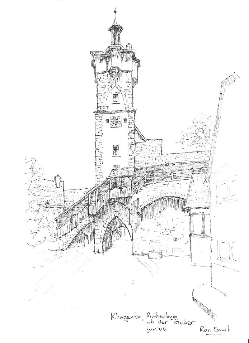
And just because I do like a bit of bragging (aren’t we all self-promoting here on Medium anyway?) let me include a picture of a sketch that I made of the “Klingentor” in Rothenburg. In this case I made an ink drawing of my own (colour) photograph. I later added a watercolour wash to the sketch, but I do prefer this black-and-white line version. (Could have benefited from some gray shading in the background sky now, looking at it again…).
So those were my (somewhat recreated) black-and-white memories, some recent, some from long ago. I hope you’ve enjoyed them as much as my usual, more colourful fare?
There were quite a few very beautiful and inspiring stories on this topic. Here are two you should really look at:
Simon Whaley shows us a very “un-Welsh-looking” village in a beautiful Welsh location:
And Erie Astin also shares her “gray” youthful travel memories. The images might be gray, or black-and-white, but the desriptions are certainly colourful:
As always, any comments on feedback on my pictures and my writing will be welcome and even highly appreciated!


