
Satellite Data Analysis with Google Earth Engine and Graph Databases
Analyze Japanese train station data in GEE, Memgraph, and Gemini Explore

Satellite imagery has become an invaluable tool for monitoring our changing planet, from tracking the effects of climate change to managing natural resources and detecting land use patterns. Google Earth Engine (GEE) is a powerful platform that allows researchers and developers to analyze and visualize this data on a global scale (1, 2, 3, 4, and 5). However, with the growing volume of data being produced, it can be a challenge to effectively store and manage the results of these analyses. Graph databases offer a promising solution, allowing users to store and query complex relationships between different data points in a way that traditional relational databases cannot (1, 2, 3, 4, 5, and 6).
In this short article, I will explore the benefits of combining graph databases and GEE, and how they can enable new insights and discoveries in fields ranging from ecology to urban planning. This project focuses on the train stations in Hokkaido, Japan (北海道). Data from ekidata.jp are complemented by the population and elevation data from GEE. These data are then stored and analyzed in Memgraph and Gemini Explore. Memgraph can visualize the nodes on top of Leaflet maps, while Gemini Explore’s Profiler and Dashboard can reveal statistical insights in the data. The code for this project is hosted on my GitHub repository here.
1. Train station data in Japan
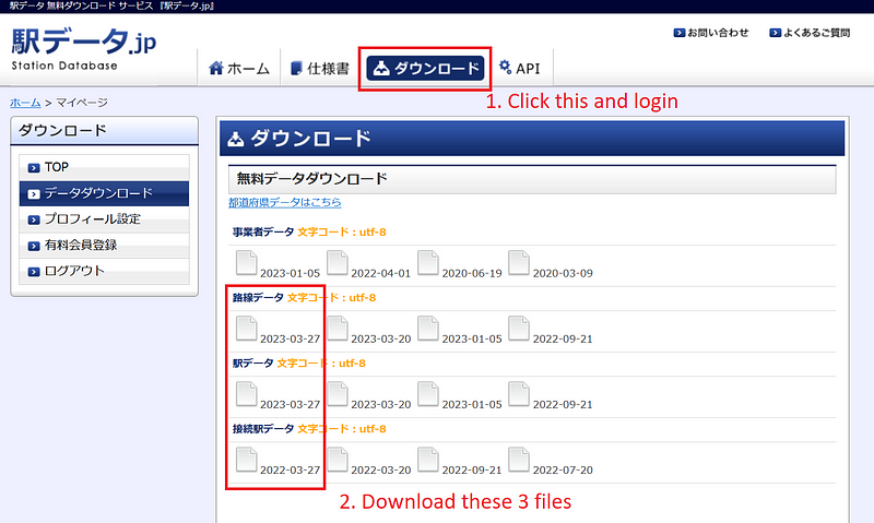
This project starts with ekidata.jp. You need a free account for the download, though. After the login is complete, click the ダウンロード (Download) tab and download the three CSV files.
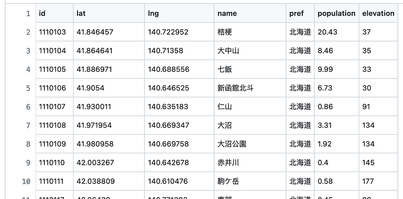
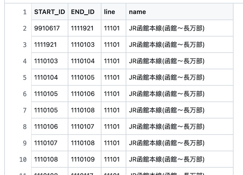
These files contain the details of the Japanese train stations and lines, including their names and locations. Stations are connected via train lines. In this project, I only focus on the train network in Hokkaido (北海道). Moving forward, I want to supplement this data with population and elevation information sourced from Google Earth Engine.
2. Google Earth Engine API
I described my Google Earth Engine API in my previous article. In this project, I have added two functions. The first one returns the estimated number of people residing in each ~100x100m grid cell for a given latitude-longitude pair. The data is provided by the WorldPop dataset in GEE.
@app.get("/worldpop")
async def get_worldpop(lat: float, lon: float, start_date: datetime.date, end_date: datetime.date):
    dataset = "WorldPop/GP/100m/pop"

    point = ee.Geometry.Point([lon, lat])

    image_collection = generate_collection(point, dataset, start_date.strftime("%Y-%m-%d"), end_date.strftime("%Y-%m-%d"))

    result = None
    try:
        result = get_mean(image_collection, point, "population", 1, 100)
    except:
        result = None

    return {'result': result}
The second function returns the elevation data for a given location. The data is provided by the NASA NASADEM Digital Elevation 30m dataset.
@app.get("/elevation")
async def get_elevation(lat: float, lon: float):
    dataset = "NASA/NASADEM_HGT/001"

    point = ee.Geometry.Point([lon, lat])

    image = generate_image(dataset)

    scale_factor = 1

    elevation = None
    try:
        elevation = get_image_value(image, point, "elevation", scale_factor)
    except:
        elevation = None
    return {"result": {"elevation": elevation}}
Then I started the FastAPI service in ngrok. Afterward, I went through the stations and fetched their population and elevation values from GEE via the two APIs.
#Only stations in Hokkaido
target_pref = ["北海道"]

url = "[YOUR_NGROK_URL]"

for i, row in tqdm(station_df.iterrows()):
    station_cd = row["station_cd"]

    lat = row["lat"]
    lng = row["lon"]

    api_url = f"{url}/worldpop?lat={lat}&lon={lng}&start_date=2020-01-01&end_date=2021-01-01"
    result = requests.get(api_url).json()["result"]
    pop = None
    if result and "population_mean" in result:
        pop = result["population_mean"]

    elevation_url = f"{url}/elevation?lat={lat}&lon={lng}"
    result = requests.get(elevation_url).json()["result"]
    elevation = None
    if result and "elevation" in result:
        elevation = result["elevation"]

    station_id_detail[station_cd] = {"name": name, "lng": lng, "lat": lat, "pref": pref_name, "pop": pop, "elevation": elevation}
Once the data acquisition was complete, I put the stations into a node file and the lines into an edge file.
3. Data analysis in Memgraph
Memgraph is an open source Neo4j alternative. The two platforms use the Cypher query language, share similar import commands, and offer interactive interfaces. According to its website, Memgraph is up to 120x faster than Neo4j. Moreover, it has a killer feature called Vislet. It can read the latitude-longitude pairs and superimpose the train station nodes on top of Leaflet maps. My analysis here was inspired by Barbara Prkacin’s great article Modeling, Visualizing, and Navigating a Transportation Network with Memgraph.
Let’s see Vislet in action. First, we can start Memgraph either on the Memgraph Cloud or via its Docker. The former comes with a 14-day free trial, while the latter is free.
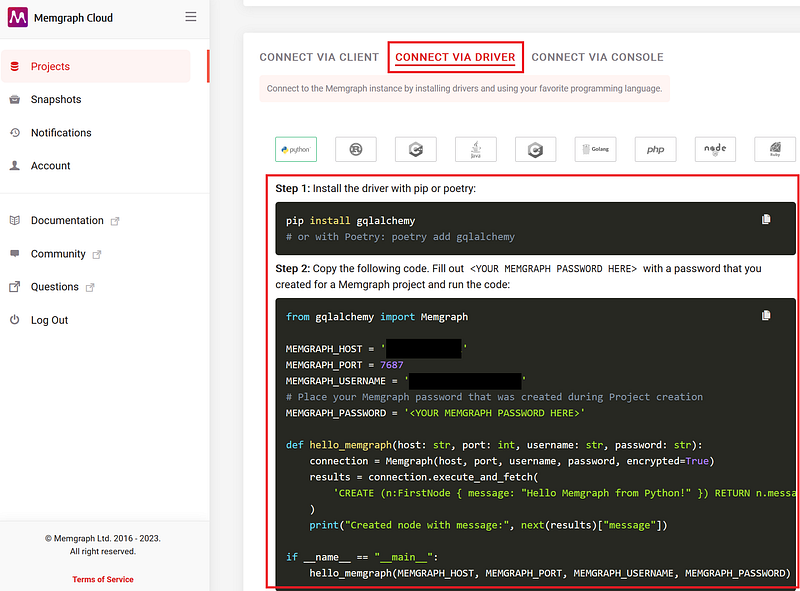
If you use the Memgraph Cloud, the easiest way to import the data is via the Python driver. You can find the instructions on your CONNECT VIA DRIVER tab on the Memgraph Cloud page (Figure 3).
Your import script thus looks like this.
from gqlalchemy import Memgraph

MEMGRAPH_HOST = '<YOUR ADDRESS>'
MEMGRAPH_PORT = 7687
MEMGRAPH_USERNAME = '<YOUR USERNAME>'
MEMGRAPH_PASSWORD = '<YOUR MEMGRAPH PASSWORD HERE>'

station_df_csv = pd.read_csv("stations.csv")
connections_df = pd.read_csv("connections.csv")

connection = Memgraph(MEMGRAPH_HOST, MEMGRAPH_PORT, MEMGRAPH_USERNAME, MEMGRAPH_PASSWORD, encrypted=True)

for i, row in station_df_csv.iterrows():
    results = connection.execute(
        f"MERGE (:Station {{id: {row['id']}, name: '{row['name']}', lat: {row['lat']}, lng: {row['lng']}, pref: '{row['pref']}', population: {row['population']}, elevation: {row['elevation']} }});\n"
    )

for i, row in connections_df.iterrows():
    results = connection.execute(
        f"MATCH (u:Station), (v:Station) WHERE u.id = {row['START_ID']} AND v.id = {row['END_ID']} CREATE (u)-[:CONNECTS {{line: '{row['line']}', name: '{row['name']}'}}]->(v);"
    )
If you use the Memgraph Docker, start the container and copy the files into the container.
docker cp connections.csv <CONTAINER ID>:connections.csv

docker cp stations.csv <CONTAINER ID>:stations.csv

docker exec -it <CONTAINER ID> bash
Afterward, open your Memgraph Lab at http://localhost:3000. Execute the following import statements in the Query Execution tab.
LOAD CSV FROM "/stations.csv" WITH HEADER AS row
CREATE (s:Station {id: row.id, name: row.name, lat: ToFloat(row.lat), lng: ToFloat(row.lng), pref: row.pref, population: ToInteger(row.population), elevation: ToInteger(row.elevation)});


LOAD CSV FROM "/connections.csv" WITH HEADER AS row
MATCH (s1:Station {id: row.START_ID})
MATCH (s2:Station {id: row.END_ID})
CREATE (s1)-[f:CONNECTS {line: row.line, name: row.name}]->(s2);
When you finish the import either way, have a quick test with the following Cypher query in the Query Execution tab again. This query searches for the top 5 most populated stations.
MATCH (s:Station)
RETURN s
ORDER BY s.population DESC
LIMIT 5;
You can immediately see the results plotted on a Leaflet map in the Graph results window. As shown in Figure 4, these five stations were all located around the Sapporo city.
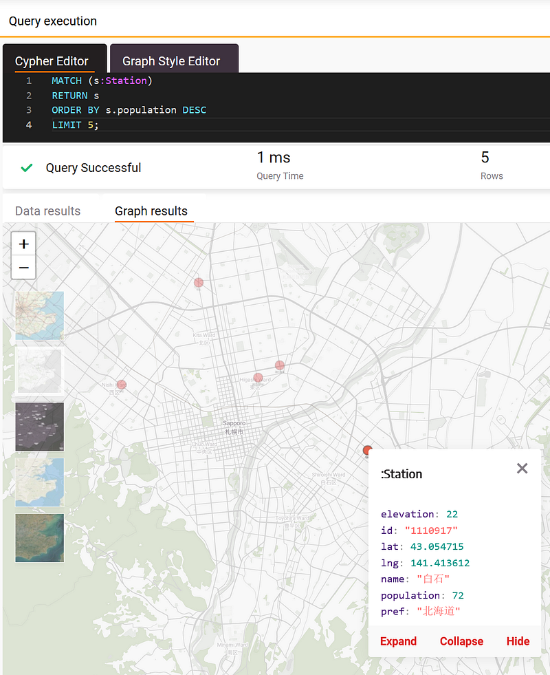
You can hover your mouse over each node and a pop-up will show the node data. Similarly, we could ask where the top 5 highest stations along the Sekihoku Line (石北本線) were.
MATCH (s:Station) -[r:CONNECTS {name: "JR石北本線"}]-()
RETURN DISTINCT(s)
ORDER BY s.elevation DESC
LIMIT 5;
I switched the background to “Satellite” and the results are shown in Figure 5.
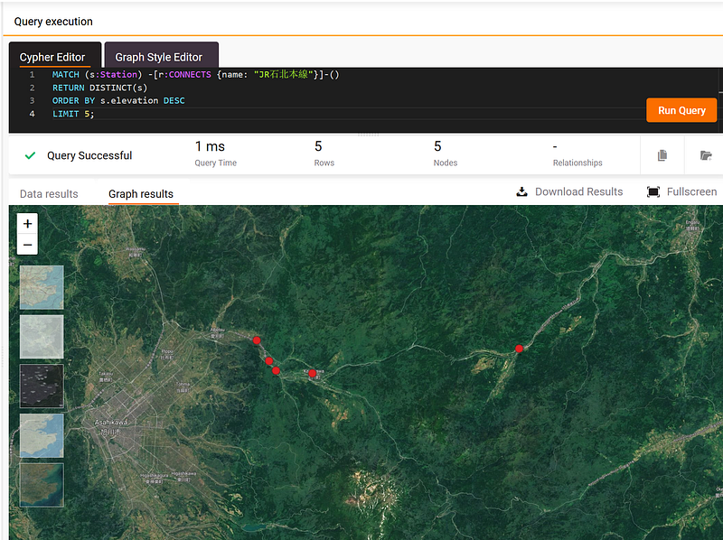
These five highest stations are near the Daisetsuzan National Park (大雪山国立公園), where the tallest mountain in Hokkaido — Mount Asahi (旭岳) is situated.
Finally, we can visualize the whole Hakodate Line between Hakodate and Oshamambe (JR函館本線(函館~長万部)) (Figure 6). This is a part of the Hakodate Main Line that connects Sapporo and Hakodate.
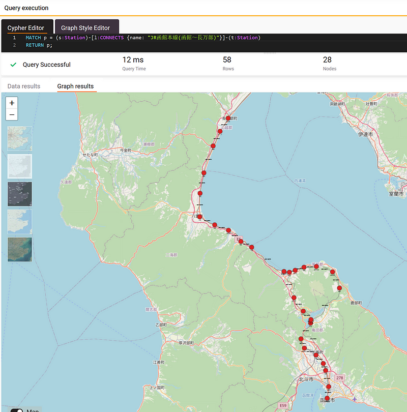
The visualization shows something interesting. The section between Nanae (七飯) and Mori (森) takes the shape of the number “8.” The larger northern loop circumvents the composite volcano — Koma-ga-take (駒ヶ岳), while the smaller loop surrounds Fujishiro (藤城). If we had simply visualized the nodes in a standard Neo4j graph, we would certainly miss this valuable insight.
4. Data analysis in Gemini Explore
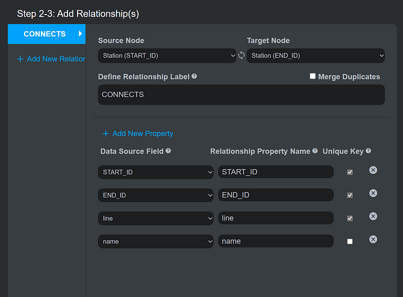
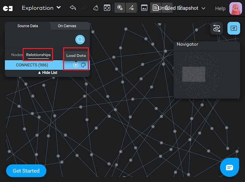
Alternatively, we can import the data into Gemini Explore and do lots of statistics without writing any code. First, import the data into a new Gemini project. Uncheck Merge Duplicates when you import the relationships, though (Figure 7).
4.1 Group statistics
After the import, we can explore the data in Gemini Explore. Because this is a small dataset, you can display all the relations at once on the canvas (Figure 8).
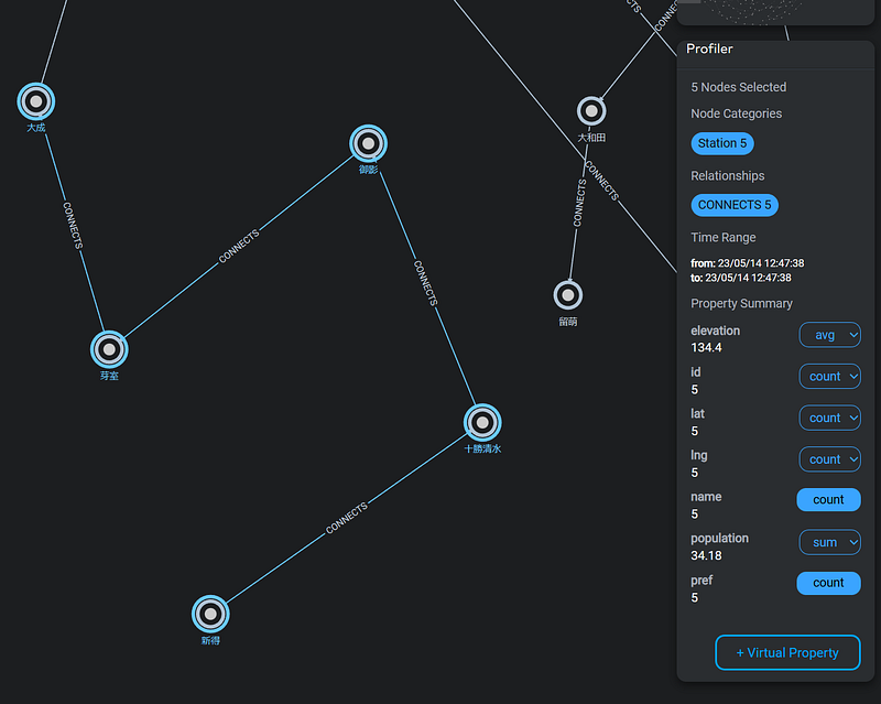
With Gemini Explore, you have the convenience of calculating group statistics effortlessly. Simply select the desired nodes and choose the appropriate summary functions. As an illustration, refer to the screenshot below (Figure 9), which showcases the average elevation and total population of the initial five stations along the JR Nemuro Line (根室本線).
4.2 Dashboard
Moreover, we can use Gemini Explore’s Dashboard to extract more insights from the data. Similar to Tableau and Power BI, you can put various widgets such as summary tables, scatter plots, and Sankey charts on the Dashboard. They complement your graph analytics with traditional statistics and reveal the different facets of the data.
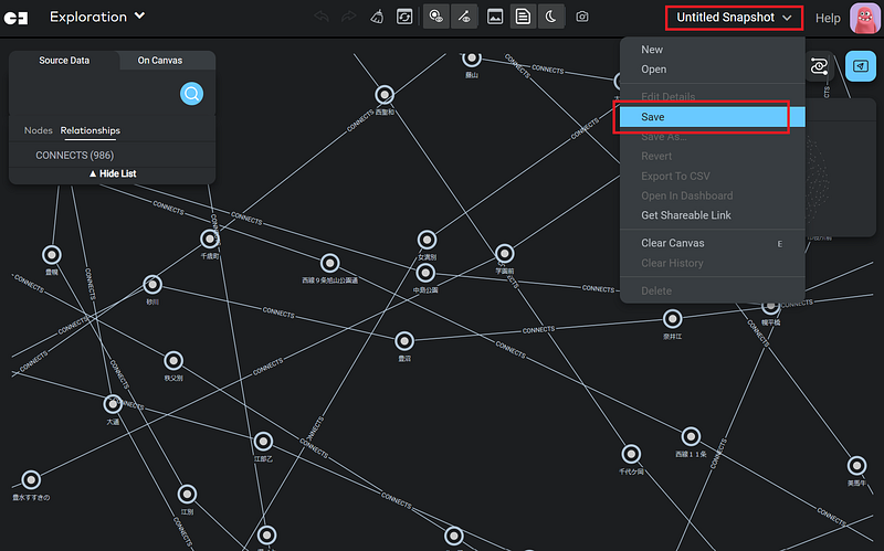
It is important to note that only the data displayed on the canvas is included in the Dashboard. In this demonstration, make sure that all the nodes and relationships are on the canvas. Afterward, create a snapshot (Figure 10).
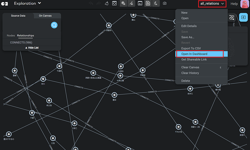
Now, click Open in Dashboard to open the Dashboard.
In the Edit Mode, you can now add widgets on the interface (Figure 12, left). Configure the widgets and position them accordingly. Figure 12 shows the configuration of my scatter plot, which unveils the relation between population and elevation in the dataset.
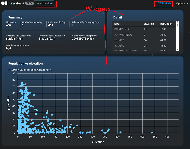
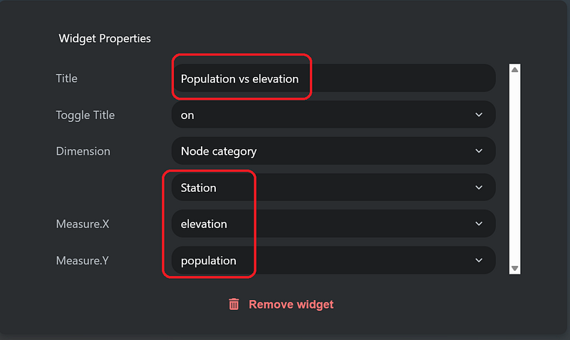
Figure 12 taught us something interesting. On the one hand, although it is tempting to say that a negative correlation exists between the two variables, a closer inspection indicated that lots of stations in low altitudes were thinly populated. On the other hand, it is true that not many people lived around the high-altitude stations. The summary and detail tables also gave us a quick overview of the data. For example, there were 456 stations and 493 line segments in the dataset.
Conclusion
Geospatial analysis is a fast-moving field. Its computation involves a large amount of individual data points. And graph databases can help us connect them. In this article, I showed you how to combine Google Earth Engine, Memgraph, and Gemini Explore. I retrieved data from GEE via custom APIs and store them as graphs in the databases. The two low- or no-code platforms allowed us to perform many complex queries and statistics on the fly.
The analyses also revealed many interesting results. And they can be valuable for several industries. For example, marketing agencies can identify those densely populated stations and then distribute advertisements accordingly. This method can also help infrastructure planners to minimize cost and environmental impact in their projects.
Of course, we can do more than that. One of the key advantages of using a graph database for satellite data analysis is its ability to capture the intricate connections between various elements in the data. For example, we can store information about satellite imagery, geographical locations, climate patterns, and other relevant metadata as nodes in the graph, with relationships between them represented as edges. This approach enables complex queries that traverse the graph, revealing valuable spatial and temporal connections that may not be immediately apparent in a traditional tabular or relational database. With graph databases, it becomes possible to uncover insights such as the correlation between land use changes and deforestation rates or the impact of climate events on crop yields, providing a powerful tool for both environmental research and policy decision-making.


