
Recreate a Dribbble App Design with UIKit : PleaseAssistMe App — Part 1
Join me as I embark on this creative journey of transforming a digital design into a functional application.
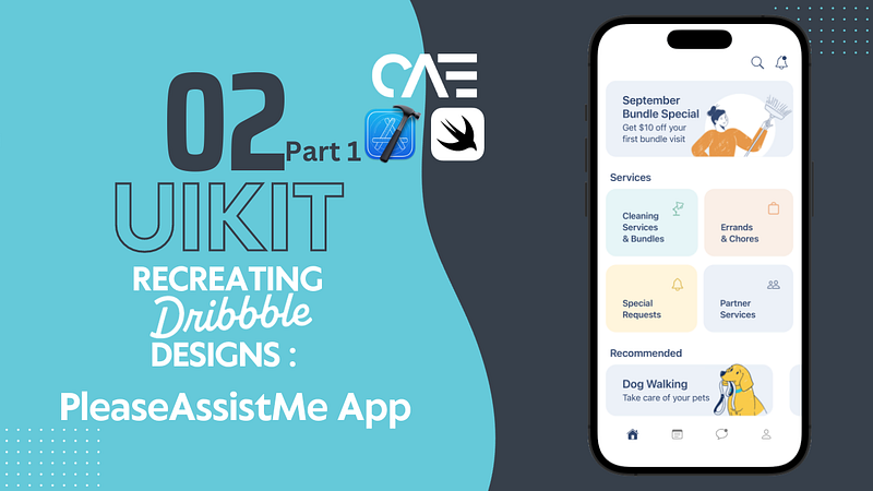
Hello, welcome to the latest installment of Recreating Dribbble Designs, not sure what that is? Well, have you ever been on Dribbble, scrolling, looking at beautiful UI designs (as I tend to do), each one more captivating than the last? (If you’ve gotten this far and this scenario sounds eerily similar...keep going). As you admire these creations, a thought crosses your mind: “How would I even begin turning a design like this into a real app?” So, does all of that sound familiar? Because that’s sort of how this series started (if you’re new, check out Episode 1 below).
In this episode, I will walk you through the thought process behind my approach to bringing this intriguing redesign for an app named PleaseAssistMe, to life.
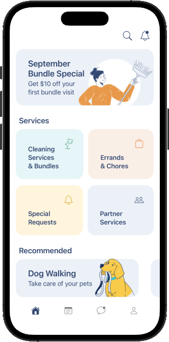
First, and this is probably my favorite thing to do, let us break this entire design down into smaller sections.
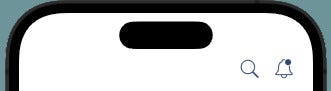
The header — this includes the search and notification icons located at the top right of the app.
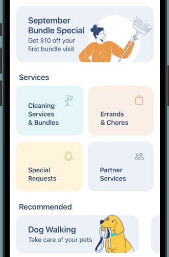
The body — This includes the various sections starting with:
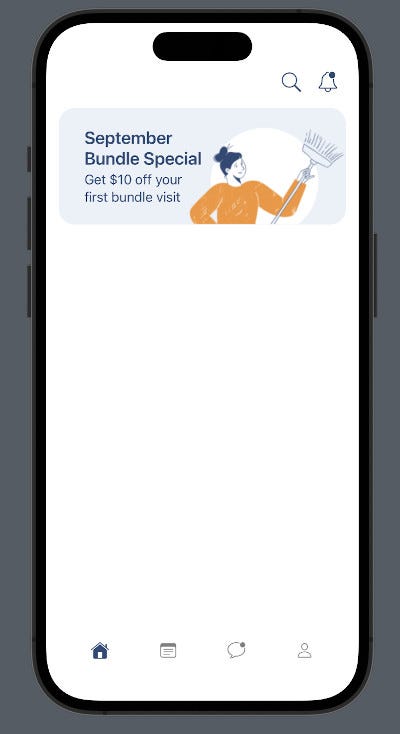
- The ‘September bundle special’ section at the top.
- The ‘services’ section — where each service is depicted by one of four colored rectangular subsections, with a title and icon.
- The ‘recommended’ section — featuring a horizontal scrollable list.
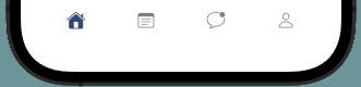
The footer — The bottom navigation bar.
MainTabController
Create a file called MainTabController.swift file, it will subclass UITabBarController — this is a container view controller that holds an array of child view controllers, and manages navigation between them.
When a user taps on a tab in the bottom navigation bar, the UITabBarController switches the currently displayed view controller, to the corresponding child view controller associated with that tab.
    // calls the configViews(), configTabBar()
    // and configConstraints() functions
    // these handle the setup of the app ui

    override func viewDidLoad() {
        super.viewDidLoad()
        view.backgroundColor = .white
        configViews()
        configTabBar()
        configConstraints()

    }

    // topView: This UIView represents
    // the top section of the screen.
    // searchIcon and notificationButton:
    // Buttons for search and notification icons, respectively.

    let topView: UIView = {
        let view = UIView()
        view.backgroundColor = .white
        view.translatesAutoresizingMaskIntoConstraints = false
        return view
    }()

    // Search Icon

    let searchIcon: UIButton = {
        var button = UIButton()
        let config = UIImage.SymbolConfiguration(pointSize: 20, weight: .light, scale: .large)
        let image = UIImage(systemName: "magnifyingglass", withConfiguration: config)
        button.setImage(image, for: .normal)
        button.tintColor = UIColor(named: "mainColor")
        button.translatesAutoresizingMaskIntoConstraints = false
        return button
    }()

    // Notification Icon

    let notificationButton: UIButton = {
        var button = UIButton()
        let config = UIImage.SymbolConfiguration(pointSize: 20, weight: .light, scale: .large)
        let image = UIImage(systemName: "bell.badge", withConfiguration: config)
        button.setImage(image, for: .normal)
        button.tintColor = UIColor(named: "mainColor")
        button.translatesAutoresizingMaskIntoConstraints = false
        return button
    }()

    // The following 4 buttons represent "The Footer"

    // 1 - The home button
    let homeBtn: UIButton = {
        var btn = UIButton()
        let config = UIImage.SymbolConfiguration(pointSize: 16, weight: .light, scale: .large)
        let image = UIImage(systemName: "house.fill", withConfiguration: config)
        btn.setImage(image, for: .normal)
        btn.tintColor = UIColor(named: "mainColor")
        btn.layer.cornerRadius = 20
        btn.translatesAutoresizingMaskIntoConstraints = false
        return btn
    }()

    // 2 - The notes button
    let notesBtn : UIButton = {
        var btn = UIButton()
        let config = UIImage.SymbolConfiguration(pointSize: 16, weight: .light, scale: .large)
        let image = UIImage(systemName: "note.text", withConfiguration: config)
        btn.setImage(image, for: .normal)
        btn.backgroundColor = .clear
        btn.tintColor = .gray
        btn.translatesAutoresizingMaskIntoConstraints = false
        return btn
    }()

    // 3 - The messages button
    let messageBtn : UIButton = {
        let btn = UIButton()
        let config = UIImage.SymbolConfiguration(pointSize: 16, weight: .light, scale: .large)
        let image = UIImage(systemName: "message.badge", withConfiguration: config)
        btn.setImage(image, for: .normal)
        btn.backgroundColor = .clear
        btn.tintColor = .gray
        btn.translatesAutoresizingMaskIntoConstraints = false
            return btn
        }()

    // 4 - The user profile button
    let userBtn : UIButton = {
        let btn = UIButton()
        let config = UIImage.SymbolConfiguration(pointSize: 16, weight: .light, scale: .large)
        let image = UIImage(systemName: "person", withConfiguration: config)
        btn.setImage(image, for: .normal)
        btn.backgroundColor = .clear
        btn.tintColor = .gray
        btn.translatesAutoresizingMaskIntoConstraints = false
        return btn
        }()


    // This stackview will arrange the bottom navigation buttons.
    let buttonStackView : UIStackView = {
        let stackView = UIStackView()
        stackView.translatesAutoresizingMaskIntoConstraints = false
        stackView.distribution = .equalSpacing
        stackView.axis = .horizontal
        return stackView
    }()

    // This function adds the topView and its subviews
    // (searchIcon and notificationButton) to the main view.
    func configViews(){
        view.addSubview(topView)
        topView.addSubview(searchIcon)
        topView.addSubview(notificationButton)
    }

    // this function adds the bottom navigation buttons
    // to the buttonStackView.
    func configTabBar(){
    // The viewControllers array is currently empty, but not for long
        viewControllers = []
        tabBar.barTintColor = .white
        tabBar.addSubview(buttonStackView)
        [homeBtn, notesBtn, messageBtn, userBtn].forEach {
            buttonStackView.addArrangedSubview($0)
        }
    }


    func configConstraints(){

        NSLayoutConstraint.activate([

            // Constrains the topView to the top of the screen
            topView.topAnchor.constraint(equalToSystemSpacingBelow: view.safeAreaLayoutGuide.topAnchor, multiplier: 0),
            topView.leadingAnchor.constraint(equalToSystemSpacingAfter: view.safeAreaLayoutGuide.leadingAnchor, multiplier: 0),
            view.trailingAnchor.constraint(equalToSystemSpacingAfter: topView.trailingAnchor, multiplier: 0),

            // constrains the notification and search icons to
            // the top right of topView
            notificationButton.topAnchor.constraint(equalToSystemSpacingBelow: topView.topAnchor, multiplier: 0),
            notificationButton.leadingAnchor.constraint(equalToSystemSpacingAfter: searchIcon.trailingAnchor, multiplier: 2),
            searchIcon.centerYAnchor.constraint(equalTo: notificationButton.centerYAnchor),
            topView.trailingAnchor.constraint(equalToSystemSpacingAfter: notificationButton.trailingAnchor, multiplier: 3),
            topView.bottomAnchor.constraint(equalToSystemSpacingBelow: notificationButton.bottomAnchor, multiplier: 1),


            buttonStackView.leadingAnchor.constraint(equalToSystemSpacingAfter: view.leadingAnchor, multiplier: 6),


            // sets the height and width
            // of the bottom nav bar buttons
            // to 40

            homeBtn.widthAnchor.constraint(equalToConstant: 40),
            homeBtn.heightAnchor.constraint(equalToConstant: 40),

            notesBtn.widthAnchor.constraint(equalToConstant: 40),
            notesBtn.heightAnchor.constraint(equalToConstant: 40),

            messageBtn.widthAnchor.constraint(equalToConstant: 40),
            messageBtn.heightAnchor.constraint(equalToConstant: 40),

            userBtn.widthAnchor.constraint(equalToConstant: 40),
            userBtn.heightAnchor.constraint(equalToConstant: 40),

            view.trailingAnchor.constraint(equalToSystemSpacingAfter: buttonStackView.trailingAnchor, multiplier: 6)

        ])


    }
This will serve as our entry point into the app. We ensure this by adding the following code into the didFinishLaunchingWithOptions function within AppDelegate.swift.
let navigationBarAppearance = UINavigationBarAppearance()
            navigationBarAppearance.configureWithTransparentBackground()
            navigationBarAppearance.backgroundColor = UIColor.white
            UINavigationBar.appearance().standardAppearance = navigationBarAppearance

        window = UIWindow(frame: UIScreen.main.bounds)
        window?.rootViewController = UINavigationController(rootViewController: MainTabController())
        window?.makeKeyAndVisible()
        return true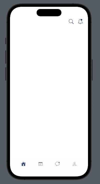
MainTabController is a pretty common user interface with a top section (the ‘header’) containing search and notification icons, and a bottom navigation bar(the ‘footer’) with buttons for home, notes, messages, and user profile.
HomeController
Now, create a file named HomeController.swift — it will subclass the UICollectionViewController, utilizing the UICollectionViewCompositionalLayout to be able to create unique UI layouts, (we will get to all of this, soon).
A compositional layout is a type of collection view layout. It’s designed to be composable, flexible, and fast, letting you build any kind of visual arrangement for your content by combining — or compositing — each smaller component into a full layout.
HomeController serves as the ‘body’ section of the app, it is a CollectionView encompassing the majority of the app’s UI components.
Let us begin with the ‘September Bundle Special’ section, by creating two files:
- IllustrationView.swift — This is a custom UIView that contains two UILabels and a UIImageView.
- TopCell.swift — This subclasses UICollectionViewCell and will simply display IllustrationView.
We’ll create IllustrationView.swift first. Full source code can be found here.
    // This label represents the title
    var title: UILabel = {
        let label = UILabel()
        label.textColor = UIColor(named: "mainColor")
        label.numberOfLines = 0
        label.lineBreakMode = .byWordWrapping
        label.font = .boldSystemFont(ofSize: 22)
        label.translatesAutoresizingMaskIntoConstraints = false
        return label
    }()

    // This label represents the subtitle
    var subtitle: UILabel = {
        let label = UILabel()
        label.textColor = UIColor(named: "mainColor")
        label.numberOfLines = 0
        label.lineBreakMode = .byWordWrapping
        label.font = .preferredFont(forTextStyle: .body)
        label.translatesAutoresizingMaskIntoConstraints = false
        return label
    }()

    // Stackview positions the title above the subtitle
    let titleStackView: UIStackView = {
        let stackView = UIStackView()
        stackView.axis = .vertical
        stackView.spacing = 3
        stackView.translatesAutoresizingMaskIntoConstraints = false
        return stackView
    }()

    // The background image
    var illustration: UIImageView = {
        var img = UIImageView()
        img.contentMode = .scaleAspectFit
        img.clipsToBounds = true
        img.translatesAutoresizingMaskIntoConstraints = false
        return img
    }()

    // Function to add the components to the view
    func configViews(){
        layer.cornerRadius = 20
        addSubview(titleStackView)
        titleStackView.addArrangedSubview(title)
        titleStackView.addArrangedSubview(subtitle)
        addSubview(illustration)
    }

    // Function to position the components within the view
    func configConstraints(){
        NSLayoutConstraint.activate([
            titleStackView.leadingAnchor.constraint(equalToSystemSpacingAfter: leadingAnchor, multiplier: 4),
            titleStackView.topAnchor.constraint(equalToSystemSpacingBelow: topAnchor, multiplier: 3),
            illustration.centerYAnchor.constraint(equalTo: titleStackView.centerYAnchor),
            bottomAnchor.constraint(equalToSystemSpacingBelow: illustration.bottomAnchor, multiplier: 0),
            trailingAnchor.constraint(equalToSystemSpacingAfter: illustration.trailingAnchor, multiplier: 0)
        ])
    }
Now, let us create TopCell.swift and place IllustrationView inside of it. Full source code here.
    // The IllustrationView
    var topIllustration: IllustrationView = {
        let top = IllustrationView()
        top.translatesAutoresizingMaskIntoConstraints = false
        return top
    }()
    // Function to add IllustrationView to TopCell
    func configViews(){
        addSubview(topIllustration)
    }
    // Function to align IllustrationView within TopCell
    func configConstraints(){
        NSLayoutConstraint.activate([
            topIllustration.topAnchor.constraint(equalToSystemSpacingBelow: topAnchor, multiplier: 0),

            topIllustration.leadingAnchor.constraint(equalToSystemSpacingAfter: leadingAnchor, multiplier: 2),
            trailingAnchor.constraint(equalToSystemSpacingAfter: topIllustration.trailingAnchor, multiplier: 2),
        ])

    }
    // Function to set the text for the labels,
    // and the image in IllustrationView
    func configData(){
        topIllustration.title.text = "September\nBundle Special"
        topIllustration.subtitle.text = "Get $10 off your\nfirst bundle visit"
        topIllustration.illustration.image = UIImage(named: "cleaning")
    }
We can now finally create HomeController.swift.
import UIKit

class HomeController: UICollectionViewController, UICollectionViewDelegateFlowLayout {

    let topCell = "TopCell"

    override func viewDidLoad() {
        super.viewDidLoad()
        collectionView.backgroundColor = .white
        collectionView.register(TopCell.self, forCellWithReuseIdentifier: topCell)

    }

    init() {
        //using CollectionView FlowLayout, for now
        let layout = UICollectionViewFlowLayout()
        super.init(collectionViewLayout: layout)
        }

        required init?(coder: NSCoder) {
            fatalError("init(coder:) has not been implemented")
        }


        func collectionView(_ collectionView: UICollectionView, layout collectionViewLayout: UICollectionViewLayout, sizeForItemAt indexPath: IndexPath) -> CGSize {

            return .init(width: view.frame.width, height: 350)
        }


        func collectionView(_ collectionView: UICollectionView, layout collectionViewLayout: UICollectionViewLayout, insetForSectionAt section: Int) -> UIEdgeInsets {
            return .init(top: 48, left: 0, bottom: 0, right: 0)
        }


    override func numberOfSections(in collectionView: UICollectionView) -> Int {
        1
    }

    override func collectionView(_ collectionView: UICollectionView, numberOfItemsInSection section: Int) -> Int {
        return 1
    }

    override func collectionView(_ collectionView: UICollectionView, cellForItemAt indexPath: IndexPath) -> UICollectionViewCell {

        let cell = collectionView.dequeueReusableCell(withReuseIdentifier: topCell, for: indexPath) as! TopCell
        return cell
    }
}
After creating HomeController, we now need to add it to MainTabController. Look for the configTabBar() function, remember it had an empty array named viewControllers? We’ll be adding HomeController() to that array.
func configTabBar(){
        //HomeController added to the viewControllers array
        viewControllers = [HomeController()]

        tabBar.barTintColor = .white
        tabBar.addSubview(buttonStackView)
        [homeBtn, bagBtn,heartBtn,userBtn].forEach {
            buttonStackView.addArrangedSubview($0)
        }

    }
Here’s the outcome of all the coding we’ve done thus far. The app is slowly starting to resemble the redesign, isn’t it?
So, remember when we talked about Compositional Layouts? It’s like Apple’s preferred approach for implementing CollectionView layouts in UIKit. Let’s dive a bit deeper into this approach!
A compositional layout is composed of one or more sections that break up the layout into distinct visual groupings. Each section is composed of groups of individual items, the smallest unit of data you want to present. A group might lay out its items in a horizontal row, a vertical column, or a custom arrangement.
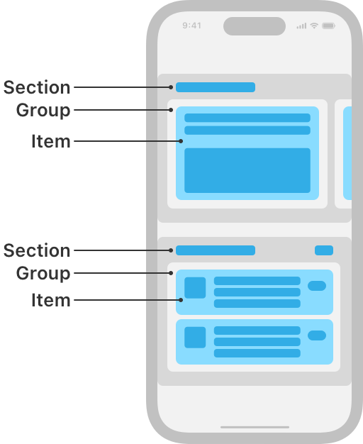
As shown in the diagram, CompositionalLayout lets you mix and match different cells with varying components, within a single CollectionView (It’s like having a party where each guest brings something special, unlike the old Flow Layout, which is more like a strict solo performance).
Let us refactor the init() function to use the CompositionalLayout .
        // An item represents a single element
        // that can be displayed in the collection view
        // Item width will span its container
        let item = NSCollectionLayoutItem(layoutSize: .init(widthDimension: .fractionalWidth(1.0), heightDimension: .fractionalHeight(1.0)))

        // A group organizes items within the collection view
        // this group is arranged vertically
        // and has a fixed height of 150
        let group = NSCollectionLayoutGroup.vertical(layoutSize: .init(widthDimension: .fractionalWidth(1), heightDimension: .absolute(150)), subitems: [item])

        // A section represents a distinct part
        // or segment of the collection view.
        // it contains the group,
        let section = NSCollectionLayoutSection.init(group: group)
        let layout = UICollectionViewCompositionalLayout(section: section)
        super.init(collectionViewLayout: layout)
The outcome will appear identical; the only differance is that we’re now utilizing the Compositional Layout.
Alrighty, folks! We’re putting a bow on Part 1 of this episode, but stay tuned! In the next segment, we’re going to:
- Take a deeper dive into the world of compositional layout.
- Create unique cells for the remaining sections.
- Add titles!
See you soon! And before I forget, the completed source code can be found in the GitHub repo below(please leave a star if you find it useful).
Thanks for reading!