
React-Select Makes Creating Selectable Menus Easy
An introduction to react-select, which works out of the box and is highly customizable

HTML’s select isn’t easy. It takes two types of tags to define:
<select>
  <option value="apple">Apple</option>
  <option value="banana">Banana</option>
  <option value="orange">Orange</option>
  <option value="berry">Berry</option>
</select>
React’s select is similar, except it uses JSX (JavaScript + XML), which is an extension of JavaScript that writes HTML directly within JavaScript. In many ways, JSX is similar to HTML, but it needs to be transpiled into standard ECMAScript and then converted to HTML.
I would recommend using React Select, which makes selection easy. This open-source code started in August, 2014, and now has hundreds of contributors and tens of thousands of stars. It provides a single component, Select, with commonly used select capabilities, easy styling, async loading, dynamically created options, fixed options, and many other features.
Select Capabilities
As always, we use the Create React App as a starting point. First, install React Select with the command npm i react-select. Then the package becomes part of dependencies in package.json.
"dependencies": {
  "react-select": "^3.1.0"
}
Change src/App.css to this for minimal styling:
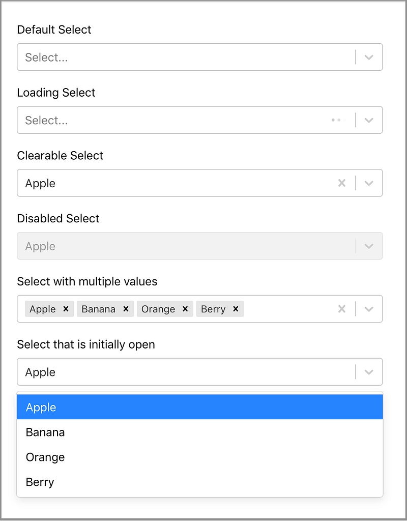
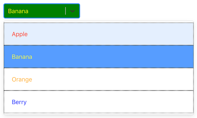
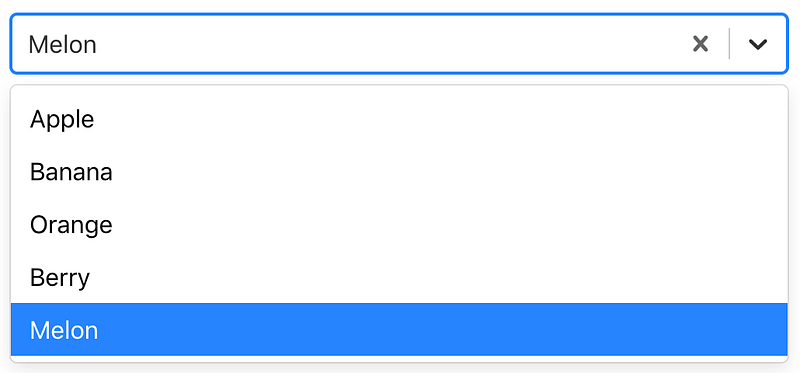
Out of the box, we can easily code the following user interface:
This is the code for src/App.js:
- Line 18: A default
Select. - Line 20: Shows the loading animation with
isLoadingbeing set. - Line 22: Shows the preselected value,
“Apple”. SinceisClearableis set, it allows us to clear the selected value either using the backspace button or the “x” button on the right side of the field. - Line 24: Shows the disabled
SelectwithisDisabledbeing set. - Line 26: Shows
Selectwith multiple values withisMultibeing set. Each selected value can be deleted individually, or use the “x” button at the right side of the field to delete all of the selected values. - Line 28: Opens the
Selectmenu initially.
Style Select Component
How do we style the Select component? First, we need to know how the Select component is converted into HTML elements.
This line of code, <Select options={options} />, generates the following HTML elements:
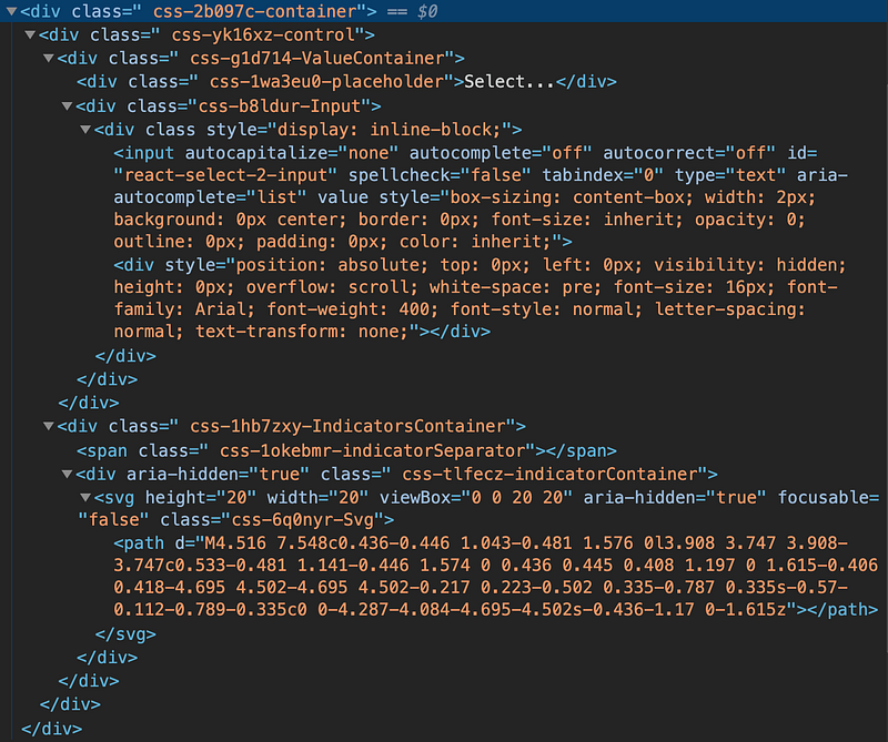
At the top level, it’s a container, which contains a control, which is composed of a valueContainer and a indicatorsContainer.
The valueContainer has a placeholder and an input.
The indicatorsContainer is the right side’s dropdown arrow, etc.
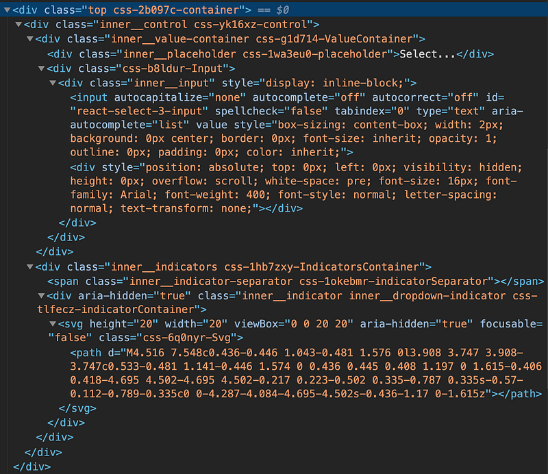
The Select component can take a className for the Select element, and classNamePrefix for inner elements with the given prefix.
We set className to “top”, and classNamePrefix to “inner” inside <Select options={options} className=”top” classNamePrefix=”inner” />. These are the converted HTML elements:
With specific class names, elements can be styled using CSS rules.
However, the Select component provides a better way to overwrite the built-in styles for each part. It uses the styleFn function, which has two parameters:
provided: The component’s default built-in styles.state: The component’s current state, which can be used to generate new styles.
The following code customizes a Select component:
Remember to spread the original provided style. Otherwise, you will be surprised by the look and feel of the missing basic styling.
This is the provided object:
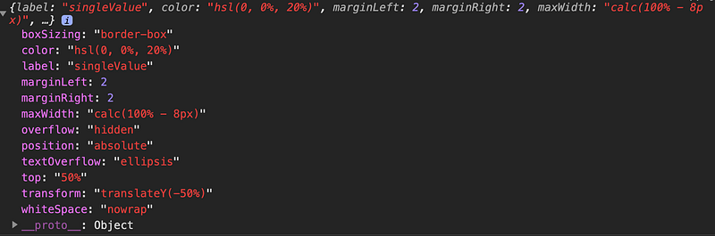
This is the state object:
In the above code:
- lines 17-23 style each
option's border, color, opacity, and padding in the openmenu. - Lines 24 - 28 style the select
controlbox. - Lines 29 - 32 style the selected
singleValue.
Here’s the styled Select component:
These parts can be styled:
clearIndicatorcontainercontroldropdownIndicatorgroupgroupHeadingindicatorsContainerindicatorSeparatorinputloadingIndicatorloadingMessagemenumenuListmenuPortalmultiValuemultiValueLabelmultiValueRemovenoOptionsMessageoptionplaceholdersingleValuevalueContainer
Async Select
We can make the Select component searchable by setting isSearchable:
What if the options list is remote?
React Select provides a component, AsyncSelect, to dynamically load options based on the user input:
Line 26 calls loadOptions, which is defined in Lines 12-21. This function has two parameters, inputValue and callback. In the above example, a promise is returned. Alternatively, the retrieved options can be passed into callback. Here, a three-second delay shows the loading process clearly:
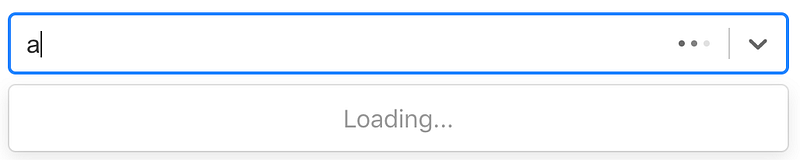
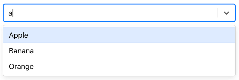
After three seconds, options with a letter a display in the open menu:
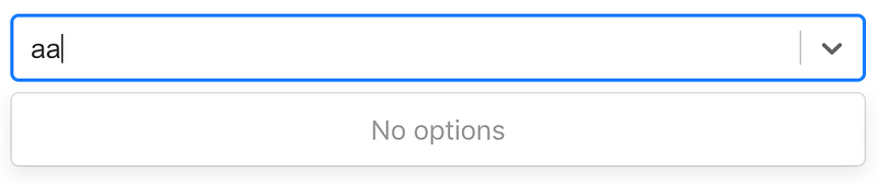
Typing aa, there are no options:
Backspace to have one a in the Select component, we can see the effect of cacheOptions at line 26.
With cacheOptions, it immediately shows the previous options. Otherwise, it takes another three seconds to retrieve them.
Creatable Select
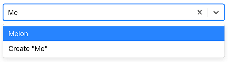
What if the choice is not in Select’s options?
React Select provides a component, CreatableSelect, to dynamically create an option based on user input:
Lines 27-33 construct the CreatableSelect component. When a new item is created, it calls handleCreate, which is defined in Lines 16-23. This function adds the newly created value to the option list.
In addition, CreatableSelect can be used in conjunction with Async. React Select provides a component, AsyncCreatableSelect, to dynamically load options and allow creating an option based on user’s input.
Now the AsyncCreatableSelect component filters the existing options and provides a choice to create.
Fixed Options
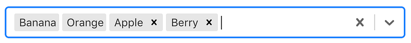
React Select with multiple values can have some values fixed, i.e. they’re always selected.
This user interface shows Banana and Oranges as fixed options. Apple and Berry can be deleted and added.
The following code shows how it’s accomplished:
Lines 74 - 82 define a Select component with fixed options.
Line 76 makes the component animated. When a value is deleted, the item disappears in animated mode.
Line 77 defines the clear button that shows only when there are some delete-able options.
Line 78 defines the styles that differentiate fixed and delete-able options.
Lines 52 - 70 show the algorithm to make fixed options not delete-able. handleChange is passed in with two parameters:
inputValue: The current options- The destructured
{ action, removedValue }: Allows us to amend the options based onactionandremovedValue.
These are available values for action:
select-option: Selecting an option from the list.deselect-option: (Multiple) Deselecting an option from the list.remove-value: (Multiple) Removing a selected option with the remove button.pop-value: Removing options using backspace.set-value: CallingsetValuefrom a component without anaction.clear: Removing all selected options using the clear button.create-option: (Creatable) Creating a new option.
Conclusion
Do you feel the power of React Select? It seems easy to compose a Select component with a few lines of code. Is it time for you to give it a try?
To make things more interesting, you can also check out Select in the Ant Design System.
Thanks for reading. I hope this was helpful. You can see my other Medium publications here.


