
Python: Adding Features To Your Stock Market Dashboard With Plotly
My previous article showed you how to write a program that will retrieve live stock market data from Yahoo Finance, and create a basic candlestick chart to graph the data using Plotly.
This article will expand upon the code used in the past article, and will include several tips for plotting stock price alongside important features like Moving Averages, Volume, MACD, & Stochastic indicators.
Please see the full code for this article at the bottom should you get lost.
I have included the full code that was described in my last article below so that if you missed it, you can catch right up. If you would like to learn the retrieval process step by step, please read my previous article as linked above or by clicking Here.
For Amazon (AMZN), this set returned the following figure when ran after-market hours on 11/29/2021:
This tutorial is aimed at teaching you how to transform the same data frame used to make the above chart into something more meaningful like this:
Once you are caught up and have the code from LivePlot.py above we are ready to start building upon our chart.
I. Add Moving Average traces over your candlestick chart
Traces are used to show additional data on our visualizations in Plotly. To include moving averages on top of our candlestick stock price data — we will need to first add them to the data frame:
# add Moving Averages (5day and 20day) to df
df['MA5'] = df['Close'].rolling(window=5).mean()
df['MA20'] = df['Close'].rolling(window=20).mean()
These can be placed under the yahoo finance download as follows:
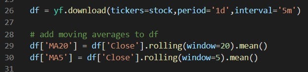
Now, when you go to print your data frame, separate columns titled MA 5 and MA 20 will appear as the last two columns. Next, we will add these values as traces in our plot. Each of these columns can be added as traces to our plot with the following syntax:
# Add 5-day Moving Average Trace
fig.add_trace(go.Scatter(x=df.index,
                         y=df['MA5'],
                         opacity=0.7,
                         line=dict(color='blue', width=2),
                         name='MA 5'))
# Add 20-day Moving Average Trace
fig.add_trace(go.Scatter(x=df.index,
y=df['MA20'],
opacity=0.7,
line=dict(color='orange', width=2),
name='MA 20'))If you add these commands below the first “Add Candlestick” trace your program will return:
You might notice that the stock price data is referred to in the legend as “market data.” This is what we named the data when declaring the candlestick chart in our last exercise, but it can be quite troublesome to rename the plot title, so it’s best practice to assign a name when adding each trace.
II. Add Volume, MACD and Stochastic Indicators as views to your dashboard
Part of the reason Python is so useful for data analytics is the incredible libraries it offers us access to.
One such library is the technical analysis library, ta-lib, which we can use to import calculations for the Moving Average Convergence Divergence (MACD), the stochastic indicator and many more!
To utilize this library we will first need to install it in a command prompt using the following lines of code:
pip install ta We already have volume in our main dataframe, but since we want to use this library to find values for MACD and stochastic — we will need to import the following into our python script.
from ta.trend import MACD
from ta.momentum import StochasticOscillator
# MACD
macd = MACD(close=df['Close'],
window_slow=26,
window_fast=12,
window_sign=9)# Stochastic
stoch = StochasticOscillator(high=df['High'],
close=df['Close'],
low=df['Low'],
window=14,
smooth_window=3)The above lines of code only creates the instance of MACD and Stochastic which we have yet to use in our program.
We have already graphed our candlestick chart showing stock price data, so to make a figure with subplots we will need to declare subplots. Where we declared the figure in our code we will input the following:
# Declare plotly figure (go)
fig=go.Figure()
# add subplot properties when initializing fig variable ***don't forget to import plotly!!!***
fig = plotly.subplots.make_subplots(rows=4, cols=1, shared_xaxes=True, vertical_spacing=0.01, row_heights=[0.5,0.1,0.2,0.2])The syntax to add each view (Volume, MACD, Stochastic) is the following, which we will elaborate on later in this article.
# Plot price data on the 1st subplot (using code from last article)
fig.add_trace(go.Candlestick(x=df.index,
                 open=df['Open'],
                 high=df['High'],
                 low=df['Low'],
close=df['Close'], name='market data'))fig.add_trace(go.scatter(x=df.index,
y=df['MA5'],
opacity=0.7,
line=dict(color='blue', width=2),
name='MA 5'))fig.add_trace(go.scatter(x=df.index,
y=df['MA20'],
opacity=0.7,
line=dict(color='orange', width=2),
name='MA 20'))# Plot volume trace on 2nd row in our figure
fig.add_trace(go.Bar(x=df.index,
y=df['Volume']
), row=2, col=1) ), row=2, col=1)# Plot MACD trace on 3rd row
fig.add_trace(go.Bar(x=df.index,
y=macd.macd_diff()
), row=3, col=1)
fig.add_trace(go.Scatter(x=df.index,
y=macd.macd(),
line=dict(color='black', width=2)
), row=3, col=1)
fig.add_trace(go.Scatter(x=df.index,
y=macd.macd_signal(),
line=dict(color='blue', width=1)
), row=3, col=1)# Plot stochastics trace on 4th row
fig.add_trace(go.Scatter(x=df.index,
y=stoch.stoch(),
line=dict(color='black', width=1)
), row=4, col=1)
fig.add_trace(go.Scatter(x=df.index,
y=stoch.stoch_signal(),
line=dict(color='blue', width=1)
), row=4, col=1)# Update the layout by changing the figure size, hiding the legend and rangeslider
fig.update_layout(height=1000, width=1200,
showlegend=False,
xaxis_rangeslider_visible=False)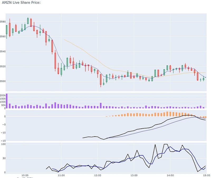
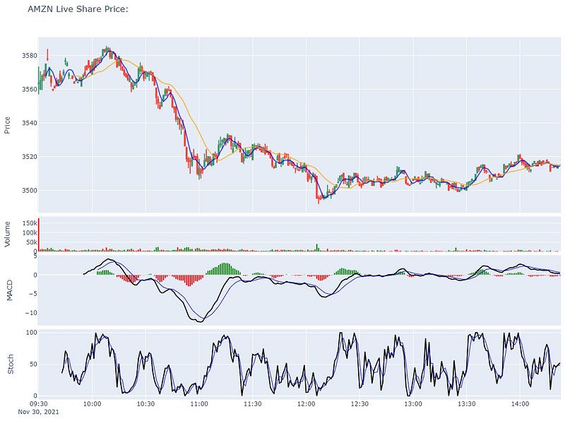
Right now, the sizing of the chart is troublesome, and it makes reading each individual section difficult. Additionally, labels for each row would help readers identify what they’re looking at. Changing the colors of the subplots to match positive (green) and negative (red) will also make this dashboard more useful.
First, let’s add a label for each subplot so that we can keep track of which subplot represents what:
# update y-axis label
fig.update_yaxes(title_text="Price", row=1, col=1)
fig.update_yaxes(title_text="Volume", row=2, col=1)
fig.update_yaxes(title_text="MACD", showgrid=False, row=3, col=1)
fig.update_yaxes(title_text="Stoch", row=4, col=1)
Next, let’s change the colors of the Volume and MACD data points (replace the previous code for each):
# Plot volume trace on 2nd row
colors = ['green' if row['Open'] - row['Close'] >= 0
          else 'red' for index, row in df.iterrows()]
fig.add_trace(go.Bar(x=df.index,
                     y=df['Volume'],
                     marker_color=colors
                    ), row=2, col=1)
# Plot MACD trace on 3rd row
colors = ['green' if val >= 0
else 'red' for val in macd.macd_diff()]
fig.add_trace(go.Bar(x=df.index,
y=macd.macd_diff(),
marker_color=colors
), row=3, col=1)Final Chart Output:
Extra:
If you’re wondering how I embedded these Plotly visualizations in this article I highly recommend you check out the following:
What other functions/plots would you like to see? Leave a comment
Full Code:
Source(s):
(1) A Simple Guide to Plotly for Plotting Financial Charts


